Captivating Dining Room Color Schemes for an Inviting Space
Selecting the right dining room color scheme sets the mood for gathering, dictating whether your meals feel intimate and moody or bright and energetic. From deep forest greens paired with honey oak to moody charcoal greys balanced by crisp off-white, color combinations define your room’s architecture. Discover these research-backed color palettes to design a memorable dining space for family and guests.
Deep Forest Green and Warm Honey Oak Wood Palette

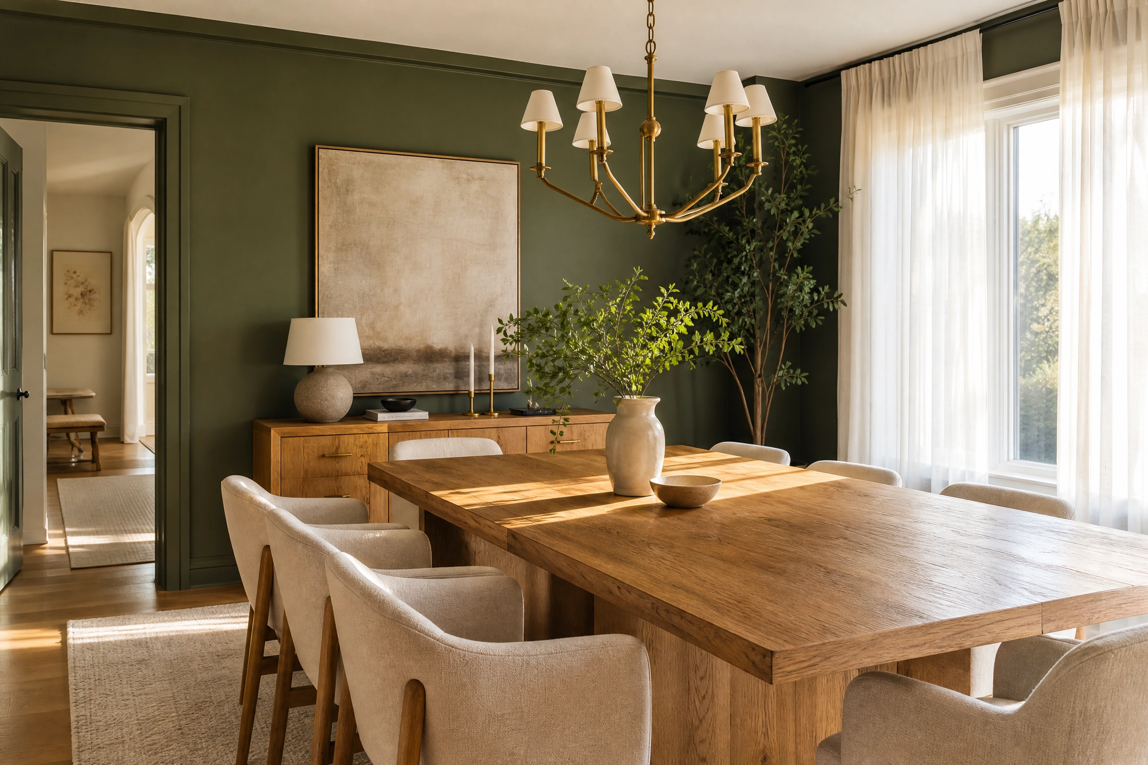
Pairing deep forest green painted walls with a warm honey oak dining table brings nature-inspired sophistication into your dining room. The saturated green backdrop absorbs harsh daylight, creating an intimate evening atmosphere that accentuates natural timber wood grains. Add brass sconces to introduce golden metallic highlights.
DESIGNER ADVICE: Use matte or eggshell green wall paint to absorb glare while letting honey oak tables reflect warm ambient light.
Classic Navy Blue and Polished Brass Palette
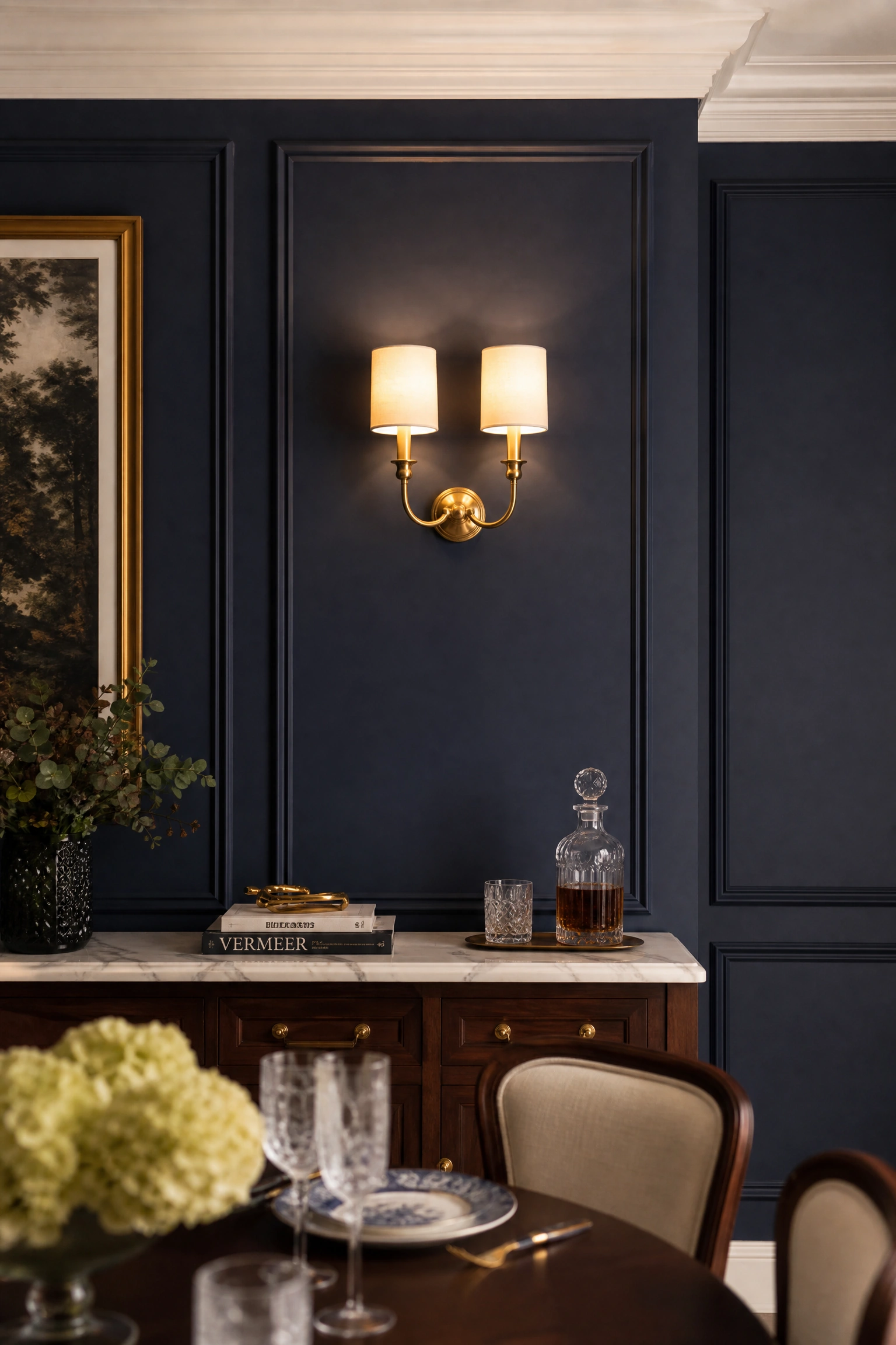
Combining classic navy blue wall paneling with polished brass chandeliers and hardware yields a tailored, timeless aesthetic. Navy blue brings dark, dramatic weight that makes metallic brass fixtures gleam brightly during dinner gatherings. Balance the deep blue with crisp white ceilings and light-colored dinnerware.
QUICK TIP: Paint lower wainscoting crisp white to prevent navy blue walls from feeling overly dark in smaller dining spaces.
Moody Charcoal Grey and Crisp Off-White Palette
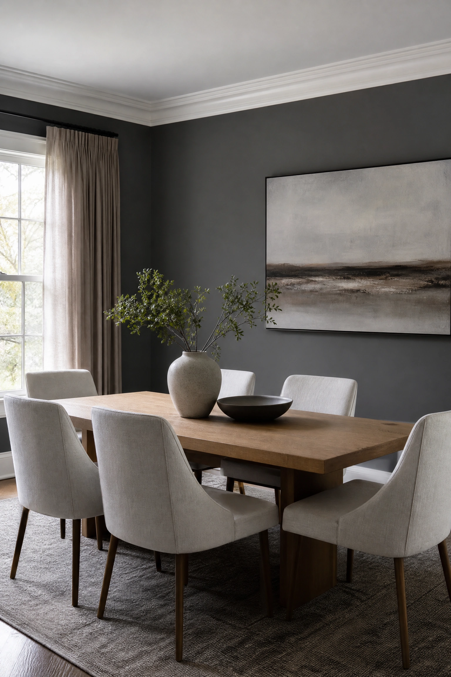
Painting dining walls in a dark charcoal grey while keeping trim and ceilings crisp off-white creates a striking modern high-contrast scheme. The dark charcoal envelope wraps the seating area in cozy focus, while off-white accents prevent the room from feeling closed in. Pair with pale grey rugs.
STYLE SECRET: Incorporate light linen upholstery on dining chairs to create a soft visual bridge between charcoal walls and white trim.
Terracotta Clay and Warm Cream Palette

Combining burnt terracotta clay walls with warm cream plaster trim brings Mediterranean warmth and organic texture to your dining table. The rusty red-orange hue stimulates appetite and conversation, creating a welcoming, sun-baked atmosphere for evening entertaining. Pair with natural woven seagrass chairs.
BUDGET HACK: Apply a lime-wash terracotta paint to create an authentic, rustic Mediterranean plaster texture on standard drywall.
Dusty Rose and Carrara White Marble Palette
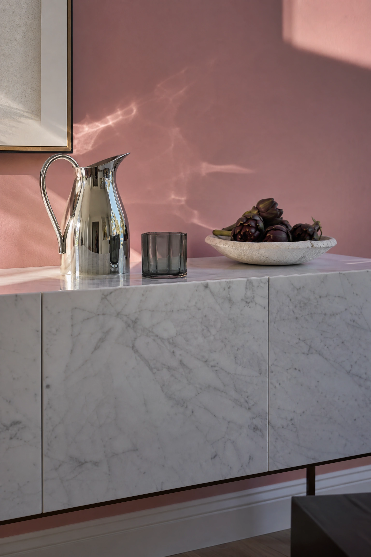
Pairing muted dusty rose wall paint with polished Carrara white marble sideboards creates a delicate, romantic dining sanctuary. The soft rose hue warms cold grey veins in white marble, yielding an elegant color harmony that feels light and airy. Add polished chrome or nickel accents.
DESIGNER ADVICE: Choose a dusty rose shade with grey undertones to prevent your dining room from looking overly sweet or youthful.
Sage Green and Bleached Ash Wood Palette
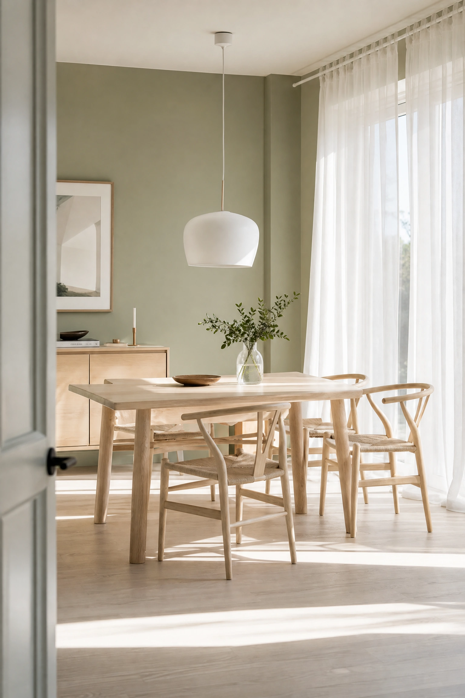
Combining tranquil sage green walls with light bleached ash wood furniture establishes a serene, Scandinavian-inspired dining environment. The soft green shade reflects morning sunlight gently, creating a breezy space for weekend breakfasts. The pale ash wood brings organic simplicity.
QUICK TIP: Incorporate leafy green plants in ceramic pots to enhance the natural organic palette of sage green and light ash.
Rich Plum Burgundy and Dark Walnut Palette

Pairing deep plum burgundy paint with dark walnut dining tables builds an opulent, jewel-toned dining room perfect for formal dinners. The deep red-purple walls absorb ambient light to create a dramatic, cocooning backdrop that elevates dark timber furniture. Add warm gold accents.
SAFETY WARNING: Ensure adequate layered lighting with dimmers so dark plum burgundy rooms remain functional during evening meals.
Muted Olive Green and Natural Linen Palette

Combining muted olive green wall paint with unbleached natural linen curtain drapes creates an earthy, grounded dining atmosphere. The muted green tone offers quiet sophistication that connects indoor dining with outdoor garden views. The textured linen fabric adds relaxed warmth.
MAINTENANCE RULE: Vacuum natural linen drapes regularly to keep dust from dulling the soft organic color contrast against olive green walls.
Warm Sandstone Beige and Matte Black Accent Palette
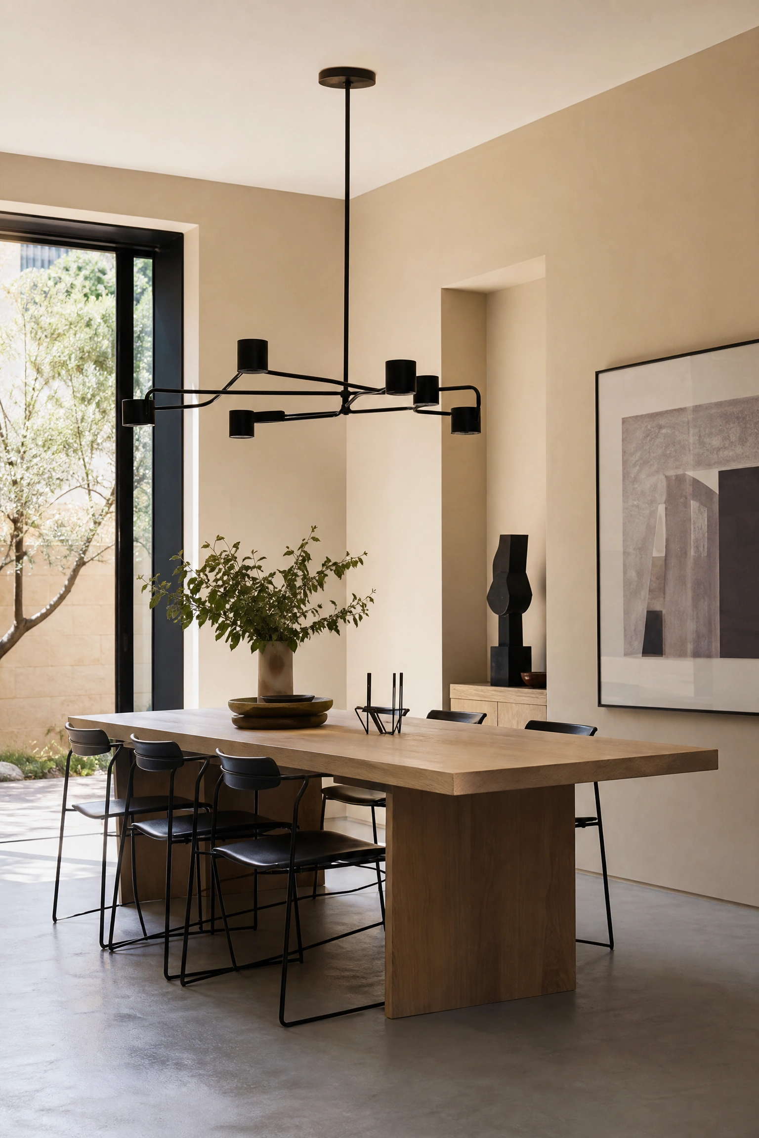
Pairing warm sandstone beige painted walls with matte black light fixtures and chair frames yields a modern, high-contrast neutral scheme. The warm beige walls provide cocooning warmth that softens sharp black architectural metal lines. It creates a clean, architectural presentation.
QUICK TIP: Use matte black window frames to crisp up sandstone beige walls without adding extra decorative wall clutter.
Ochre Yellow and Dark Chocolate Brown Palette

Combining rich ochre yellow wall paint with dark chocolate brown wooden furniture creates a vibrant, retro-inspired dining atmosphere. The sunny ochre hue brightens dark rooms, pulling warm amber notes out of deep brown wood grains. Add cream textiles to balance saturation.
BUDGET HACK: Paint an accent wall in mustard or ochre yellow behind your dark brown sideboard for a low-cost high-impact color pop.
Soft Slate Blue and Brushed Nickel Palette
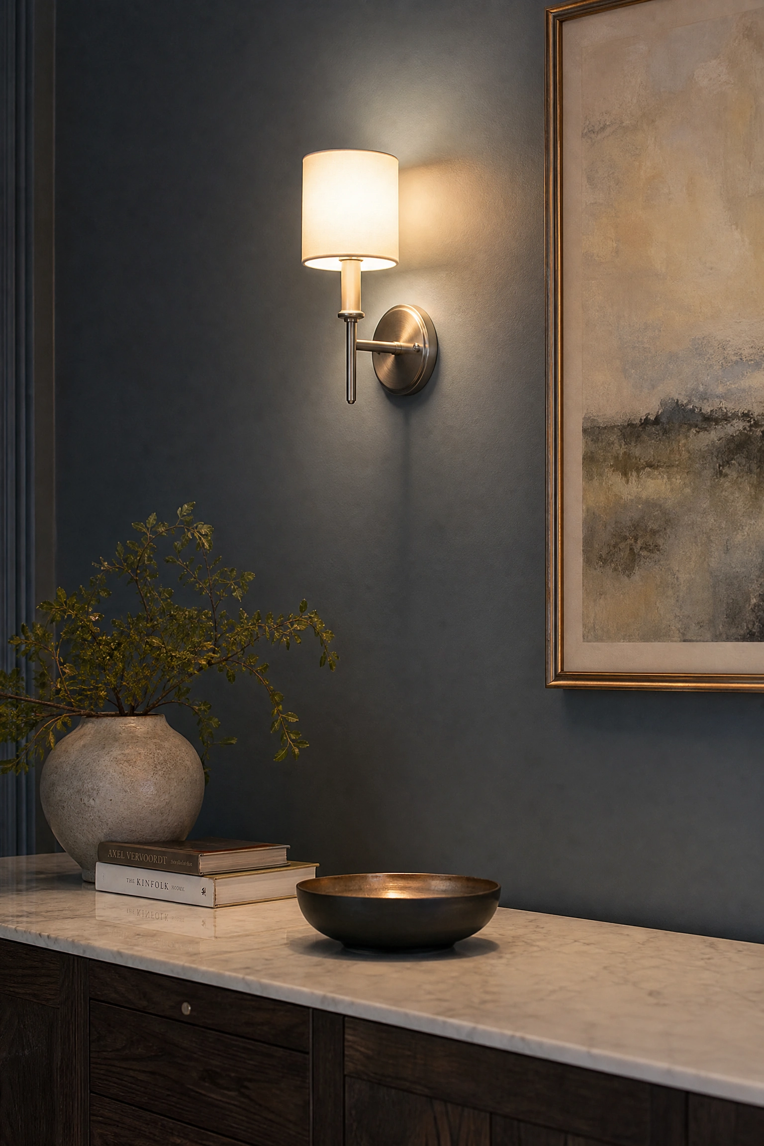
Pairing soft slate blue walls with brushed nickel light fixtures and cabinet hardware establishes a cool, elegant coastal aesthetic. The grey undertones in slate blue keep the room feeling calm and refined, while brushed nickel adds subtle silver sheen. Pair with white linen chairs.
DESIGNER ADVICE: Choose brushed nickel over polished chrome to maintain a soft, satin metallic finish against cool slate blue paint.
Burnt Orange and Raw Concrete Palette
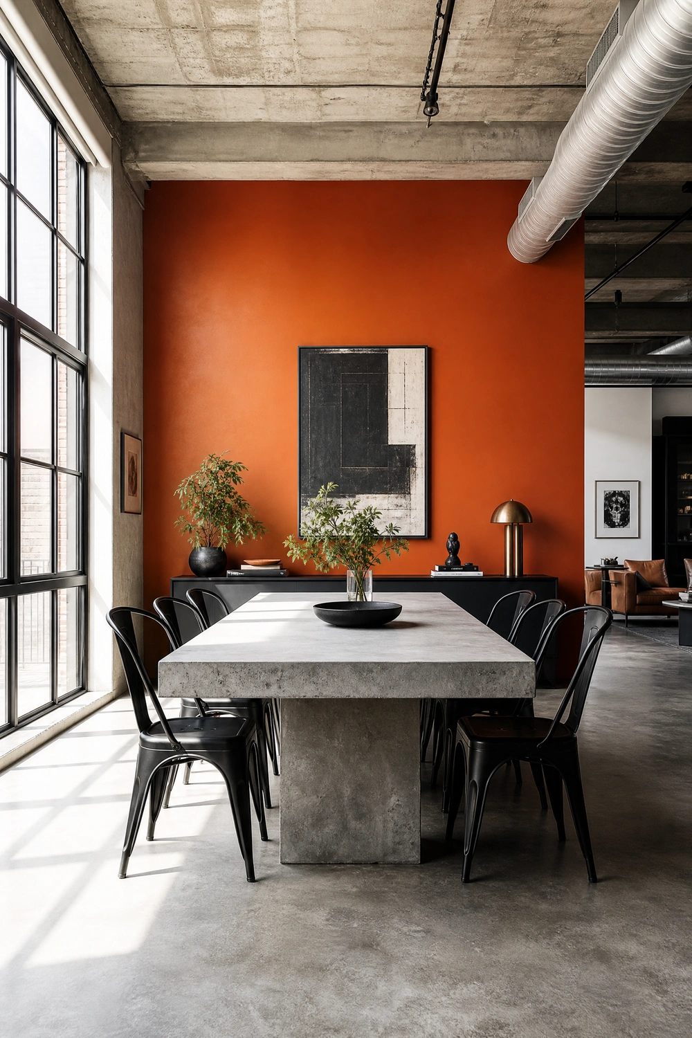
Pairing burnt orange accent walls with raw grey concrete floors or dining tables delivers a vibrant industrial-chic scheme. The intense fiery orange shade warms up cold, utilitarian grey concrete surfaces, creating an energetic balance. Add matte black metal chairs to ground the look.
SAFETY WARNING: Seal raw concrete dining tables with a food-safe sealer to prevent acidic liquids like wine from staining grey stone.
Creamy Ivory and Warm Teak Wood Palette
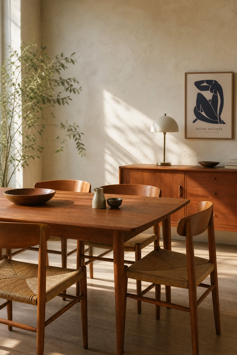
Combining creamy ivory plaster walls with warm mid-century teak wood dining furniture creates a timeless, Scandinavian-inspired space. The warm ivory backdrop reflects natural daylight gently, emphasizing the rich honey-brown grain of Scandinavian teak. The palette feels relaxed.
QUICK TIP: Treat vintage teak furniture with teak oil annually to maintain rich golden-brown wood tones against ivory walls.
Midnight Black and Warm Amber Gold Palette
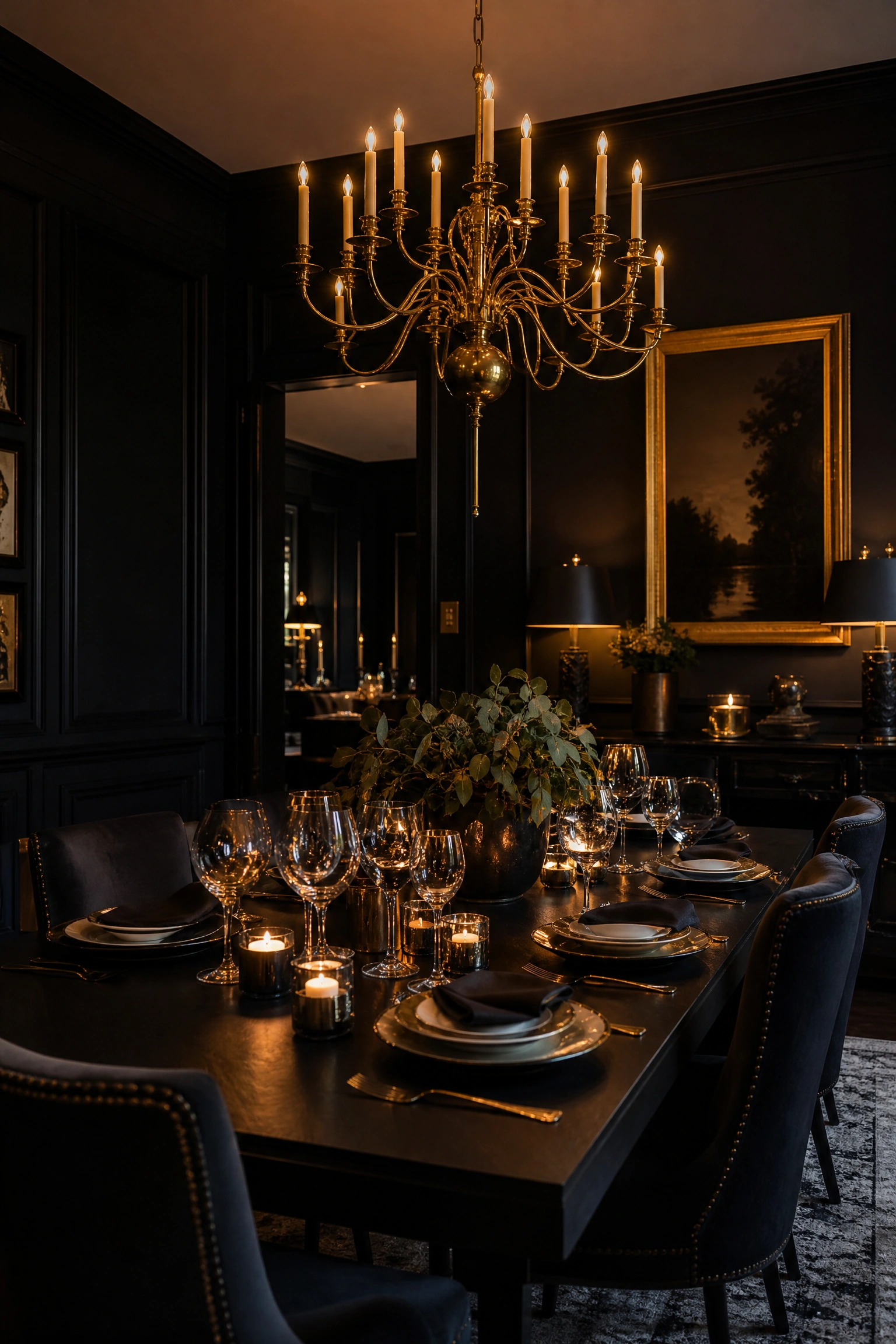
Painting dining walls in a midnight black matte finish paired with warm amber gold chandeliers creates a jewel-box dining lounge. The dark black background absorbs light completely, allowing gold fixtures, warm candlelight, and brass tableware to glow intensely. It transforms dinner into a event.
DESIGNER ADVICE: Incorporate large mirrors on midnight black walls to bounce amber gold lighting around the dark dining room.
Dusty Blue and Crisp White Beadboard Palette

Combining dusty blue upper walls with vertical crisp white beadboard wainscoting yields a classic cottage-style dining nook. The fresh white beadboard protects lower walls from chair scuffs, while dusty blue upper paint adds soft sky-like color. It feels clean and light-filled.
BUDGET HACK: Install pre-cut MDF beadboard paneling on lower walls and paint crisp white to achieve cottage style affordably.
Soft Blush Pink and Emerald Green Palette

Pairing soft blush pink painted walls with deep emerald green velvet dining chairs creates a glamorous, high-contrast botanical scheme. The delicate pink walls provide a warm neutral canvas that makes jewel-toned green velvet seating pop intensely. Add brass details for shine.
STYLE SECRET: Use polished brass leg caps on emerald green velvet chairs to tie into the warm undertones of soft blush pink walls.
Warm Greige and Natural Seagrass Woven Palette

Combining warm greige (grey-beige) wall paint with natural woven seagrass rug runner and chair seats yields a subtle, textured neutral space. Greige offers a modern background that blends warm and cool tones, allowing organic seagrass fibers to bring tactile warmth. The look feels calm.
MAINTENANCE RULE: Vacuum woven seagrass rugs using suction-only settings to prevent pulling natural plant strands apart.
Deep Sapphire Blue and Cognac Leather Palette

Pairing deep sapphire blue walls with rich cognac leather dining chairs creates a masculine, high-contrast seating area. The fiery warm orange-brown tones of cognac leather pop vividly against cool deep blue walls, establishing a energetic balance. Add dark wood accents.
DESIGNER ADVICE: Choose matte sapphire blue wall paint to let the glossy, supple texture of cognac leather chairs shine.
Muted Moss Green and Antique Copper Palette
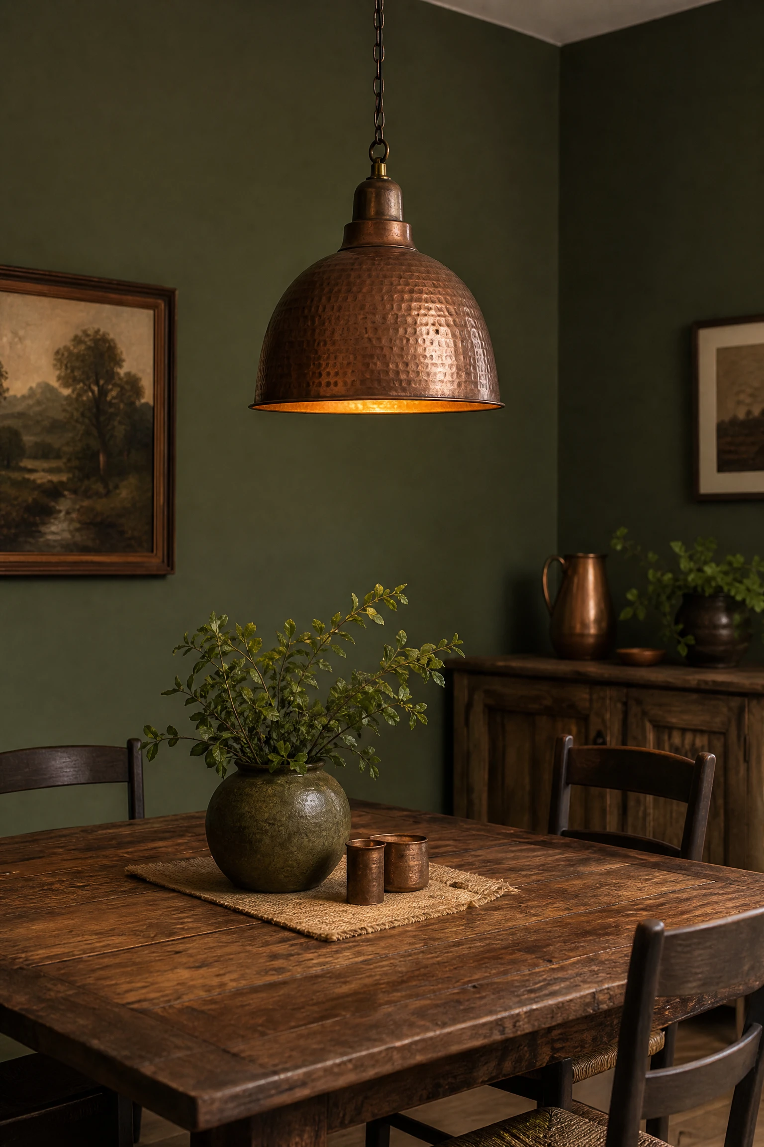
Combining muted moss green walls with antique copper pendant lights and chargers introduces warm rustic metallics and organic color. The earthy green backdrop sets a relaxed tone, while reddish-gold antique copper reflects warm light across dinner plates. It feels cozy.
QUICK TIP: Hang hammered copper pendant lights low over your dining table to cast warm golden pools of light onto moss green settings.
Rich Mahogany Red and Vintage Gold Leaf Palette
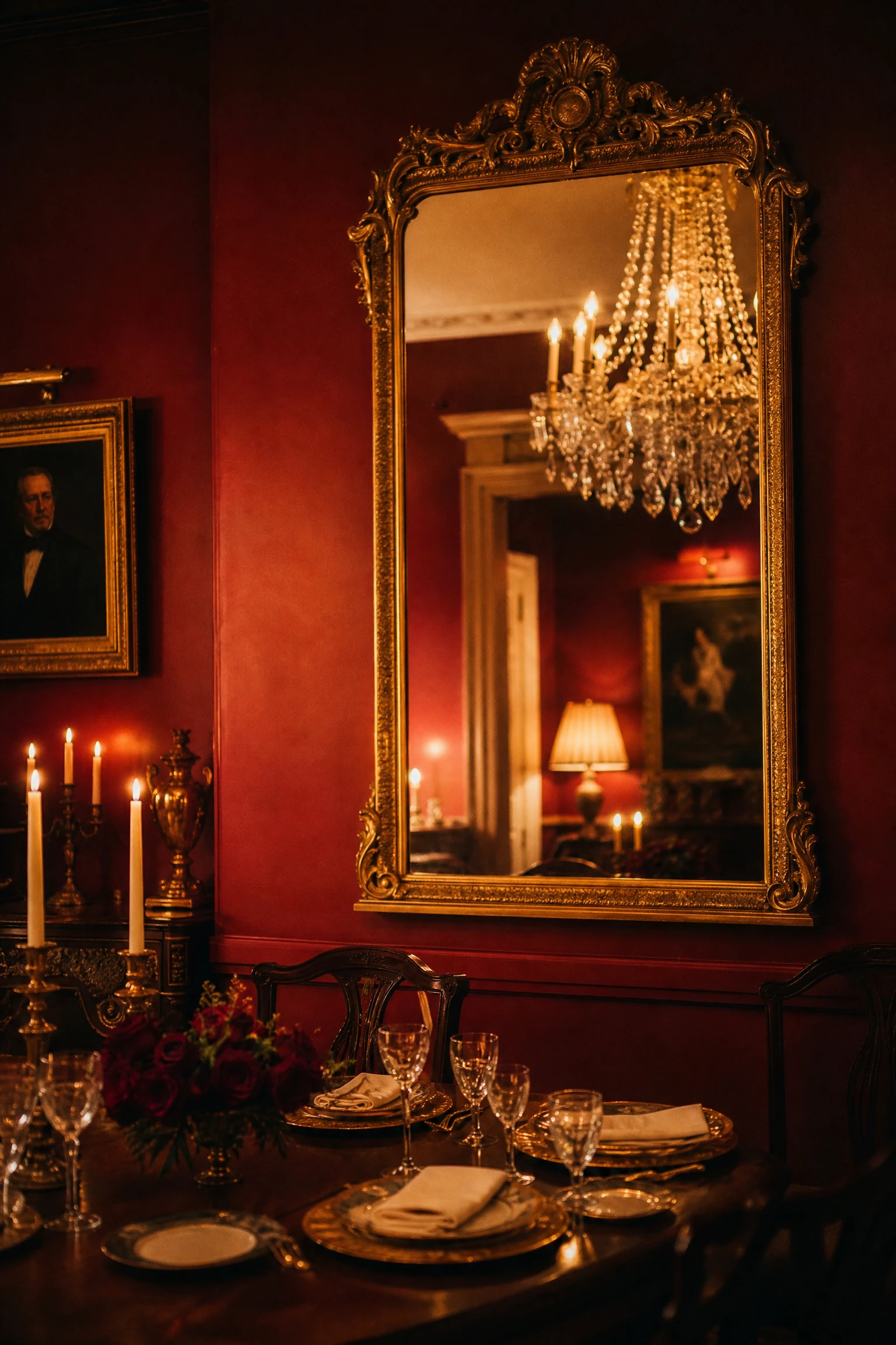
Pairing rich mahogany red walls with vintage gold leaf mirror frames creates a traditional, stately dining room for formal hosting. The deep reddish-brown walls envelop the room in dramatic warmth, while gold leafing catches chandelier light for a shimmering metallic border. It feels historic.
SAFETY WARNING: Ensure dark mahogany red rooms have dimmable wall sconces to keep table settings visible during evening dinners.
Pale Alabaster White and Matte Charcoal Accent Palette
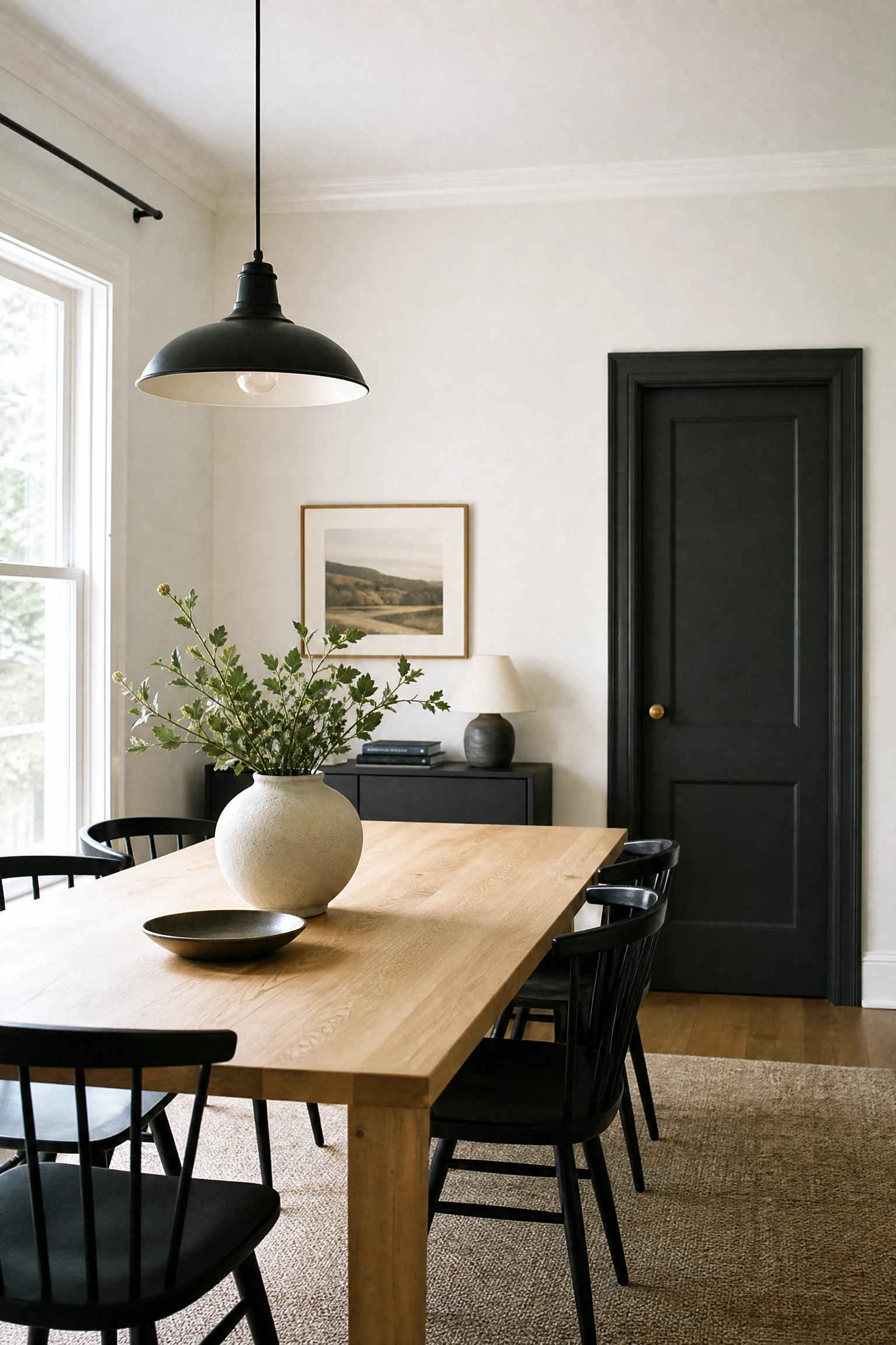
Combining pale alabaster white walls with matte charcoal grey accent doors and black metal light fixtures yields a clean modern aesthetic. The luminous white walls bounce daylight freely, making compact dining rooms feel spacious, while dark charcoal accents ground the open layout.
QUICK TIP: Paint dining room interior doors matte charcoal black to add architectural structure to plain alabaster white walls.
Deep Teal and Warm Chestnut Wood Palette
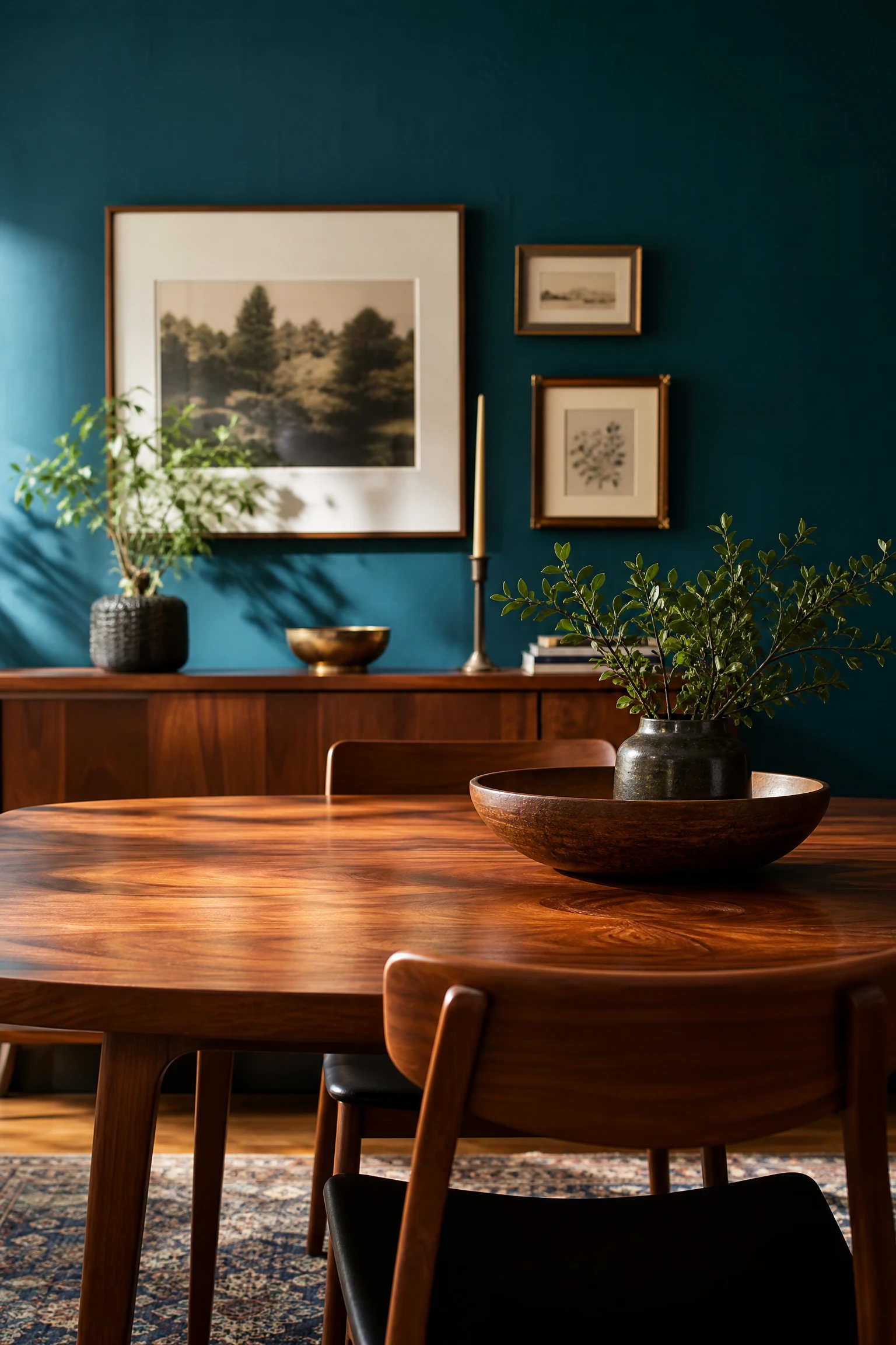
Pairing deep teal blue-green walls with warm chestnut wood dining furniture creates a rich jewel-toned contrast full of natural warmth. The deep blue-green backdrop pulls out the reddish-amber grain of chestnut wood, establishing a cozy, sophisticated dining space. Add brass fixtures.
DESIGNER ADVICE: Use brushed brass hardware to bridge the gap between cool deep teal paint and warm reddish chestnut wood.
Soft Taupe and Brushed Bronze Palette
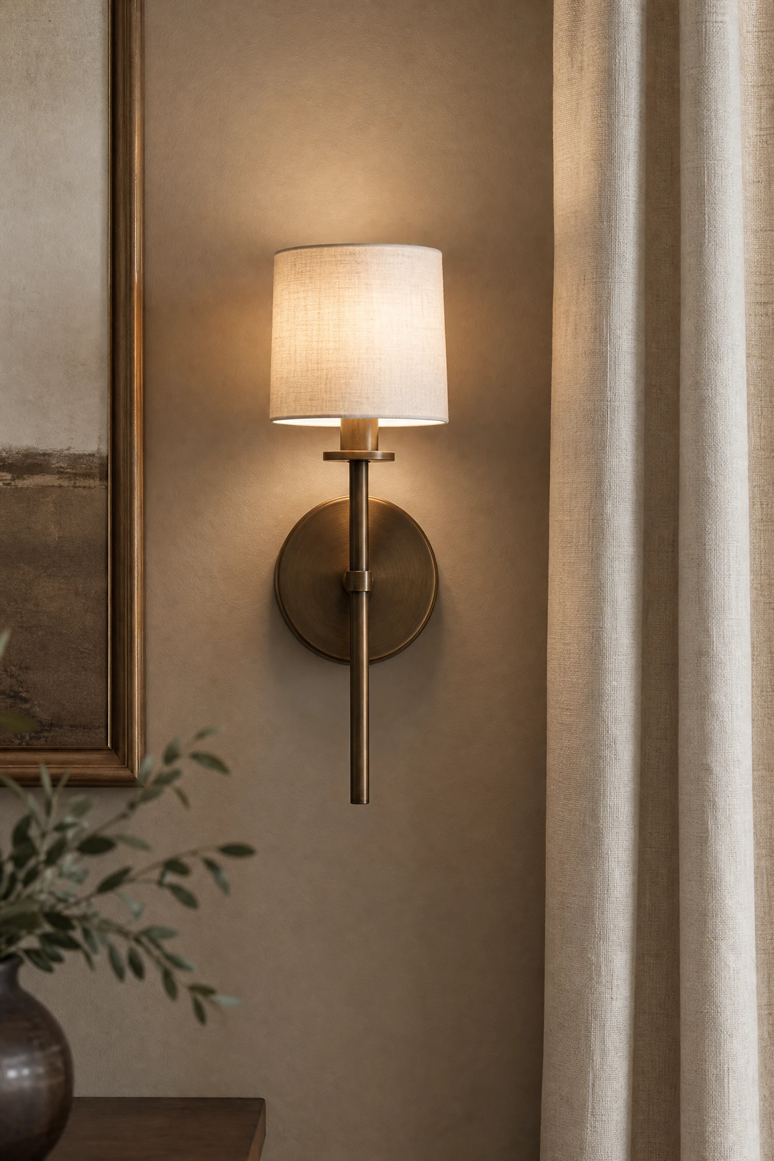
Combining soft taupe walls with brushed bronze light fixtures and picture frames creates a serene, low-contrast neutral palette. The grey-brown taupe tone brings sophisticated warmth that feels more complex than basic beige, while brushed bronze adds subtle metallic depth. It feels relaxed.
QUICK TIP: Pair soft taupe walls with off-white linen drapes to maintain a soft, harmonious visual flow across window walls.
Mustard Yellow and Slate Grey Palette
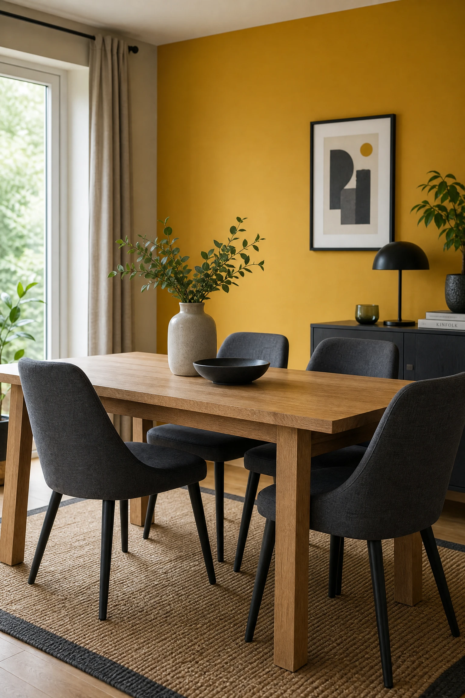
Pairing bold mustard yellow accent walls with cool slate grey dining chairs establishes a energetic, modern color scheme. The sunny mustard yellow brings energetic warmth that stimulates social meals, while slate grey seating grounds the bright color. Add light wood tables.
BUDGET HACK: Paint just the dining room end-wall in mustard yellow to create a high-energy focal point without painting full rooms.
Muted Eucalyptus Green and Cream Linen Palette
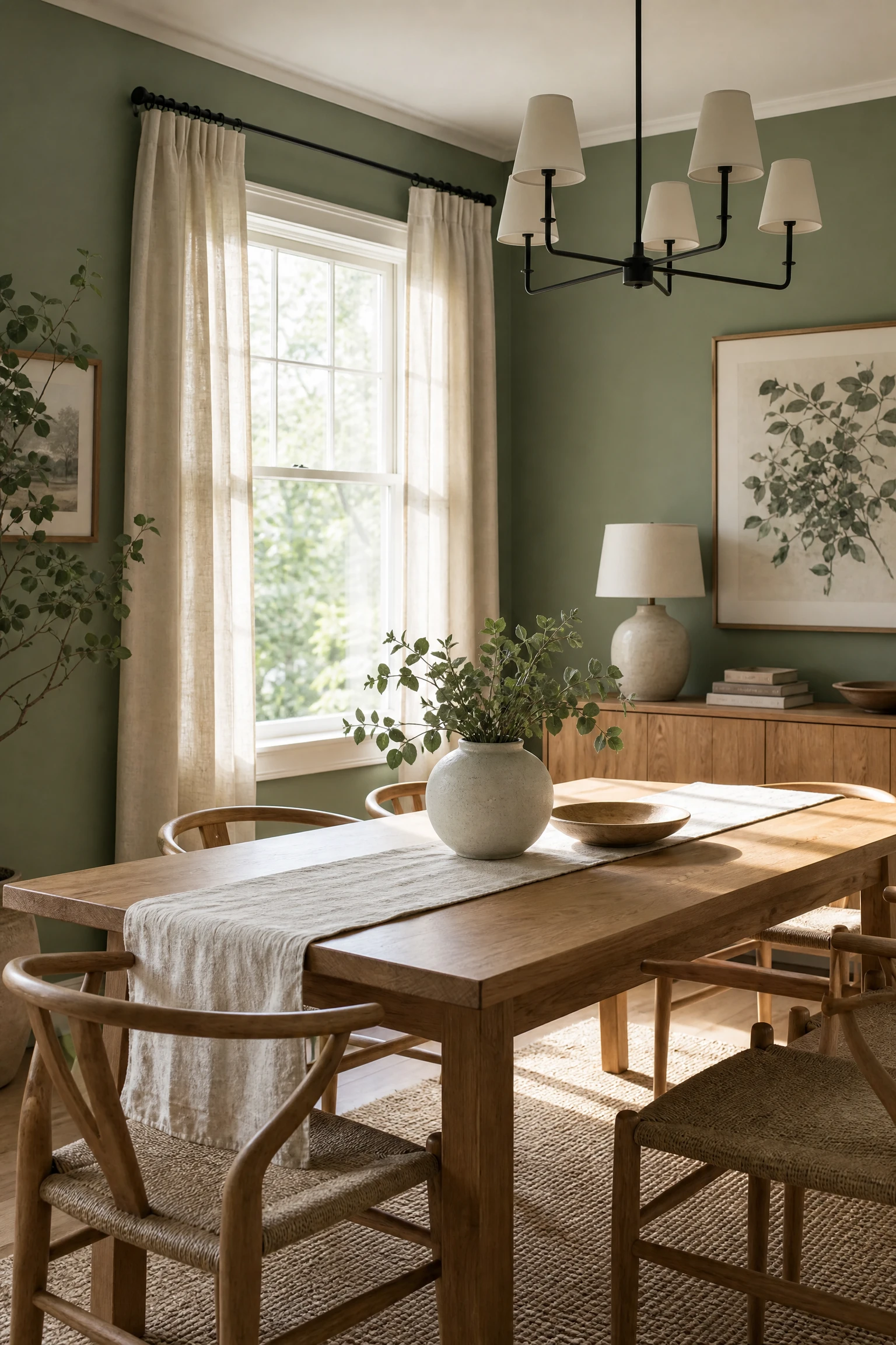
Combining muted eucalyptus green wall paint with soft cream linen curtain panels and upholstery yields a tranquil botanical retreat. The silver-green undertones in eucalyptus green feel soothing, while cream linen adds soft tactile texture. It connects dining areas with garden views.
QUICK TIP: Use matte eucalyptus paint on walls to keep green tones looking muted and natural rather than glossy.
Rich Garnet Red and Dark Smoked Oak Palette

Pairing rich garnet red painted walls with dark smoked oak dining furniture creates an intense, opulent dining room designed for evening entertaining. The deep red wall envelope absorbs ambient light, while dark smoked oak tables bring serious timber grounding. Add gold tableware.
SAFETY WARNING: Ensure garnet red paint is applied with proper primer coats to achieve deep, even color opacity across dining walls.
Soft Powder Blue and Pale Ash Wood Palette
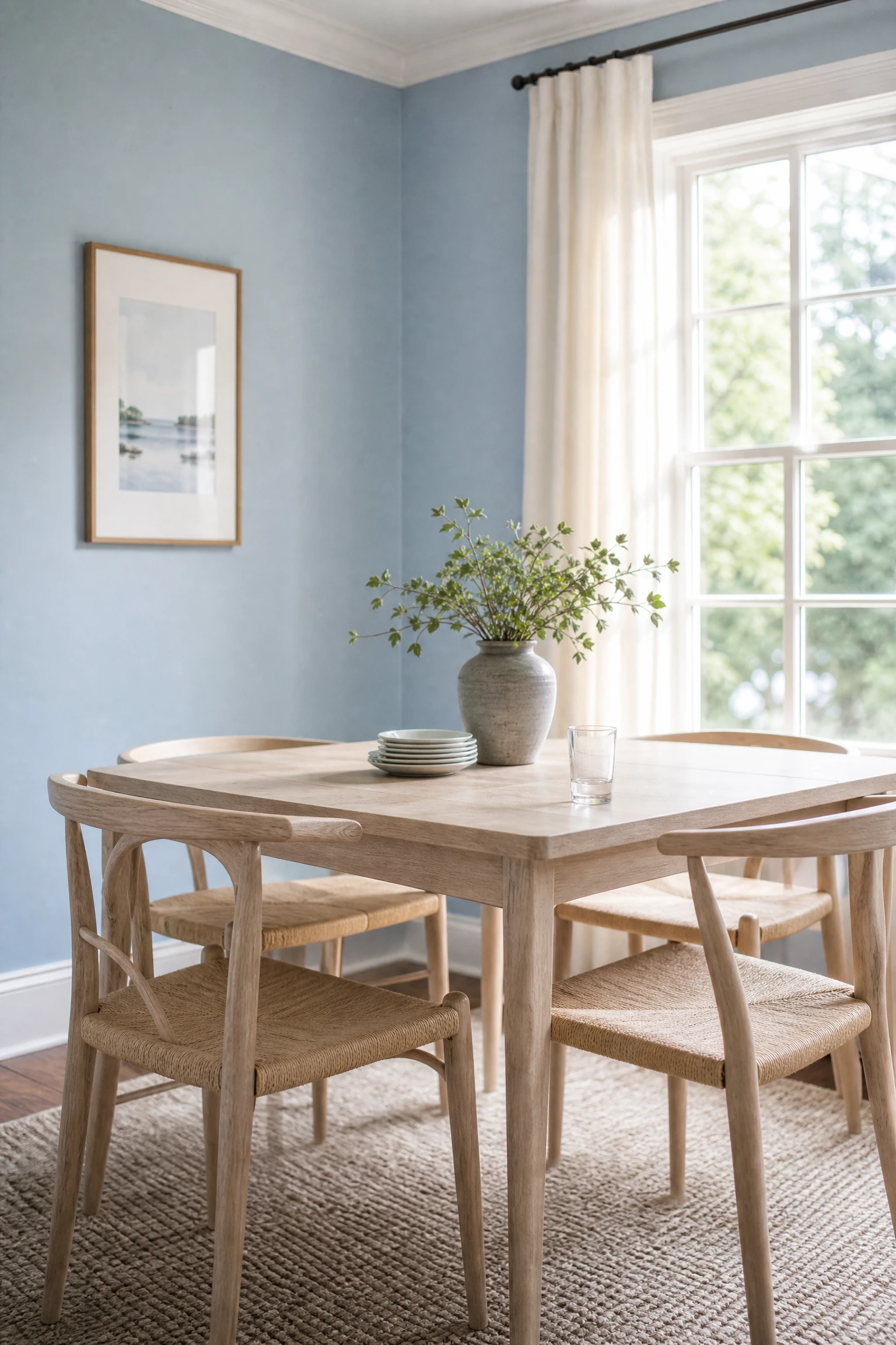
Combining soft powder blue walls with light pale ash wood furniture creates a breezy, coastal-inspired dining space. The delicate light blue hue reflects daylight, making compact dining nooks feel open and airy, while pale ash wood adds organic texture. Add white cotton accents.
BUDGET HACK: Use clear light wood wax on pale ash chairs to preserve light natural tones against powder blue walls cheaply.
Burnt Sienna Brown and Warm Cream Plaster Palette
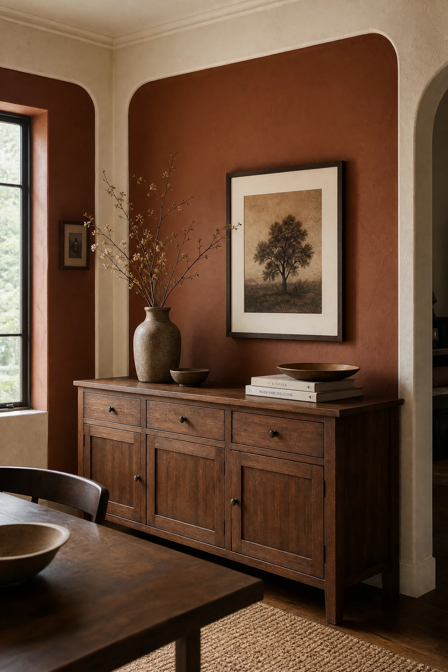
Pairing deep burnt sienna brown walls with warm cream plaster trim creates a rich, earthy dining room full of natural clay tones. The warm sienna shade envelops guests in cozy warmth, while cream plaster trim adds crisp architectural borders. Pair with leather or wood.
DESIGNER ADVICE: Incorporate warm amber lighting to highlight the rich reddish-brown tones of burnt sienna wall paint.
Deep Charcoal Blue and Natural Rattan Woven Palette

Combining deep charcoal blue painted walls with natural woven rattan dining chairs yields a moody yet relaxed coastal-modern palette. The dark navy-grey background makes light tan rattan weaving pop with intricate texture. Add white table linens for crisp contrast.
QUICK TIP: Select dark charcoal blue with navy undertones to keep dark walls feeling rich rather than cold grey.
Conclusion
Selecting the ideal dining room color scheme is all about creating the right atmosphere for gathering, whether you prefer dark moody jewel tones or light breezy neutrals. By pairing saturated wall paint with complementary wood grains, natural stone, and metallic accents, you can establish an inviting space designed for memorable meals. These research-backed color palettes ensure your dining room remains beautiful and stylish for years to come.