Grey Living Room Looks That Actually Work (and Feel Like Home)
Grey gets a bad reputation sometimes. People worry it will feel cold, flat, or like a waiting room. But anyone who has actually lived with a well-done grey living room knows the truth: it is one of the most flexible, layered, and genuinely beautiful color stories you can tell in a home. The real trick is not picking a grey and calling it a day. It is understanding what makes grey breathe, what warms it up, what gives it personality, and what turns it from a neutral into a whole mood.
This article is organized into style categories because grey really does behave differently depending on the design direction you take it. A soft warm-grey Scandinavian room and a dark dramatic charcoal lounge are technically both grey living rooms, but they feel like completely different homes. So rather than throwing a random list of ideas at you, this guide is broken into groups: cozy and warm approaches, bold and dramatic directions, light and airy styles, nature-inspired looks, and a few budget-friendly routes for people who want to get there without spending a fortune.
Throughout each idea, you will find specific details on color, furniture, lighting, textures, and decor accessories, because the real-life application matters more than the pretty Pinterest pin. Whether you are starting a room from scratch, repainting, or just trying to figure out what is missing from a space you already have, there is something here for you.
Grey is genuinely one of those colors that rewards you the more effort you put into it. Let’s get into it.
— Cozy and Warm Grey Ideas —
1. Warm Greige With Honey Wood Accents
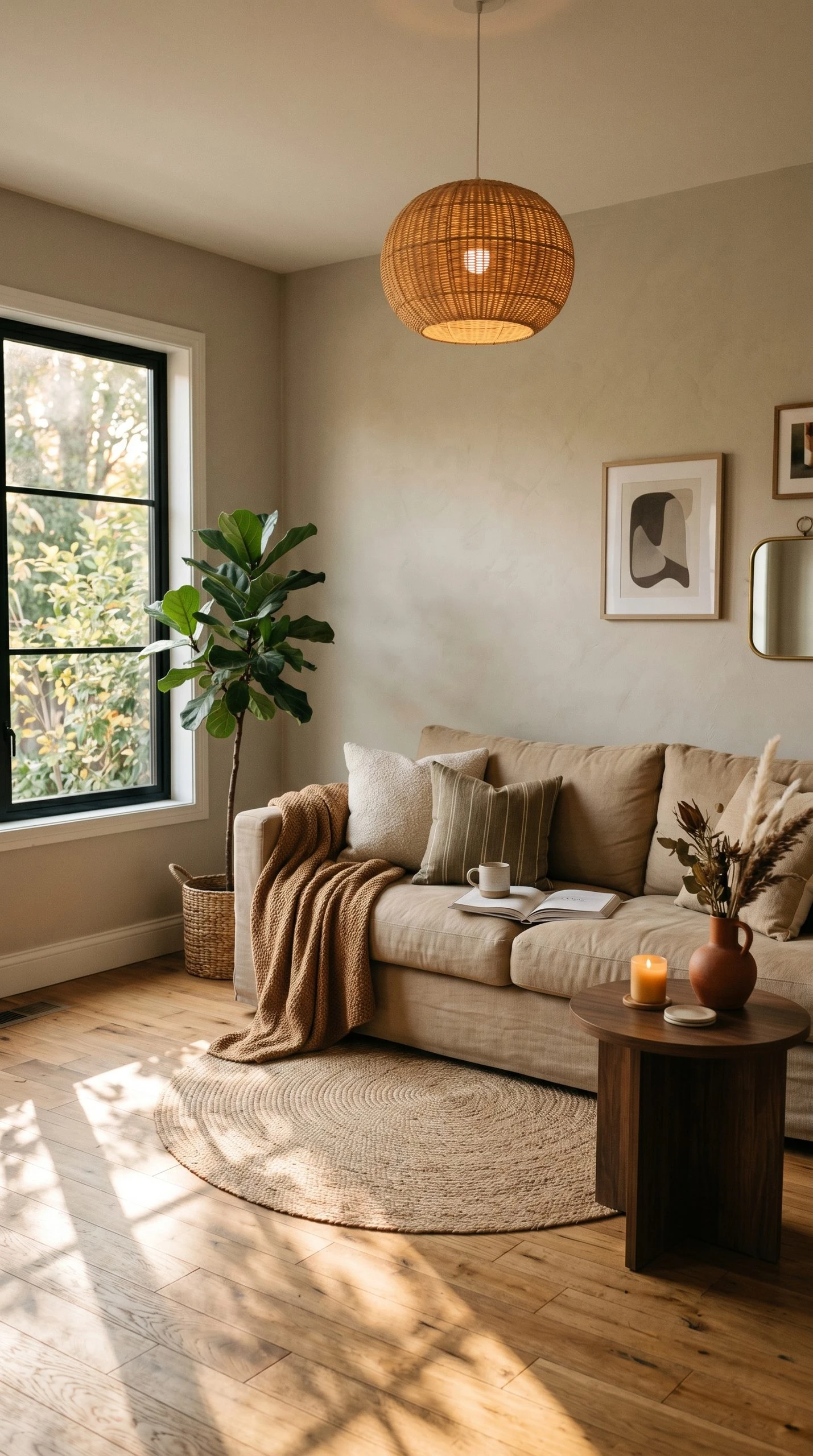
Greige, the grey-beige hybrid, is the most livable version of grey for people who love warmth. It sits right between the two colors and works especially well in living rooms that get limited natural light, where a cooler grey might start to feel a little clinical. The trick with greige is to lean fully into the warmth story and let the wood tones carry the room forward. Think honey oak floors, a walnut coffee table, or rattan side chairs. These warm browns pull the greige off the wall and into the furniture layer in a way that feels completely intentional.
On the walls, a shade like Benjamin Moore’s Pale Oak or Sherwin-Williams Accessible Beige works well here, both sitting firmly in that warm grey territory without going too beige. For seating, a deep linen sofa in a biscuit or oat tone grounds the room without fighting the walls. Add a chunky knit throw in a slightly darker caramel, a jute area rug with a simple weave, and a few ceramic vases in muted terracotta or sand. Your lighting should lean warm, around 2700K bulbs, and a floor lamp with a linen shade in the corner creates that soft, buttery evening glow that makes greige rooms look incredible after dark.
| Designer Advice: Avoid cool-white trim if your greige has yellow undertones. Warm white or off-white trim (like Simply White or Navajo White) will keep everything cohesive and prevent the walls from looking greenish. |
2. Charcoal Grey With Mustard Yellow Pops
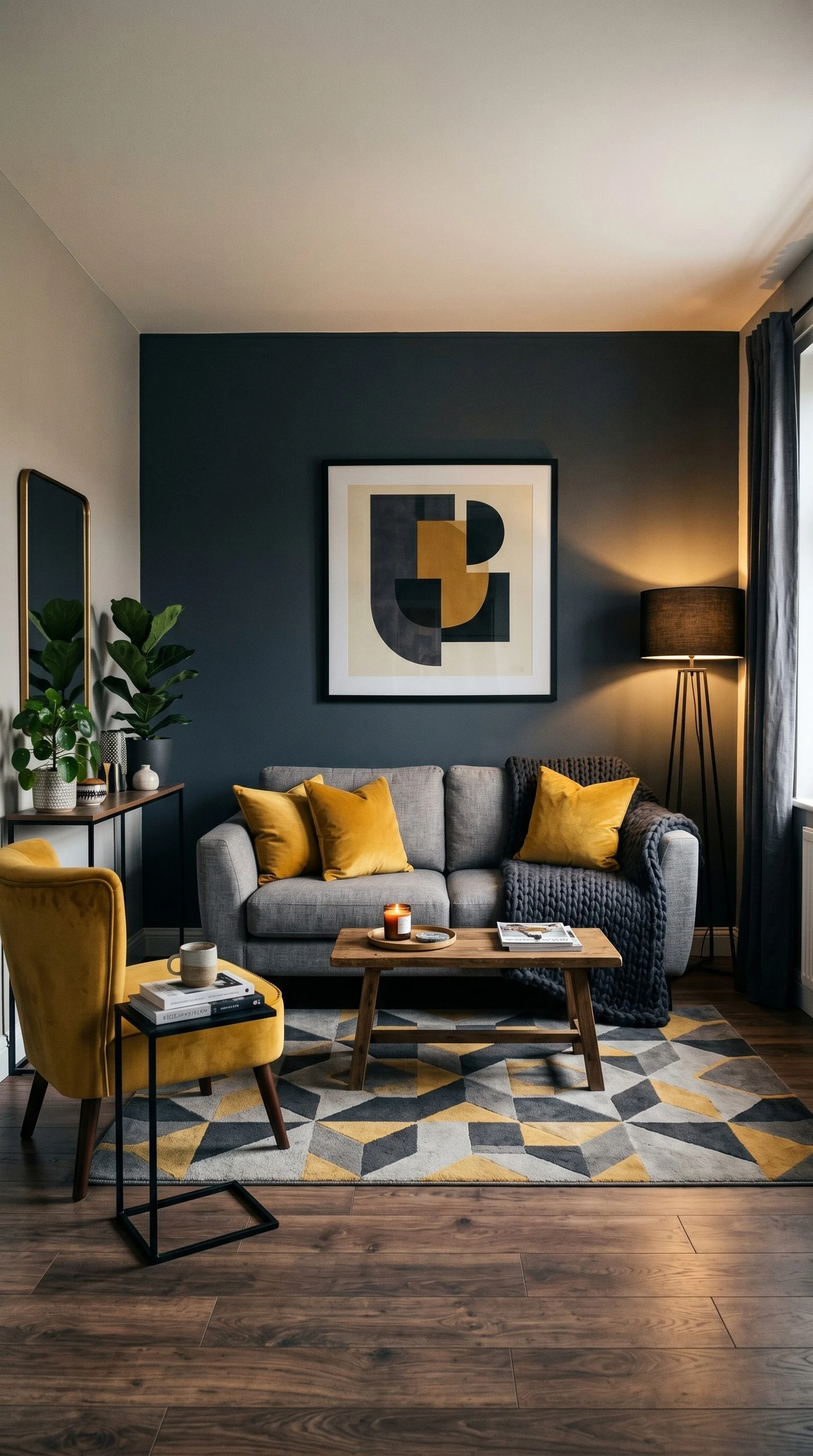
This combination has been popular for a few years now and it is still going strong because it genuinely works. Charcoal is a deeper, almost moody grey that gives the room weight and seriousness, and mustard cuts right through it with heat and energy. The contrast is sharp but not jarring because both colors have enough depth to stand beside each other. This look reads well in apartments and homes with medium-sized living rooms where you want the space to feel full rather than airy.
Start with a charcoal accent wall behind the sofa, using a paint in the blue-grey family rather than pure brown-grey, as it will stay looking rich and intentional. The sofa itself can be a medium grey or even a dark navy to keep the color story tight. Introduce mustard through two or three throw pillows, a chunky woven blanket draped over one arm of the sofa, and a mustard velvet accent chair if you have room. A geometric printed rug in grey, charcoal, and yellow ties all three zones together without you having to do much else. For art, a large black-framed print with warm graphic shapes or abstract brushstrokes looks right at home in this palette.
| Designer Advice: Keep the mustard accessories odd-numbered. Three mustard pillows, one throw, one chair. Even numbers of accent pieces can feel staged. Odd numbers feel collected. |
3. Soft Grey With Blush Pink and Brass
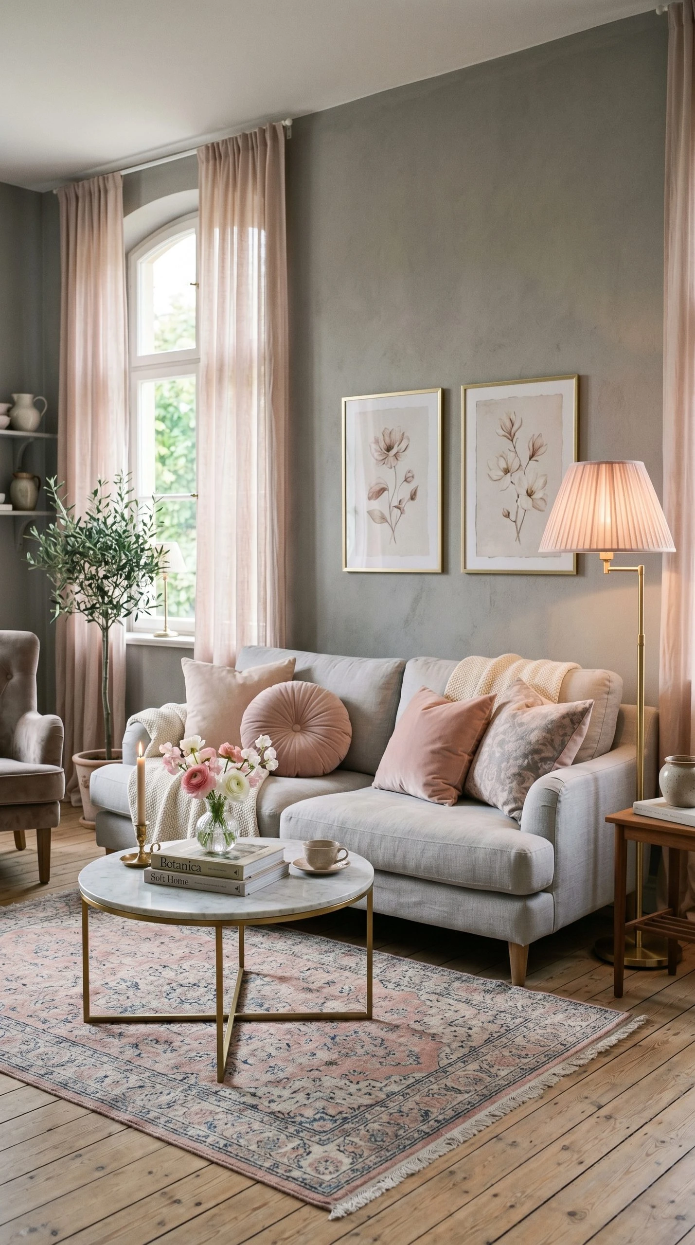
This is the living room equivalent of a good cashmere sweater. Everything is soft, warm, and slightly luxurious without trying too hard. The base here is a warm mid-tone grey, something like Farrow and Ball’s Pavilion Gray or Dulux’s Grey Pebble, paired with blush accents and brass hardware. This combination skews feminine and elegant, but it does not have to feel precious. The key is keeping the grey grounded so the blush reads as an accent, not a main color.
A light grey linen sofa is the anchor here, layered with blush velvet throw pillows and a cream knit blanket. A round brass coffee table or a marble-top table with brass legs gives the room just enough glamour without turning it into a hotel lobby. Hang thin-framed art in soft pinks, creams, and dusty roses, keeping the frames in a brushed brass or aged gold. For lighting, a pendant with a smoke grey glass shade or a floor lamp with a blush fabric drum shade keeps things cohesive. Curtains in a sheer blush linen let the light filter in softly and make the whole room glow during the day.
| Designer Advice: If blush tips too far into pink, swap to a dusty rose or clay tone instead. These are more grounded versions that work just as well without making the space feel overly sweet. |
— Bold and Dramatic Grey Ideas —
4. Deep Charcoal Gallery Wall Living Room
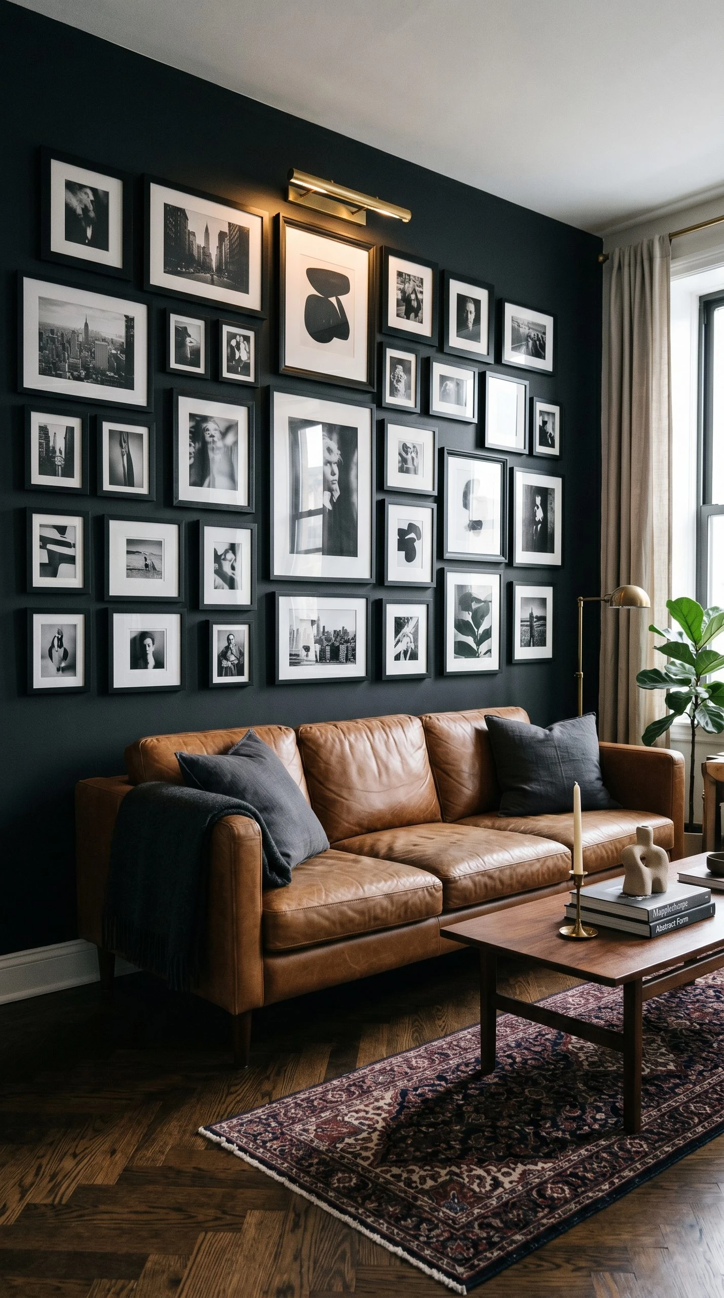
If you are the kind of person who has been meaning to do a gallery wall for years but could never figure out where it fit, a deep charcoal backdrop is your answer. Dark walls create the perfect high-contrast backdrop for framed art because they make the frames and images pop without you needing a spotlight. The gallery wall becomes the room’s focal point immediately, and everything else can be relatively quiet and simple.
Paint the main wall in a rich charcoal or near-black grey, something like Farrow and Ball Railings or Sherwin-Williams Tricorn Black if you want to go very dark. Keep the rest of the walls in a lighter mid-grey to avoid closing the room in too much. The sofa in this setup does best in a warm medium grey or even a camel or cognac leather to add warmth against the dark wall. For the gallery wall itself, mix frame sizes but keep the frame color consistent, all black, all white, or all natural wood. Include a mix of black and white photography, abstract prints, and one or two color-blocked pieces that pull from the room’s accent color.
| Designer Advice: Light the gallery wall with picture lights or a warm-toned track light system. Overhead lighting rarely does art justice, and the right light will make the whole wall feel like it belongs in a real gallery. |
5. Industrial Grey With Exposed Concrete and Metal
This look pulls from warehouse lofts and urban apartments, but it works in regular homes too when done with intention. The idea is to let grey take its most raw, unfinished form. Concrete-effect walls, textured paint or a concrete-effect plaster works beautifully, gunmetal and matte black metal accents, and a general sense that the room values material over decoration.
The sofa in an industrial grey space works best in dark leather, either black, dark brown, or a worn grey. A metal-frame coffee table with a glass or reclaimed wood top anchors the seating area. Open shelving in black iron brackets with raw wood planks brings in a utilitarian storage element that also looks great. For lighting, Edison bulb pendants or a matte black arc floor lamp are classic industrial choices that still look fresh. Add one soft texture to prevent the room from feeling too harsh, a large wool area rug in off-white or stone, or a sheepskin draped over a chair arm.
| Designer Advice: Industrial rooms often feel too cold because everything is hard and matte. The quickest fix is an oversized potted plant, a fig tree or a large monstera, which adds life and softness without compromising the aesthetic. |
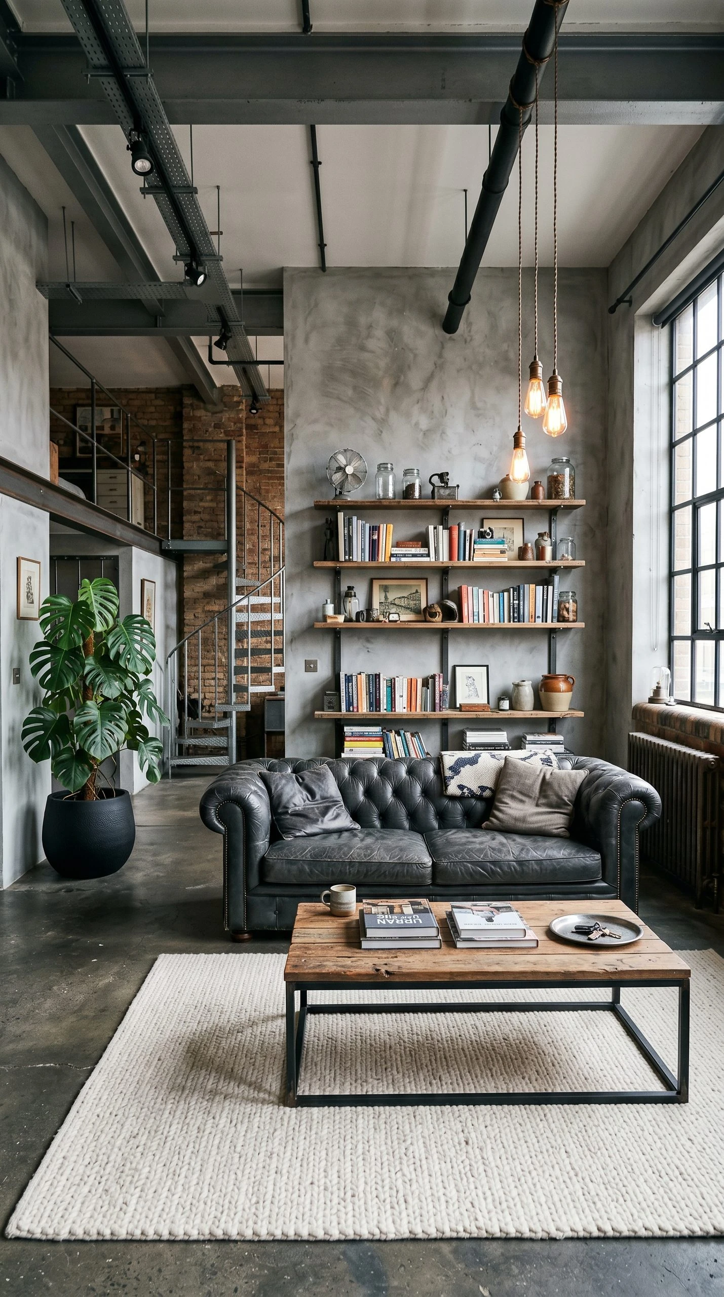
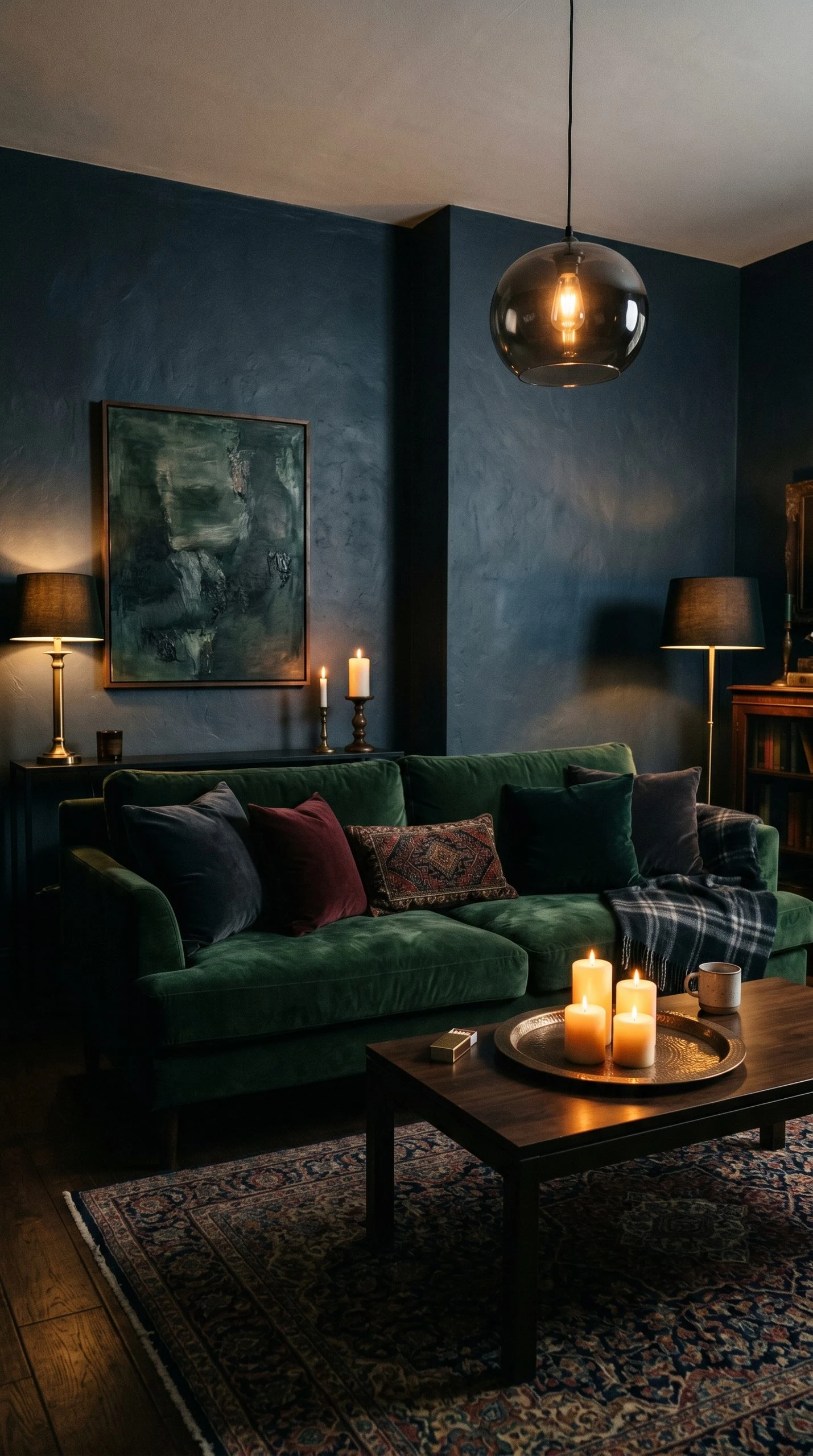
6. Moody Grey With Velvet and Candlelight
This is a living room designed for evenings. Think dimly lit, deeply layered, and deliberately atmospheric. The grey here should be on the darker side, either a blue-grey or a green-grey, and the whole room is built around the idea of being a place people want to sink into and stay. It is less about decoration and more about creating a feeling.
A deep teal or forest green velvet sofa is the star of this room, sitting against dark grey walls. Layer it with grey and charcoal velvet throw pillows and a velvet throw in deep burgundy or plum. A large vintage-style Persian rug in muted jewel tones brings pattern and history to the floor. For lighting, skip overhead entirely and rely on floor lamps, table lamps, and actual candles in clusters on the coffee table or a side console. A smoked glass pendant fixture above is the only overhead light you need, and it should be on a dimmer. The art should feel collected and slightly moody, whether that is dark landscape paintings, black and white portraiture, or abstract pieces with deep pigments.
| Designer Advice: Scent matters more in moody rooms. A candle in oud, sandalwood, or amber makes the room feel considered in a way you cannot fake with decor alone. |
— Light and Airy Grey Ideas —
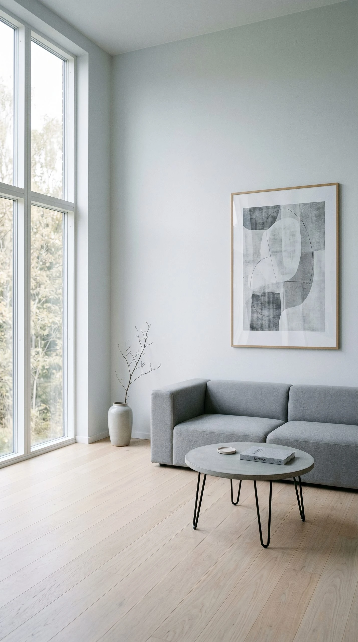
7. Pale Grey Minimalist Living Room
Minimalism and pale grey were practically made for each other. Both are about restraint, about choosing fewer things and making each one count. A pale grey living room in the minimalist style is not sparse because it is lazy. It is sparse because every piece that made it into the room earned its place. This look works especially well in rooms with good natural light, where the grey can shift and change through the day.
Paint in a cool, soft grey like Farrow and Ball Mist or Dulux Polished Pebble. The sofa should be low-profile with clean lines, either in a light natural linen or a slightly darker stone grey. Keep the coffee table simple, a round stone or concrete top on hairpin legs works well here. Decor should be kept to a minimum: one large vase with a simple branch arrangement, a stack of books, and one piece of large-scale wall art rather than a gallery situation. The floor is important in a minimalist space, so if you have good hardwood, let it show with only a simple flat-weave rug in natural off-white or pale grey.
| Designer Advice: In minimalist rooms, quality of materials shows more because there is nowhere to hide. Invest in a sofa with a proper frame and good fabric, and you will not need much else. |
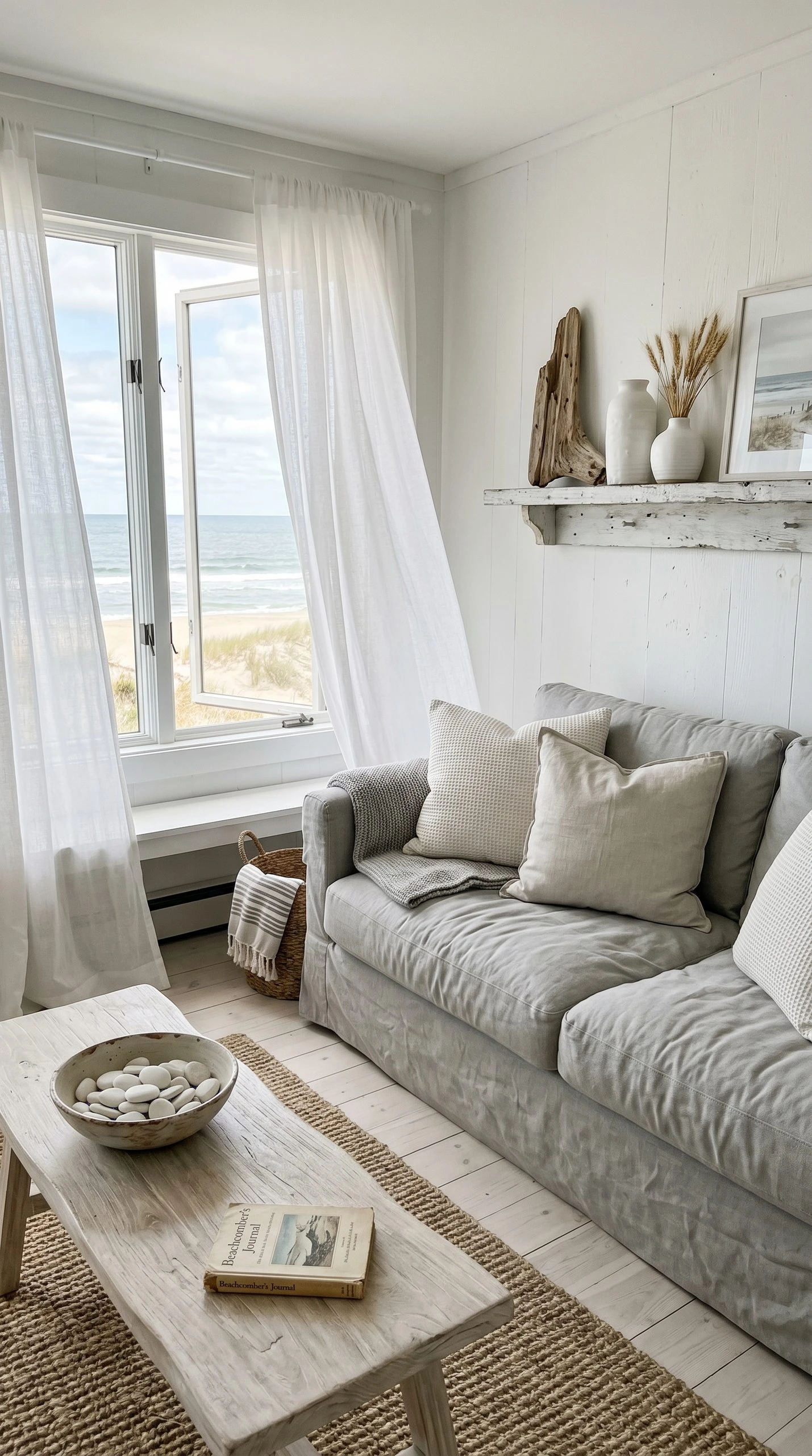
8. Grey and White Coastal Living Room
Coastal style has evolved a lot. It is no longer about anchors and rope baskets. The modern coastal grey living room is clean, breezy, and calm, using grey as the grounding color while white and natural textures do the work of making things feel light and seaside-adjacent.
White walls with soft grey furniture work better here than grey walls with white furniture, as the walls staying light keeps the room feeling open. A light grey slipcovered sofa is very much in the spirit of coastal living because it feels relaxed and washable. Layer with white and off-white pillows in different textures: linen, waffle-weave cotton, and plain cotton canvas. A weathered white coffee table or a bleached wood piece is the right furniture choice here. For decor, think found objects rather than purchased accessories: a bowl of smooth stones, a piece of driftwood on a shelf, simple white ceramic vases. Sheer white curtains that move in a breeze complete the look.
| Designer Advice: Keep plants in terracotta pots painted white rather than using ceramic planters. The slightly rough texture of painted terracotta fits the coastal-casual spirit perfectly. |
9. Grey and Gold Glam Living Room
Grey and gold is a combination that always looks more expensive than it actually is, which makes it one of the most satisfying living room palettes to put together. The grey keeps the room feeling sophisticated and restrained while the gold lifts everything into something a little more special. This is the living room for people who want elegance without going full maximalist.
A soft medium grey on the walls pairs with a plush light grey velvet sectional or sofa. Gold accents come in through the coffee table legs, a gold-frame mirror above the fireplace or console, gold picture frames, a gold pendant light, and small gold-tipped ceramic accessories. The rug should have some pattern: a soft abstract in cream and light gold, or a geometric with grey and metallic threads. For curtains, go long and floor-length in a soft champagne or warm ivory fabric. The key with gold accents is consistency: brushed gold or satin brass, not polished or shiny, which can feel cheap against a soft grey palette.
| Designer Advice: The mirror above the mantle or sofa should be as wide as the furniture piece beneath it. A too-small mirror over a wide sofa always looks like an afterthought. |

10. Grey and Green Biophilic Living Room
Biophilic design is about bringing the outside in, and grey is one of the best base colors for it because it echoes natural stone, concrete, and bark. When you pair grey with deep greens, warm olive tones, and an abundance of actual plants, the result is a room that feels genuinely grounded and restorative.
Keep the walls in a cool mid-grey and bring in green through a sage or olive velvet sofa, green botanical-print cushion covers, and a forest green throw. Then bring in actual plants, multiple, at different heights. A large fiddle leaf fig in the corner, trailing pothos on a shelf, a snake plant in a grey ceramic pot beside the sofa. The coffee table should be a natural material, either live-edge wood or a rattan-frame piece. For art, black and white botanical prints or large-scale nature photography feels right at home. The floor can work with either a pale jute rug or a dark green vintage-style rug with a worn patina.
| Designer Advice: Cluster plants in odd-numbered groups, and vary the pot sizes. A big statement plant plus two smaller ones in a corner creates a layered, natural grouping that looks intentional rather than random. |

11. Grey With Warm Terracotta and Earthy Tones
This combination is one of the biggest interior design moves of the past few years, and it shows no sign of stopping. Terracotta and grey look like they should not work, but they do, because terracotta is a warm, dusty orange-red that complements grey’s cool undertones rather than clashing with them. It is the color equivalent of an opposites-attract friendship.
A warm mid-grey wall works better than cool grey here. Something with a slight violet or brown undertone, like Sherwin-Williams Worldly Gray, sits beautifully beside terracotta. Bring the terracotta in through a chunky woven throw, a large ceramic bowl on the coffee table, terracotta-painted plant pots, and possibly a single accent chair in a warm burnt clay fabric. The rug is the unsung hero of this combination: a kilim or Moroccan-inspired rug in muted terracotta, rust, and sand bridges both colors naturally. Wooden furniture with a warm honey or medium walnut finish keeps everything from feeling too cool or stark.
| Designer Advice: Look for terracotta tones in unexpected places: a matte terracotta candle holder, a small clay sculpture, a warm-toned paperback spine on a styled shelf. These small repeated hits of color make the palette feel considered rather than forced. |

12. Grey and Sage Japandi-Inspired Living Room
Japandi is the blend of Japanese minimalism and Scandinavian hygge, and it is having a genuine moment right now. The palette is muted, the furniture is low-profile and made from natural materials, and the whole feeling is one of intentional calm. Grey and sage work perfectly together in this context because both colors exist in the muted, earthy-neutral family.
Walls in a warm light grey, almost the color of unfinished concrete, set the tone. The sofa is low-to-the-ground with simple wooden legs in a pale ash or whitened oak finish. Upholstery in a natural linen-texture fabric in warm greige keeps the sofa from dominating. A sage green accent chair or a pair of small sage cushions introduces the second color quietly. The coffee table is an organic shape, perhaps a live-edge wood slab or an irregular stone piece on low wooden legs. Decor is minimal but deliberate: one ceramic vase, one bonsai or moss arrangement, one simple candle on a flat stone trivet.
| Designer Advice: Japandi rooms often look incomplete when first assembled. Resist the urge to add more. Live in it for a week and then decide what, if anything, is actually missing. Most of the time, nothing is. |

— Budget-Friendly Grey Ideas —
13. Grey Living Room Refresh With Paint and Pillows
Not every grey living room makeover requires new furniture. Sometimes all a room needs is a fresh coat of grey paint and a complete swap-out of the soft furnishings. This is the most budget-conscious approach, and it works surprisingly well because paint is the most transformative material in any room, and pillows are the quickest way to change a room’s personality.
Choose a warm grey paint and always do a test patch in your actual room before committing. If your sofa is a neutral color, a grey paint change might be all it takes to make the whole room feel new. Then go through your pillow and throw situation ruthlessly. Donate the mismatched ones and invest in a set of three or four pillow covers in a cohesive color story: grey, dusty blue, and off-white, for example. A new throw blanket in a chunky knit or waffle texture makes the sofa look intentionally styled. Add one new plant and one new candle, and you have a genuinely refreshed room for well under a hundred dollars if you shop sales and thrifted items.
| Designer Advice: Look for pillow covers rather than pre-filled pillows because you can swap the covers seasonally without buying new inserts each time. It is a simple way to keep a room feeling current without spending much. |

14. Thrifted Grey Living Room With Vintage Finds
Some of the best grey living rooms are built almost entirely from secondhand shops, and there is a very good reason for that. Vintage and thrifted pieces have character, imperfection, and scale that flat-pack furniture often lacks. Grey is the perfect backdrop for a thrifted mix because it is neutral enough to let individual pieces shine rather than compete with each other.
Start with what you already have and decide what is worth keeping. Then build around those pieces by visiting local charity shops, estate sales, Facebook Marketplace, and vintage markets. A secondhand leather armchair in cognac or caramel looks excellent in a grey room. An old wooden side table sanded down and left natural adds warmth. A vintage mirror with a chippy painted frame brings age and character to a wall. You do not need to match everything, and in fact you should not, because the layered look of a well-done thrifted room is all about mixing eras and materials.
| Designer Advice: When thrifting furniture, always check the frame and bones of upholstered pieces rather than the fabric. A solidly built chair with tired fabric is a gem. Reupholstering one seat cushion is a beginner-level project and costs a fraction of buying new. |

15. Grey Rental Living Room Without Painting the Walls
Not everyone can paint, and plenty of landlords have opinions about grey walls. This idea is entirely about creating a cohesive grey-based living room without touching a single painted surface. The trick is to shift the visual weight of the room away from the walls and toward the furniture, floor, and textiles.
A large grey area rug is the single most impactful thing you can add. It anchors the room and gives the space a color identity even if the walls are beige or white. Then choose a sofa in grey or a dark neutral tone. Add a grey bookcase or shelving unit filled with books and objects organized loosely by color. Hang a large piece of grey-toned art on one wall, and surround it with other pieces in similar tones. Light grey curtains in a soft fabric make the windows look intentional. The walls become background, and the room tells its own grey story without a paintbrush in sight.
| Designer Advice: If your rug is your biggest investment, protect it with a non-slip pad underneath and vacuum it regularly. A good rug in bad condition loses its visual impact fast, and you want it to anchor the room for as long as possible. |

16. Grey Living Room With DIY Textured Feature Wall
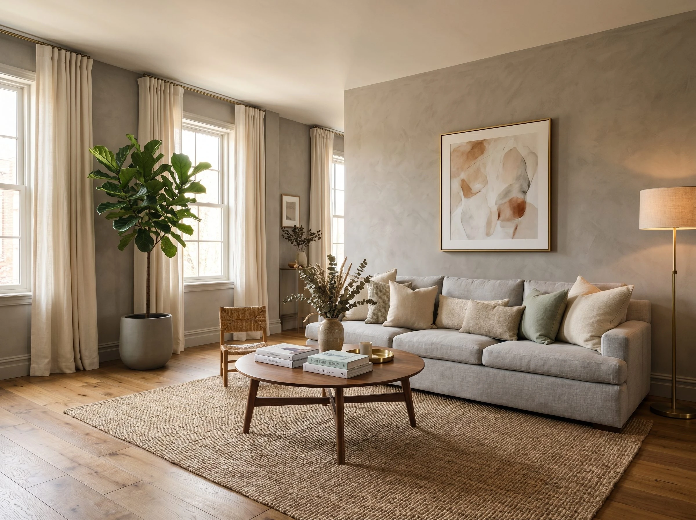
A textured feature wall is one of the most underrated and affordable ways to add architectural interest to a plain room. And in a grey living room, a textured wall behind the sofa adds depth and dimension that flat paint simply cannot replicate. There are several DIY-friendly options: a limewash paint effect, Roman clay, a simple plaster technique using joint compound, or even a peel-and-stick textured wallpaper.
Limewash paint is a great beginner option because it is applied in random, overlapping strokes that create a natural variation in the grey tone. The result looks ancient and interesting and costs roughly the same as regular paint. Apply it to the wall behind the sofa and leave the remaining three walls in a flat matte grey or even a soft white. This creates a focal point without boxing the room in. For furniture, keep things simple since the wall is doing the heavy lifting. A clean-lined grey or oatmeal sofa, a simple wooden coffee table, and minimal accessories let the wall be the hero.
| Designer Advice: Before attempting any textured wall technique, watch at least two or three tutorial videos and practice on a piece of cardboard or a small patch behind a door first. Limewash in particular dries much lighter than it goes on wet, so testing the final dried color is essential. |

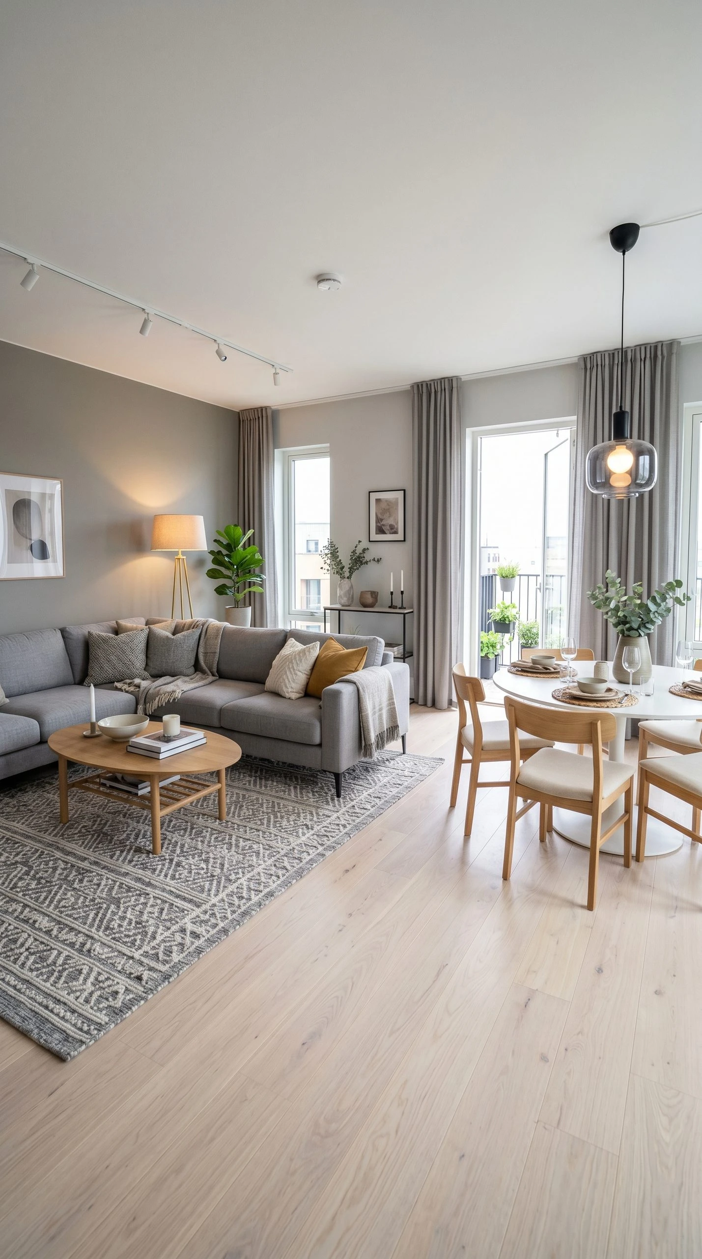
17. Grey Open-Plan Living Room With Zoning
Open-plan living can be a challenge because the space can feel shapeless and undefined. Grey is actually one of the best colors for open-plan rooms because you can use different shades to define different zones without hard dividers or dramatic changes in color. This idea is about using grey intelligently to give an open-plan space structure.
Use a slightly darker grey in the living area and a lighter, warmer grey in the dining zone. The difference does not need to be dramatic, two or three shades apart is enough. You can also define the living zone with a large area rug that clearly marks out the sofa grouping. A bookcase or a console table placed perpendicular to the wall can act as a soft room divider between zones. In the living zone, a sectional sofa in a mid-grey linen fabric creates a generous seating area. Pendant lighting over the dining table and a floor lamp in the living zone reinforce the zoning without any physical barriers.
| Designer Advice: In open-plan spaces, repeat one or two elements in both zones to keep the overall space cohesive. The same grey curtains running the length of a wall, or the same wood tone in both the coffee table and the dining table, ties the zones together visually even when the shades of grey differ slightly. |
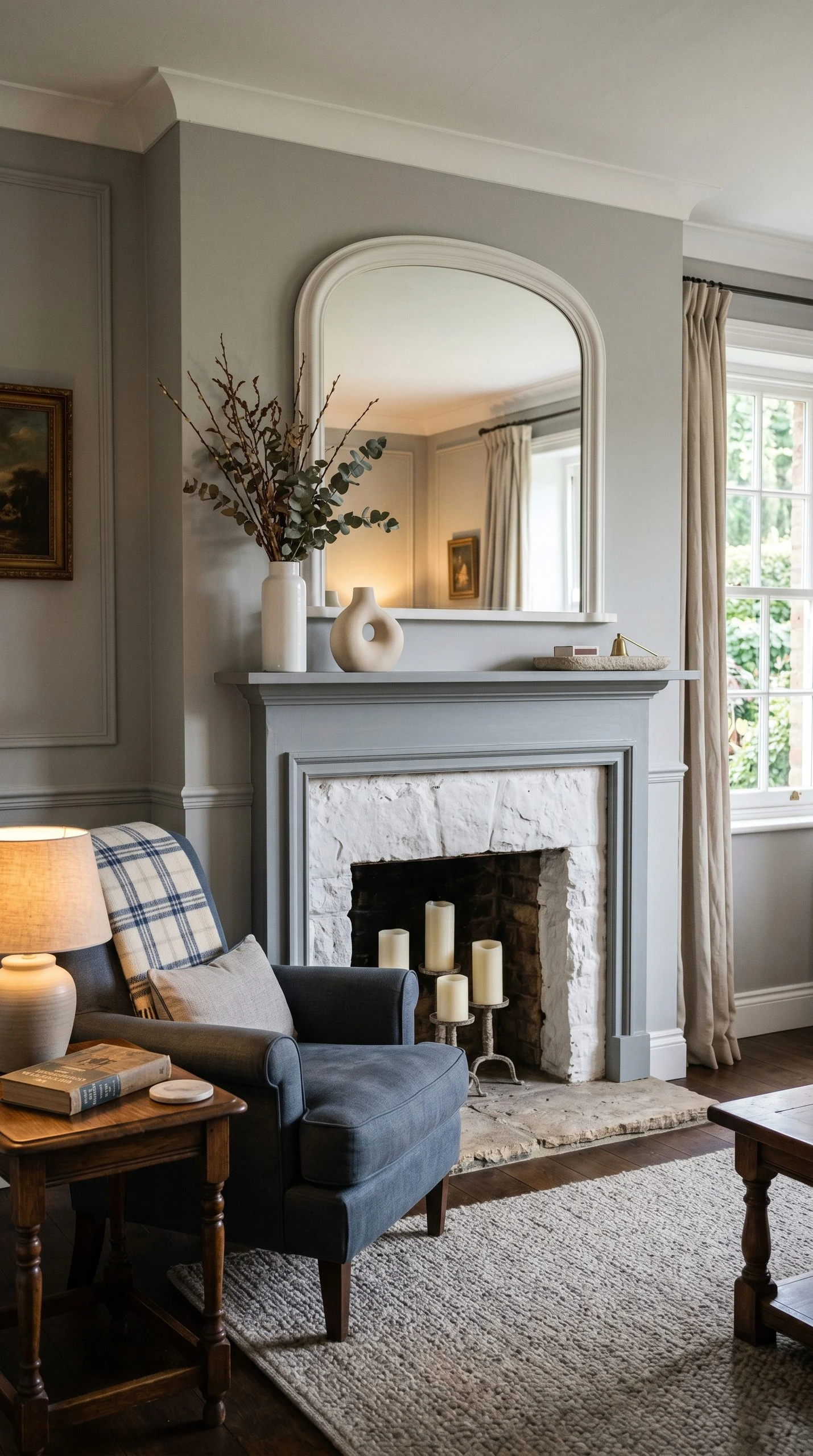
18. Grey Living Room With a Statement Fireplace
A fireplace is already the natural focal point of a living room, but when you style it well within a grey palette, it becomes a genuinely dramatic moment in the room. Grey and white fireplaces, stone surrounds, painted brick in grey, and concrete-effect mantels all have a quiet, architectural beauty that photographs extremely well and looks even better in real life.
For a gas or electric fireplace with a plain surround, consider painting the surround and mantel in a chalky grey that is just slightly darker than the walls. Style the mantel thoughtfully: an odd number of objects, varying in height. One tall candle or narrow vase, one medium object, and one low flat piece. Above the mantel, hang either a large mirror or a single large piece of art, but not both. The seating arrangement should always face the fireplace, with the sofa angled toward it as the primary sightline.
| Designer Advice: In summer when the fireplace is not in use, fill the firebox with pillar candles in varying heights, all in off-white or ivory. It keeps the fireplace looking intentional year-round and creates a beautiful alternative focal point. |
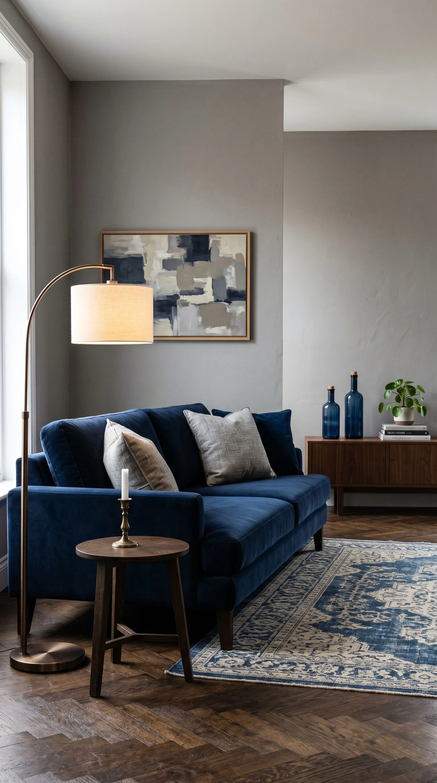
19. Grey and Navy Blue Living Room
Navy and grey is one of those combinations that always looks put-together without feeling stuffy. Navy is serious enough to pair with grey’s seriousness, and together they create a room with real weight and calm authority. It reads well in both modern and traditional homes, which makes it one of the most versatile two-color combinations in interior design.
A medium grey on the walls works well with navy accents in the furniture and textiles. A navy velvet sofa or a navy accent chair gives the room its color anchor. Grey and navy throw pillows in different textures add layering without confusion. For the rug, a vintage-style blue and cream piece, or a flatweave stripe in navy and off-white, feels classic and grounded. Brass or bronze hardware in the lighting and table accessories keeps both colors feeling warm rather than cold, which is important because both grey and navy can skew cool if you do not balance them with something warm.
| Designer Advice: If you want to make a navy accent wall work in a grey room, paint the wall behind the sofa in navy and keep the remaining walls grey. The contrast creates a sophisticated layered palette without feeling like two completely different rooms. |
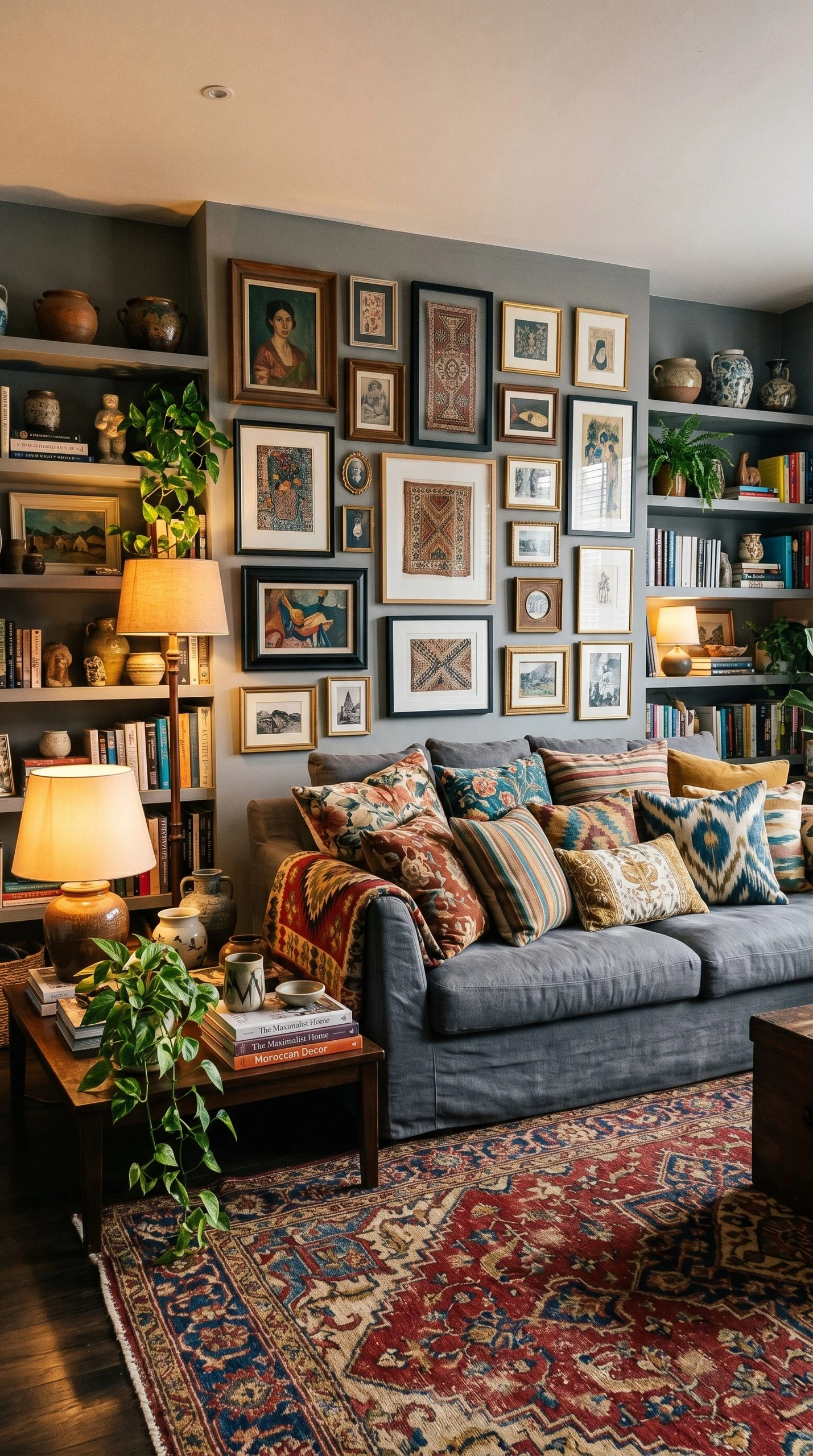
20. Grey Living Room With Maximalist Accessories
Grey as a maximalist base color might sound counterintuitive, but it is actually a genius move. When you pile up pattern, color, texture, and art on a grey backdrop, the grey acts as the visual breathing room that stops everything from becoming chaotic. It is the quiet, grounding foundation for a room that has a lot going on.
Start with a mid-tone grey on the walls and a simple grey sofa. Then go generous with everything else. A patterned Moroccan rug in bold colors, a mix of printed throw pillows in different patterns, a gallery wall with frames in mixed sizes and finishes, and shelves filled with books organized by color alongside ceramics, plants, and collected objects. Layering is the key, and in a maximalist room, each layer should feel like it was collected over time rather than purchased all at once.
| Designer Advice: The rule of maximalism is not more of everything. It is more of the right things. Each item should be something you genuinely love. Random quantity feels cluttered. Intentional quantity feels curated and personal. |
Conclusion
Grey is one of the most honest colors in interior design. It does not pretend to do everything on its own. It asks you to bring it warmth, texture, and personality, and when you do, it rewards you with a living room that feels layered, considered, and genuinely comfortable to be in. The ideas in this article cover a huge range of styles, budgets, and room types, but the through-line across all of them is the same: grey works best when you treat it as a foundation, not a finish line.
Whether you are painting one wall for the first time, redecorating a whole room, or simply swapping a few accessories to refresh what you already have, these ideas give you real, practical starting points. Some rooms in this list take a Saturday and a trip to a thrift store. Others take a longer planning phase and a real budget. But all of them start with the same thing: a decision to lean into grey fully, to understand its undertones and its needs, and to build around it with intention.
If you take nothing else from this article, take this: grey does not make a room cold. Not caring about the details makes a room cold. Get the details right, and grey will carry the whole room beautifully.
Frequently Asked Questions
How do I make a grey living room feel warmer?
The most reliable way to warm up a grey room is to choose a grey with warm undertones (look for greys that lean toward beige, violet, or brown rather than pure blue or green), and then layer in warm materials like natural wood furniture, jute rugs, linen textiles, and warm-white lighting around 2700K. A few terracotta or brass accessories add warmth immediately.
What colors go well with grey in a living room?
Grey pairs well with almost any color, but the most popular and reliable combinations include mustard yellow, navy blue, blush pink, sage green, terracotta, and warm white. The key is to match the warmth or coolness of the grey to the accent color: warm greys pair best with warm accents, cool greys pair better with cooler accent tones like blue or green.
What shade of grey is best for a small living room?
Lighter greys generally make a small space feel more open, especially soft warm greys or greige tones that reflect light back into the room. However, a small room can absolutely handle a darker grey if you balance it with good lighting, mirrors, and furniture with open legs that allow light to flow underneath.
Can grey walls work with a grey sofa?
Yes, grey on grey works beautifully when you vary the shades and, crucially, vary the textures. A mid-grey matte wall paired with a deep charcoal velvet sofa, for example, creates depth through contrast. The mistake to avoid is same-shade, same-finish grey everywhere, which can feel flat and undefined.
Is grey going out of style for living rooms?
Grey has been a popular interior color for well over a decade, and while design trends shift around it, grey itself remains one of the most versatile and livable neutral colors available. The key is pairing it with current accent colors and materials rather than styling it the same way it was done ten years ago. Grey with warm earthy tones, for instance, feels very current right now.
How do I choose between warm grey and cool grey?
Look at the fixed elements of your room first: the floor color, any existing furniture you are keeping, and the quality of natural light. Rooms with warm wood floors generally suit warm greys better. Rooms with white or stone floors can handle cool greys without feeling clinical. Test paint swatches on your actual walls in both daylight and lamplight before committing, because grey is one of the most light-sensitive colors and can look drastically different across the day.