Bedroom Colors Worth Painting Your Walls For, According to Real Sleep
Introduction
You have probably read at least once that blue is the best color for sleep. Maybe you even painted your bedroom a shade of pale blue and waited for the magic to happen. But if you are still lying awake at 11pm with your mind running through tomorrow’s to-do list, you know that a coat of paint alone is not the whole story. Color matters, but the way you use it, the undertones you choose, the furniture you pair it with, and the lighting you layer in all add up to something much bigger than a single shade on a wall.
The truth is that any color can either help or hurt your sleep depending on how saturated it is, how it reads under artificial light, and how it interacts with the other elements in your room. A soft terracotta, which sounds like it should be energizing, can actually feel incredibly grounding when used with the right linen bedding and warm-toned lighting. A pale lavender that looks dreamy in a catalog photo can feel harsh and cold in a room with north-facing windows and cool LED bulbs. Context is everything.
This article walks through 17 bedroom color ideas that are genuinely worth trying, not because a study said so, but because they work in real rooms, for real people who actually need to fall asleep at night. Each color idea comes with a short scene to help you picture the room, plus a full breakdown of what furniture, lighting, and textures pair best, and a designer tip at the end to help you get it right on the first try. Whether you are doing a full repaint or just swapping out bedding and accessories, there is something here for every budget and every bedroom size.
1. Dusty Blue-Gray
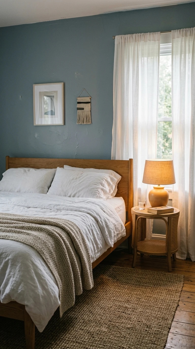
Picture this: it is Sunday evening and you have just had a long week. You walk into your bedroom, the late sun is coming through sheer linen curtains, and the walls have this quiet, slightly washed-out blue that somehow makes the whole room feel like it is already winding down. That is dusty blue-gray. It is not a loud, bold blue and it is not a stark gray. It is that soft middle ground that feels cooler than the rest of the house without feeling cold.
Pair this color with warm white or off-white bedding in a cotton percale or linen weave. The contrast between the cool wall and the warm, tactile bedding keeps the room from feeling clinical. For furniture, light oak or blonde wood nightstands work really well here because they bring in warmth and prevent the room from reading as too cool. A textured jute rug grounds everything and keeps the palette feeling natural rather than staged.
Lighting is where dusty blue-gray really comes alive. Avoid cool-white bulbs at all costs, they will make the room feel like a waiting room. Go with 2700K warm bulbs in bedside lamps, ideally with a warm fabric shade that diffuses the light softly. Dimmer switches are worth the small investment in a room like this. Wall sconces instead of overhead lighting will keep the ambiance low and sleep-friendly. Layer in a knitted throw in oatmeal or cream and you have a room that genuinely relaxes you the moment you walk in.
Designer Tip: When sampling this color, look at it under lamplight in the evening, not just in daylight. Blue-grays can shift dramatically and you want to love it at 10pm, not just at noon.
2. Sage Green
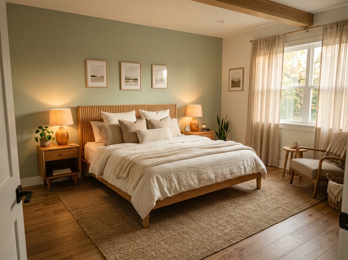
Imagine waking up in a room that feels like the inside of a forest on a calm morning. Not dark and moody, just green and quiet and alive. Sage green has been everywhere in home decor over the past few years, but it earns its popularity in the bedroom specifically because it hits a rare balance between fresh and restful. It is the kind of color that makes you exhale.
The key with sage is choosing the right undertone. True sage has a gray undertone that keeps it muted and grounded. Avoid anything that leans too yellow-green, it will read as energizing rather than calming, and avoid anything too dark, which can feel heavy and close in smaller rooms. Some reliable shades to look for are those described as gray-sage, dusty sage, or muted moss.
For furniture, warm wood tones are your best friend here. A walnut bed frame or nightstands with a medium-brown finish complement sage without competing with it. White or cream bedding keeps the room fresh and airy. For textures, reach for natural linen pillow covers, a cotton waffle-weave throw, and a wool or cotton area rug in a warm natural tone. Botanicals or a single potted plant on a windowsill feel completely at home in a sage room and reinforce that connection to nature that makes this color so restful.
For lighting, warm filament bulbs or Edison-style lamps add a golden glow that brings out the warmth in sage without washing it out. Soft linen curtains in an ivory or warm white filter daylight beautifully and prevent the room from going too cool in the morning.
Designer Tip: If you are nervous about committing to sage on all four walls, try it on the wall behind your bed only. A sage accent wall with white or warm ivory on the remaining walls is a softer starting point that still delivers the calming effect.

3. Warm Creamy White
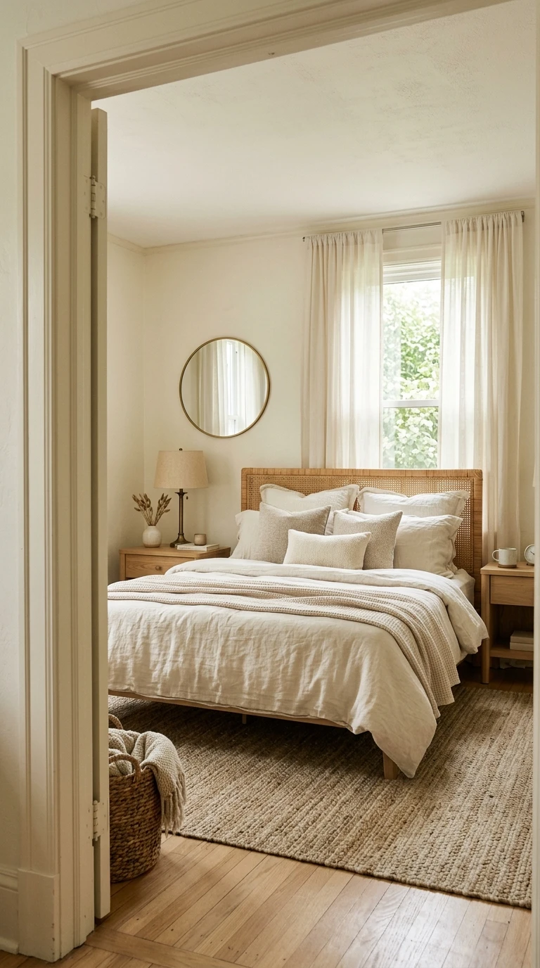
You have seen the stark white bedroom trend. It is clean and photogenic, but in real life, bright white walls with cool undertones can feel sterile and even harsh, especially under artificial lighting at night. The fix is not to abandon white entirely. It is to switch to a warm creamy white that has a hint of yellow, ivory, or soft beige baked in.
Warm creamy white works in literally every bedroom style. It suits a minimal Scandinavian room just as well as a relaxed coastal bedroom or a warm maximalist space layered with pattern and texture. The secret is that it reflects light softly instead of bouncing it harshly around the room, which immediately makes the space feel more comfortable and less caffeinated.
The trick to making creamy white feel intentional and not just like “we couldn’t decide on a color” is in the layering. Choose bedding in slightly different tones, a warm white duvet cover with ivory pillow cases and a soft sand or blush throw creates that effortless tonal look that reads as very high-end without the cost. For furniture, think natural wood, rattan, or woven pieces rather than stark white or black, which would break the softness of the room. Aged brass hardware on dressers and nightstands adds a warm, glowing accent.
Lighting is crucial in a creamy white room. Warm amber bulbs, ideally around 2400K to 2700K, will deepen the warmth in the walls and make the room feel like candlelight is doing its job even when it isn’t. Layered lighting with a mix of a bedside lamp, a floor lamp in the corner, and possibly a dimmer on the overhead fixture gives you full control over the mood.
Designer Tip: Always test warm whites against your trim color before committing. A creamy wall with a bright white trim can actually make both look worse. Match the trim to an equally warm shade or use the same color throughout for a clean, tonal finish.
4. Soft Terracotta
Most people hear “terracotta” and immediately think of an energizing, warm, almost restaurant-style color. But soft terracotta, the kind that has been diluted with a lot of white and a touch of gray, is something entirely different. Think of it as the color of a pottery mug that has been left in the sun, faded and gentle and earthy. In a bedroom, it wraps around you like warmth.
The psychology behind terracotta as a bedroom color is about grounding. Earth tones have a quieting effect on the nervous system because they connect us subconsciously to natural environments. As long as the saturation is kept low, meaning you are choosing a blush terracotta or a washed clay rather than a bold burnt orange, the color reads as cozy and enveloping rather than stimulating.
Pair soft terracotta with warm neutrals throughout the room. Linen bedding in oatmeal, sand, or warm white works beautifully. A chunky knit throw in a cream or off-white adds texture without adding visual noise. For furniture, think dark wood or even black metal frames, both of which anchor the warm wall color without overpowering it. A jute or sisal rug brings in another earthy layer that keeps everything feeling grounded and cohesive.
This is also a color that genuinely improves with warm, low lighting. Beeswax or amber candles, rattan pendant lights, or lamps with warm paper shades all enhance the cozy, cave-like feeling that makes a terracotta bedroom so restful. Layer curtains in a warm linen or cotton to keep the light soft when morning comes in.
Designer Tip: Request a shade with the word “blush,” “clay,” or “pale” in the name to stay in the restful zone. Anything described as “bold,” “deep,” or “rust” is likely too saturated for a primary bedroom color.

5. Pale Lavender
You know that feeling when you are almost asleep and your whole body feels heavy and your thoughts finally go quiet? Pale lavender as a bedroom color has a way of nudging your brain toward that state a little earlier than usual. It is soft, it is slightly cool, and it has just enough color to feel intentional without demanding your attention.
The important word here is pale. Pale lavender, the kind that reads almost as a soft gray-purple or a barely-there lilac, is very different from a saturated royal purple or a bold violet, both of which would be far too stimulating for a sleep space. Think of shades that look like a white wall with just the faintest exhale of purple into it.
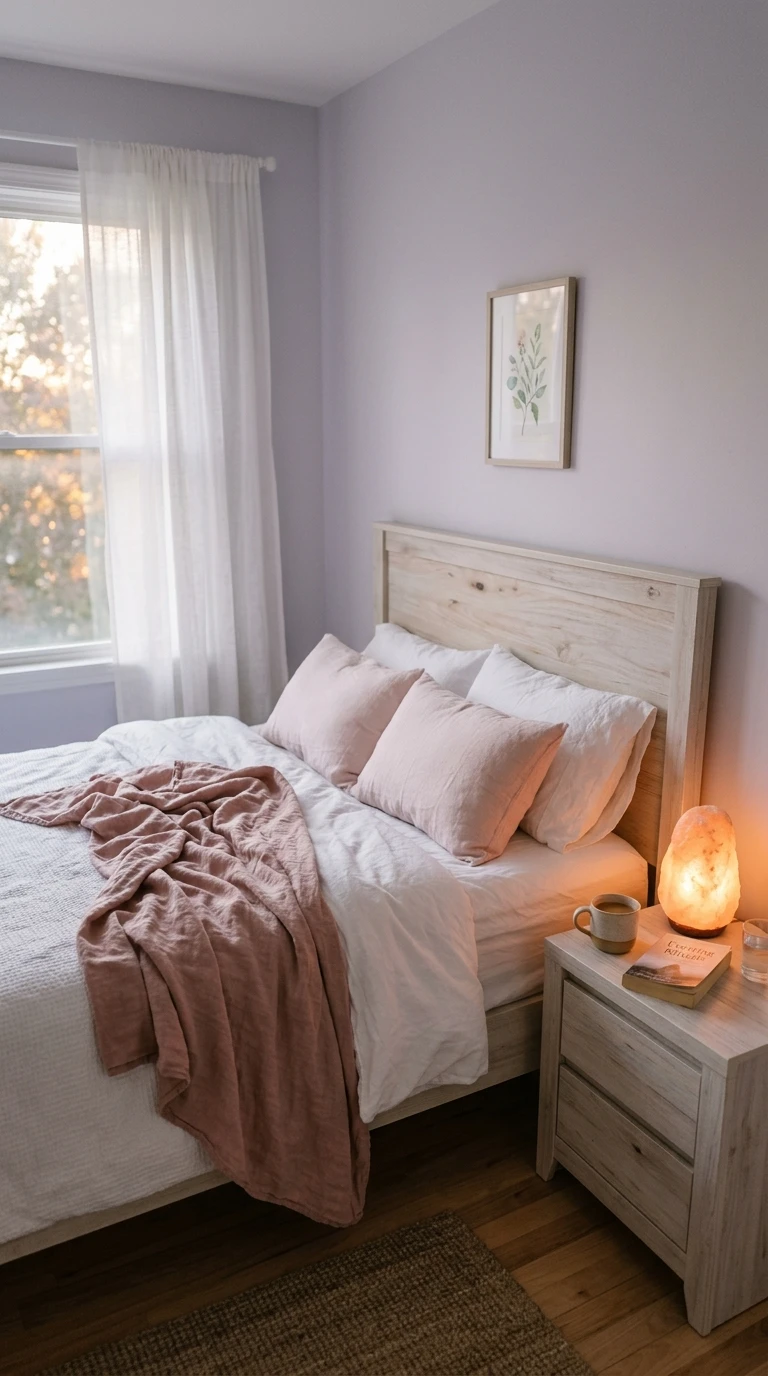
With pale lavender walls, you have a lot of flexibility in the rest of the room. Soft white and ivory bedding is the classic pairing and it works for good reason. Blush pink or dusty rose pillows and throws add warmth without breaking the gentle, cool feeling of the walls. For furniture, whitewashed or pale natural wood pieces feel at home here, as do soft gray upholstered headboards. Avoid dark or heavy furniture, which tends to make the room feel somber rather than dreamy.
Lighting in a pale lavender bedroom should lean warm. The slight purple in the walls can pull cool under fluorescent or bright-white LEDs, making the room feel chilly and flat. Opt for warm-toned bulbs in layered lighting, a bedside lamp, possibly a wall sconce, and even a Himalayan salt lamp in the corner adds a soft amber glow that plays beautifully off the lavender walls.
Designer Tip: Pale lavender is particularly effective in bedrooms that get a lot of afternoon or evening light. The warm light coming through the windows will warm up the cool tones and create a magical, rosy effect on the walls around sunset.
6. Warm Taupe
You finally get to the weekend. The house is quiet, the bed looks made in that effortless way it only does when you actually have time to fluff the pillows, and the walls have this warm, nothing-and-everything color that feels like a deep breath. That is warm taupe. It is the neutral that every designer reaches for when they want a bedroom to feel expensive, restful, and completely unpretentious.
Warm taupe occupies the space between beige, brown, and gray without fully committing to any of them. That vagueness is actually the point. It is a color that does not fight for attention. It simply creates a backdrop that makes everything in the room look better and feel calmer. It reduces visual noise in a way that busy, colorful rooms cannot.
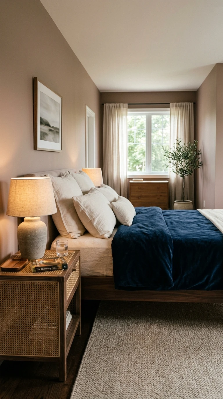
Because taupe is so versatile, you have a lot of creative freedom in the rest of the room. Deep navy or forest green bedding creates a sophisticated contrast that still feels restful. Warm white or ivory keeps things light and clean. Textured bedding is key in a taupe room because the walls themselves are so quiet, the tactile elements of the room do a lot of the visual work. Think bouclé throw cushions, a velvet duvet cover, or layered linen sheets in slightly different tones.
For furniture, the same principle applies. Mix materials for depth. A dark walnut bed frame paired with a lighter cane or rattan nightstand brings visual interest without breaking the calm of the palette. Soft ceramic or stone table lamps with warm-toned bulbs fit naturally into a taupe bedroom. Add a wool area rug in a complementary neutral and the room will feel pulled together without being fussy.
Designer Tip: Taupe with a pink undertone (sometimes called “greige” or “rosy taupe”) is one of the most flattering shades to fall asleep in because it gives the whole room a warm, skin-like glow that feels naturally relaxing and welcoming.
7. Soft Teal
There is a version of teal that is bright, saturated, and belongs in a Caribbean resort lobby. Then there is soft teal, the version where the teal has been dialed back to its quietest setting, pushed closer to the blue-green of a calm sea on an overcast day. It is fresh without being loud, and in a bedroom that doubles as a place to actually think and rest, it holds up remarkably well.
Soft teal works particularly well in bedrooms that need to pull double duty, serving as a sleep space and a reading room or a workspace. The color is just stimulating enough to keep you alert and focused during the day but not so energizing that it prevents you from winding down at night. Paired with the right lighting strategy, it is one of the more versatile calming colors on this list.
For bedding, warm whites and naturals work best. Avoid cool blues or greens in the bedding itself, which can make the room feel one-note. Instead, reach for warm linen in oatmeal, aged white, or a soft camel tone. Rattan or natural wood furniture pieces complement soft teal beautifully, as does warm black metal if you prefer a more modern look. A handwoven area rug in warm natural tones keeps the room grounded.
Add warmth through your lighting and decor accessories. Brass or gold accents, warm-toned throw cushions in dusty rose or terracotta, and plants all bring softness to what could otherwise feel like a very cool palette. Warm filament bulbs in linen-shaded lamps will shift the mood of the room significantly toward the cozy end of the spectrum by evening.
Designer Tip: Look for shades described as “duck egg,” “sea glass,” or “pale teal” rather than “teal” or “turquoise” on their own. The lighter, grayer versions of this color are what make it sleep-friendly.
8. Muted Dusty Pink
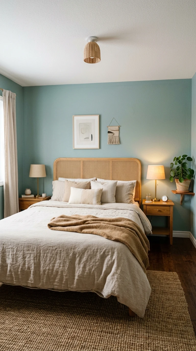
There is a version of pink that nobody argues with. It is not bubblegum and it is not millennial pink from five years ago. It is a pink so muted and so gray-washed that it almost reads as a warm neutral, except there is something in it that just feels soft and kind, like the room itself has a gentle personality. Dusty pink, the kind with a lot of gray and beige in it, is one of the most underrated calming bedroom colors going.
The science behind why pink can work in a bedroom is actually interesting. Studies have found that certain shades of pink can reduce feelings of aggression and anxiety, which is part of why it has historically been used in environments where people need to feel calm. The trick is keeping the saturation extremely low so the pink acts as a warm neutral rather than a statement color.
Pair dusty pink walls with warm white bedding and natural linen textures. A warm white duvet with a woven cotton or linen throw in cream or stone creates a bedroom that feels both soft and substantial. For furniture, choose dark walnut or aged wood for contrast, or go for an all-tonal look with soft natural wood and white or blush upholstery. Aged brass accessories on lamps, picture frames, and drawer pulls add a warm, vintage quality that suits dusty pink beautifully.
For lighting, the warmest possible bulbs are your ally here. The pink in the walls will deepen and bloom under warm amber light in the evening, creating a sunset effect that is genuinely relaxing. Avoid cool or bright-white lighting, which will flatten the warmth in the color and make the room feel cold.
Designer Tip: Sample dusty pink alongside your trim color and your planned bedding before committing. This shade reads very differently against crisp white trim versus warm off-white trim, and against white bedding versus ivory bedding.
9. Warm Charcoal
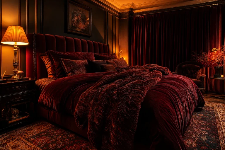
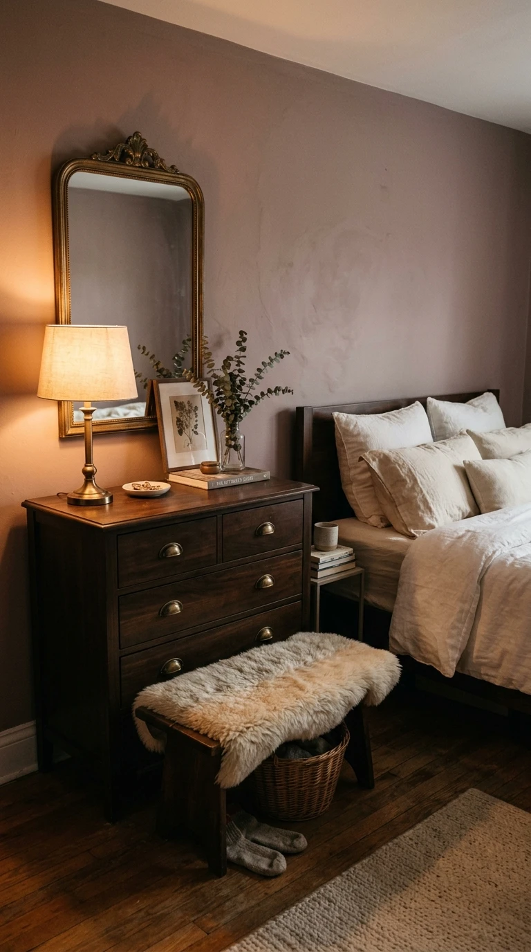
Some people just cannot sleep unless the room feels properly dark and enclosed. If you are one of those people who pulls all the blinds, covers the LED on the TV, and essentially tries to recreate a cave every night, warm charcoal walls might be the color you have been waiting for. Not cold, stark black, not heavy navy, but a charcoal that leans warm with brown or red undertones underneath all that dark gray.
Dark bedroom colors have had a real moment in recent years in interior design and for good reason. A well-done dark bedroom feels like a cocoon. It is visually quieter than a lighter room because there is less contrast and visual activity on the walls, which means your brain has less to process. Paired with the right lighting, warm charcoal creates one of the most genuinely sleep-inducing environments on this list.
The key to making a dark bedroom work is balance. The rest of the room needs to be light enough to prevent the space from feeling oppressive. White or very light bedding is non-negotiable, it lifts the room visually and creates a beautiful contrast. Light wood furniture, warm brass or gold accents, and textured natural materials like linen, wool, and jute all prevent the room from feeling heavy. Large mirrors help bounce light and keep the space feeling open.
Lighting is critical in a dark-walled room. Rely entirely on layered warm lighting sources rather than overhead lighting. Think two or three bedside lamps, a floor lamp in the corner, maybe a strip of warm LED lighting behind the headboard or along the base of the bed for a soft ambient glow. Never turn on a harsh overhead light in this room and it will feel incredible.
Designer Tip: Always paint a test swatch of warm charcoal and live with it for at least three days before committing. Dark colors look different at dawn, midday, afternoon light, and under artificial lighting at night, and you need to love it at all four.
10. Soft Dove Gray
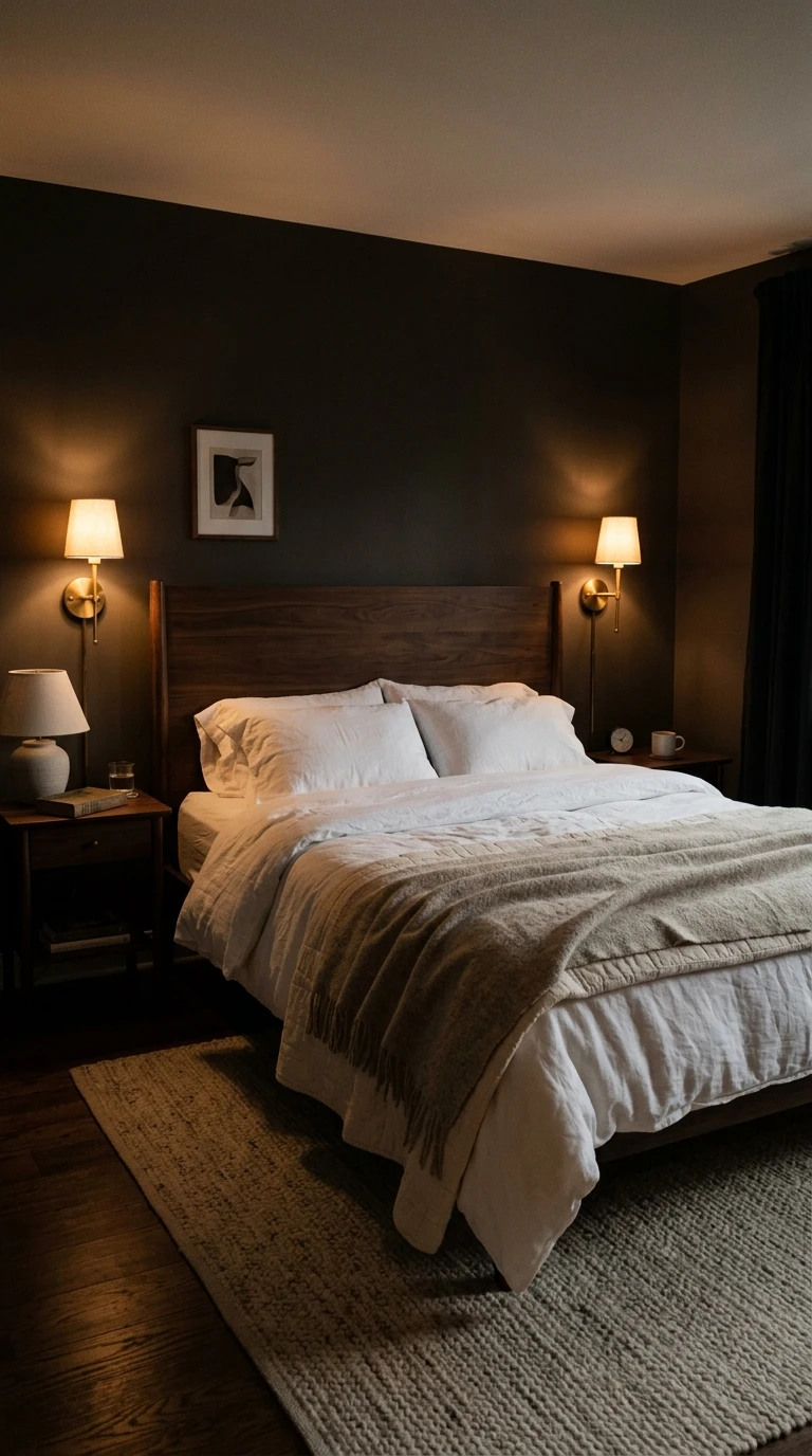
Dove gray is the color of old plaster walls in a Parisian apartment, of morning fog just starting to lift, of cashmere you cannot stop touching. It is quiet and sophisticated without being cold, assuming you choose the right version. The most important distinction here is warm dove gray versus cool gray. Cool gray with blue or green undertones can tip into feeling clinical and flat. Warm dove gray with the faintest whisper of beige or lavender is entirely different.
One of the great things about dove gray as a bedroom color is that it makes everything else in the room look better. Bedding looks crisper, wood furniture looks richer, and textiles look more saturated against it. It is genuinely one of the most versatile bedroom backdrops you can choose, working with almost any style from modern to traditional to eclectic.
Pair warm dove gray with rich, layered bedding. Deep burgundy or plum bedding creates a sophisticated, hotel-like look. Navy or indigo is another option that feels both restful and polished. For a softer approach, stay tonal with warm whites and ivory layered with a gray or blush throw. For furniture, medium-toned wood like walnut or hickory creates a warm contrast, while dark metal or matte black frames feel more contemporary. Both work equally well.
Lighting in a dove gray room can run the full range depending on your preference. For a cozy, restful feel, go warm with amber-toned bulbs in fabric-shaded lamps. For a more minimalist, spa-like feel, slightly cooler soft-white lighting works because dove gray reads as neutral enough to handle it without going cold. Linen curtains in an ivory or warm white filter light softly and complement the palette.
Designer Tip: Hold your dove gray sample next to natural wood furniture and your planned bedding before buying a full gallon. Gray can shift dramatically depending on the other materials in the room, and you want to make sure the undertones play nicely together.
11. Warm Mushroom
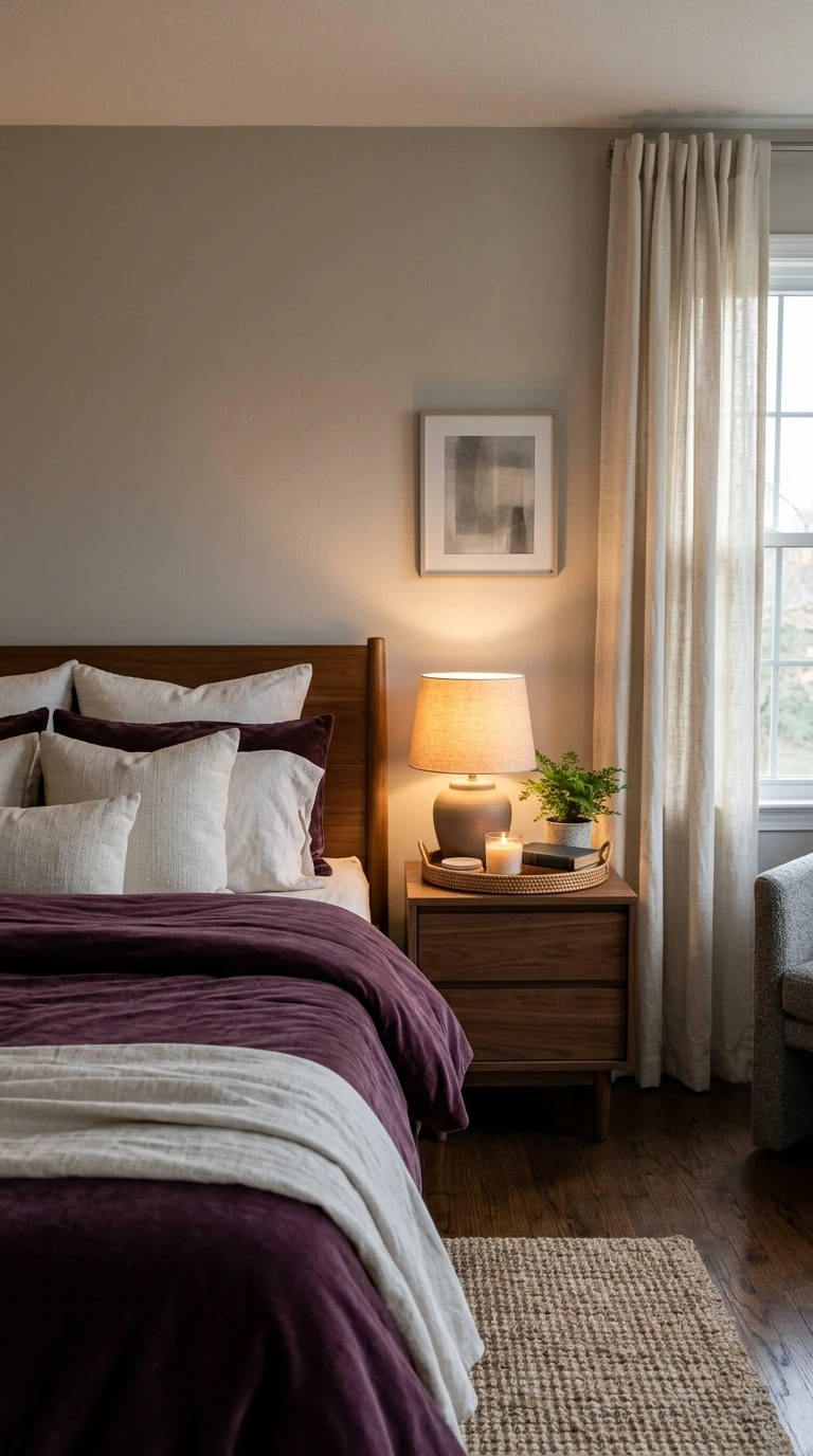
Mushroom is the color that people describe as the best version of beige they have ever seen. It is a deep, organic neutral that sits somewhere between taupe and greige and brown, with enough depth to feel interesting but enough quietness to feel completely restful. If you have been dismissing neutral bedrooms as boring, mushroom might be the color that changes your mind.
What makes mushroom different from standard beige is that it has more depth and complexity. There are brown tones in it, sometimes a hint of gray or even a touch of green, and that layered quality means the color looks slightly different depending on the light source and the time of day. In morning light it might feel warm and golden. In evening lamplight it might feel deeper and more enveloping. That quality makes it a genuinely interesting color to live with.
For bedding, deep jewel tones work beautifully against mushroom walls. Forest green, deep burgundy, navy, and plum all pop against this neutral in a way that feels rich rather than jarring. Natural materials like linen, suede, and bouclé feel completely at home here. For furniture, darker wood tones like espresso or dark walnut create a sophisticated, grounded look. Lighter wood brings a more relaxed, organic feel. Both work, it just depends on the mood you are going for.
Layer in natural textures through your accessories. A sheepskin throw over a bench at the foot of the bed, a rough linen cushion, a handmade ceramic lamp base, a macrame wall hanging in a warm natural tone. All of these add warmth and tactile interest that keeps a mushroom room from feeling flat or generic.
Designer Tip: Mushroom and warm off-white or cream trim is a particularly beautiful combination. The slight contrast between the two warm tones creates a layered, sophisticated look that feels much more intentional than a straight all-neutral approach.
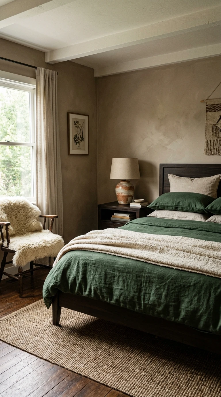
12. Soft Slate Blue
There is a specific kind of calm that comes from slate blue, the kind that feels like the sky at 6am before the full light comes in. Not dark, not navy, not periwinkle. Soft slate blue sits somewhere between a muted blue and a gentle gray, and it is one of the most reliably effective sleep-promoting colors you can put on a bedroom wall.
Research has consistently pointed to blue as the most restful bedroom color, and the reason comes down to the way blue interacts with our nervous systems. Blue tones are associated with calmness, safety, and openness, qualities that help the body move out of alert mode and toward rest. Soft slate blue, specifically, keeps those benefits while avoiding the risks of brighter or darker blues that can feel cold or even slightly melancholy.
For a soft slate blue bedroom, warm white bedding is the most effective pairing. It creates a clean, breathing contrast that prevents the room from feeling monotone. Natural linen textures, whether in a duvet cover, throw pillows, or window treatments, add warmth and prevent the palette from going too cool. For furniture, warm oak or light pine works beautifully here, as does rattan for a more relaxed, coastal feel.
Keep the metal accents warm. Brushed brass, aged gold, or warm copper in your lamp bases, drawer pulls, and decorative objects will offset the coolness in the blue walls and keep the room feeling inviting rather than clinical. Warm bulbs at 2700K or below are the finishing touch that makes the whole palette come alive in the evening.
Designer Tip: Soft slate blue is especially effective in rooms with south or west-facing windows where warm afternoon and evening light naturally warms up the cool wall color, creating a gorgeous, shifting effect throughout the day.
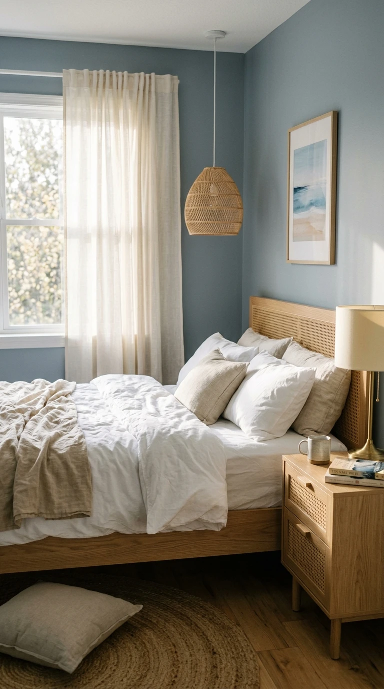
13. Sand and Dune Tones
Close your eyes and picture a wide, empty beach on a calm day. Not the summer crowd version. The early morning or late October version, where the light is low and golden and the sand has this beautiful range of tones from pale cream to warm golden brown. That is the color palette of a dune-inspired bedroom, and it is one of the most genuinely restful looks you can create.
Sand and dune colors are essentially warm off-whites and very light beiges with golden or peachy undertones. They are lighter and warmer than mushroom or taupe, less committed than a terracotta, and more interesting than a plain creamy white. What they share with all of those colors is that grounding, earthy quality that helps the room feel quiet and still.
In a sand-toned bedroom, the magic is in the textures because the color palette itself is deliberately quiet. You need tactile interest to prevent the room from feeling flat. Layered linen bedding in multiple ivory and sand tones, a chunky knit throw in a natural cream, woven jute or sisal rugs, cane or rattan furniture, and raw wood accessories all build that organic, textural richness that makes a sand bedroom feel like a deeply relaxing place.
For lighting, warm amber or soft golden bulbs suit this palette perfectly. Even candles feel appropriate in a sand-toned room, and if you are someone who winds down with candles burning, this is the bedroom palette most likely to make that ritual feel truly luxurious. Sheer curtains in a warm ivory float beautifully in this room during the day, filtering the light softly.
Designer Tip: For an extra layer of coastal calm, choose bedding and curtains in slightly different shades of sand rather than one uniform tone. The tonal variation creates depth and interest without breaking the restful, monochromatic feel of the palette.
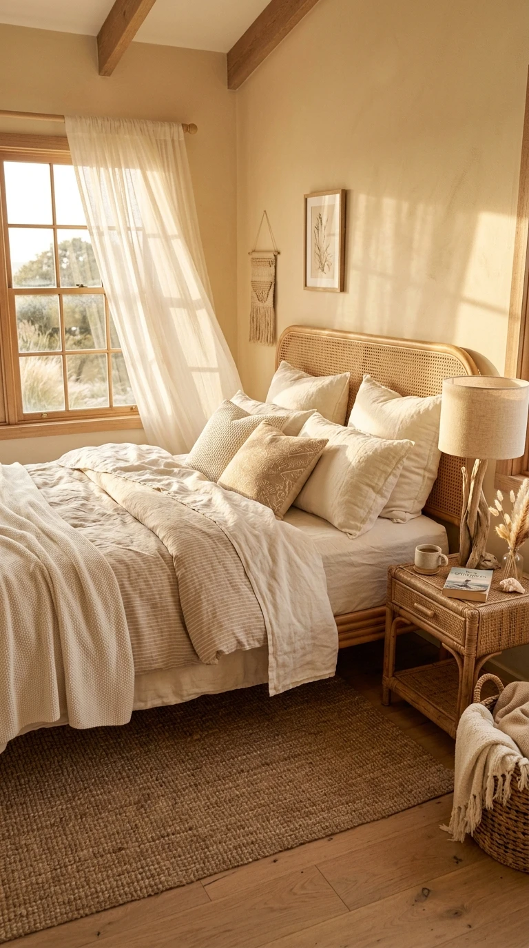
14. Muted Sage with Warm White Accents
This one is for anyone who has wanted to do a sage bedroom but worried about committing fully. Rather than going all-in on sage across all four walls, this approach uses muted sage on the primary wall or two walls and brings in warm white on the remaining walls and trim. The result is a lighter, airier version of the sage bedroom that feels more open and works especially well in smaller rooms.
The warm white you use as the contrast color matters a lot here. Avoid anything with a cool or blue undertone, which will fight with the green in the sage. Go for a white with a very subtle yellow, cream, or pink undertone, something described as warm white, aged white, or soft white rather than pure or bright white. The contrast between the sage and the warm white creates a fresh, slightly Scandinavian quality that is both calming and visually interesting.
For furniture and bedding, keep things natural and unfussy. Pale oak or light wood furniture suits this combination beautifully. White or warm white bedding with a single sage or green throw adds color without overwhelming. For textiles, linen is your best friend in this palette, linen curtains in warm white, linen pillow covers in natural tones, a linen duvet in off-white. The combination of sage, warm white, and linen together creates a bedroom that feels very fresh and clean without feeling sterile.
Potted plants are at home in a sage bedroom in a way they rarely are in any other palette. A fiddle-leaf fig, a monstera, or even simple trailing pothos on a shelf reinforces the botanical quality of the sage walls and makes the whole room feel more alive and oxygenated.
Designer Tip: Use a consistent sheen throughout. Matte paint on walls, matte or eggshell on trim. Mixing sheens (like matte walls with glossy trim) can make the color contrast between sage and warm white feel harsher than it should.
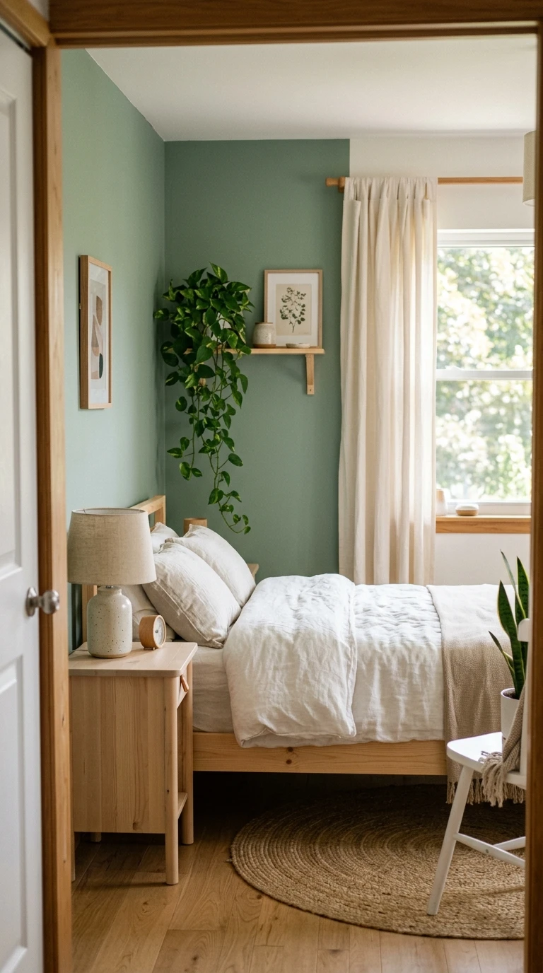
15. Deep Forest Green
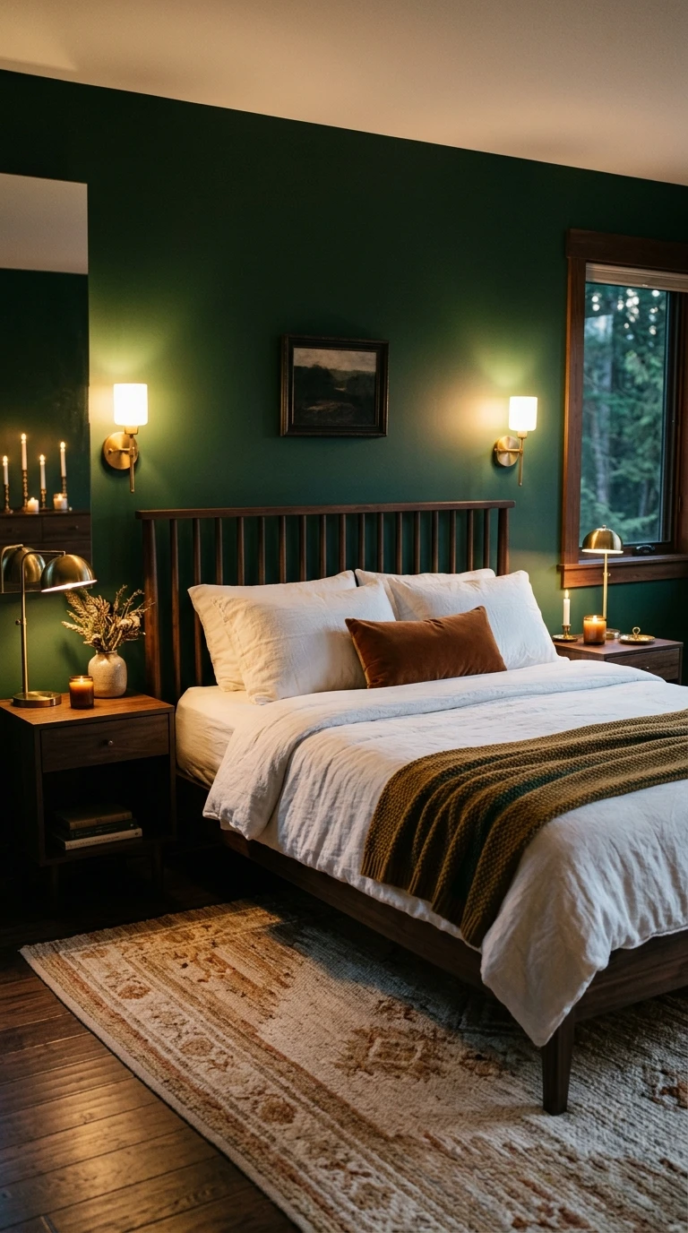
Not everyone sleeps better in a light, airy room. Some people genuinely rest best when the bedroom feels enclosed, deliberate, and a bit dramatic. If you have ever stayed in a hotel room with dark, moody walls and slept better than you have in months, deep forest green might be your color. It is rich, enveloping, and when it is done well, it is one of the most gorgeous bedroom looks in contemporary interior design.
Deep forest green works by creating a cocoon effect similar to warm charcoal but with a natural, organic quality that feels different from a gray or near-black wall. The color has inherent associations with nature, trees, quiet outdoor spaces, things the brain connects with safety and rest. At depth and with the right lighting, it creates a space that feels almost meditative.
The rules for a dark-walled bedroom apply strongly here. Light bedding is essential. White, cream, and warm ivory all pop beautifully against deep green and keep the room from feeling oppressive. Natural linen textures add warmth and breathability. For furniture, brass and aged gold accents are spectacular against deep green walls, the warm metal against the deep, organic green has a richness that feels genuinely luxurious. Dark walnut or warm wood furniture grounds the room while keeping it feeling natural.
Lighting needs careful attention. Layer warm light sources throughout the room. Wall sconces with warm amber bulbs, table lamps with linen or paper shades, and even candles on the dresser or windowsill all create pools of warm light that make the dark green walls glow rather than recede. Avoid overhead lighting entirely if you can, or use it only on a very low dimmer setting.
Designer Tip: Before you paint all four walls, paint just the wall behind your bed and live with it for a week. A forest green accent wall might give you the cocooning effect you are after without the full commitment, and it will tell you quickly whether you want to go further.
16. Blush Mauve
Mauve sits in that interesting territory between pink, purple, and gray, and the blush version of it, where it is kept very light and slightly desaturated, is one of the most quietly sophisticated bedroom colors around. It does not read as pink in most rooms. It reads as a warm, slightly rosy neutral that gives the room a gentle, flattering glow.
Blush mauve is particularly effective for people who want color in their bedroom but find pure pink too playful and pure lavender too cold. It splits the difference beautifully. The slight purple in the mauve gives it a calming, slightly cool quality that the pink alone would not have, while the pink keeps it warm and inviting rather than clinical.
For bedding, dusty rose, warm white, or even a deep plum all work well against blush mauve. Avoid anything bright or highly saturated, which will make the mauve look washed out by comparison. Textured bedding in velvet, linen, or bouclé adds depth and prevents the palette from feeling flat. For furniture, aged gold or warm brass accessories are the real star in a mauve bedroom. A brass lamp, a gold-framed mirror, even brass drawer pulls all pick up the warm pink in the mauve walls and create a cohesive, glowing quality throughout the room.
Medium to dark wood furniture grounds blush mauve effectively. Walnut or dark oak prevents the room from feeling too soft or without any anchoring. A deep-toned area rug, perhaps in burgundy, mushroom, or plum, adds weight at the floor level and keeps the room feeling balanced rather than floaty.
Designer Tip: Blush mauve is one of the most flattering wall colors when you are actually in the room at night under warm light. The color reflects back a rosy warmth that makes the whole room feel like golden hour. Test it under lamplight before making your final decision.

17. Warm Greige
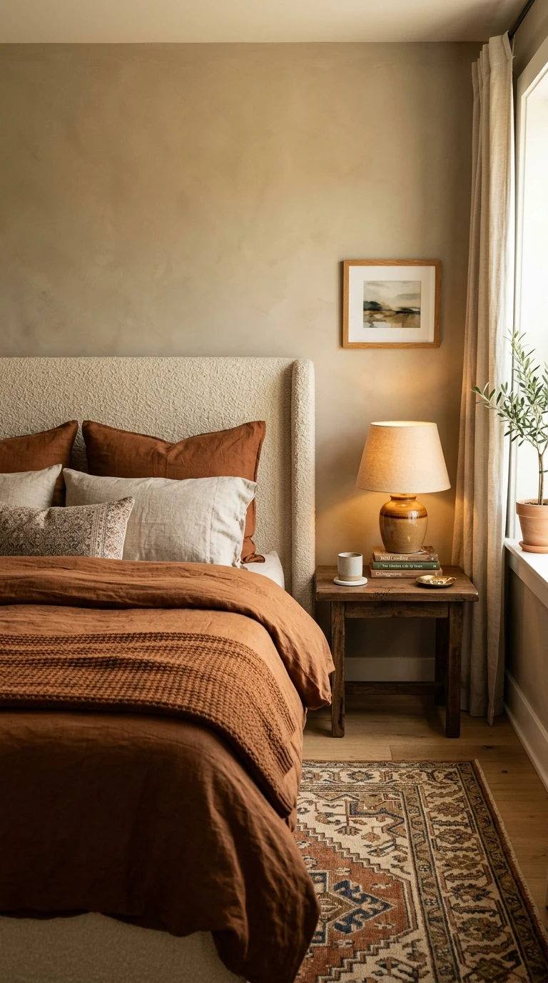
You might have heard “greige” described as the color that replaced beige when beige got boring. It is a blend of gray and beige that manages to be warmer than gray and more interesting than beige, and in its warmest, most golden versions, it is one of the best all-rounder bedroom colors you can choose. It works in almost every light condition, with almost every furniture style, and with almost every bedding palette, which makes it an incredibly low-risk way to bring calm and warmth into a bedroom.
The difference between a warm greige and a cold greige is everything. A warm greige has yellow, gold, or pink undertones that make it feel cozy and inviting. A cold greige leans blue or green and can feel flat and lifeless, especially in rooms with limited natural light. When shopping for this color, hold the swatch up to a warm light source to reveal its true undertone.
With warm greige walls, nearly any bedding style works. Crisp white bedding looks clean and hotel-like. Deep navy or forest green looks rich and sophisticated. Warm earthy tones like rust, cinnamon, and ochre look organic and layered. The walls simply provide a beautiful backdrop that does not compete. For furniture, virtually any wood tone works from light pine to dark espresso. Warm greige is genuinely one of the most versatile neutral bedroom colors in existence.
For a bedroom that feels deliberately designed rather than just safe, use warm greige as the base and then make your statement through a rich, layered textile story. A statement headboard in a velvet or boucle, high-quality linen bedding in a deep tone, a vintage or handwoven area rug in warm tones, and carefully chosen lighting all turn a warm greige bedroom from “nice neutral” into something that feels truly intentional and restful.
Designer Tip: If you are painting a room that currently has cool gray walls and it is not feeling quite right, switching to a warm greige is often the single change that makes everything else in the room come to life. The warmth in the undertone does a lot of work.
Conclusion
Choosing the right bedroom color is one of those decisions that genuinely affects your daily life, not just how your room looks in photos but how you feel when you walk in at 9pm after a long day, and how easily you actually fall asleep once you get there. The 17 colors in this article all have the potential to help you sleep better, but none of them work in isolation. The color is the starting point. The lighting, the textures, the furniture choices, and even the time of day you look at the paint sample all shape the final result.
The most important thing you can do before committing is to test your color in the actual room, in actual conditions. Look at it in the morning light, in afternoon sun if your room gets it, and under your lamps in the evening. Buy a small tester pot and paint a large swatch on your wall. Live with it for a few days. The right color should make you feel a little more relaxed every time you look at it, not just once in a good light, but consistently.
Whether you go with the quiet sophistication of warm dove gray, the organic warmth of dusty terracotta, the grounding depth of forest green, or the gentle softness of pale lavender, the goal is the same: a bedroom that your brain recognizes as a place to slow down. Start there, layer thoughtfully, and let the room do the rest.
Frequently Asked Questions
What is the single best bedroom color for sleep?
There is no single best color because people respond to color differently based on their personal associations and the specific undertones of the shade. That said, soft blue-gray, warm dove gray, and muted sage green consistently perform well for most people because they are low in saturation, non-stimulating, and easy to pair with warm lighting. If you want a reliable starting point, any of those three is a safe bet.
Does the finish of the paint affect how calming a bedroom color looks?
Yes, significantly. A matte finish absorbs light and makes colors look softer and more recessive, which is exactly what you want in a sleep space. A satin or semi-gloss finish reflects light back into the room and can make the same color feel brighter and more energizing. For bedroom walls, always go with a matte or eggshell finish. Save the satin for trim if you want a slight sheen difference.
Can a dark bedroom color actually help with sleep?
Absolutely, and for some people it works better than lighter colors. Dark walls like warm charcoal or deep forest green reduce the amount of visual contrast in the room, which means the brain has less to process when you are trying to wind down. The key is using warm lighting, light bedding, and natural textures to prevent the room from feeling heavy or oppressive. Done well, a dark bedroom feels like the best kind of cocoon.
How do I know if a color has warm or cool undertones?
The easiest way is to hold the paint sample next to a pure white surface and look at what the white makes the color look like. If the white makes the sample look more blue, green, or purple, the color has cool undertones. If it looks more pink, yellow, or brown, it has warm undertones. You can also look at the sample under a warm lamp and then under natural daylight to see how it shifts. Colors that warm up under lamplight and go a little cool in daylight have mixed undertones, which can actually work beautifully in a bedroom.
I want to change my bedroom color but I am renting. What can I do without painting?
A lot, as it turns out. Bedding is the biggest visual element in a bedroom and switching to a calming color in your duvet cover and pillowcases has an outsized effect on the room’s mood. A large area rug in a calming tone adds significant color at floor level. You can also use removable wallpaper or peel-and-stick panels on a single accent wall for a color hit without the commitment. Swapping your lighting bulbs to warm amber tones will change the mood of any room instantly and for very little money.
Should all the walls in my bedroom be the same color?
Not necessarily. A single accent wall behind the bed in your chosen color with the remaining walls in a lighter complementary neutral is a popular and very effective approach. It draws the eye toward the headboard, creates depth in the room, and gives you a taste of the color without full commitment. This also works well in smaller bedrooms where a full wrap of dark or saturated color might feel overwhelming. Three walls in a light neutral and one in your chosen calming shade is a flexible formula that works for most color choices on this list.