Kitchen Cabinet Colors That Actually Make a Difference
If you have been staring at your kitchen cabinets and wondering why the room never feels quite right, the color might be the answer. Cabinet color is one of the biggest visual decisions in any kitchen, and it sets the mood for everything else in the space. The wrong shade can make a bright kitchen feel cold, or a small kitchen feel like a closet. The right one can pull a whole room together without you spending a fortune on new countertops or appliances.
What is tricky is that there are so many directions you can go. Painted cabinets, stained wood, bold colors, soft neutrals, two-tone combinations, and everything in between. It gets overwhelming fast, especially when you are looking at tiny paint swatches and trying to imagine them on 30 cabinet doors. That is where this guide comes in. Instead of just listing colors and calling it a day, each idea here walks you through how the color actually works in a real kitchen, what pairs well with it, what kind of lighting it needs, and what the overall vibe ends up being.
Whether you are renovating from scratch, refreshing on a budget, or just trying to figure out what color to paint your existing cabinets, there is something in here for you. These are 15 ideas that cover a wide range of styles, from calm and classic to bold and unexpected. None of them are generic, and all of them are worth thinking about seriously before you crack open a paint can.
1. Sage Green Lower Cabinets with Crisp White Uppers
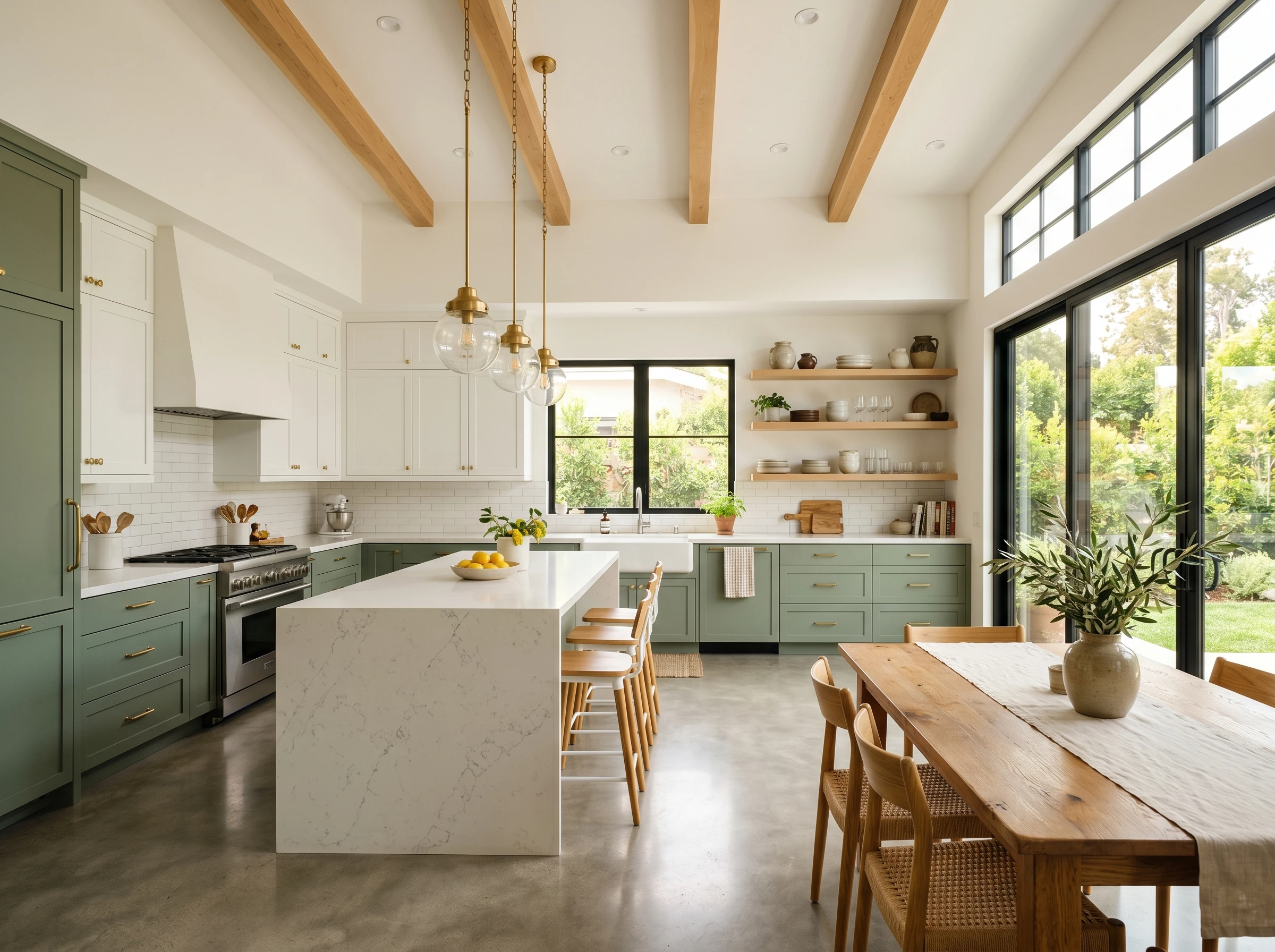
This two-tone combination has been gaining real traction for a reason. The sage green is soft enough to feel calming but has enough pigment to read as a real color choice, not just a near-white. Pairing it with white upper cabinets keeps the space from feeling heavy, which is especially important in kitchens with lower ceilings or limited natural light. The contrast between the two tones also creates a visual separation that makes the kitchen feel more layered and intentional.
For countertops, a light quartz with subtle veining works well here, as does butcher block for a warmer, more relaxed feel. Hardware makes a significant difference with sage green. Aged brass or matte black pulls both work beautifully, but aged brass tends to feel especially cohesive because it picks up the earthy warmth in the green. Avoid chrome or bright silver, which can clash with the softness of sage.
Quick Tip: Test your sage paint in the actual kitchen before committing. Sage can swing warm or cool depending on the undertones, and the way your kitchen light hits it will look completely different from the paint store chip. Look at it in the morning and at night before you decide.

2. Deep Navy Blue All-Over Cabinets
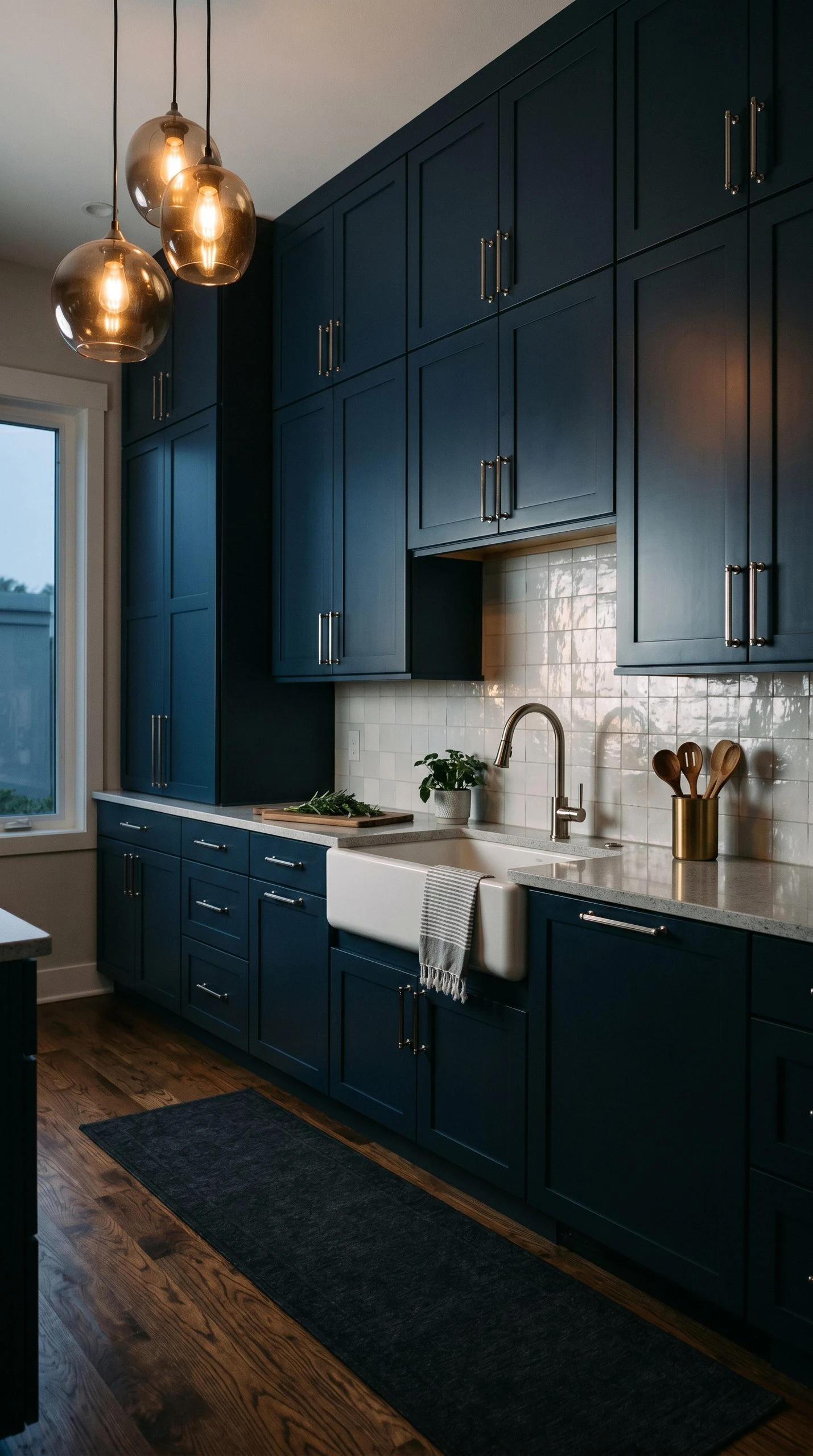
Navy blue cabinets used to feel like a risky move, but at this point they have become a genuinely classic choice for kitchens that want to feel rich and polished without going full black. A deep navy, like Benjamin Moore’s Hale Navy or Sherwin-Williams’ Naval, creates a kitchen that feels anchored and sophisticated. It works across a wide range of styles, from farmhouse to modern to transitional, which makes it a flexible option even if your home’s style is hard to pin down.
The key to making navy cabinets work is balancing them with lighter elements. White subway tile or off-white shiplap backsplashes give the eye somewhere to rest. Light countertops in white marble or pale gray quartz prevent the kitchen from absorbing all the light. If your kitchen has good natural light, navy handles it beautifully and actually shows its depth on sunny days. In a darker kitchen, add under-cabinet lighting to prevent the space from feeling like a cave.
Quick Tip: Polished nickel or brushed gold hardware is a standout pairing for navy blue cabinets. Both finishes read as elevated and work with the inherent drama of a dark cabinet color without feeling too matchy-matchy.
3. Warm Greige for a Modern Organic Look
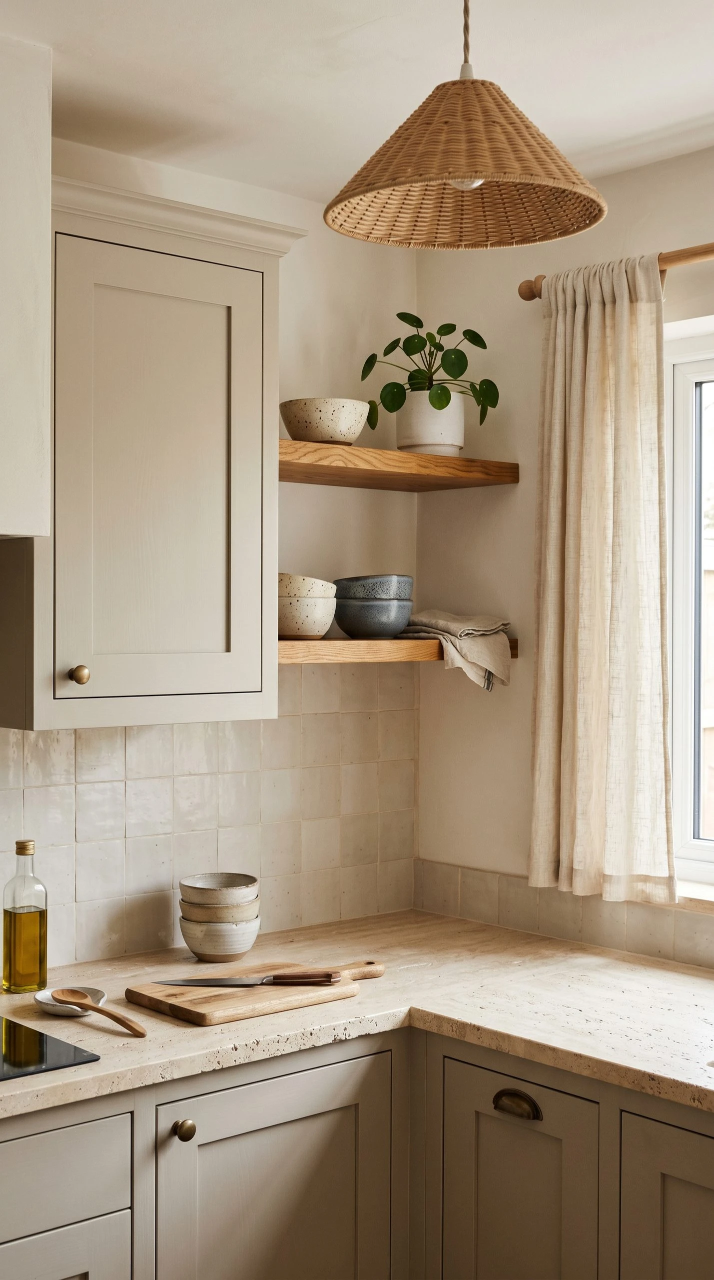
Greige, the blend of gray and beige, has moved far beyond its early overuse and settled into something genuinely interesting when done with the right warmth. A warm greige on kitchen cabinets creates a neutral foundation that does not feel cold the way pure gray can, and does not feel dated the way honey beige once did. Think Accessible Beige by Sherwin-Williams or Pale Oak by Benjamin Moore but pushed slightly darker for cabinets, or look at dedicated cabinet paint lines that offer similar tones.
What makes greige work in a modern organic kitchen is how well it plays with natural textures. Pair it with honed travertine countertops, open wood shelving, or rattan pendant lights and the result feels intentional and warm without being overly rustic. Greige is also one of the most forgiving cabinet colors when it comes to different flooring tones, which matters if you already have floors you are not replacing. It reads as a true neutral that cooperates with wood, tile, and stone alike.
Quick Tip: If your kitchen gets cool northern light, choose a greige with yellow or pink undertones rather than one with gray or green undertones. Cool light will push neutral colors toward blue or gray, so you need a warmer base to keep the color looking like what you actually chose.
4. Forest Green for a Moody, Dramatic Kitchen
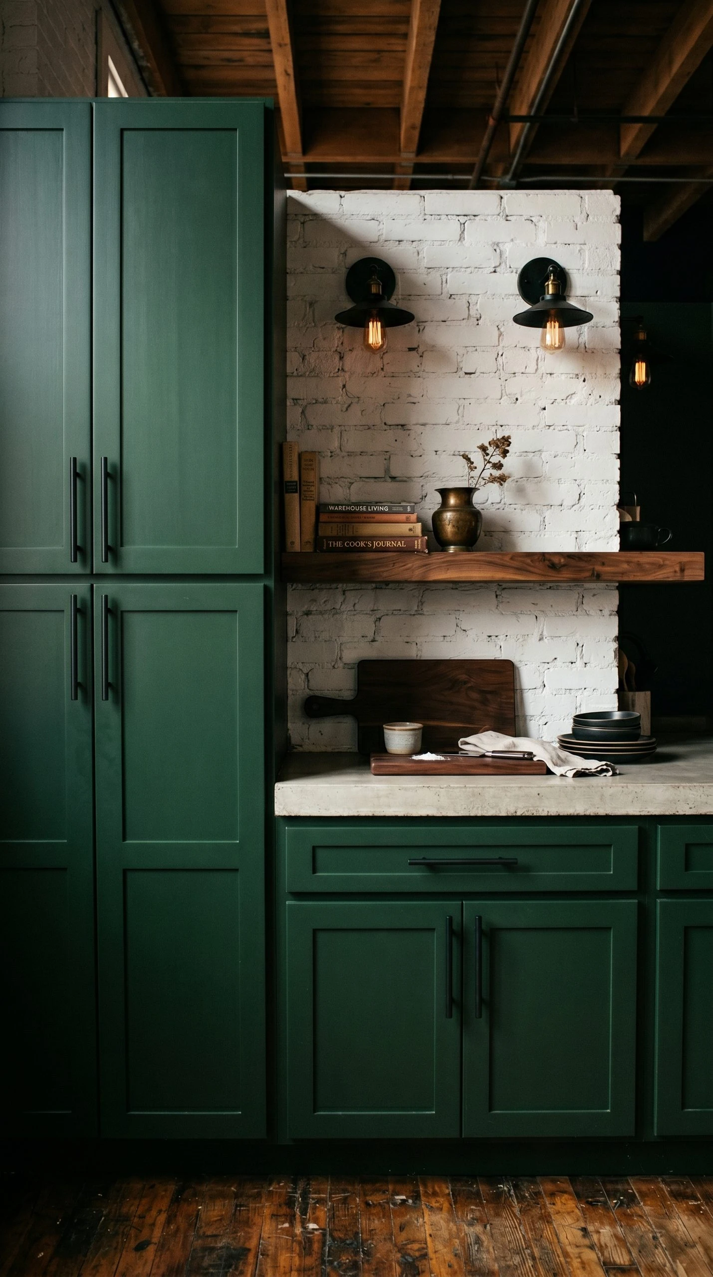
Forest green is a step beyond sage, and it is a step worth taking if you want a kitchen that feels genuinely moody and impressive. Colors like Farrow and Ball’s Calke Green or Sherwin-Williams’ Hunt Club bring a depth to cabinets that makes the kitchen feel like a considered space, not just a functional room. This color works especially well in kitchens with good natural light or vintage-style pendant lighting, where the richness of the green gets to show itself properly.
Forest green pairs naturally with warm wood accents, which is convenient since most kitchens already have some form of wood nearby. Open floating shelves in walnut or oak, a wood island top, or even a cutting board visible on the counter will all pick up the warmth that forest green needs as a companion. For a more contemporary angle, pair forest green cabinets with polished concrete countertops and matte black hardware for a kitchen that feels like it belongs in an architectural magazine.
Quick Tip: Use a paint with a satin or semi-gloss finish on forest green cabinets rather than flat or matte. Darker colors show fingerprints and grease more easily, and a slightly reflective finish makes cleaning much easier while also allowing the color to show its true depth under light.
5. Soft Black with Warm Undertones
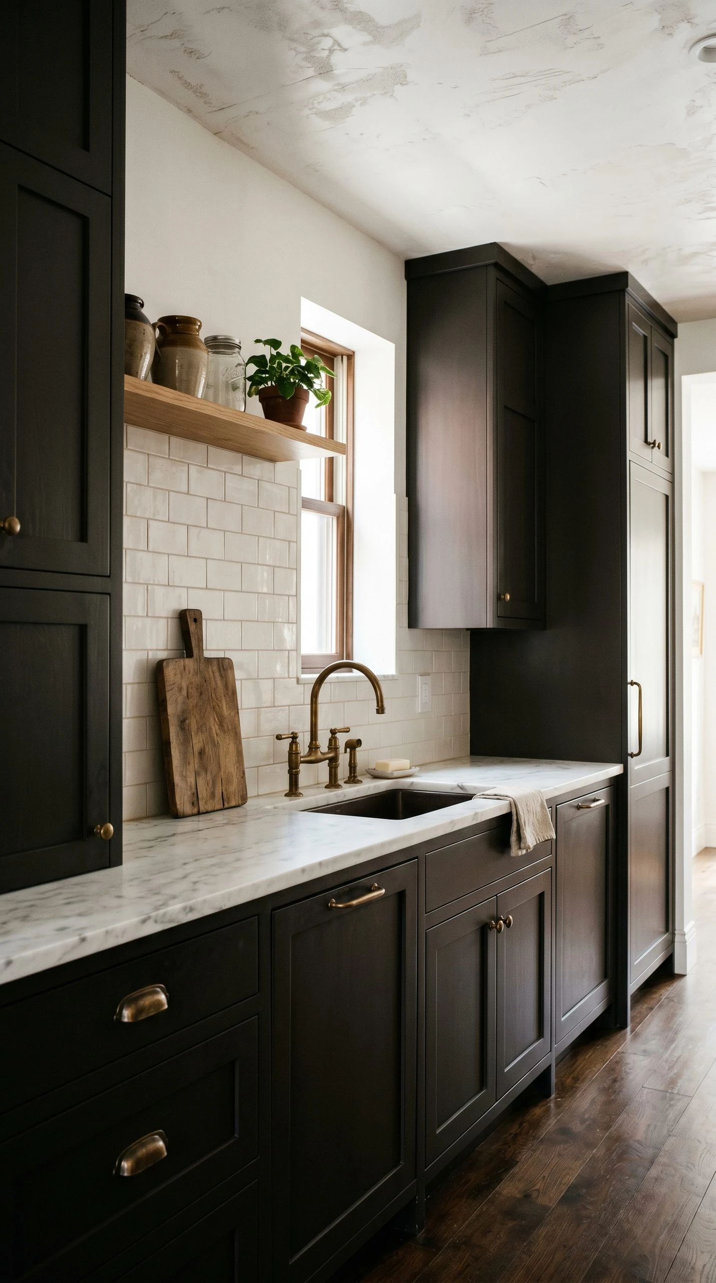
Pure black cabinets can feel stark and unforgiving, especially in a kitchen where the lighting is not perfectly controlled. But soft blacks, which are really very dark charcoals or near-blacks with a slightly warm or brown undertone, give you all the drama of a black kitchen without the harshness. Colors like Tricorn Black, Iron Ore, or Off Black by Farrow and Ball occupy this space perfectly. They read as black in photographs but have a subtle warmth in person that makes them feel livable rather than severe.
The best kitchens with soft black cabinets tend to have one major light element to create contrast. This could be white countertops, a light-colored tile backsplash, or even lighter upper cabinets if you are going two-tone. Open shelving with ceramics or plants adds a softness that keeps the kitchen feeling inviting rather than industrial. Unlacquered brass hardware is a particularly beautiful pairing here because it develops a patina over time that adds character alongside the dark cabinets.
Quick Tip: If you are hesitant about going full soft black throughout, try it on a kitchen island first. An island in a near-black with the surrounding cabinets in a lighter color is one of the most visually striking combinations in kitchen design right now, and it lets you test the color before going all in.
6. Dusty Blue for a Coastal or Cottage Feel
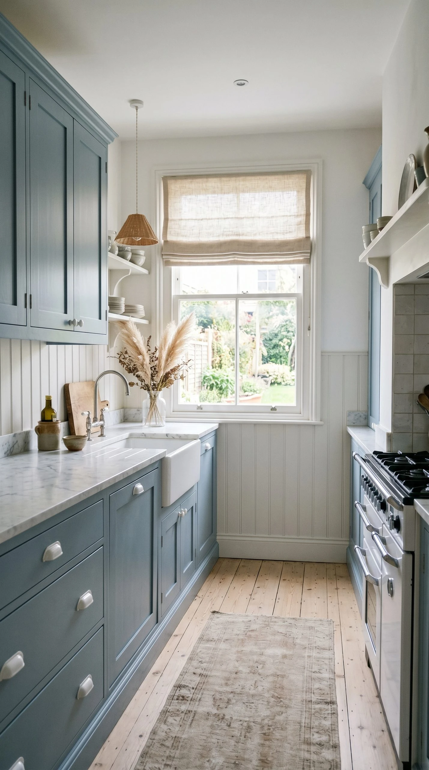
Dusty blue is different from navy and different from bright sky blue. It sits somewhere in between with a slightly grayed-down quality that makes it feel quiet and sophisticated rather than loud or beachy in a cliched way. Think of colors like Muted Sage’s blue equivalent, a color that has some cloud in it, some gray, and a whisper of the sea. It is not a color trying to impress you immediately. It reveals itself more slowly, and you find yourself liking it more over time.
This color works especially well in cottage-style kitchens, beach houses, or older homes with charm and character. It pairs well with shiplap walls, beadboard backs inside glass-front cabinet doors, and simple bin pulls in white or brushed nickel. Countertops in white marble or light granite keep the look fresh and clean. Add linen curtains if there is a kitchen window nearby and the whole room starts to feel like something you would see in a coastal lifestyle magazine from the good era, not the overdone one.
Quick Tip: Dusty blue can look quite different under incandescent versus LED lighting. If your kitchen uses LED bulbs, choose one with a warm color temperature (around 2700K) to prevent the blue from looking too cold or institutional.
7. Warm White with a Hint of Cream
Calling something ‘white cabinets’ is far too simple because there are hundreds of whites and they are all doing something slightly different. The warmest and most livable white cabinet colors are the ones with a slight cream or ivory undertone, not the stark bright whites that can feel clinical under the wrong light. Colors like White Dove by Benjamin Moore, Swiss Coffee, or Antique White all land in this creamy warm-white zone that reads as clean and classic without feeling cold or sterile.
Warm white cabinets are the most universally flattering cabinet color because they work with nearly any countertop, backsplash, or floor color. They also show the quality of your cabinet construction and hardware choices more clearly than a darker color would, so this is a finish that rewards good craftsmanship. For a kitchen that feels elegant rather than builder-basic, pair warm white cabinets with a statement countertop, like a veined marble or a dramatic waterfall quartz, and let the cabinets play the supporting role.
Quick Tip: Warm white cabinets show grease and smudges more easily near the stove, so plan for a semi-gloss finish on any cabinets adjacent to cooking areas and a lighter eggshell on the rest. The slight sheen difference will not be noticeable in the overall look but it makes a big practical difference for cleaning.

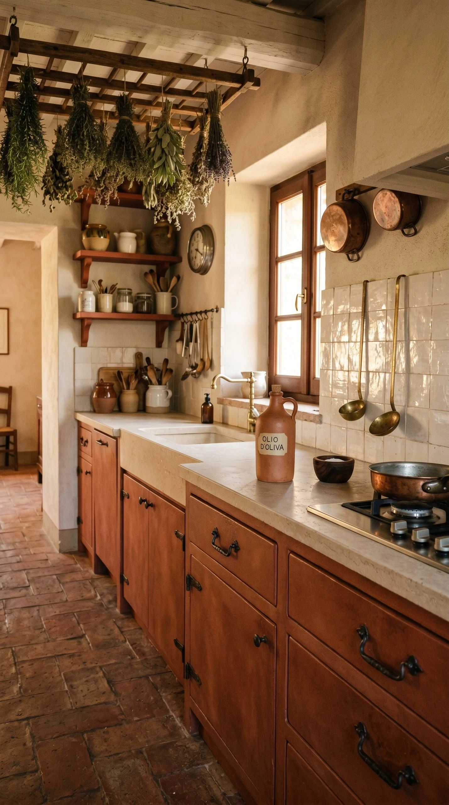
8. Terracotta for a Warm Mediterranean Kitchen
Terracotta on cabinets is one of the bolder moves on this list and also one of the most rewarding if you commit to it. It is a color that cannot be ignored, that immediately sets a mood, and that makes a kitchen feel warm even on a gray January morning. When the shade is right, terracotta cabinets feel Mediterranean and grounded, like a kitchen in southern Italy or a converted farmhouse in Spain. When it is wrong, it can feel orange and overwhelming, so the shade selection matters enormously.
Look for terracottas that lean toward rust or clay rather than pumpkin. Brands like Portola Paints and Farrow and Ball tend to offer better versions of this color than standard paint lines because their formulas have more depth and complexity. Pair terracotta cabinets with zellige tile backsplashes, handmade tiles with a slightly uneven glaze, or simple cream subway tile. Countertops in honed limestone or warm concrete keep the earthy, organic feeling going. Wrought iron hardware or hand-hammered pulls add to the artisan quality of the look.
Quick Tip: Terracotta is a color that benefits from a lot of natural light. If your kitchen is on the darker side, consider using terracotta as an accent, perhaps on a small pantry cabinet or island, rather than throughout the entire kitchen.
9. Charcoal Gray Two-Tone with Light Wood Accents
Charcoal gray sits between the drama of black and the neutrality of medium gray. On cabinets it feels grown-up and contemporary without trying too hard. The two-tone approach, using charcoal on the lower cabinets and a lighter tone on the uppers, is a version of this idea that keeps the kitchen from feeling heavy. The charcoal provides grounding and visual weight at the base of the room while the lighter upper cabinets keep the eye moving upward and make the ceiling feel higher.
What makes this combination really interesting is bringing in a warm wood element. A kitchen island with a warm walnut or white oak face, open shelving in a natural wood, or even wood cabinet doors on a small section of the upper cabinets can add the contrast and warmth that charcoal needs to feel cozy rather than cold. Stainless steel appliances disappear beautifully into a charcoal gray kitchen, while matte black hardware ties the whole room together without creating too much contrast.
Quick Tip: When choosing your charcoal, hold the paint chip next to your countertop sample and your floor sample at the same time. Charcoal grays can pull very differently depending on surrounding materials, and some will look purple or blue next to certain stones or tiles.

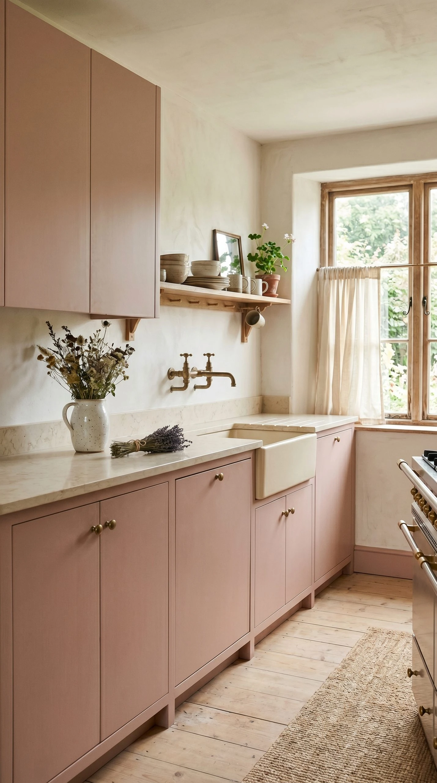
10. Blush Pink for a Soft, Unexpected Kitchen
Blush pink cabinets sound like a statement but in practice they tend to be surprisingly livable. The best blush tones for kitchens are far from pastel or babyish. They are muted, dusty, and slightly sophisticated, more like a dried rose petal than a birthday cake. Farrow and Ball’s Setting Plaster or Sulking Room Pink are good references for the kind of pinkish nude that works in a kitchen without making it feel like a child’s bedroom. These are colors that feel mature and considered, not whimsical.
Blush pairs best with warm neutrals and natural textures. Cream or off-white countertops, natural linen Roman shades, unlacquered brass faucets, and ceramic pendant lights with a handmade quality all work together with blush to create a kitchen that feels genuinely original. This is also a color that looks especially good in older homes with period-appropriate details, where it picks up on the softness of plaster walls and the warmth of original wood floors rather than fighting against them.
Quick Tip: Keep the overall palette quiet if you choose blush cabinets. Too many other colors or patterns competing with the pink will make the kitchen feel busy. Let the blush be the statement and keep everything else simple and calm.
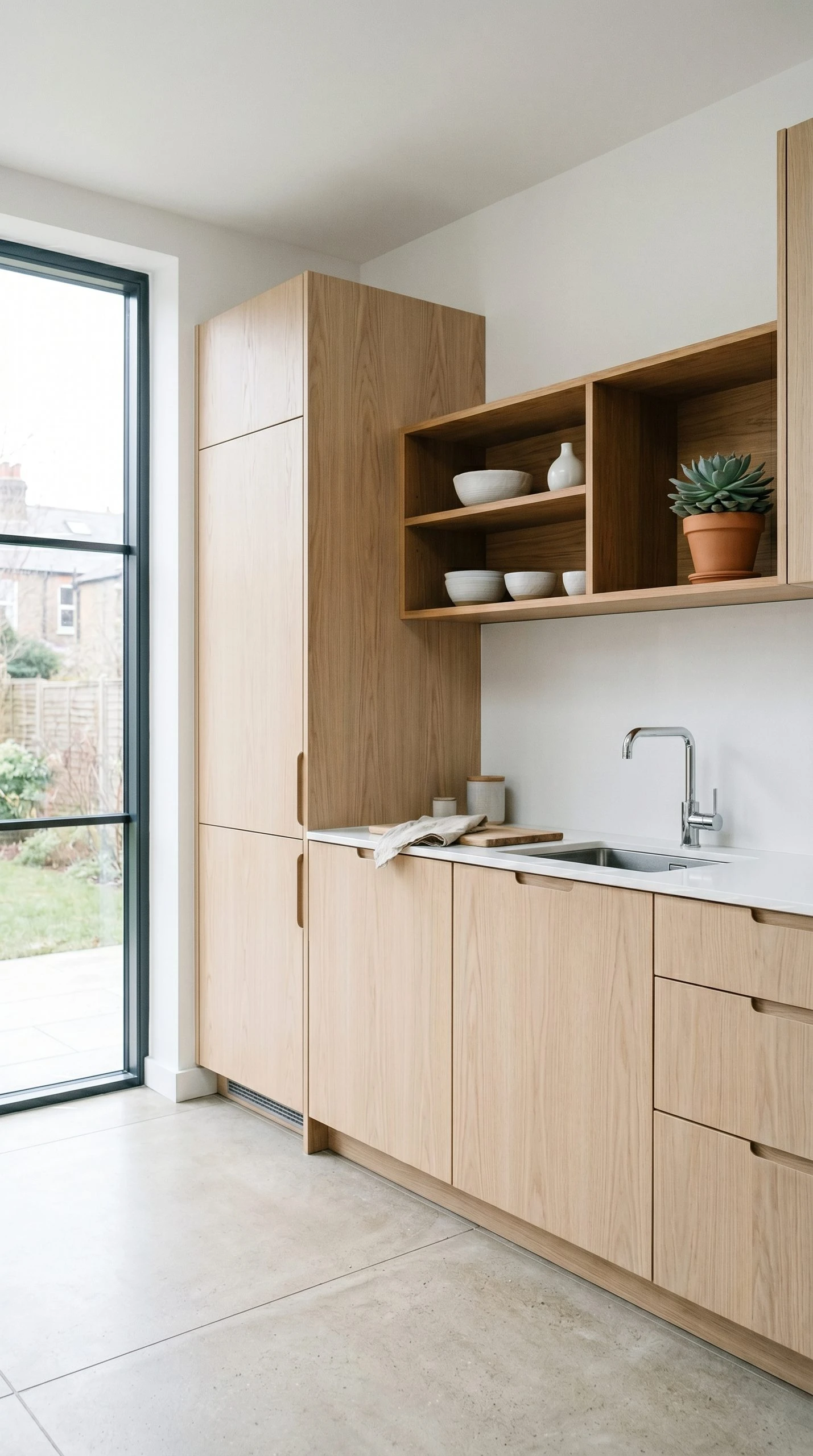
11. Raw Wood Stain for a Scandinavian Minimal Kitchen
Not every cabinet color comes from a paint can. Raw or lightly stained wood cabinets in pale tones like white oak, birch, or ash create a kitchen that feels clean and Scandinavian without any of the cold, sterile associations that sometimes come with that style. The natural grain of the wood adds visual interest that a painted surface cannot, and the pale tone of light wood keeps the room feeling open and airy. This is particularly effective in kitchens with open plans where the cabinets can be seen from living spaces.
The key is in the finish. A matte or satin lacquer on the wood keeps it from looking too casual or unfinished while still allowing the grain to show. Pair light wood cabinets with white quartz countertops, integrated stainless steel appliances, and simple bar pulls in brushed stainless or matte black. Avoid heavy decorative elements. The beauty of this look is in its restraint, and the more clutter-free the countertops and shelves, the better the natural wood reads. Floating shelves in a matching or slightly darker wood add warmth without disrupting the minimal quality.
Quick Tip: Light wood cabinets can show water marks and staining near the sink more than painted cabinets. Choose a high-quality waterproof finish and apply it properly, or discuss moisture-resistant options with your cabinet maker before committing to a natural wood finish near the sink.
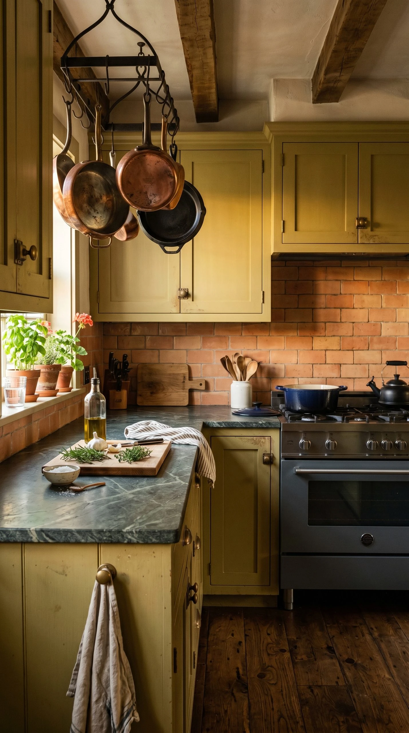
12. Olive Green for an Earthy, Grounded Kitchen
Olive green lands in a different place than sage or forest green. It has more yellow in it, which gives it an earthier, almost military quality that feels unexpectedly sophisticated in a kitchen. Done right, olive cabinets feel like a color that has been there forever, worn in and comfortable rather than trendy and self-conscious. It is a color that people tend to fall in love with gradually, which is one of its most appealing qualities. It does not announce itself loudly. It just makes the whole room feel settled.
Olive pairs especially well with warm bronze or copper hardware, unlacquered brass, or antique brass in a slightly more weathered finish. Countertops in soapstone or dark green granite play into the earthy palette beautifully. Brick or terracotta tile backsplashes are an interesting pairing that leans into the organic, outdoorsy quality of olive. For a more contemporary version, pair olive cabinets with light gray quartz countertops and simple matte black hardware and let the color speak without additional warmth.
Quick Tip: Olive green is one of those colors that looks significantly different in different light conditions. Natural morning light might make it look quite yellow-green, while evening artificial light pushes it toward a deeper, more military tone. Test it on your actual cabinets with a sample pot before doing the whole kitchen.
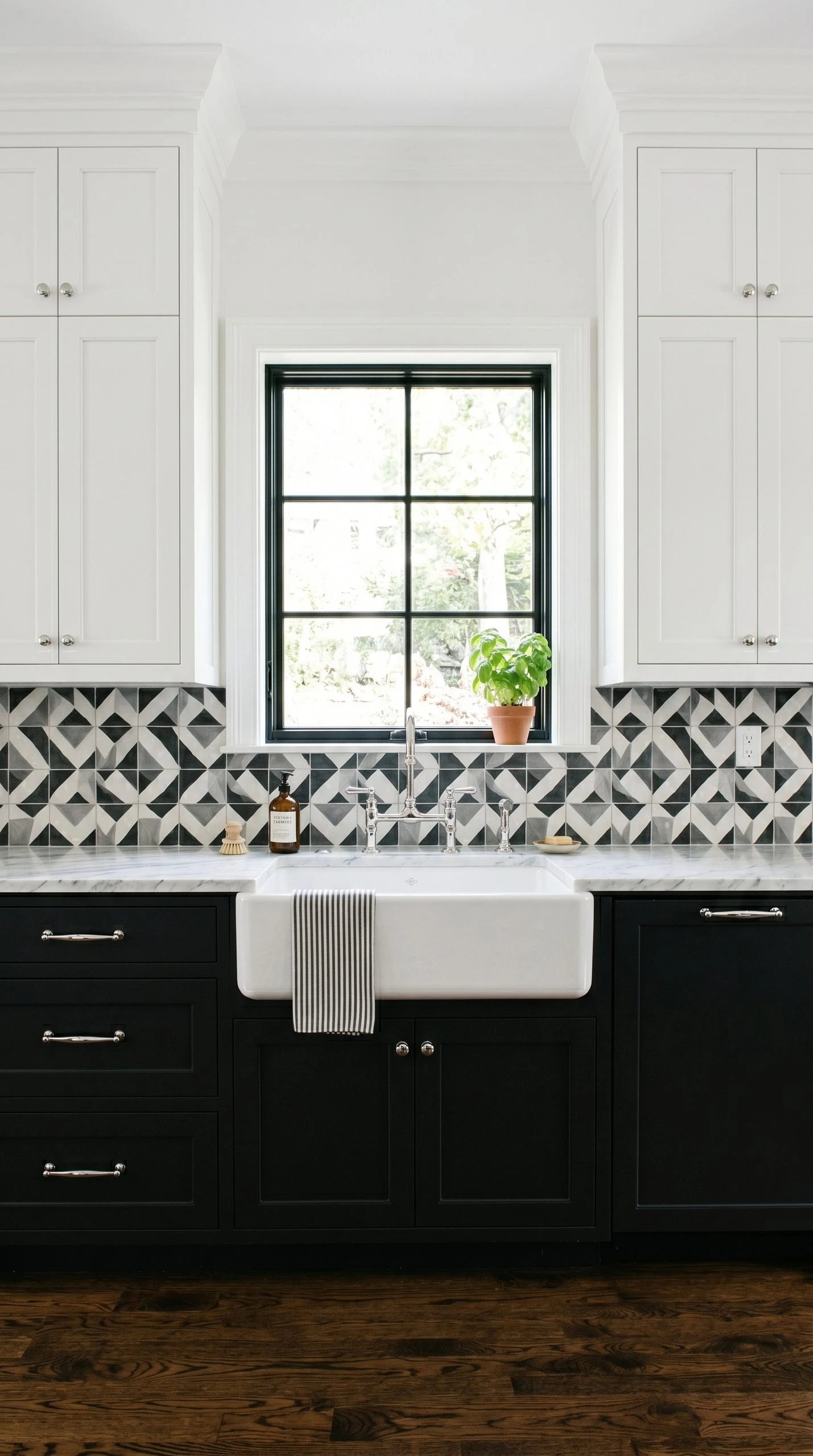
13. Black and White Two-Tone with a Classic Feel
A black lower and white upper cabinet combination is one of the most classic two-tone kitchen pairings, and it has earned that status by being endlessly versatile and visually effective. The black lower cabinets provide drama and grounding while the white uppers keep the kitchen feeling open at eye level and above. It is a combination that works in Victorian homes with ornate cabinet details, in modern kitchens with flat-front doors, and in farmhouse spaces with shaker-style construction. The style adapts to whatever surround it.
For countertops, white Carrara marble or marble-look quartz bridges the two cabinet colors naturally. A bold backsplash in graphic black and white tile, like encaustic cement tile or subway tile in a herringbone layout, adds personality without disrupting the core palette. Hardware needs some thought here. Chrome or polished nickel works well as a clean, classic option. Unlacquered brass adds warmth and character. Matte black pulls can be used on both cabinet colors to create visual continuity and a slightly more contemporary result.
Quick Tip: If the transition between black lowers and white uppers feels too abrupt, add an open shelf in a natural wood between the two levels. It acts as a visual buffer and softens the contrast while adding a practical and decorative display space.
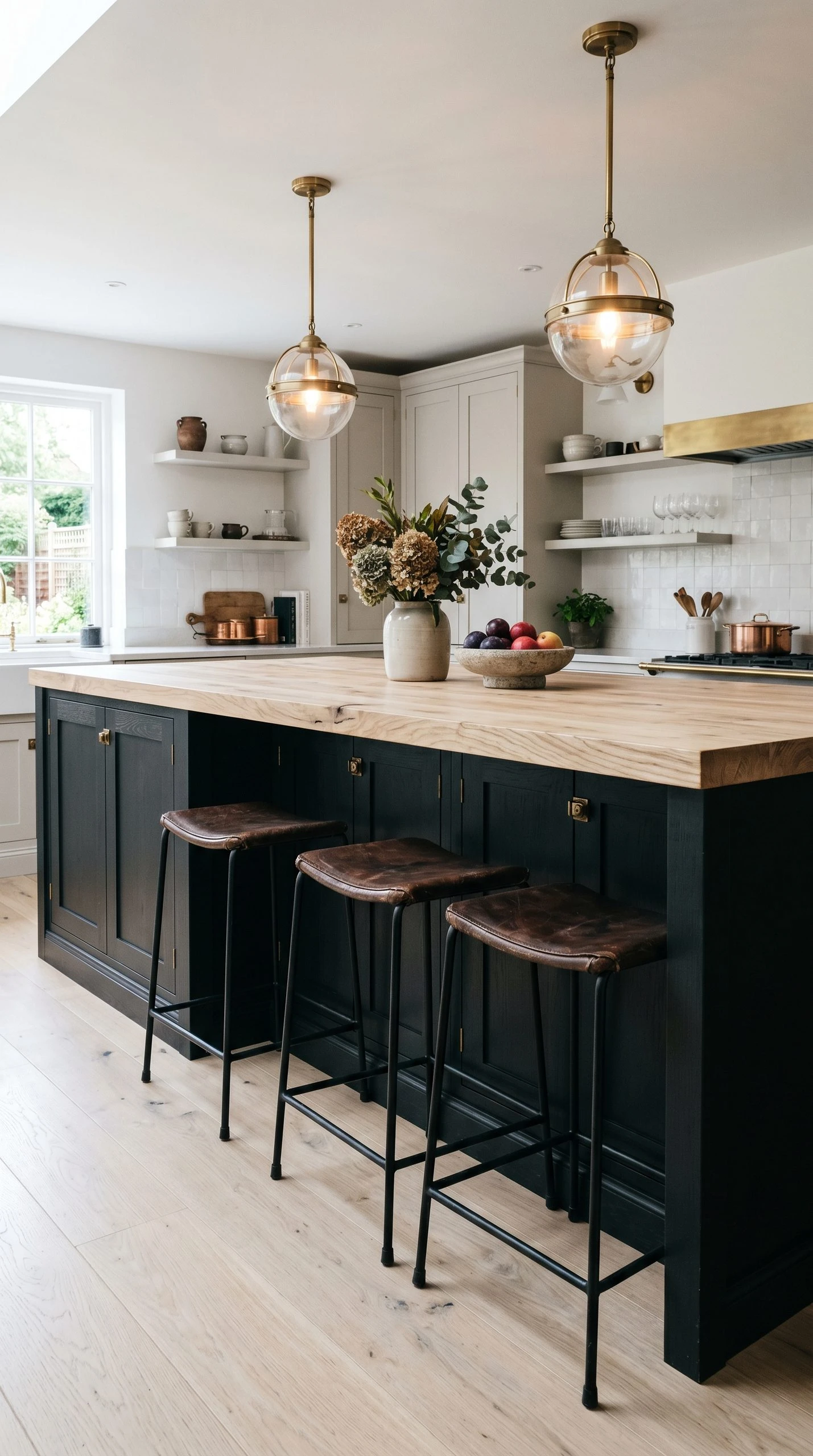
14. Off-Black on a Kitchen Island Only
Not everyone is ready to commit to dark cabinets throughout an entire kitchen, and honestly, you do not have to be. One of the most effective ways to introduce a deep, dramatic color is to use it on the island only while keeping the perimeter cabinets in a lighter tone. A kitchen island painted in an off-black, very dark navy, or deep charcoal instantly becomes the focal point of the room. It reads like a piece of furniture rather than a built-in, which adds to the visual interest and makes the kitchen feel more layered.
For the island countertop, choose something that contrasts with the dark base. White or light marble, a pale butcher block, or even a bright quartz all work well against the depth of a dark island. Add some distinctive bar stools in a warm material, leather or rattan, and the island becomes a proper gathering spot that feels separate from the working kitchen. Pendant lights above the island should be chosen thoughtfully since they will be close to the dark cabinets and can either complement or clash with the look.
Quick Tip: When painting only the island, make sure the dark color relates to some other element in the room, even if it is just the color of the appliances or the hardware on the perimeter cabinets. A totally isolated dark island can look like an afterthought rather than a planned design decision.
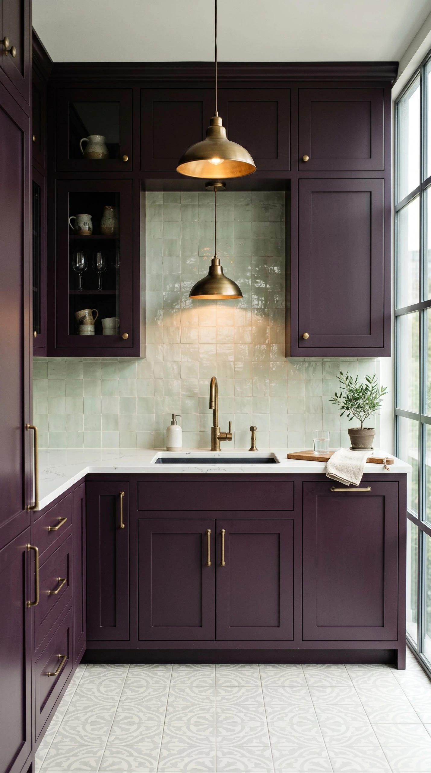
15. Deep Plum or Aubergine for a Truly Unique Kitchen
Deep plum and aubergine cabinet colors are rare because most people hesitate, which is exactly why they work so well for anyone who actually commits. A kitchen with aubergine cabinets looks like nothing else. It is rich, deeply pigmented, sophisticated, and genuinely original in a world full of white, gray, and navy kitchens. The color has warmth from the red in it and depth from the blue, and it works best in kitchens with good natural light or a serious lighting plan because it needs illumination to reveal its full complexity.
The pairings matter a great deal here. A light countertop, either white or a very pale stone, is essential to prevent the kitchen from feeling too dark. A backsplash in an interesting tile, zellige in pale green or off-white, or glossy white metro tiles, reflects light back into the space and keeps the room feeling alive. Aged brass hardware is the most natural companion to aubergine because it picks up the warmth in the red undertones. Avoid cool metallics which will push the color toward looking purple in a less flattering way.
Quick Tip: Because aubergine is such an uncommon choice, it is worth paying for a quality paint brand rather than going with a budget option. The depth and complexity of a pigment like this depends heavily on the quality of the colorants used, and a cheap version will look flat and unconvincing where a premium version will look extraordinary.
Finding the Right Color for Your Kitchen
At the end of the day, choosing a kitchen cabinet color is one of the most personal decisions in home design because no two kitchens have the same light, the same proportions, or the same surrounding materials. What reads as a warm, inviting green in one kitchen might look muddy in another. What feels bold and dramatic in a magazine image might look completely different in your actual space. That is why the most important thing you can do before committing to any color is to test it properly.
Get a sample pot or order a paint sample from a brand that offers them. Paint a large swatch, at least one foot square, on an actual cabinet door or on a piece of cardboard that you hold up to the cabinet. Look at it in the morning, midday, and at night under your kitchen lights. Look at it with your countertop sample, your backsplash tile, and your floor nearby. This process will save you from a very expensive mistake and will give you the confidence to commit fully.
Whatever direction you choose, commit to it. Half-measures in kitchen color tend to look like indecision rather than sophistication. If you are going dark, go properly dark. If you are going bold, choose a bold that you actually love rather than a watered-down version you think is safer. The kitchens that people remember and admire are the ones that have a clear point of view, and getting that right starts with a color decision you believe in.
Frequently Asked Questions
What is the most popular kitchen cabinet color right now?
Greens in various shades have been the dominant trend for a few years now, with sage green and forest green both showing up consistently across interior design publications, real estate listings, and renovation projects. Navy blue remains a classic that never really goes out of style, and off-white or warm white continues to be the most widely chosen color for its versatility and broad appeal.
Should kitchen cabinets be lighter or darker than the walls?
There is no single rule here, but most designers recommend creating some contrast between the cabinets and the walls rather than having them match too closely. Lighter cabinets with a slightly deeper wall color, or darker cabinets with white or off-white walls, both create a more interesting visual result than cabinets and walls that are nearly the same tone. The contrast is what gives the room definition.
What cabinet color makes a small kitchen look bigger?
Light colors, particularly whites, creams, and very light grays, reflect more light and make a kitchen feel more open than it is. However, the effect goes beyond just the cabinet color. Reflective surfaces on the countertop, good task lighting under the cabinets, and hardware that does not create too much visual noise all contribute to the perception of space. In a small kitchen, keeping things light and simple tends to be more effective than any single color choice.
How do I choose between painted and stained wood cabinets?
Painted cabinets give you a smooth, uniform finish and unlimited color options. They work well in contemporary and transitional kitchens and are easy to touch up if they chip. Stained wood cabinets show the natural grain of the wood and tend to feel warmer and more organic. They work well in farmhouse, traditional, and Scandinavian-style kitchens. The condition of your existing cabinet boxes matters too. Very old or lower-quality cabinet boxes tend to look better painted, while solid wood with good grain is worth showing off through a stain.
Can I paint my kitchen cabinets myself or should I hire a professional?
You can definitely paint kitchen cabinets yourself, but it is a bigger project than most people expect. The preparation is the most important part, which includes cleaning the cabinets thoroughly, sanding, priming, and using a sprayer or a high-density foam roller for a smooth finish. Professional cabinet painters tend to use sprayers and specialty cabinet paints that produce a more durable, factory-like finish. If your budget allows and you want a truly professional result, hiring a painter with cabinet experience is worth the investment.
Does cabinet color affect the resale value of my home?
Cabinet color can influence a buyer’s perception of the kitchen, which is one of the most important rooms in any home sale. Neutral and widely appealing colors, like white, soft gray, or warm greige, tend to appeal to the broadest range of buyers. Very bold or unusual colors might appeal strongly to some buyers but turn off others, which could limit your pool of interested parties. If you are planning to sell within a few years, a popular but not overly trendy color is usually the safer investment. If you are staying long-term, choose what you love.