Interior Design Tips That Actually Make a Difference
Most people assume that a beautiful home requires a big budget, a complete renovation, or years of design experience. The truth is far more accessible than that. Good interior design is mostly about understanding a handful of core principles and knowing how to apply them in ways that suit your specific space, your lifestyle, and your personality. You do not need to hire a professional to make your home look and feel genuinely great.
What you do need is a clear sense of direction, a few smart guidelines to follow, and the confidence to make decisions that reflect who you actually are. The tips in this article are pulled from real design practice, not just theory. They cover everything from how you handle color and light to how you place furniture, layer textures, and add those finishing touches that make a room feel complete rather than half-done.
Whether you are decorating from scratch, refreshing a space you have lived in for years, or just trying to figure out why a room feels slightly off, these ideas will give you a solid foundation to work from. Some of them are quick wins you can act on this weekend. Others are bigger-picture principles that will guide you every time you make a new purchase or rearrange a room. All of them are genuinely useful. Read through, pick what applies to your situation, and start making changes that actually stick.
Color and Light: The Foundation of Every Room
1. Start with a Color Anchor, Not a Color Scheme
Most people try to choose a full color palette all at once, and that is where things tend to go wrong. Instead of picking five colors before you have bought a single thing, start with one anchor color. This is the color that speaks to you most, something you would genuinely love to look at every day, whether it is a deep terracotta, a dusty sage, a warm off-white, or a rich navy. Everything else in the room gets built around that one choice.
From your anchor, you can select one or two complementary shades and one neutral. The 60-30-10 rule is a reliable guide: 60 percent of the room in the dominant color (usually walls and larger furniture), 30 percent in a secondary color (rugs, curtains, accent chairs), and 10 percent in a pop color (cushions, artwork, small decorative objects). This keeps things visually balanced without looking like every piece was bought from the same catalog.
The anchor approach also makes shopping easier. When you have a clear starting point, you stop second-guessing every pillow and paint swatch. You know what you are working toward, and that clarity shows in the finished room.
Designer Advice: Pull your anchor color from something you already love and plan to keep, like a rug, a piece of art, or even a piece of clothing. Nature already chose those colors to work together.
2. Test Paint Colors Before You Commit
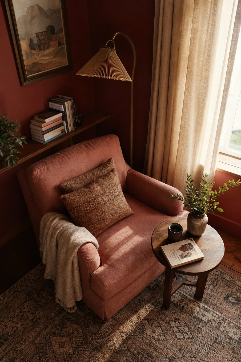
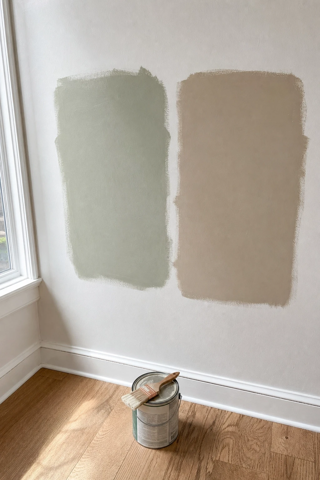
Paint is one of the most affordable ways to change a room, but it is also one of the most commonly regretted decisions in home decor. The reason is almost always the same: people choose a color from a small paint chip under store lighting and then apply it across an entire room, only to find it looks completely different at home. Natural light, the direction your windows face, the time of day, and the other colors already in the room all affect how a paint color reads.
The fix is simple: buy sample pots and paint at least two large swatches on different walls before you commit. Live with them for a few days, look at them in morning light and evening lamplight, and see how they interact with your floors and furniture. What reads as a soft blush in the morning might look almost orange by evening under warm bulbs.
If you are working with a bold color, consider painting just one wall first. An accent wall is a lower-commitment way to introduce drama, and it gives you a feel for the color without having it surround you on all four sides.
Designer Advice: Always test paint in the actual room it will go in, not in a hallway or on a piece of cardboard. The light in each room is unique.
3. Layer Your Lighting Instead of Relying on One Overhead Source
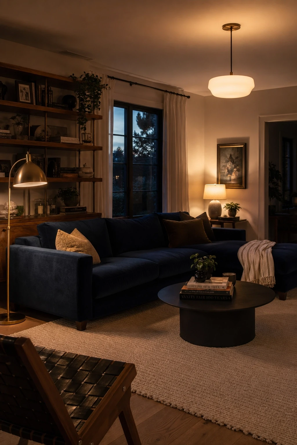
Overhead lighting is the most common mistake in home decor, and it is the quickest fix once you understand the problem. A single ceiling light floods a room with flat, even illumination that kills atmosphere and makes every corner look the same. Real interior design uses at least three layers of light: ambient (general overhead or recessed light), task (focused light for reading or cooking), and accent (decorative sources like table lamps, floor lamps, and wall sconces).
In a living room, this might look like a ceiling fixture for general light, a floor lamp next to the sofa for reading, and a couple of table lamps that cast a warm glow in the evenings. In a bedroom, you might skip the overhead entirely after dark and rely on bedside lamps and a dimmer on the ceiling light for winding down.
Warm bulbs with a color temperature around 2700K work best for living spaces. Save cooler, brighter bulbs for task-heavy areas like the kitchen or home office. Dimmers are one of the most worthwhile investments you can make, and they are easy to install on most existing fixtures.
Designer Advice: Add at least one plug-in wall sconce or an extra floor lamp to a room that currently only has overhead lighting. The difference in atmosphere is immediately noticeable.
4. Use Mirrors to Borrow Light and Add Depth
Mirrors are one of the most useful tools in interior design, especially in smaller spaces or rooms that do not get much natural light. A well-placed mirror can make a room feel twice the size, bounce light into dark corners, and add a sense of depth that no amount of rearranging furniture can replicate on its own.
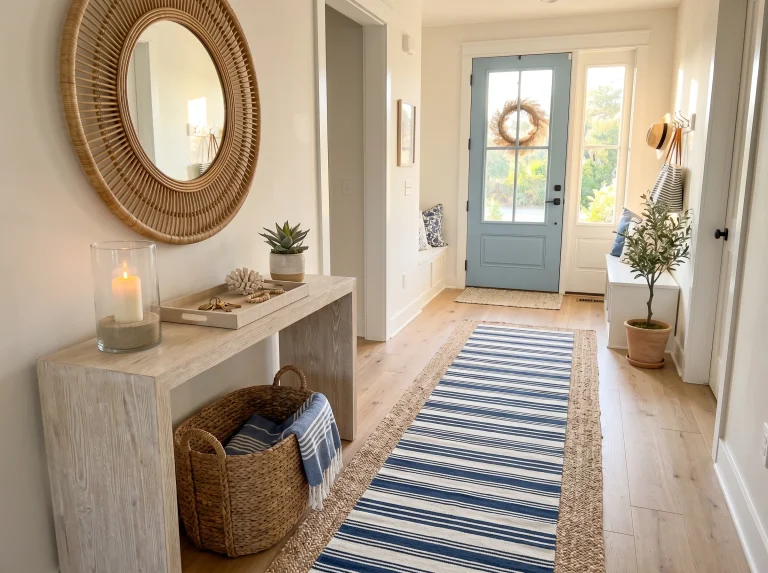
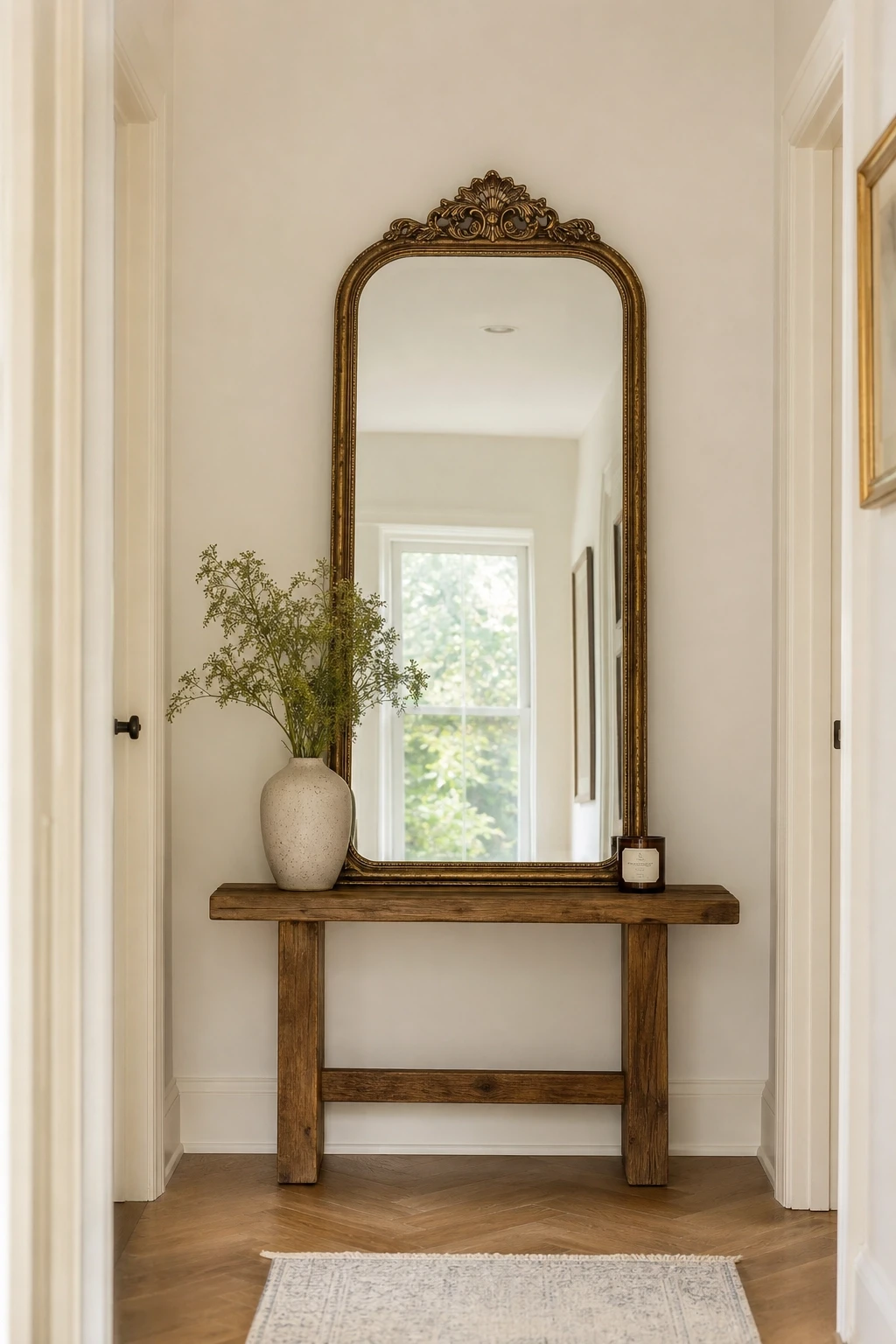
The key is placement. Hang a mirror across from a window to reflect natural light back into the room. In a narrow hallway, a tall mirror on one wall opens up the space visually. In a dining room, a large mirror behind a console or sideboard adds a classic, layered look that interior designers use constantly.
Beyond function, mirrors are also decorative objects. A vintage-framed mirror above a fireplace, a cluster of small round mirrors on a gallery wall, or an oversized leaning mirror in a bedroom corner all add personality and visual interest. Shop thrift stores and antique markets for unusual frames at a fraction of retail prices.
Designer Advice: When hanging a mirror, think about what it will reflect. A mirror that faces a beautiful window view or a well-decorated wall multiplies that beauty. A mirror that faces a blank wall or a cluttered corner just amplifies the problem.
5. Do Not Fear Dark Colors in Small Rooms
One of the most persistent myths in interior design is that small rooms should always be painted white or light colors to make them feel bigger. In reality, dark colors used correctly can make a small room feel cozy, intimate, and intentional rather than cramped and overlooked. The key is choosing the right dark shade and making sure the room has enough light sources to balance the depth of the color.
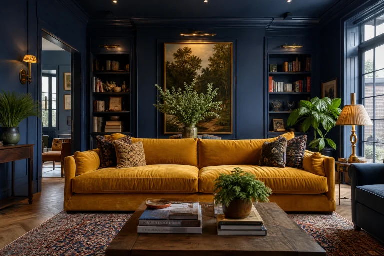
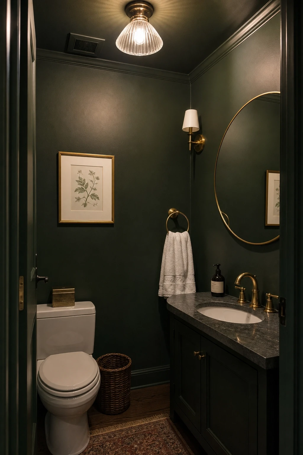
Deep navy, forest green, charcoal, and warm chocolate brown can all work beautifully in small spaces like bathrooms, reading nooks, home offices, or dining rooms. The trick is to keep the trim, ceiling, and any built-ins in the same dark color family rather than creating contrast with bright white. When you wrap a room in a single dark color, it stops looking small and starts feeling enveloping.
Add plenty of warm lighting, reflective surfaces like mirrors or metallic accessories, and a few lighter textiles to keep the room from feeling heavy. A dark green bathroom with brass fixtures and white towels, for example, looks far more sophisticated than the same bathroom painted beige.
Designer Advice: If you are nervous about going dark on all four walls, start with the ceiling. A dark ceiling in an otherwise light room adds drama and draws the eye upward in a really unexpected way.
Furniture and Layout: How to Make a Room Work
6. Always Measure Before You Buy
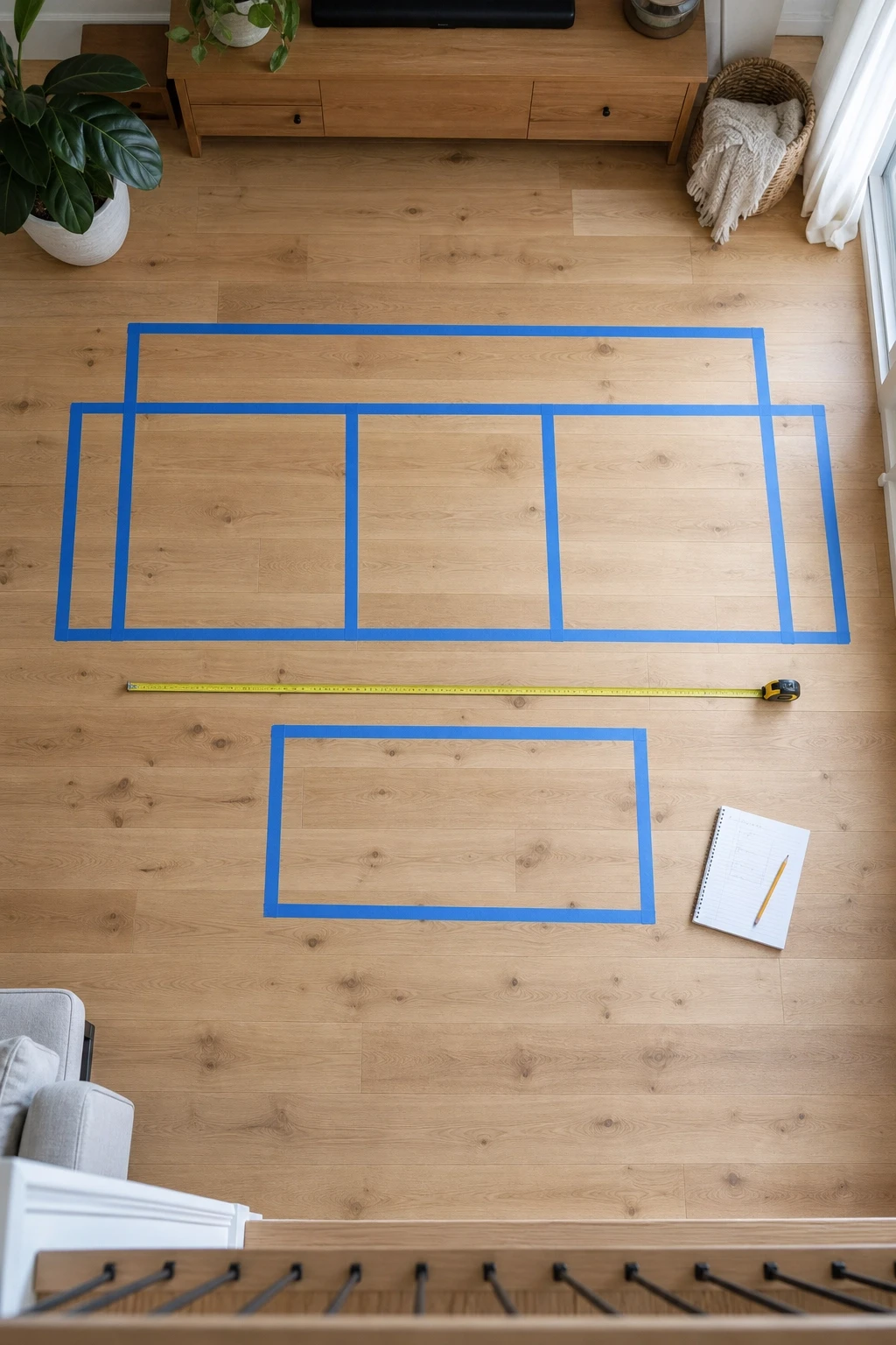
This sounds so obvious that it barely seems worth mentioning, and yet it is one of the most common reasons rooms end up feeling off. A sofa that seemed like a reasonable size in a showroom can completely overpower a small living room. A dining table that looked proportionate in a catalog can block traffic flow and make the room feel impossible to move through. Measuring is not optional; it is the foundation of good layout.
Before buying any major piece of furniture, measure your room carefully and mark out the footprint of the piece using painter’s tape on the floor. Walk around it, sit in front of where the sofa would go, open nearby doors, and check that pathways stay clear. Interior designers typically aim for at least 30 to 36 inches of clearance for main walking paths and 18 inches between a coffee table and sofa.
Also measure doorways, stairwells, and any tight corners the furniture needs to pass through on the way to its final spot. More than a few people have bought beautiful pieces they could not get into their homes.
Designer Advice: Keep a small notebook or phone note with the key measurements of every room. Having them on hand makes shopping far less stressful, whether you are in a store or browsing online.
7. Pull Furniture Away from the Walls
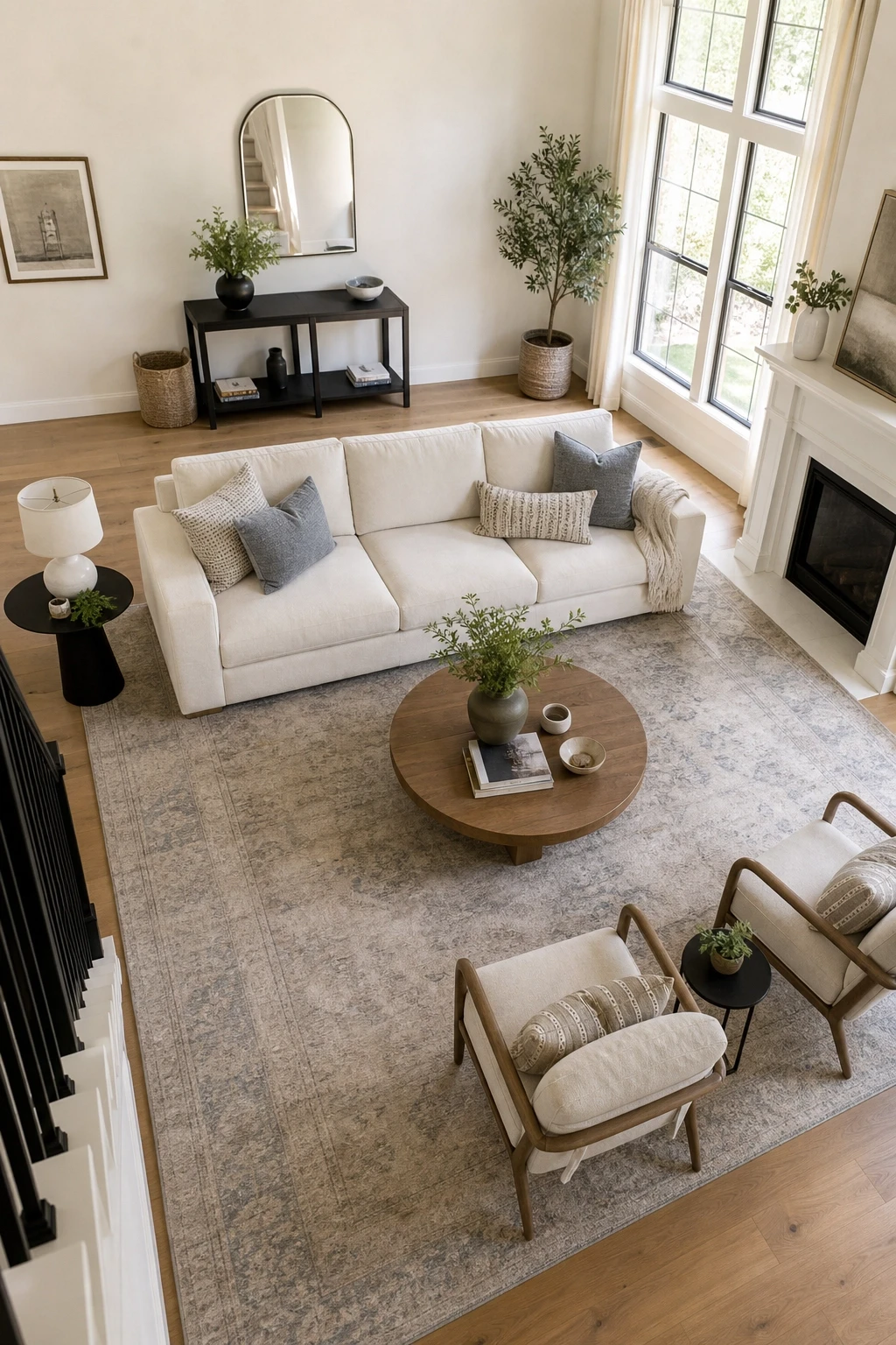
Pushing all the furniture against the walls is the most common layout mistake in living rooms. It feels logical because it seems to maximize floor space, but what it actually does is create a disconnected, cold arrangement where every piece feels isolated from the others. The space in the center of the room becomes an awkward void, and the room ends up feeling less like a place to live in and more like a waiting room.
Instead, pull furniture toward the center of the room and group it around a focal point. In a living room, that might be a fireplace, a television, or a large window. Position the sofa and chairs so they face each other or the focal point, with the coffee table within easy reach. Leave a few inches between the sofa and the wall behind it; that small gap makes a surprisingly big difference.
In a bedroom, the bed does not need to be pushed against the wall unless space is genuinely too tight. Centering a bed on the main wall with matching nightstands on either side creates a more balanced, hotel-like look that feels intentional rather than squeezed in.
Designer Advice: If a room feels cold or disconnected, try floating the furniture group before making any purchases. Rearranging costs nothing and often solves the problem immediately.
8. Choose a Focal Point for Every Room
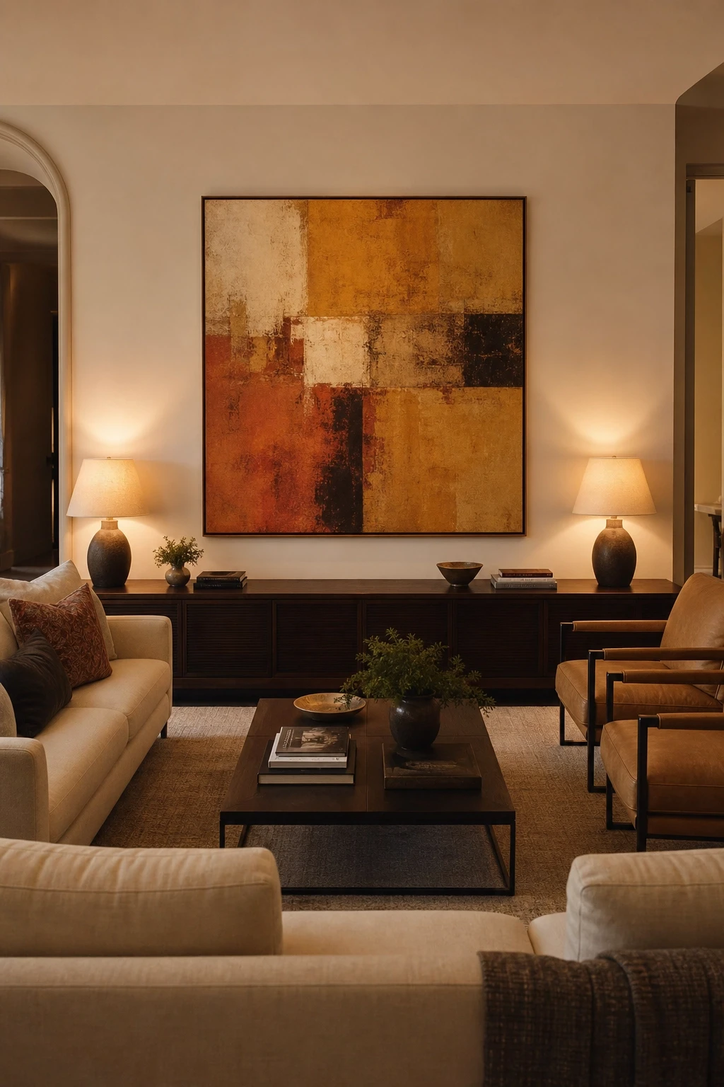
Every well-designed room has one thing that draws the eye first. It is the anchor the rest of the room is arranged around, and without it, a space tends to feel directionless, like there is nowhere to land visually. In some rooms, the focal point is already built in: a fireplace, a large window with a great view, or an architectural feature like a built-in bookcase. In others, you need to create one.
A large piece of artwork is one of the easiest ways to establish a focal point. So is a statement piece of furniture, like a bold-colored sofa, a canopy bed, or a distinctive dining table. A gallery wall, a dramatic light fixture, or even a beautifully styled shelf can all serve the same function depending on the room.
Once you have your focal point, arrange the rest of the room to support it rather than compete with it. Keep other decorative elements quieter so the focal point can do its job. A room with one strong visual anchor always feels more intentional and pulled together than a room where everything is trying to be the star at once.
Designer Advice: Stand in the doorway of a room and notice where your eyes go first. If the answer is nowhere in particular, the room needs a focal point.
9. Get the Rug Size Right
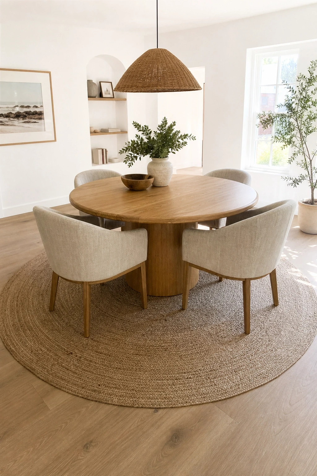
Wrong rug size is one of the most consistent problems in decorated rooms, and it is easy to spot once you know what to look for. A rug that is too small makes furniture look like it is floating on an island of bare floor, which breaks up the room visually and makes the whole space feel disjointed. The general rule is that a rug should be large enough for at least the front legs of every major piece of seating to rest on it.
In a living room, the ideal size is usually large enough for all four legs of the sofa and chairs to sit on the rug, or at minimum, the front two legs. In a bedroom, the rug should extend at least 18 to 24 inches beyond each side of the bed so your feet land on something soft when you get up. In a dining room, the rug needs to be large enough that chairs stay on the rug even when pulled out from the table.
When in doubt, go bigger. A slightly too-large rug always looks more intentional than a rug that is too small. Use painter’s tape on the floor to visualize the size before ordering.
Designer Advice: The most commonly purchased rug sizes, 5×8 and 6×9, are almost always too small for living rooms. In most standard living rooms, you need at least an 8×10, and often a 9×12.
10. Mix Furniture Styles and Eras
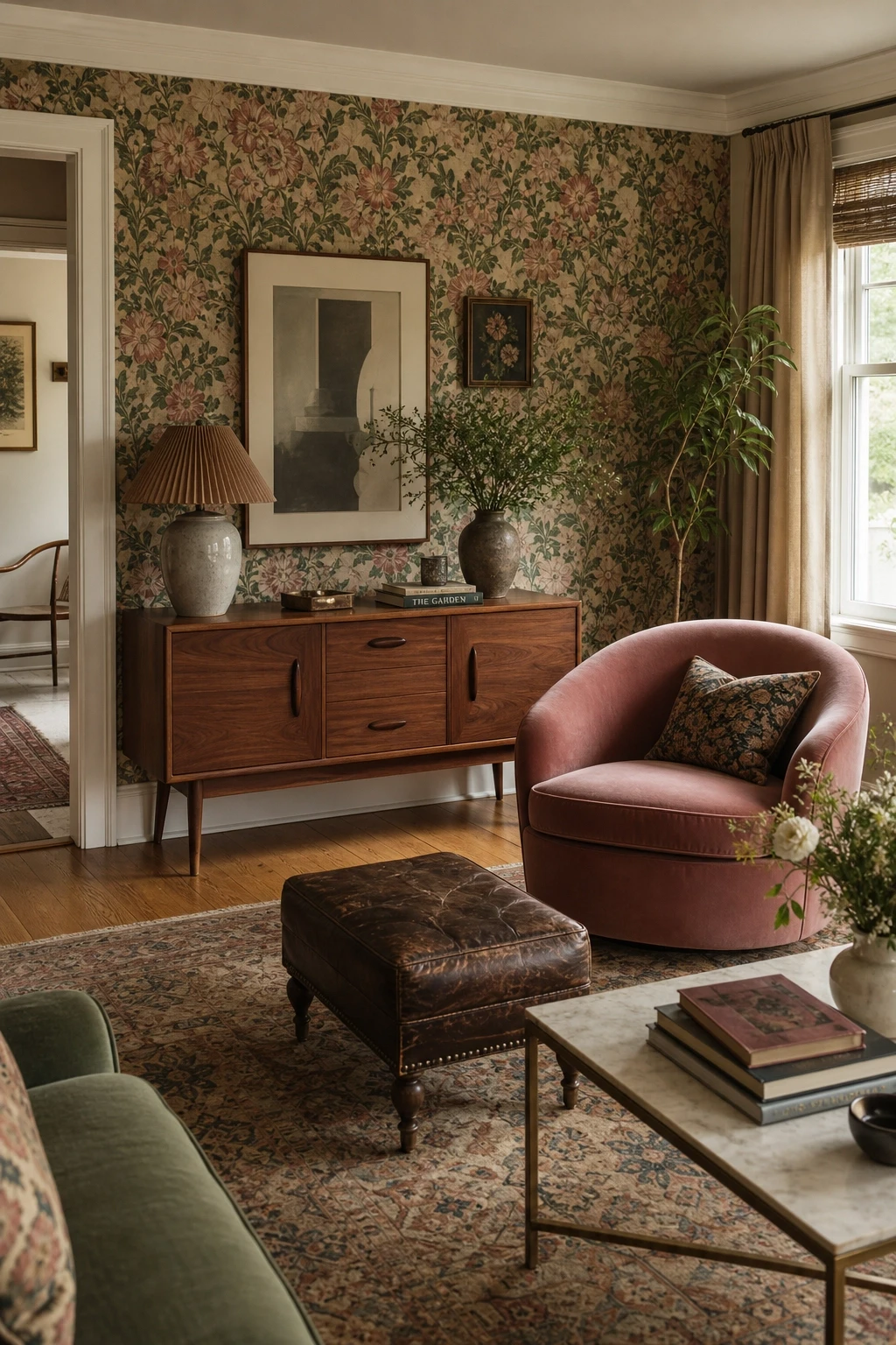
One of the hallmarks of a room that looks professionally designed is that not everything in it matches perfectly. Rooms where every piece came from the same collection or the same era tend to look flat, like a showroom display rather than a home. The most interesting spaces mix furniture from different periods and styles, which creates visual contrast and makes a room feel layered and personal.
A mid-century modern sideboard looks fantastic against a traditional wallpaper. A rustic farmhouse table pairs beautifully with sleek contemporary chairs. A vintage leather armchair in a mostly minimalist room adds character that no catalog item can replicate. The key is finding a common thread that ties the pieces together, whether that is a shared color palette, a recurring material like wood or brass, or a consistent level of visual weight.
Thrift stores, antique markets, and online resale platforms are excellent sources for older pieces that add depth to a room without the price tag of buying everything new. One genuine vintage find can do more for a room than five matching items from a big-box store.
Designer Advice: Aim for at least one piece in every room that has some age or history to it. That contrast between old and new is what makes a space feel collected and alive.
Texture and Layering: Depth Without Clutter
11. Layer Textiles to Add Warmth and Dimension
Texture is one of the quietest and most powerful tools in interior design. It is not something most people think about consciously, but it is one of the main reasons some rooms feel warm and inviting while others feel cold and flat even when the colors are identical. Layering different textiles is the most accessible way to add texture to a room, and it works in any style and any budget.
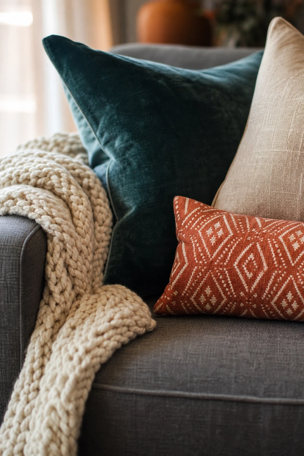
In a living room, this might mean a linen sofa paired with wool throw blankets, velvet cushions, and a jute rug. Each material catches the light differently, creates different tactile experiences, and adds visual complexity without adding clutter. In a bedroom, layer a cotton duvet with a linen throw, a knit blanket folded at the foot of the bed, and a variety of pillow textures.
Avoid using more than three or four different textures at once, or things can start to feel chaotic. The goal is variety within a cohesive palette. Stick to your color scheme and let the textures do the work of adding interest.
Designer Advice: A quick way to add texture to any room without spending much money is to swap out your throw pillows. Go from plain cotton covers to something with a raised weave, a velvet finish, or a woven pattern, and the whole room will feel richer.
12. Do Not Underestimate the Power of Curtains
Curtains are one of those elements that get overlooked in many home decorating projects, but they have an outsized impact on how a room feels. The right curtains make a room feel tall, finished, and put-together. The wrong curtains, or worse, no curtains at all, make even a beautifully furnished room feel bare and unfinished.
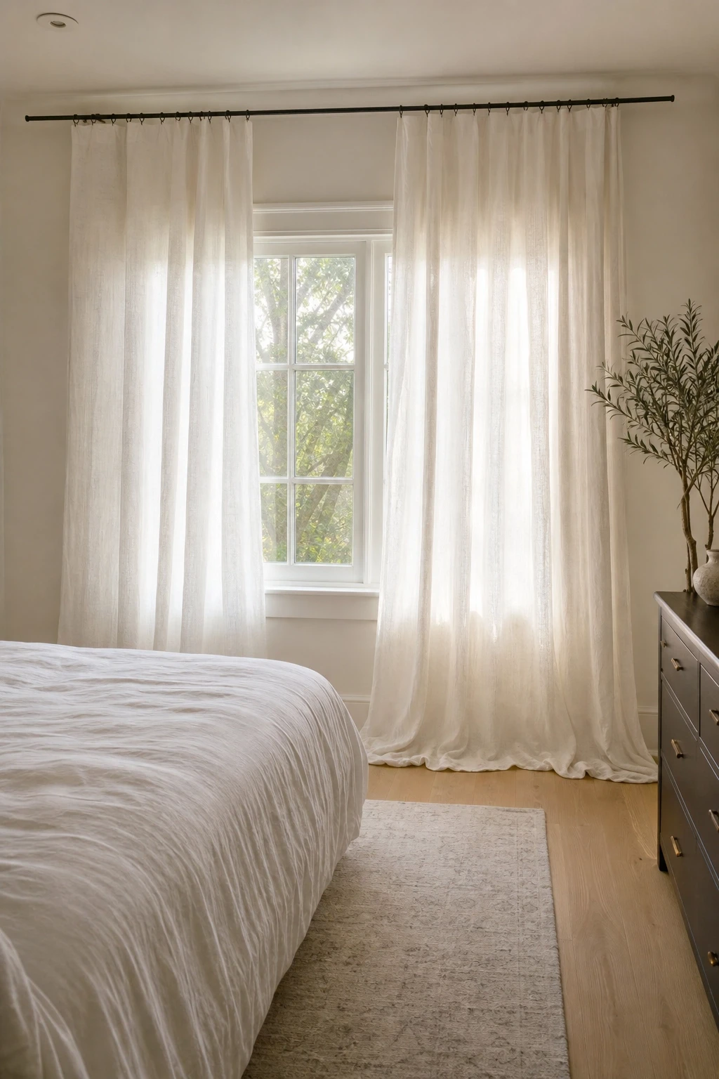
The most important rule with curtains is to hang them high and wide. Mount the curtain rod as close to the ceiling as possible, not just above the window frame, and extend the rod at least 6 to 12 inches beyond the window on each side. This makes the window look larger, the ceiling look higher, and the room look more polished. It is a technique used in almost every professionally decorated room.
For fabric, linen and linen-look fabrics are versatile choices that work in casual and formal rooms alike. If you want warmth and a bit of luxury, velvet curtains in a deep color are incredibly effective. Blackout lining is worth adding in bedrooms, and it does not have to be visible from the front of the curtain.
Designer Advice: Curtains that puddle slightly on the floor look more luxurious than curtains that stop just above it. Buy curtains slightly longer than you need and let them break gently on the floor for an effortless, tailored look.
13. Bring in Natural Materials for an Organic Feel
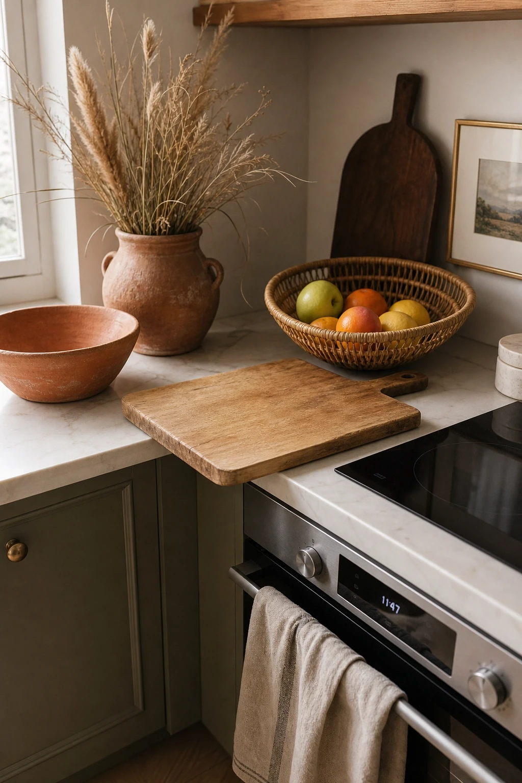
Spaces that incorporate natural materials, wood, stone, rattan, linen, jute, clay, and leather, consistently feel warmer and more grounded than spaces that rely entirely on synthetic materials. There is a reason biophilic design has become such a dominant trend: human beings are drawn to the textures, colors, and imperfections found in natural materials. They make a space feel alive in a way that perfectly polished surfaces simply do not.
You do not need to overhaul your furniture to bring in natural materials. A rattan side table, a jute rug, a terracotta pot, wooden candlestick holders, or a linen tablecloth can all introduce that organic quality without requiring a large investment. Look for pieces with visible grain, natural variation, and an imperfect quality that signals these are real materials rather than imitations.
Natural materials also tend to age well. A solid oak coffee table develops character over time. A leather sofa becomes richer with use. Linen softens beautifully with every wash. Choosing natural materials is often a smarter long-term investment than cheaper synthetic alternatives that look tired after a few years.
Designer Advice: When mixing natural materials, vary the scale and texture. Pair a chunky jute rug with a smooth wood surface and a rough terracotta pot. The contrast between fine and coarse textures is what makes the combination interesting.
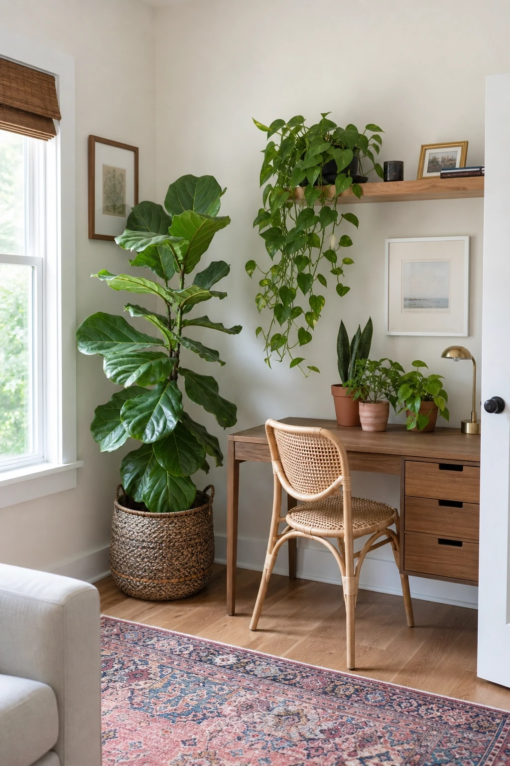
14. Use Plants as Decor, Not Just as Afterthoughts
Plants have become a staple of interior design for good reason. They add color, texture, and life to a room in a way that no inanimate object can replicate. A room with well-placed plants feels more vibrant, more personal, and more connected to the natural world. The key word, though, is well-placed. A single sad succulent on a windowsill does not have the same impact as a thoughtfully arranged collection of plants in varied sizes and pots.
Think about plants as design elements rather than afterthoughts. A large fiddle leaf fig in a corner can fill vertical space the way a floor lamp does. A trailing pothos draped over a shelf edge adds softness to otherwise hard lines. A cluster of smaller plants grouped together on a side table creates a moment of visual interest. Vary the heights, leaf shapes, and pot styles to keep things from looking too uniform.
If you are not naturally good with plants, choose low-maintenance varieties like snake plants, ZZ plants, pothos, or cast iron plants. They tolerate irregular watering, lower light, and general neglect far better than most other houseplants.
Designer Advice: The pot matters as much as the plant. A beautiful plant in a cheap plastic pot looks half-finished. Invest in pots with interesting textures and colors, and the plant instantly becomes a proper decorative object.
15. Layer Rugs for a Collected, Bohemian Look
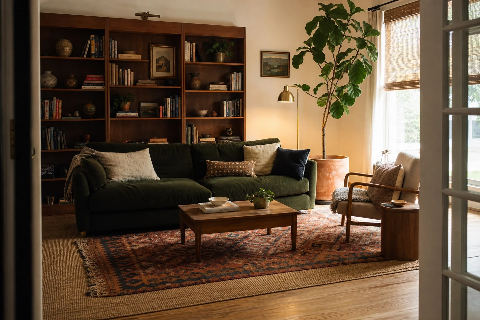
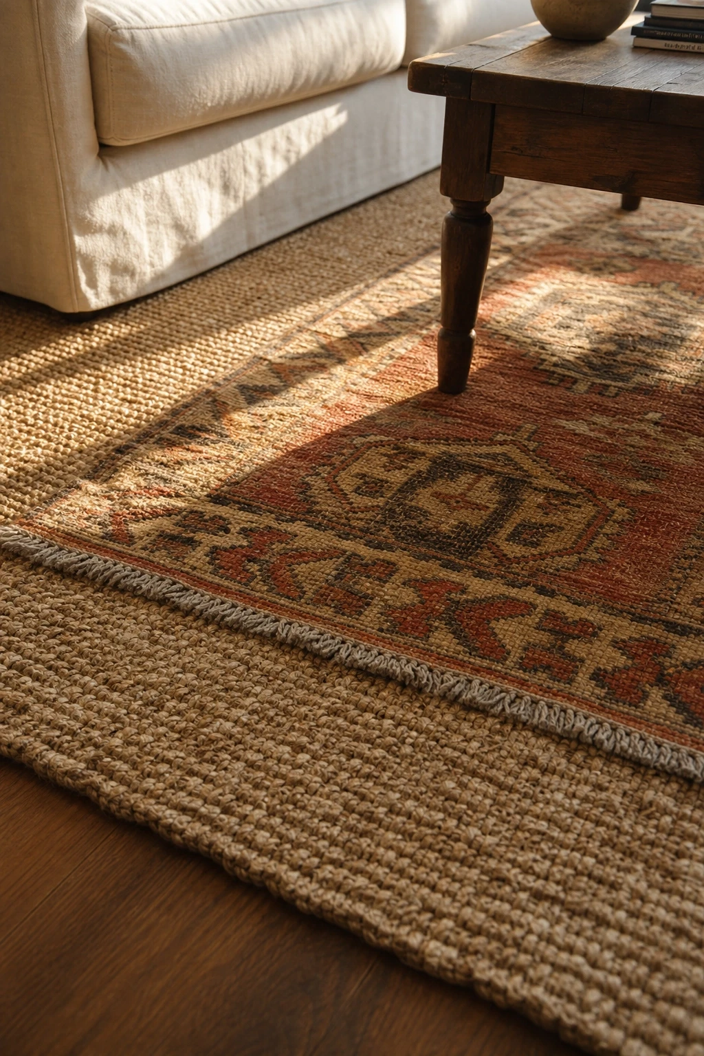
Layering rugs is a technique that has become increasingly popular because it adds depth, pattern, and warmth to a room in a way that a single rug simply cannot. The base layer is typically a larger, neutral rug, a natural fiber like jute or sisal works particularly well, and a smaller, more decorative rug goes on top. The combination creates a lived-in, layered look that feels intentional and visually rich.
This approach also solves a practical problem: natural fiber rugs are affordable and provide great texture, but they can be scratchy underfoot. Layering a softer decorative rug over the top gives you the visual benefit of the natural fiber with the comfort of something softer where you actually walk or sit.
The decorative top rug can be a vintage kilim, a bold geometric print, a Persian-style runner, or anything else with pattern or personality. Position it so it sits centered within the base rug with several inches of the base rug visible on each side. In a living room, center both rugs under the coffee table. In a bedroom, layer a smaller rug at the foot of the bed.
Designer Advice: Layered rugs work best when the two rugs share at least one color. It can be subtle, but that common thread is what makes the combination feel intentional rather than random.
Details and Accessories: The Finishing Touches
16. Hang Art at the Right Height
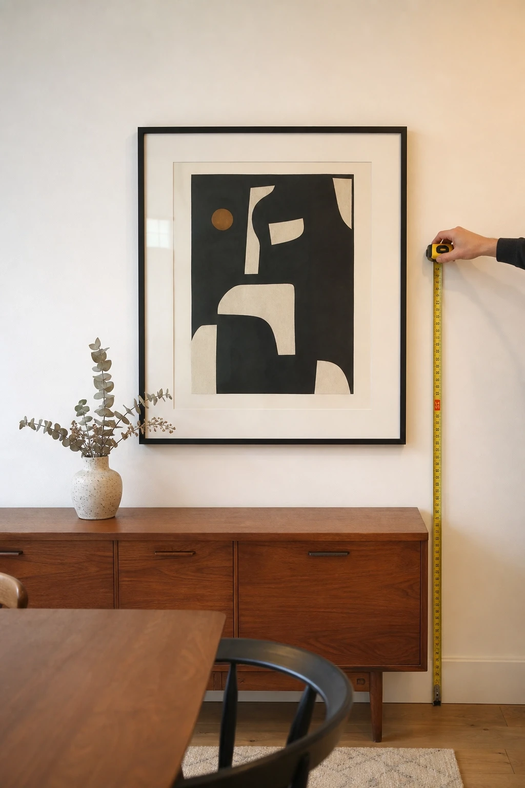
Art hung too high is one of the most common mistakes in home decor, and it makes a room feel disconnected and awkward without most people being able to identify exactly why. The standard rule used by most museums and galleries is to hang art so that its center sits at approximately 57 to 60 inches from the floor, which is roughly eye level for most adults. In a home, this means most people hang art significantly too high.
When hanging art above furniture, the bottom of the frame should sit 6 to 8 inches above the piece it is hanging over. This creates a visual connection between the art and the furniture below it. Art hung too high floats up toward the ceiling and loses its relationship with the rest of the room.
For a gallery wall, lay out all the pieces on the floor first and figure out your arrangement before anything goes on the wall. Take a photo of the layout, then transfer it to the wall, starting with the center piece and working outward. Use picture-hanging strips for lighter pieces if you want to avoid putting too many holes in the wall.
Designer Advice: Step back and look at your art from across the room, not just while you are standing close to it. Art should read well from the full width of the room, not just from a few feet away.
17. Edit Your Accessories Ruthlessly
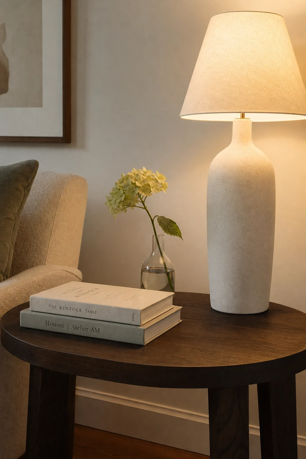
More is not always better when it comes to decorative accessories. A room full of objects competes with itself for attention, and the effect is visual noise rather than visual interest. The best-decorated rooms have a clear sense of restraint, where every object has been chosen intentionally and placed with care. Editing your accessories is not about getting rid of things you love; it is about making sure what is on display can actually be seen and appreciated.
A useful exercise is to clear everything off a surface entirely and then add pieces back one at a time, stopping when the arrangement feels complete. Most people add back fewer items than they started with, and the surface immediately looks better. Group objects in odd numbers, typically threes, and vary heights within each group to create visual rhythm.
Rotate accessories seasonally rather than keeping the same objects on display all year. This keeps your space feeling fresh without requiring new purchases, and it gives you the pleasure of putting out things you love without the guilt of storing others.
Designer Advice: If you would not display it in a store you admire, it probably does not need to be on display in your home. The bar for what makes it onto a surface should be high.
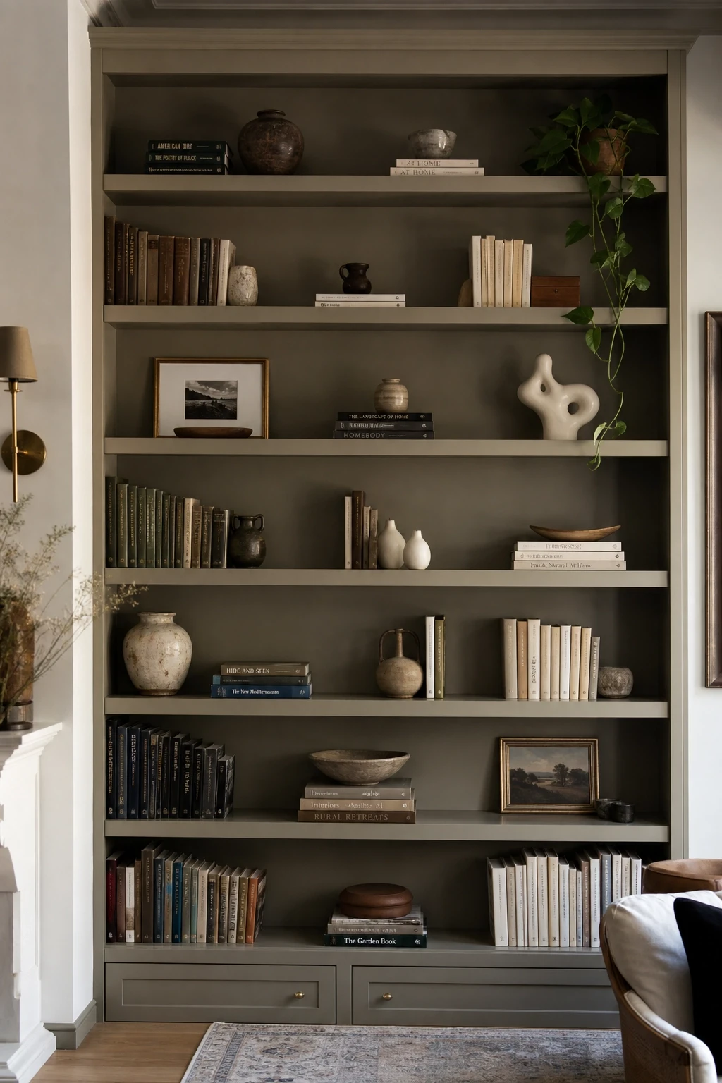
18. Style Shelves Like a Visual Story
Shelves are one of the most visible displays in a home, and they tend to be either over-stuffed with books and random objects or too sparse and empty to have any personality. The goal is a middle ground: shelves that feel curated and intentional, where books, objects, and empty space all work together to create a pleasing arrangement.
Mix books with objects at varying heights. Use a few books stacked horizontally as a platform to raise a small sculpture or a plant. Leave some breathing room between groupings so the eye has a place to rest. A shelf that is full from edge to edge with no gaps or variation reads as cluttered even when everything on it is beautiful.
Think about the color palette of your shelves too. If you want a cleaner look, remove book jackets from hardcovers to reveal the neutral cloth covers underneath. Group books by color for a more styled, editorial appearance. Add one or two larger objects that anchor the shelf, a piece of pottery, a framed photo, a sculptural object, and build smaller groupings around them.
Designer Advice: Step back about 10 feet from your shelves and squint slightly. If the overall pattern looks balanced and varied, you are on the right track. If one area looks heavy or cluttered, something needs to move.
19. Invest in Good Hardware and Fixtures
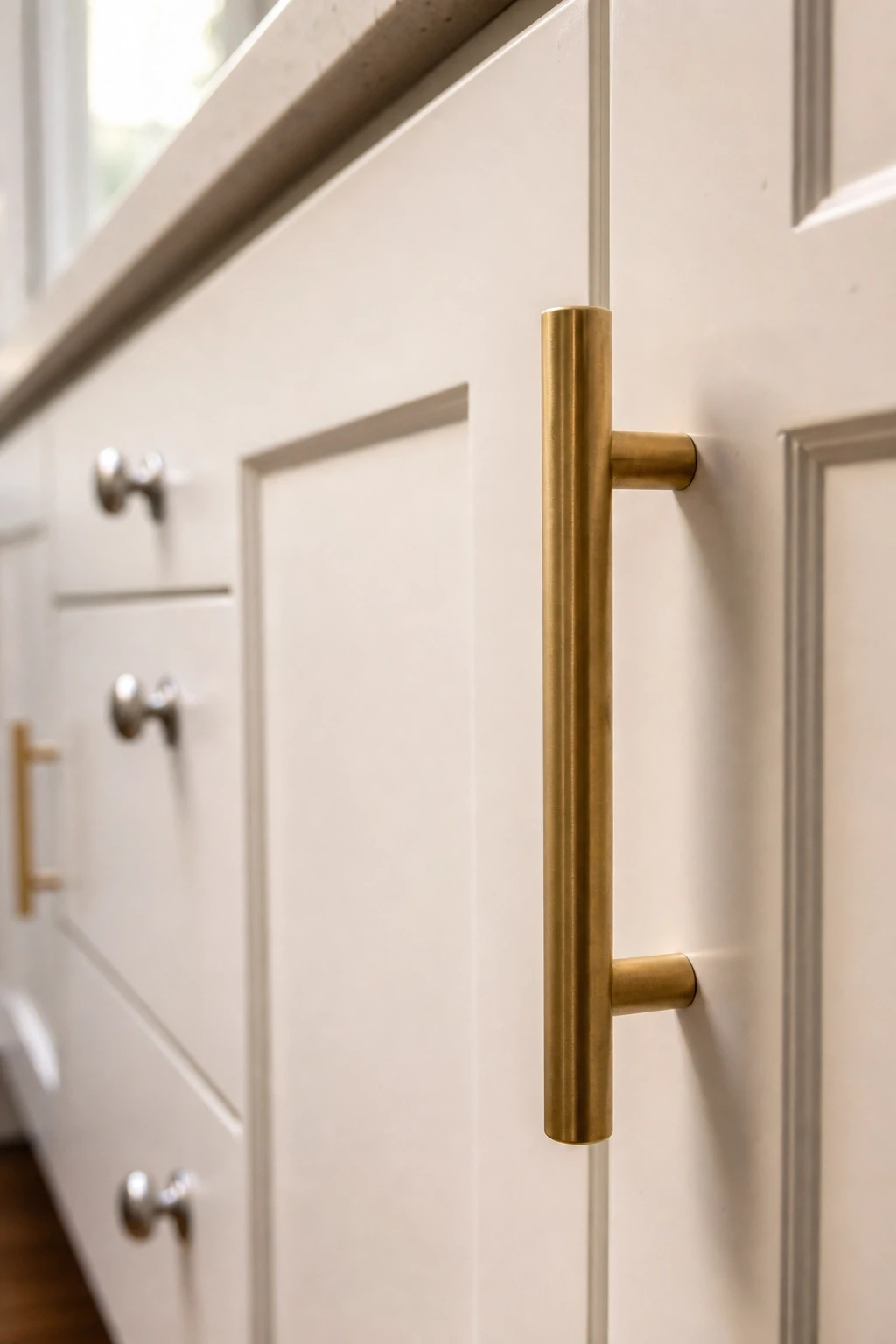
Hardware is one of those invisible details that quietly separates a refined room from a generic one. Cabinet handles, drawer pulls, light switch plates, door knobs, and curtain rod finials are all hardware, and upgrading them is one of the most cost-effective ways to make a kitchen, bathroom, or bedroom feel more elevated without touching the big-ticket items.
Swapping out builder-grade chrome knobs for matte black pulls, antique brass handles, or unlacquered brass hardware can completely change the character of a kitchen or bathroom cabinet. The work takes an afternoon and the cost is a fraction of what a full renovation would run. The visual impact, however, is significant, and it is often one of the first things people notice without being able to pinpoint exactly why the room looks better.
Choose a metal finish and stick with it across a room. Mixing brass drawer pulls with chrome faucets and nickel light fixtures creates visual clutter. Picking one metal and repeating it in hardware, fixtures, and accessories creates cohesion and makes the room look designed rather than assembled.
Designer Advice: If your budget only allows for one upgrade in a room, make it the hardware. It is the cheapest way to make the biggest visual difference in a kitchen or bathroom.
20. Create Cohesion with a Repeated Color
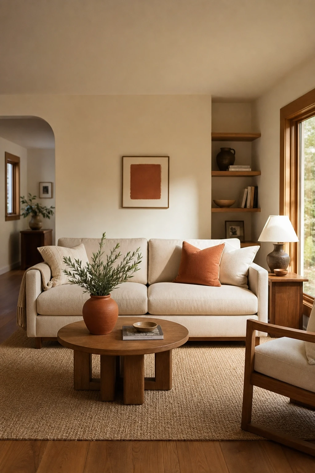
One of the simplest tricks professional designers use is repeating a color at least three times throughout a room. This might be as subtle as the same terracotta appearing in a throw pillow, a ceramic vase, and a small piece of art. Or it could be as deliberate as a navy that shows up in the curtains, a patterned rug, and a set of books on the shelves. The repetition creates cohesion, making the room feel like it was designed rather than decorated.
This principle works especially well with accent colors and is a reliable fix when a room feels disjointed. If something feels off but you cannot identify what it is, look at whether your accent color appears in at least two or three places throughout the space. If it only appears once, it reads as a mistake rather than a choice.
You do not need to add new objects to achieve this. Often, you can move things around to create the repetition you need. Move a pillow from one sofa to an accent chair. Bring a small plant pot into a room where that color already appears. Swap a lamp shade for one in the accent color.
Designer Advice: Hold a piece of the accent color in your hand and walk around the room looking for where it already appears naturally. That tells you where to add or subtract to create better balance.
Practical and Smart Habits: Designing With Intention
21. Declutter Before You Decorate
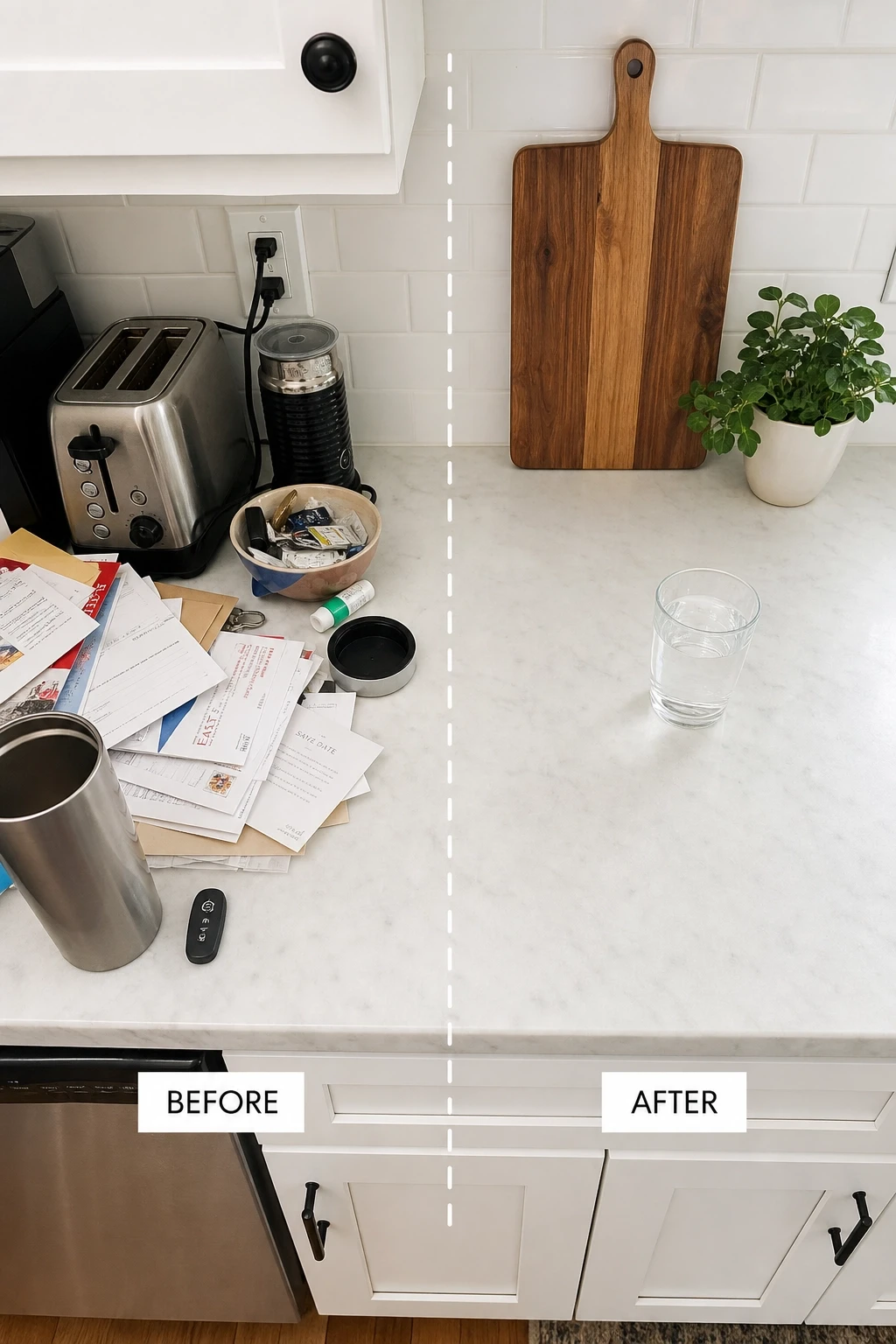
No amount of styling can compensate for clutter. This is one of the most fundamental truths in interior design, and it is one that gets skipped constantly in the rush to make a space look better. Before you buy anything new, rearrange furniture, or start thinking about color palettes, go through what you currently have and remove what does not belong.
Clutter makes rooms feel smaller, darker, and more stressful than they actually are. Clearing it creates an immediate visual improvement that costs nothing. It also forces you to see the room more clearly, so you can identify what is actually missing rather than layering new things on top of an already crowded space.
Be honest about what you use, what you love, and what you simply have not dealt with. Items that have not been used in a year are fair game for donation or resale. A well-edited room with fewer things that are all genuinely chosen will always look better than a crowded room full of purchases that have never quite found a home.
Designer Advice: Before adding anything to a room, ask yourself what you would need to remove to make space for it. If you cannot answer that question, you probably do not need the new item yet.
22. Design for How You Actually Live
One of the most common interior design mistakes is designing for a life you wish you had rather than the one you actually live. The immaculate all-white living room sounds lovely until you have children, pets, or simply enjoy takeout on the sofa on Friday nights. The formal dining room with delicate chairs looks beautiful in photos but gets used twice a year. Designing around reality rather than aspiration creates homes that are both beautiful and genuinely livable.
Think about how each room is actually used on a daily basis. If your family spends most of their time in the kitchen, that is where the design energy should go. If you work from home, your office setup matters more than a perfectly decorated guest room. If you love hosting gatherings, invest in a dining area that seats people comfortably and is easy to clean.
Practical choices are not a compromise on style. A performance fabric sofa in a deep color can look just as good as a light linen one while being infinitely more practical for real life. A coffee table with storage serves double duty without sacrificing looks. Good design solves real problems while also looking beautiful.
Designer Advice: Spend a week noting how you actually move through and use your home. The patterns you notice will tell you where the design is working and where it needs attention.
23. Use Vertical Space Intentionally
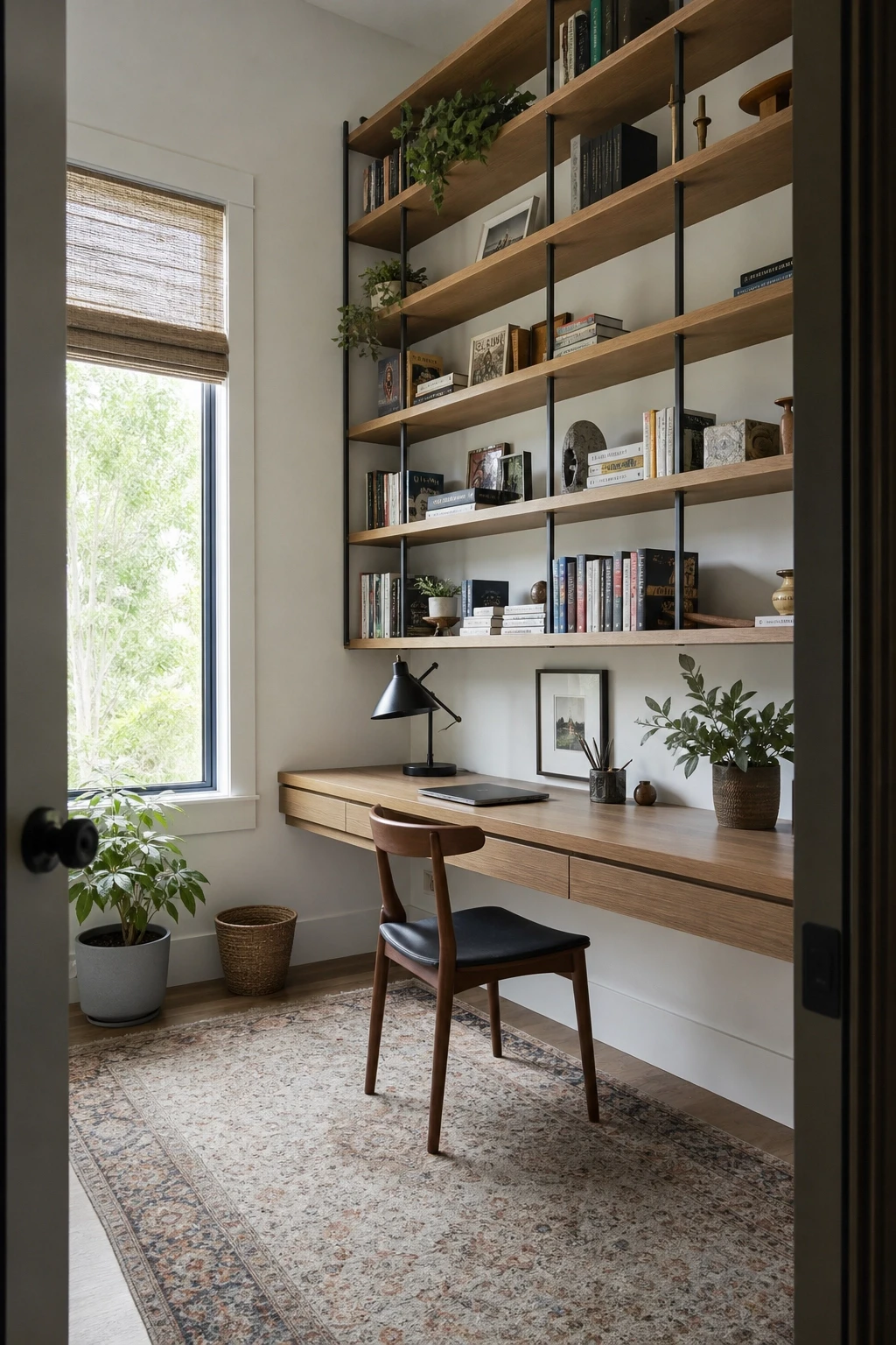
Most people decorate from the waist up and completely ignore the space between their furniture and the ceiling. In rooms with limited floor space, vertical surfaces are some of the most valuable real estate in the home, and using them well creates storage, visual interest, and the impression of height all at once.
Tall bookshelves that reach close to the ceiling are one of the best investments in a small room. They create storage without consuming floor area, and they draw the eye upward, which makes ceilings feel higher. In a small bedroom, a tall wardrobe is almost always a better choice than a wider, shorter one. In a kitchen, cabinets that go all the way to the ceiling rather than stopping short maximize storage and eliminate the awkward space above where grease and dust collect.
Wall-mounted shelves, pegboards in offices or kitchens, floating nightstands in bedrooms, and hooks in entryways are all ways to use vertical space without buying more furniture. Plants on high shelves with trailing stems add life to otherwise empty upper wall space.
Designer Advice: Look at the space between your tallest furniture and the ceiling in each room. If that space is significant, you are leaving storage and decorating potential on the table.
24. Keep a Design File of Things You Love
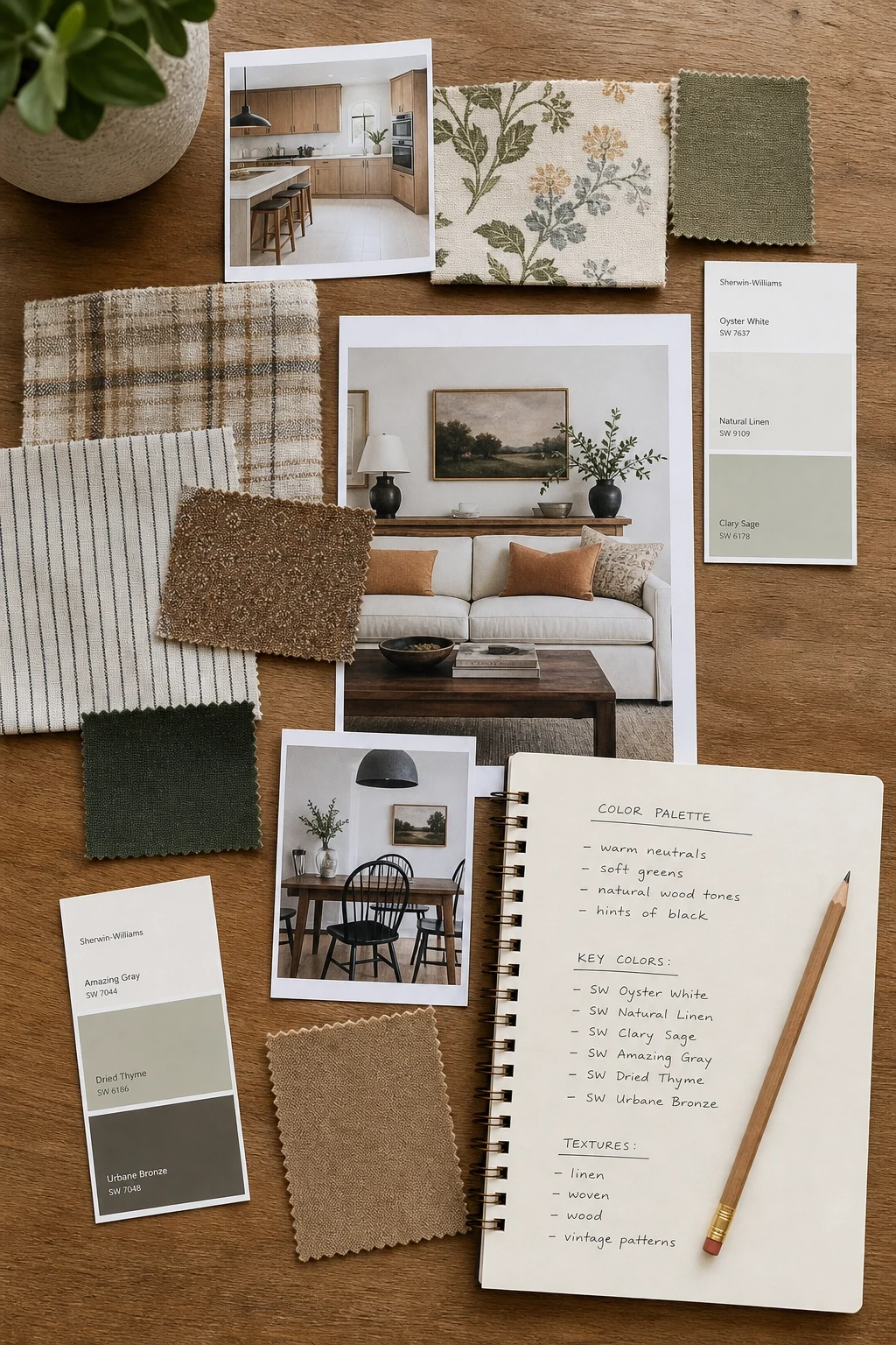
One of the most practical habits you can develop as someone who cares about their home is keeping a running record of design ideas, images, colors, and objects that genuinely appeal to you. This serves two purposes. First, it helps you identify your actual aesthetic over time, which is often different from what you think it is when you sit down to make a single design decision under pressure. Second, it gives you a reference point when you are shopping or making choices so you can quickly evaluate whether something fits your vision.
A simple folder on your phone for saved images works perfectly. So does a board on a design app, a physical mood board with printed images, or a dedicated folder of screenshots. The format matters less than the habit of consistently saving things that genuinely attract you.
Over time, patterns will emerge. You might realize you are consistently drawn to warm wood tones and deep greens, or to clean lines and ceramic textures. Those patterns are your design language, and recognizing them makes every future decision faster and more confident.
Designer Advice: When you are stuck on a design decision, go back to your file and look at the images that appear most often. The answer to what you should do is usually already in there.
25. Let Your Home Tell Your Story
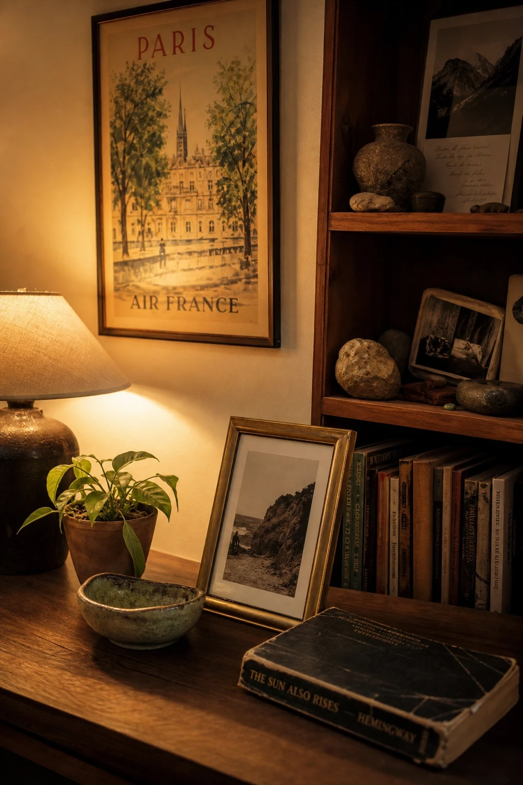
The most memorable and genuinely beautiful homes are the ones that reflect the people who live in them. Collections of objects gathered on travels, books that are actually read, artwork made by people you know, furniture with history and meaning, these are the elements that make a home feel irreplaceable rather than interchangeable. No amount of perfect styling can substitute for genuine personal expression.
Do not be afraid to display things that matter to you even if they do not fit a particular aesthetic. A vintage poster from a concert you loved, your grandmother’s china on open shelving, a collection of rocks your child brought home, a painting from a local artist that spoke to you the first time you saw it. These things are what separate a home from a hotel room.
Professional design principles are tools that help you create a home that works well and looks good. But they are not rules that override your own taste, history, and preferences. Use the guidelines in this article as a framework, then fill that framework with the things, the colors, the textures, and the stories that are genuinely yours.
Designer Advice: Walk through your home and count the things in it that have a story behind them. If that number is low, your home is probably missing its most important design element: you.
Bringing It All Together
Interior design does not have to be complicated, expensive, or reserved for people with a natural gift for it. The principles in this article are learnable, practical, and applicable to any home at any budget. What they all have in common is this: good design starts with intention. Every choice, from the color on the wall to the rug on the floor to the objects on the shelves, should be made deliberately rather than by default.
The most important shift you can make is to stop treating your home as a work in progress that will be sorted out someday and start treating it as a place that deserves your attention right now. You do not need to do everything at once. Pick one tip from this list and apply it this week. Then another the week after. Small, consistent improvements add up quickly, and before long your home will feel genuinely different.
Come back to these principles whenever you make a new purchase, rearrange a room, or simply feel like something is not quite working. They are not rigid rules but reliable starting points, the kind of foundation that frees you to make confident choices and build a home that is genuinely yours.
Frequently Asked Questions
How do I make a small room look bigger without knocking down walls?
Focus on a few key moves: use light-reflective paint or go all-in on a single dark color (which makes a room feel intentional rather than cramped), hang curtains from ceiling to floor and wider than the window, use mirrors to add depth, choose furniture with legs rather than pieces that sit on the floor, and avoid blocking natural light pathways. Getting your rug size right also makes a significant difference in how large a room reads.
What is the best way to start decorating a room from scratch?
Start with the largest investment you cannot easily change: the floor covering, wall color, and main seating piece. Get those right before buying anything else. Choose your anchor color first, then select your rug and sofa in complementary tones. Once those big pieces are in place, layering in lighting, textiles, and accessories becomes much easier because you have a clear foundation to work from.
How do I make my home look more expensive without spending a lot?
The biggest visual upgrades for the smallest investment are usually: upgrading hardware on cabinets and drawers, hanging curtains high and wide, editing accessories so surfaces are less cluttered, adding real plants in good-looking pots, and getting your lighting right by layering sources rather than relying on a single overhead fixture. None of these require major spending, but together they make a significant difference.
How do I mix different furniture styles without it looking chaotic?
The key is finding a common thread. That might be a shared color that runs through all the pieces, a recurring material like wood or brass, or a consistent visual weight (all the pieces feel similarly heavy or light). When mixing styles, also aim to have one dominant style that roughly 60 percent of the room follows, with the mixed pieces acting as accents rather than competing for dominance.
What should I prioritize if I am working with a tight budget?
Focus your budget on the things that will have the most visual impact and that you will live with the longest. A good sofa, a right-sized rug, and quality lighting are usually the best investments in a living room. In a bedroom, a quality bed frame and good window treatments make the biggest difference. Accessories, art, and decorative objects can be added gradually at lower price points, and thrift stores and online resale markets are excellent sources for unique pieces.
How many colors should I use in one room?
Three to four colors is generally a good range for a cohesive room. Follow the 60-30-10 guideline: one dominant color for about 60 percent of the space (walls, large furniture), a secondary color for about 30 percent (rugs, curtains, accent chairs), and a pop color for the remaining 10 percent (cushions, artwork, small accessories). Sticking to this framework prevents rooms from feeling either too bland or too busy.