Tiny Home Layout Ideas That Actually Make Small Spaces Work

Introduction
If you have ever walked into a tiny home and thought, “how does someone actually live here comfortably,” you are not alone. Most people assume that small square footage means constant compromise, but the truth is that a well-planned tiny home can feel just as relaxed, functional, and personal as a much larger house. The secret is not in having more space. It is in knowing exactly how to use what you have.
Tiny home living has grown from a fringe lifestyle choice into a genuine movement, and with good reason. People are choosing smaller footprints for all kinds of reasons, whether that is financial freedom, environmental values, a desire for simplicity, or just a preference for less upkeep. Whatever brings someone to the tiny home world, the one thing everyone agrees on is that layout matters more than anything else. Get the layout wrong and even the prettiest tiny house feels cramped and chaotic. Get it right and you will be surprised how little you actually miss about bigger living.
This guide covers nineteen layout ideas that go beyond the obvious. These are not just tips about using mirrors or painting walls white. These are real, considered approaches to arranging space, defining zones, choosing furniture, and building a home that genuinely works for the way you live. Whether you are designing from scratch, retrofitting a small cottage, converting a structure, or just trying to make your current tiny home feel more intentional, there is something here for every situation and every style.
OPEN-PLAN LAYOUTS THAT DEFINE WITHOUT DIVIDING
1.The Single-Flow Open Plan
The single-flow open plan is probably the most popular starting point for tiny home layout ideas, and that popularity is completely earned. By removing interior walls entirely, you allow the full width and length of the home to read as one connected space. The result is a room that feels significantly larger than its footprint suggests. Natural light moves freely from one end to the other, and there is no sense of being boxed in at any point of the day. The key to making this work is furniture placement. Since you have no walls doing the work of separation, your sofa, kitchen island, and rug placement have to create zones on their own. A low bookshelf running perpendicular to the main axis works beautifully as a living-to-sleeping divider without blocking sightlines. A slightly raised kitchen counter acts as a natural boundary between cooking and lounging without needing a wall or even a door. Colors and textures can reinforce these zones too. A warm terracotta rug under the seating area and a cooler linen runner in the kitchen zone signal two different functions without any hard break. For lighting, pendant lights above the kitchen and a floor lamp in the living corner help define areas even after dark. Sconces mounted on the wall at bed height give the sleeping area its own atmosphere without needing a separate room.
Designer Tip: Use three different pendant light styles throughout the open plan, one in the kitchen, one over a dining spot, and one in the lounge. Varied lighting fixtures act as invisible room dividers and give each zone its own personality.

2.The Rug-Zoned Layout
Rugs are one of the most underused tools in tiny home design, and the rug-zoned layout puts them front and center. The idea is simple. Instead of walls or furniture acting as dividers, rugs of different sizes and textures define each functional zone within a shared open space. A large, low-pile rug in a warm neutral anchors the living zone. A smaller, washable flatweave sits under the dining table. A soft runner beside the bed marks the sleeping area. All three exist within the same open plan but feel like distinct spaces once you are standing inside each one.
The magic of this approach is how low-cost and flexible it is. You can completely redefine the layout of your tiny home simply by moving or replacing the rugs, which is not something you can say about walls or built-in furniture. It also works across nearly every design style. Jute rugs give a relaxed, coastal feel. A patterned Moroccan rug brings warmth and character to a minimalist interior. Matching rugs in the same palette but different textures keep things cohesive without being boring.
Choose rugs that are correctly sized for each zone. A rug that is too small floats awkwardly and makes a space feel unfinished. In the living area, the front legs of your sofa and chairs should sit on the rug. Under the dining table, the rug should be large enough that chairs remain on it even when pulled out.
Designer Tip: Layer a smaller patterned rug over a larger solid one in the lounge zone. This adds visual depth and makes the space feel curated without adding any physical bulk.

3.The Sliding Partition Layout
For people who want the openness of a single-flow plan most of the time but the ability to close off a space when needed, a sliding partition layout is worth serious consideration. Large sliding panels, whether solid wood, frosted glass, paper screens, or fabric-hung frames, can be pushed back completely during the day to open up the full footprint of the home, then drawn across in the evening to create a more enclosed and private sleeping area. This layout works especially well in tiny homes where the bedroom is at the rear or end of the structure. The partition slides along a ceiling-mounted track, which means it takes up no floor space at all. During the day, your home reads as a bright, open living space. At night, you pull the panel across and the bedroom becomes its own quiet retreat with a completely different mood. Wood panels with a natural grain are the most versatile choice because they work with both modern and rustic interiors. Frosted glass panels keep light moving through the home even when closed. If budget is a concern, tension rods with heavyweight linen curtains achieve a similar effect at a fraction of the cost, and they add beautiful softness to the overall design.
Designer Tip: Mount a small recessed shelf at the end of the partition track. When the panel is open, the shelf displays a plant or a few books. When the panel slides closed, it hides away behind it neatly.

VERTICAL LAYOUTS THAT USE HEIGHT OVER FOOTPRINT
4.The Classic Sleeping Loft
The sleeping loft is probably the first layout idea people think of when they picture a tiny home, and there is a reason it has become iconic. By placing the bed above the main living level, you free up the entire ground floor for everything else. The loft itself can be accessed by a ladder, a ship’s staircase with built-in drawers, or a compact set of stairs depending on how much floor space you are willing to give up for the climb. What makes a sleeping loft feel properly designed rather than like an afterthought is the treatment of the space itself. The ceiling above the loft should be high enough for at least comfortable seated sleeping, with around four feet being a comfortable minimum. Adding a small window in the loft wall brings in natural light and ventilation, which makes the upper level feel much less like a storage shelf and much more like a real bedroom. A small reading light, a narrow shelf for a phone and water glass, and a curtain that can be drawn across the loft opening all add up to a space that genuinely feels intentional. Below the loft, the freed-up ground floor can become whatever the home needs most, whether that is a full living room, a home office, a dining area, or some combination of all three. The visual relationship between the loft above and the living space below is also part of what gives these homes their charm.
Designer Tip: Install a thin rail of LED strip lighting along the underside of the loft platform. It provides gentle ambient lighting for the living space below without taking up any room and gives the loft a warm, floating quality at night.

5.The Double-Decker Storage Wall
One of the smartest vertical layout moves you can make in a tiny home is to dedicate one entire wall from floor to ceiling to storage and display. This is not about cramming shelves wherever they fit. It is about designing a full wall unit that handles all of your storage needs in one clean, intentional block, rather than letting storage scatter across multiple pieces of furniture that eat into your floor space. A well-designed storage wall might have deep lower cabinets with doors for everyday items like bedding and kitchen appliances, open mid-level shelves for books, decor, and frequently used items, and upper closed cabinets for seasonal storage. The entire thing runs from corner to corner and floor to ceiling, making it look architectural rather than just functional. When done well, it becomes a design feature in its own right. Colors matter here. Painting the storage wall the same shade as the surrounding walls makes it feel built-in and intentional. Using a contrasting color on just the back panels of the open shelves adds depth and makes whatever you display on them pop visually. Natural wood finishes on the cabinet faces with white or cream painted walls behind is a particularly warm and easy-to-live-with combination.
Designer Tip: Leave a small gap between the top of the upper cabinets and the ceiling, then place soft uplighting inside that gap. The glow at ceiling level draws the eye upward and makes the room feel taller than it actually is.

6.The Mezzanine Office or Study Nook
Not every tiny home needs the sleeping area elevated. Sometimes the better layout idea is to put a home office or study nook up on the mezzanine level and keep the sleeping area below where it is easier to move around at night. This works particularly well for people who work from home and need a dedicated workspace that they can mentally step away from at the end of the workday, even within a very small home. A mezzanine office can be kept quite minimal. A built-in desk along the railing edge, a task light, a small bookshelf on the wall behind, and a comfortable stool or chair are all you really need. The railing itself can double as a display area for plants or photos. The fact that you are elevated above the main living space also creates a useful sense of separation even without a door, which matters when you need to focus. The main floor below becomes entirely domestic, with the living area, kitchen, and sleeping space arranged without any pressure to accommodate a workspace in the mix. This frees up the ground-level layout considerably and means your personal life and professional life each have their own physical territory, which is a real quality-of-life benefit in a small home.
Designer Tip: Use a glass or cable railing on the mezzanine edge instead of a solid wall. It keeps sightlines open, lets light flow between levels, and prevents the upper space from feeling like a separate enclosed box.

MULTI-FUNCTIONAL LAYOUTS FOR EVERYDAY FLEXIBILITY
7.The Murphy Bed Living Room
The Murphy bed has come a long way from the awkward, squeaky contraption of old apartment buildings. Modern wall-bed systems are built into sleek cabinetry, fold down smoothly, and in many cases include integrated shelving, lighting, and even a fold-down desk or sofa that works with the bed in different configurations. In a tiny home, this layout idea effectively turns your living room into your bedroom at night, giving both spaces the full square footage of the room. During the day, the bed is completely hidden behind cabinetry that can look like anything from a built-in bookshelf to a clean-paneled feature wall. A sofa sits in front, the room is open and bright, and there is nothing to suggest that a bed lives inside the wall. At night, the sofa pushes forward or tucks against the side wall, the bed folds down, and in about two minutes the room transforms. This is not a compromise. Done well, it is genuinely a better layout than having a separate bedroom that sits empty most of the day. For materials, choose a cabinet finish that matches the rest of your interior. In a coastal or Scandi-style home, pale oak with white walls reads beautifully. In a more industrial interior, dark walnut with matte black hardware gives it a sophisticated edge. Make sure the mattress that comes with your Murphy system is genuinely comfortable, because too many people cut corners here and end up with a poor night’s sleep.
Designer Tip: Add two swing-arm wall sconces on either side of the Murphy bed position. When the bed is folded up, they look like decorative wall lights on the cabinet panel. When the bed is down, they become perfect reading lights.

8.The Convertible Dining and Work Layout
In a tiny home, the dining table often ends up doubling as a desk, a craft space, a homework station, and a place to fold laundry. Rather than fighting this reality, a convertible dining and work layout leans into it. A wall-mounted fold-down table on a sturdy bracket takes up virtually no space when not in use and can be raised and lowered in seconds. A bench seat with storage inside runs along one wall, and two or three simple stools tuck underneath when not needed. This setup handles dining for two to four people comfortably while also serving as a proper work surface when needed. Because nothing is fixed to the floor except the wall-mounted bracket, the entire area can be cleared completely for yoga, play, or just a more open-feeling living space. The bench seat doubles as extra seating in the living area and storage for items you want accessible but not on display. Choose a table surface in a material that holds up well to daily use. Solid wood is warm and beautiful but needs care. A laminate surface in a wood look gives you durability without maintenance anxiety. A raw-edge wood top with a sturdy powder-coated metal bracket hits a nice balance between character and practicality.
Designer Tip: Mount a pegboard or a magnetic strip above the fold-down table for organizing papers, pens, and small office supplies. It keeps the table surface clear and means the wall does double duty as both support and storage system.

9.The Flexible Zone Layout with Rolling Furniture
One of the most freeing tiny home layout approaches is to build your entire main floor around rolling furniture that can be repositioned quickly and easily. A sofa on lockable casters, a kitchen island on wheels, a rolling cart serving as a sideboard, and a small nesting table set that can be spread out or pushed together all give you a home that adapts to whatever the moment requires. Hosting four people for dinner? Roll the island to the center, pull out the nesting tables, and arrange chairs around. Want a big open floor for movement or stretching? Everything rolls back against the walls. This is not about constantly reorganizing your furniture. Most of the time things stay in their usual spots. The point is that on the occasions when you need the space to behave differently, it can do so without drama or effort. This flexibility is something that most fixed-furniture layouts cannot offer, and it makes the tiny home feel genuinely spacious rather than constantly squeezed. Look for furniture with a low visual profile. Pieces that sit close to the ground, with thin legs or open bases, take up less visual space and keep the room feeling airy. A sofa with tapered wood legs looks much lighter than one that sits flush to the floor. A kitchen island with open shelving below feels more breathable than a solid block unit.
Designer Tip: Choose all rolling furniture in a consistent leg or metal finish, whether that is black, brass, or natural wood. Repeating the same hardware tone across multiple pieces ties the room together visually even when the furniture is in different positions.

KITCHEN AND BATHROOM LAYOUTS WORTH PLANNING CAREFULLY
10.The Galley Kitchen Layout
The galley kitchen is one of the most efficient cooking layouts ever designed, which is exactly why it has been used in boats, trains, and aircraft for over a century. In a tiny home, a well-executed galley kitchen runs along one wall with all of the appliances, storage, and prep space in a single organized line. This keeps the cook in one productive zone without needing to cross a room to reach anything. The key to a great galley kitchen in a small home is storage that goes all the way to the ceiling. Upper cabinets that stop at standard height waste the vertical space above them, which in a tiny home is space you simply cannot afford to leave empty. Extend cabinets to ceiling height and use the upper section for items you reach less frequently. Open shelves above the counter for everyday dishes look beautiful and save the effort of opening cabinet doors constantly. A compact range or two-burner induction top with a drawer microwave below and a deep single-basin sink make the most efficient trio for a tiny home kitchen. Avoid a large double sink because the second basin rarely gets used and eats into prep space. A butcher block counter adds warmth and gives you a dedicated chopping surface without needing a separate cutting board out at all times.
Designer Tip: Use the same tile on both the backsplash and the floor directly in front of the galley kitchen run. This visual connection between vertical and horizontal surfaces makes the kitchen feel like a considered design moment rather than a strip of appliances against a wall.

11.The Wet Room Bathroom Layout
In tiny home bathrooms, every inch is fighting for a purpose, which is why the wet room layout makes so much sense. By removing the shower enclosure entirely and waterproofing the entire bathroom floor and lower walls, you create a bathroom that functions as one continuous space. The shower head points at a corner or along a wall, water drains through a central or corner drain, and there is no glass screen or curtain rod eating into the already limited room. Wet rooms feel surprisingly generous because there is nothing cutting the space in two. A small floating vanity, a wall-hung toilet, and a wall-mounted shower head all share the same open footprint without any of them encroaching on the others. The continuous tile surface from floor to walls also creates a visually unified space that reads as intentional and clean rather than improvised. For materials, large-format tiles work particularly well in wet rooms because they have fewer grout lines, which means less cleaning and a calmer visual field. A herringbone or geometric pattern on the floor in a natural stone look adds character without feeling busy. A rainfall shower head is worth the minor additional plumbing cost because it fits flat against the ceiling and frees up the wall for other fixtures.
Designer Tip: Install a small teak bench or stool in the wet room corner. It is practical for seated showering or resting things while you shower, and teak’s natural water resistance means it looks beautiful even with regular exposure to moisture.

12.The Kitchen-as-Divider Layout
One of the more creative tiny home layout ideas is to position the kitchen not along a wall but as a dividing element between the living area and the sleeping zone. A compact kitchen island or a run of kitchen units with a counter that faces the living space on one side acts as both a cooking area and a room divider, doing two jobs with a single piece of architecture. From the living side, you see a clean counter surface that can serve as a breakfast bar with a couple of stools. From the kitchen side, you have your prep area, your sink, and your cooking appliances. The sleeping zone behind the kitchen gets a degree of separation without any wall needed. It is a surprisingly effective psychological division even in a very small space. The counter height matters here. A standard kitchen counter at around 36 inches is just high enough to visually separate the zones without blocking views across the whole space. If you go for a kitchen island on casters, you gain the added flexibility of repositioning it when you want the home to feel completely open. In terms of finishes, the kitchen-as-divider works best when the counter material and cabinet finish feel consistent with the living area furniture rather than looking purely utilitarian. A butcher block top with a painted cabinet base in the same tone as your living room sofa makes the kitchen feel like a considered part of the whole space rather than a functional insert.
Designer Tip: Add pendant lights above the counter on the living side. Two or three pendants in a warm metal finish make the bar seating feel like a proper dining moment and distinguish the kitchen zone beautifully in the evening.

OUTDOOR EXTENSION LAYOUTS THAT EXPAND THE FOOTPRINT
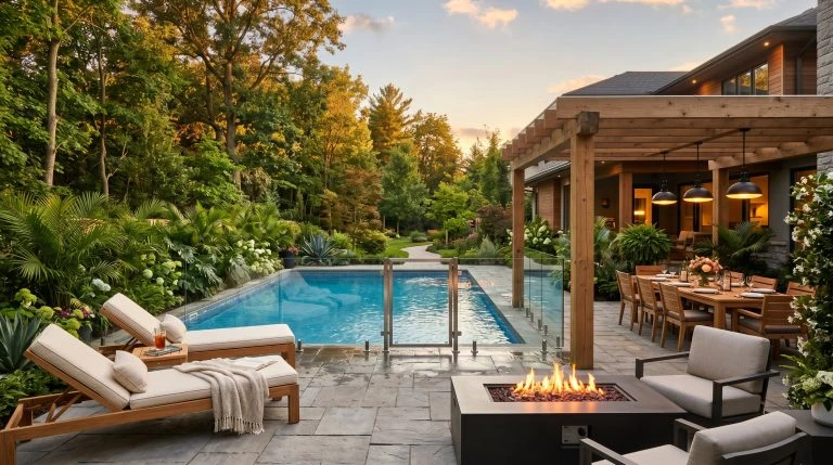
13.The Indoor-Outdoor Flow Layout
One of the most effective ways to make a tiny home feel genuinely spacious is to design the interior layout so that it visually and physically extends into an outdoor area. Large glass doors, a continuous floor material that runs from inside to outside, and furniture that works in both spaces blur the boundary between the interior and the garden, deck, or patio. When those doors are open, the tiny home suddenly has twice the usable space. The layout choice that supports this best is positioning your main living area directly adjacent to the exterior opening. This means the sofa, the coffee table, and the primary seating area have a direct relationship with the outdoor space rather than being separated from it by a kitchen or a hallway. A sliding glass door or a set of bifold doors works better than a standard hinged door because it opens the full width of the wall rather than just a segment. Continue the same flooring material outside where possible, using an outdoor-rated version of the same wood look or large-format tile. A shade sail or a simple pergola above the outdoor area extends the comfort of the space on warm days and makes it genuinely usable as a second living room rather than just a place to put plants.
Designer Tip: Keep a dedicated set of outdoor cushions in a waterproof storage bench right beside the door. This makes it effortless to move from indoor to outdoor living and back, and means the transition happens without any setup time.

14.The Wraparound Deck Layout
For tiny homes that sit on a plot of land rather than a tight urban lot, a wraparound deck layout is one of the most rewarding investments you can make. By wrapping a deck around two or more sides of the home, you effectively add several hundred square feet of living space for a fraction of the cost of interior square footage. The deck becomes the main gathering space in good weather and the indoor layout can be arranged to support and connect with it from multiple points. Different sections of the wraparound deck serve different purposes. One side might be the outdoor dining area with a table and chairs. The other side might be a lounge corner with deep-seated weather-resistant sofas and a small side table. The connection point at the back might have a simple hammock or a pair of low chairs facing a view. Each zone has its own function and its own mood, which gives the tiny home an overall sense of variety and generosity that is hard to achieve from the interior alone. For materials, hardwood decking ages beautifully and stays cool underfoot in hot weather better than some composite options. Cedar and redwood are naturally resistant to rot and insects without needing heavy chemical treatment. A painted or stained railing in a color that complements the exterior of the home ties the deck into the overall design rather than making it feel like an add-on.
Designer Tip: String warm globe lights across the deck ceiling on a weatherproof cable at roughly eight feet high. They provide enough light for evening use without harsh spotlights and give the whole outdoor area a relaxed, inviting glow after dark.

15.The Screened Porch Extension Layout
In climates where bugs or unpredictable weather make full outdoor living unreliable, a screened porch that adjoins the tiny home directly is a brilliant layout extension. The screened porch functions as a true additional room, usable through a longer season than an open deck and without the hassle of bugs in the evening. When incorporated into the layout from the outset rather than added as an afterthought, it can feel like a proper part of the home rather than a tacked-on structure. The screened porch works best when it connects directly to the main living area of the tiny home through a wide opening, ideally a full-width door or a folding panel that opens completely. Positioned at the front or side of the home, the porch acts as a buffer between the outdoor environment and the interior, which also means less dust and debris tracked inside. In cooler weather, a simple outdoor fan heater extends the useful life of the space considerably. Furniture for the screened porch should lean into its transitional nature. Wicker, rattan, and weather-resistant linen all feel appropriately relaxed without trying too hard. A low wooden coffee table, a couple of hanging rocking chairs or a porch swing, and a small side cabinet for outdoor entertaining supplies complete the picture nicely.
Designer Tip: Run a continuous painted ceiling from the interior living space out through the screened porch in the same shade. The visual connection of the ceiling color across both spaces makes the porch feel genuinely connected to the interior rather than like a separate annex.

CLEVER SPECIALTY LAYOUTS FOR SPECIFIC LIFESTYLES
16.The Two-Bedroom Split Layout
Tiny homes do not have to mean one-person living. A two-bedroom split layout positions sleeping areas at opposite ends of the home with the shared spaces, kitchen, living, and bathroom, in the middle. This gives two occupants genuine privacy from each other without needing a large footprint. The key is that each bedroom, though compact, should feel like a real room with its own door, its own lighting, and enough space for a bed and basic storage without feeling like a cupboard. The middle section carries all the social functions of the home and needs to be designed to flow well. A galley kitchen along one side, a small dining space in the center, and a compact living corner toward one of the bedroom ends creates a logical movement path from one end of the home to the other. A single bathroom positioned off this central zone serves both bedrooms conveniently without either occupant needing to walk through the other’s private space. Color plays a useful role in a split layout. Keeping the shared middle section in a neutral palette makes it feel open and sociable, while each bedroom can take on its own personality and color scheme. This small gesture makes the home feel less uniform and gives each resident a sense of ownership over their own space.
Designer Tip: Use the same bathroom tile in both the entry zone and the bathroom itself. This visual callback creates a sense of considered design through the home and keeps the central section feeling cohesive even with bedrooms at each end.

17.The Off-Grid Self-Sufficient Layout
For tiny homes designed to operate independently of utilities, the layout has to support the systems that make off-grid living work. This means thinking carefully about where solar panels connect to battery storage, where the composting toilet sits in relation to the bathroom, and where the rainwater collection and filtration system feeds into the kitchen and bathroom supply. These are not afterthoughts. They should inform the floor plan from the very beginning. Practically speaking, an off-grid layout often positions the kitchen and bathroom back to back or side by side so that a shared wall carries all the plumbing connections from the same water source. The mechanical space, whether that is a small utility closet or a compact outdoor shed, sits close to the connection points to keep pipe and wire runs short. The orientation of the home on the land is also part of the layout decision, with the roof slope facing south in the northern hemisphere to maximize solar panel efficiency. Inside, an off-grid home benefits from deeply considered storage. Extra food stores, cleaning supplies, and off-grid tools like hand water pumps and backup power banks all need homes. Building these storage needs into the initial layout means they get proper dedicated spaces rather than overflowing onto every available surface.
Designer Tip: Install a small indoor herb garden under the kitchen window using a recessed wall shelf with a grow light. In an off-grid home where grocery runs might be infrequent, fresh herbs at arm’s reach in the kitchen make a meaningful difference to daily cooking.

18.The Tiny Home on Wheels Layout
Designing the layout of a tiny home on wheels, also known as a THOW, involves a set of considerations that static builds do not have to deal with. Weight distribution matters enormously because an unbalanced load over the trailer axles affects towing safety. This means heavy items like the bathroom, the water tank, and dense storage should be positioned over or near the axle, not at the very front or back of the trailer where they create unsafe tongue weight or rear drag. The layout also has to think about what happens while the home is moving. Drawers need to latch. Cabinet doors need catches. Items on shelves need to be secured. This changes how you think about open shelving versus closed storage and influences decisions about how many fragile or heavy display items you keep out. A practical THOW layout often has more closed cabinetry than a static tiny home for exactly this reason. That said, a THOW layout can still be beautiful and full of personality. A lofted sleeping area at the front over the hitch end, a full kitchen mid-trailer, and a bathroom at the rear over the axle is a classic and well-balanced configuration. The living area can flow between the kitchen and the loft access, and generous windows on both sides keep the interior light and connected to wherever the home happens to be parked.
Designer Tip: Install a roof vent fan above the kitchen area rather than just in the bathroom. It draws cooking smells and steam up and out quickly, which matters enormously in a small enclosed space and keeps the interior feeling fresh no matter where you are parked.

19.The Tiny Home for Aging in Place
Not everyone planning a tiny home is in their twenties with full mobility and limitless energy. More and more people are looking at tiny home living as a genuinely practical option for retirement, and a layout designed with aging in place in mind is different in specific and important ways from a standard compact layout. Wide doorways of at least 32 inches, ideally 36, allow for walker or wheelchair access if that ever becomes necessary. A single-level layout without stairs or lofts means no falls and no barriers between rooms. The bathroom in an aging-in-place tiny home benefits from a walk-in or roll-in shower with no threshold, a grab bar on the shower wall and beside the toilet, and a vanity at a height that works for both seated and standing use. These are not design compromises. Many of these features, like a threshold-free shower, a floating vanity, and a wide doorway, look exactly like the features you would choose in a beautifully designed contemporary bathroom anyway. The kitchen should position its most-used items at mid-height to minimize bending and reaching overhead. Pull-out shelves in lower cabinets and a drawer microwave at counter height rather than mounted high up both reduce strain. A kitchen island with knee clearance underneath means the cook can sit on a stool at counter height, which matters more as the years go by.
Designer Tip: Choose lever-style door handles and tap fittings throughout the home rather than round knobs. They are easier to use with limited grip strength, they look just as good as standard hardware, and they are a detail that future-proofs the whole home without any visual sacrifice.
Final Thoughts
Tiny home living is not about settling for less. It is about being deliberate. Every one of the layout ideas in this guide works precisely because it starts with an honest question: how do you actually live, and how can this space support that? When you answer that question clearly and then build your layout around the answer, something genuinely good happens. The home stops feeling small and starts feeling right.
Whether you are drawn to the openness of a single-flow plan, the cleverness of a Murphy bed living room, the independence of an off-grid layout, or the accessibility of an aging-in-place design, the common thread is intention. Intention in how zones are defined. Intention in how furniture earns its place. Intention in how light moves and how storage integrates. These are the details that separate a tiny home that feels like a compromise from one that feels completely enough.
Take the ideas that speak to your situation and adapt them to your own needs. No layout is universal, and the best tiny home is always the one that fits the person living in it. Start with the layout, get that right first, and everything else follows from a much stronger foundation.
Frequently Asked Questions
What is the best tiny home layout for a couple?
For couples, the open-plan layout with a sleeping loft tends to work very well because it gives both people a shared living space below and a private, separated sleeping area above. If stairs or ladders are a concern, a Murphy bed living room layout or a sliding partition bedroom can achieve a similar sense of separation at ground level. The most important thing is ensuring the bathroom and kitchen work comfortably for two people simultaneously.
How do I make a tiny home feel bigger without changing the layout?
Light and sightlines are your best tools. Use light paint colors on walls and ceilings, keep window areas unobstructed, and use mirrors strategically to bounce natural light deeper into the space. Furniture with thin legs and open bases keeps the floor plane visually clear, which makes rooms feel larger. Removing clutter from horizontal surfaces also makes a significant difference because visual noise is one of the things that makes small spaces feel cramped.
What is the ideal square footage for a tiny home?
There is no single ideal number, but most tiny homes fall between 100 and 400 square feet. A well-designed 200 square foot layout can feel perfectly comfortable for one or two people when the layout is properly considered. Above 300 square feet, a tiny home can accommodate a small family with smart multi-functional design. The quality of the layout matters far more than the total square footage.
Can a tiny home have two bedrooms?
Yes, and the two-bedroom split layout covered in this guide is a proven way to achieve this. Positioning bedrooms at opposite ends of the home with shared spaces in the middle gives each room genuine privacy. In homes above 300 square feet, two proper bedrooms with real doors and enough space for a bed and closet storage are completely achievable. In homes closer to 200 square feet, a sleeping loft for one person and a Murphy bed or fold-out bed below for another is a practical alternative.
What are the most important things to get right in a tiny home layout?
In order of priority: the kitchen placement, the bathroom location, and the sleeping arrangement. These are the three fixed points around which everything else arranges itself. Get these three right and the rest of the layout tends to fall into place. The kitchen and bathroom should share a wall where possible to keep plumbing runs short. The sleeping area needs enough separation from the main living zone to feel restful. Once those anchors are set, the living and dining areas fill the remaining space naturally.
Is a loft necessary in a tiny home?
Not at all. Lofts are popular because they free up ground floor space, but they are not right for everyone. People with mobility concerns, families with young children, and anyone who does not want to climb a ladder or steep staircase every night will be better served by a ground-level sleeping arrangement. Murphy beds, sliding partition bedrooms, and two-bedroom split layouts all achieve proper sleeping separation without any elevation involved. Choose the arrangement that fits your body and your daily routine, not the one that looks most dramatic in photos.