Blue and Yellow Living Room Ideas That Get the Tones Right
Blue and yellow is one of the most energetically complementary colour combinations in the spectrum and also one of the most reliably ruined by choosing the wrong shades. In their purest primary forms, true blue and true yellow sit at a maximum distance from each other on the colour wheel and create a contrast so vivid and so graphic that it belongs in branding rather than a room where people actually want to relax. IKEA. Walmart. Goodyear. These are the associations that primary blue and primary yellow create together in an interior. The combinations that work in a living room are almost never those two colours at their most saturated. They are the more specific, more considered versions of each: the blue toned into navy or deepened into teal, the yellow warmed into mustard or quieted into butter, the specific pairing of a tone on each side of the colour pair that creates a relationship rather than a contest.
This article is organized by the specific tone pairing rather than by furniture type or room element, because the tone decision is the one that determines everything else. Once you know whether you are working in navy and mustard, cobalt and gold, sky and butter, or teal and ochre, the furniture choices, the lighting, the pattern approach, and the accessory decisions all follow from that foundation. Organized any other way, blue and yellow advice tends to create exactly the garish primary-colour living room that people were trying to avoid.
Navy and Mustard: The Deep and Sophisticated Pairing
Navy and mustard is the most widely used and most reliably successful pairing in the blue and yellow family, because both colours have been desaturated and deepened enough from their primary origins to read as genuinely sophisticated rather than cheerful. Navy has authority and depth. Mustard has warmth without brightness. Together they create a living room that feels considered and rich rather than playful and graphic.
1. Navy Walls With a Mustard Velvet Sofa
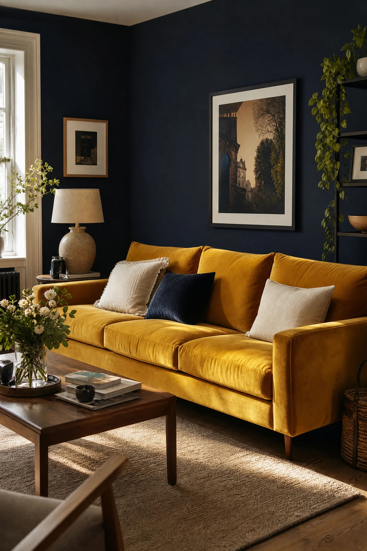
A living room with navy painted walls and a mustard velvet sofa as the central furniture piece creates the most visually dramatic version of this tone pairing because both colours are given large surface areas that allow them to fully express their relationship. The depth of the navy walls makes the warm mustard velvet of the sofa appear even more richly golden against the dark backdrop, and the velvet fabric specifically suits this combination because its pile catches light at different angles and creates a surface that reads as warm amber in some conditions and deeper ochre in others, giving the sofa a visual complexity that flat woven upholstery does not provide. The practical consideration for navy walls in a living room is the impact on natural light: navy walls absorb significantly more light than pale or neutral walls, and this pairing works best in rooms that receive generous natural light from at least one large window or set of glazed doors.
Pro Move: Paint the ceiling in the same navy as the walls rather than keeping it white. In a room with navy walls, a white ceiling creates a hard horizontal line that cuts the room in two and makes the dark walls feel even heavier below it. A navy ceiling that continues the wall colour creates an enveloping quality that makes the mustard sofa feel like it sits within a jewel box rather than in a room that could not decide where to stop.
2. Mustard Accent Wall With Navy Blue Sofa
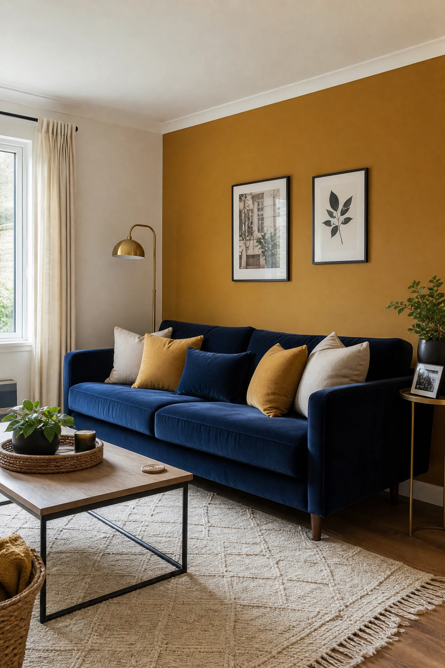
Reversing the dominant colour, with a mustard or deep ochre accent wall on the headboard-equivalent wall of the living room and a deep navy sofa in front of it, creates a warmer and more accessible version of the navy and mustard pairing because the mustard wall reflects more light than navy and keeps the room feeling brighter even when the sofa is in a dark tone. This arrangement works particularly well in rooms with limited natural light where full navy walls would make the space feel enclosed and heavy: the mustard wall provides the warm colour energy of the combination while the navy sofa provides the depth and grounding without darkening every surface simultaneously. Accessorize the sofa with cushions that mix both palette colours in different textures, a deep navy linen alongside a warm mustard velvet alongside a warm cream, and the arrangement reads as considered rather than simply colour-matched.
Designer Advice: Choose the mustard wall tone carefully: a warm mustard with a golden or amber undertone suits the navy and mustard palette considerably better than a cool, slightly green-toned mustard that can fight the blue in the navy and create a slightly murky combination. Test samples of both the wall colour and the sofa fabric together in the actual room before committing.
3. Navy Built-In Shelving With Mustard Accessories

Painting built-in shelving or alcove cabinetry in a living room in navy creates a bold architectural feature that does all the dramatic work of a dark colour without requiring the commitment of full navy walls. The navy built-ins recede visually and create depth within the alcove or shelf unit, making the objects displayed on them, the books, ceramics, plants, and personal objects, appear more vivid and more carefully arranged than they would against a pale background. Mustard accessories, a ceramic vase in ochre yellow, a lamp base in warm amber, a stack of mustard-spined books, cushions in mustard velvet on the adjoining sofa, provide the warm yellow contribution to the palette at multiple scales across the shelf and the room without any single element being overwhelming.
Quick Tip: Paint the back panel of each shelf bay in the same navy as the front and sides of the unit rather than a different accent colour. The continuity of the navy within the full depth of the shelf creates a sense that the objects on the shelf are sitting within a contained, considered space rather than against a painted backdrop, and it gives the shelf display a visual weight and presence that a pale or contrasting back panel does not.
4. Navy and Mustard Through Pattern: The Geometric Rug

A geometric or abstract rug that carries both navy blue and mustard yellow in its pattern is the most practical starting point for a navy and mustard living room because the rug anchors the room with both palette colours simultaneously and provides a reference point against which every subsequent furniture and accessory decision can be checked. A rug with a strong geometric pattern in navy and mustard on a warm cream or natural ground gives the room its organizing palette before a single piece of furniture is chosen, and it prevents the common failure of a blue and yellow room where the two colours are introduced on separate objects at different scales and never feel genuinely connected. The rug should be sized correctly for the seating arrangement, with all front legs of sofas and chairs sitting on the rug rather than beside it, which is the single most common rug sizing error in living rooms regardless of colour palette.
Heads Up: A strongly patterned rug in navy and mustard makes both colours very visible at floor level, which means the surrounding furniture and wall colours need to be restrained rather than competitive. A rug with two strong colours at full saturation in a room where the walls are also coloured and the sofa is also patterned creates a visual competition that makes the room feel chaotic rather than bold. Let the rug lead and keep everything around it calmer.
5. Navy and Mustard With Warm Timber and Brass

The navy and mustard pairing becomes most genuinely liveable and least likely to tip into overly graphic territory when a third element in warm natural materials is introduced as a bridge between the two colours. Warm timber in light to medium oak, honey-toned ash, or aged walnut provides a natural material warmth that prevents the cool depth of navy and the warm brightness of mustard from sitting in direct opposition without a mediating middle ground. Brass, in its warm unlacquered or brushed form, plays a similar role at a smaller scale: brass lamp bases, brass picture frames, brass coffee table legs, and brass hardware on built-ins all introduce a metallic warmth that reads as connected to both the yellow family and the natural material palette, and prevents the navy from feeling cold and the mustard from feeling isolated.
Reality Check: Warm timber and brass work as mediating elements in a navy and mustard living room only when they share the same warm undertone. Very blonde or very pale timber alongside navy can read as slightly cold and Scandinavian rather than warm and richly toned. Medium-warm oak, honey-toned ash, or walnut at the darker end of the warm spectrum all suit this combination better than the palest available timber options.
6. Navy Curtains in a Mustard and Cream Living Room
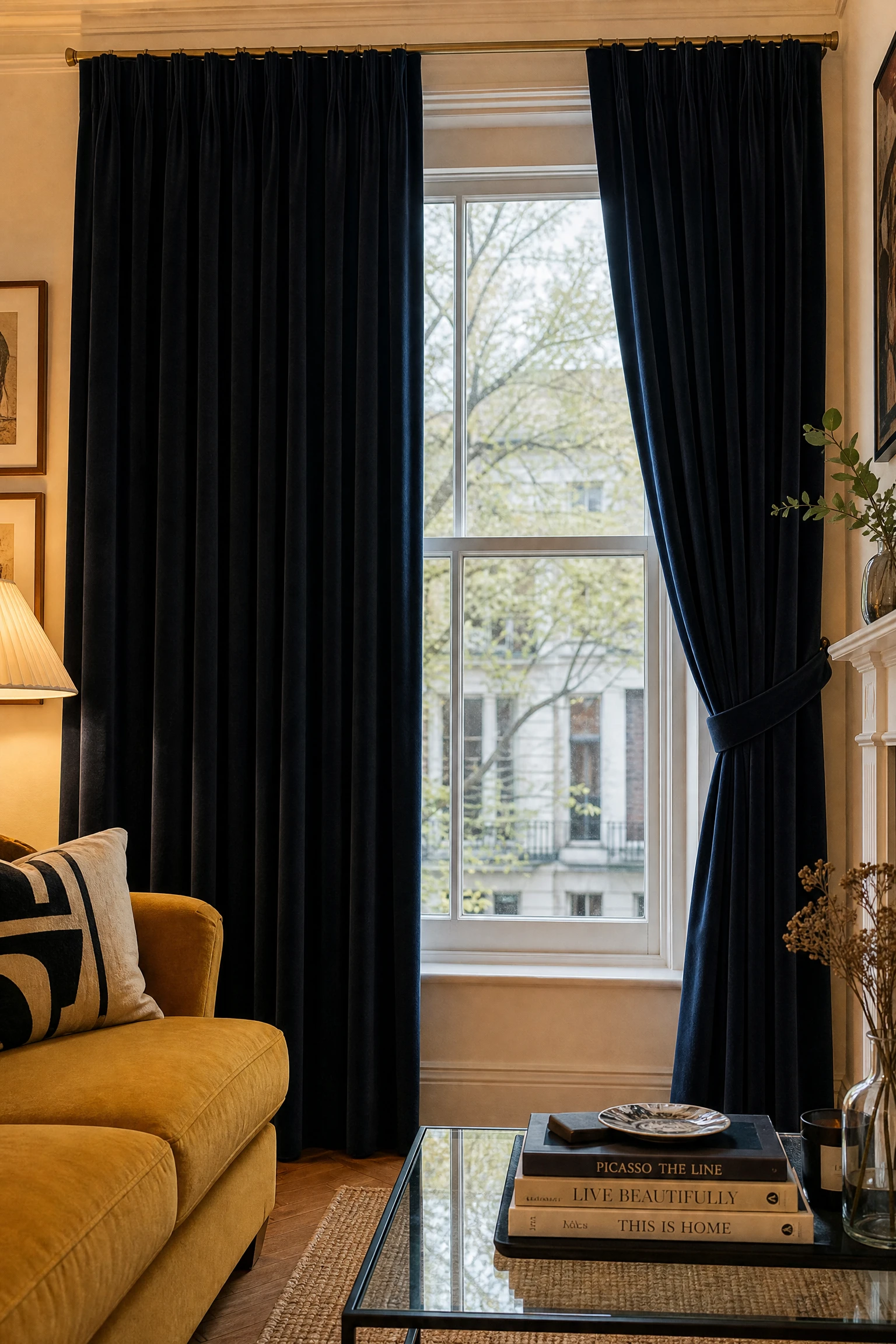
In a living room with mustard yellow walls or a mustard sofa and cream or neutral surrounding tones, navy curtains at the windows introduce the blue element as a strong architectural feature at the perimeter of the room rather than as furniture or an accent object. Floor-to-ceiling navy curtains in a linen, velvet, or heavyweight cotton fabric create the most dramatic effect: the dark fabric at the window frames the light source and creates a strong visual boundary between the room interior and the outside world. When drawn closed in the evening, navy curtains transform the room from a daytime environment into something more intimate and enclosed. The practical consideration is weight: navy velvet curtains are significantly heavier than standard cotton and require appropriate track or pole fixings and a curtain weight that prevents the fabric from hanging unevenly across the full width.
Pro Move: Line navy curtains with a natural cream or warm white lining rather than a standard white or ivory lining. The warm cream lining prevents the cool tone of the navy fabric from creating a cold light quality in the room when sunlight passes through the curtain panels, and it maintains the warmth of the navy and mustard palette in all light conditions.
| Tone Pairing | Blue Shade | Yellow Shade | Mood Created | Best Living Room Style |
| Navy and Mustard | Deep, ink-rich navy | Warm earthy mustard | Sophisticated, rich, grounded | Contemporary, traditional, mid-century |
| Cobalt and Gold | Bright saturated cobalt | Warm metallic gold | Bold, graphic, luxurious | Modern, Art Deco, maximalist |
| Sky and Butter | Soft powder sky blue | Pale warm butter yellow | Airy, fresh, relaxed | Coastal, Scandi, casual modern |
| Teal and Ochre | Blue-green teal | Earthy warm ochre | Organic, earthy, layered | Boho, Mediterranean, eclectic |
| Pattern and Texture | Mixed tones in print | Mixed tones in print | Layered, personal, complex | Eclectic, traditional, global |
Cobalt and Gold: Bold and Graphic
Cobalt and gold is the most vivid and most deliberate version of the blue and yellow pairing. It is a combination rooted in Art Deco luxury, in the rich blues and gilding of medieval manuscripts and Islamic tilework, and in the kind of confident, unapologetic decorating that treats colour as a genuine design commitment rather than a cautious accent. It is not for every room or every household, but when it works it is genuinely extraordinary.
7. Cobalt Blue Sofa With Gold Accents and White Walls

A cobalt blue velvet or linen sofa in a room with bright white walls, warm gold accessories, and natural timber flooring is the most accessible version of the cobalt and gold pairing because the white walls prevent the vivid blue from becoming oppressive and give the cobalt somewhere to rest against that amplifies its saturated quality rather than competing with it. The gold accents arrive through a brass or gold-toned floor lamp with a warm amber shade, a gold-framed mirror above the sofa, gold-dipped ceramic vases on the coffee table, and a warm gold throw pillow or two on the sofa alongside neutral cream cushions. This arrangement uses cobalt as the primary colour statement and gold as the precise, positioned accent that gives the statement its luxury quality. Keep everything else in the room in neutral cream, warm white, or natural material tones to give both the cobalt and the gold the visual space they need to register clearly.
Designer Advice: A cobalt velvet sofa in a white-walled room needs at least one other element in the room that repeats a shade from the same blue family, even if it is much lighter or much darker, to prevent the sofa from reading as a colourful object that arrived in the wrong room. A navy blue book spine on the coffee table, a pale blue-tinted glass vase on the sideboard, or a small cobalt ceramic on the shelf are all enough to connect the sofa colour to the room rather than leaving it isolated.
8. Cobalt Blue Accent Wall With Gold-Framed Artwork Gallery

A single cobalt blue accent wall in an otherwise neutral or cream living room, used as the backdrop for a gallery arrangement of artwork in gold or warm-toned frames, creates a living room focal point that is genuinely dramatic without requiring any furniture investment in either colour. The cobalt wall provides the blue at maximum saturation and coverage, and the gold frames provide the yellow element in a precise, gallery-appropriate form that reads as intentional and refined rather than accidental. Artwork in any subject matter sits beautifully against cobalt: black and white photography in gold frames creates a graphic, contemporary effect; botanical prints in warm earthy tones create a richer, more eclectic arrangement; abstract paintings in warm yellows and creams feel most directly engaged with the wall colour behind them.
Quick Tip: Choose artwork frames in a consistent gold finish rather than mixing polished gold, brushed gold, and antique gold in the same gallery arrangement on a cobalt wall. Against a vivid saturated blue background, the variations between different gold tones become very visible and create a distracting inconsistency. One gold finish used consistently across all frames creates the gallery precision that cobalt walls require.
9. Gold and Cobalt Through Textiles and Pattern

Introducing cobalt and gold through patterned textiles, a bold geometric or abstract cushion fabric that carries both colours at once, a throw with a graphic cobalt and gold weave, or curtains in a cobalt and gold ikat or botanical print, is the most flexible and most reversible way to bring the cobalt and gold combination into a living room. The textiles can be changed when the combination no longer suits the room or the season, and the specific pattern of the fabric creates a visual connection between the two colours that solid-coloured accessories placed separately on different objects do not achieve. A sofa in a neutral cream or warm linen with a pair of graphic cobalt and gold geometric cushions alongside a warm ochre cushion makes a living room that reads as colour-considered and personally curated rather than matched from a single shop floor.
Reality Check: Cobalt and gold in pattern works best when the pattern has a clear organizing logic, a geometric repeat, a structured print, or a botanical arrangement with clear ground colour. Abstract or irregularly patterned fabric in cobalt and gold can read as chaotic when used at cushion scale in a living room. A structured pattern with clear blue and gold zones keeps the fabric readable and the palette legible.
10. Cobalt Lampshade Against a Warm Gold Room
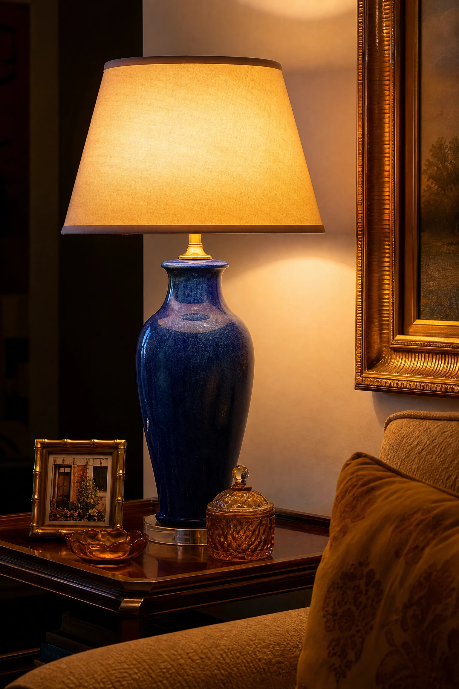
In a living room where the overall palette is warm and golden, a single cobalt blue table lamp or pendant light shade introduces the blue element in the most contained possible way while simultaneously creating the most atmospheric lighting effect available in the cobalt and gold combination. A cobalt glass or ceramic lamp base with a warm shade, or a cobalt blue fabric drum shade on a table lamp, casts a warm blue-toned ambient light onto the surrounding surfaces when switched on that creates an entirely different evening atmosphere from the same room with a standard white shade. The blue light quality that a cobalt shade creates is subtle enough to read as atmospheric rather than clinical, and it connects the lamp to the wider blue element of the room palette while functioning as a genuine design object during the day when switched off.
Heads Up: Blue or cobalt fabric lamp shades cast a noticeably cool-toned light when used with standard warm white bulbs. The blue of the shade partially filters the warm tones of the bulb, creating a light quality that is slightly cooler than a standard shade. In a living room where warm evening atmosphere is the goal, pair a cobalt shade with a warm amber or warm gold LED filament bulb to compensate for the shade colour and maintain a warm overall light quality.
Sky Blue and Butter Yellow: Light and Airy
Sky blue and butter yellow is the freshest and most relaxed version of the blue and yellow combination. The tones here are light, pale, and close in weight: neither colour is particularly saturated or dark, which means the contrast between them is gentle rather than graphic and the room created by this pairing feels open, airy, and genuinely easy to live in. This is the blue and yellow combination that suits coastal homes, Scandinavian-influenced interiors, and any living room where the goal is calm and fresh rather than dramatic and bold.
11. Sky Blue Walls With Butter Yellow Accents

Pale sky blue walls in a living room create one of the most reliably fresh and mood-lifting interior environments available because the cool, open quality of a true sky blue reads as an extension of the natural world beyond the window rather than as a deliberate colour choice. Against this background, butter yellow or warm cream yellow accents in cushions, a lamp shade, a ceramic vase, or a simple throw at the foot of the sofa introduce the warmth that the cool sky blue alone lacks and create the gentle version of the blue and yellow combination that never feels forced or graphic. The key to this approach is keeping both tones genuinely light: if the sky blue deepens toward a true blue or the butter yellow brightens toward a primary yellow, the gentle, airy quality of the combination disappears and the room shifts into a different, more demanding version of the pairing.
Pro Move: Choose a sky blue with a very slight warm or green undertone rather than a cool, slightly grey-blue for the walls. A sky blue with a touch of warmth reads as genuinely sky-like and organic, while a cool grey-blue reads as slightly clinical and flat rather than fresh and airy. The difference is small in a colour card but significant on an entire wall surface.
12. A Butter Yellow Sofa in a Sky Blue Room

A sofa in a warm butter yellow or pale straw-coloured linen in a room with sky blue walls creates a colour relationship that is simultaneously cheerful and genuinely restrained. The warmth of the pale yellow sofa against the cool lightness of the sky blue walls creates the most natural-feeling version of the blue and yellow combination because the tones are close enough in depth and saturation that neither overwhelms the other. This is the living room that genuinely feels like a sunny day inside a room, and it works particularly well in rooms that receive good natural light, where the pale yellow reflects the sunlight warmly and the sky blue walls create the backdrop of a clear day rather than the flatness of an overcast one. Accessorize with natural materials, woven rattan, light timber, white ceramic, and simple linen cushions in white and warm cream alongside the butter yellow to keep the room feeling genuinely fresh rather than themed.
Heads Up: Butter yellow and pale straw fabrics show marks and staining more readily than darker upholstery tones. A sofa in pale yellow linen in a household with children, pets, or heavy daily use should be in a performance fabric with a stain-resistant treatment rather than a standard upholstery linen. The colour will look extraordinary but only if it can be kept genuinely clean.
13. Sky and Butter Through Coastal Styling

The sky blue and butter yellow combination connects naturally to a coastal or beach-house aesthetic because both tones belong to the palette of a summer seaside environment, clear blue sky and warm sandy beach, and the styling elements that suit a coastal interior, natural timber, white ceramic, linen, rattan, and organic shapes, all work beautifully alongside the light two-tone palette. A sky blue living room with butter yellow accents, a sofa in washed cream linen, a jute rug, natural rattan side tables, a large tropical-leaf plant in a simple white pot, and a set of abstract watercolour prints in pale blue and cream tones creates a coastal living room that feels genuinely connected to a natural environment rather than costumed in nautical accessories.
Quick Tip: Avoid explicitly nautical accessories, anchors, ropes, ship wheels, and striped bunting, in a sky blue and butter yellow living room that is going for a coastal feel. The general coastal aesthetic is better served by the natural materials, the organic shapes, and the palette itself than by any specific thematic object that risks making the room look like a themed holiday rental rather than a genuinely designed home.
14. Pale Blue and Soft Yellow in a Small Living Room

In a compact living room where deep or saturated colours would make the space feel smaller and more enclosed, sky blue and butter yellow are an ideal combination because both tones reflect rather than absorb light and together create a room that feels larger than its actual dimensions. A small living room with pale blue walls, a butter yellow two-seater sofa, a white-painted timber coffee table, and a jute rug with a simple cream and pale yellow weave achieves the dual quality that small rooms most need: visual warmth from the yellow and visual openness from the blue, without the weight of either colour at full saturation. Light-coloured sofas in a small room are always a risk from a practical perspective, so choosing a performance fabric or a slipcover version of the butter yellow sofa is a practical consideration worth factoring into the budget.
Designer Advice: In a small living room with sky blue walls, keep the ceiling and woodwork in a bright warm white rather than the blue tone of the walls or the yellow tone of the sofa. A white ceiling in a small room increases the perceived height and creates a visual boundary between the coloured walls and the room above that prevents the space from feeling cave-like. In a larger room, painting the ceiling in the wall colour can be effective, but in a small room the white ceiling is the practical choice.
“Blue and yellow does not fail because the colours are wrong for each other. It fails because the shades were chosen without considering the specific relationship between their undertones, depths, and the light they will be seen in.”
Teal and Ochre: Earthy and Grounded
Teal and ochre is the most organic and most globally influenced version of the blue and yellow combination. Teal adds a green quality to the blue that connects it to nature and foliage, while ochre is the most earthy and mineral version of yellow, rooted in natural pigments found in clay and rock. Together they create a living room palette that feels genuinely warm, layered, and globally inspired rather than precisely colour-coordinated.
15. Teal Painted Walls With Ochre Textiles
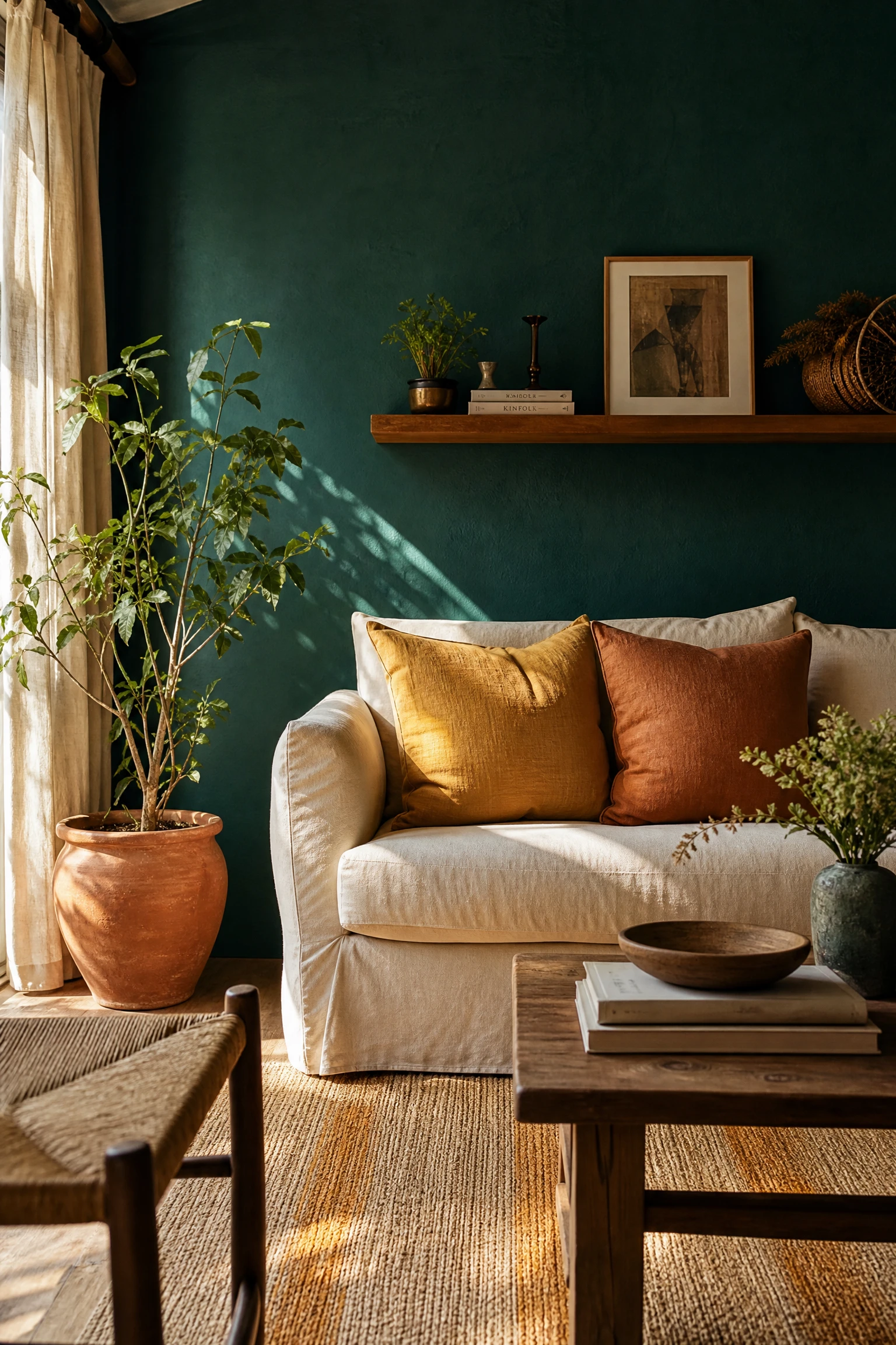
Teal painted walls, whether in a deep petrol teal or a slightly lighter blue-green with more green in its composition, create a living room that is both warm and cool simultaneously, because the blue component of teal creates depth and coolness while the green component creates the organic, natural warmth that pure navy lacks. Against teal walls, ochre textiles, a cushion in a warm clay-yellow, a throw in a deep turmeric tone, or a woven rug in ochre and cream, introduce a warmth that reads as genuinely earthy and natural rather than precisely colour-matched. The combination of teal and ochre has deep roots in Mediterranean and Moroccan design traditions, and the living rooms that use it most successfully tend to layer natural materials, terracotta ceramics, rough-hewn timber, and woven fibres, alongside the two palette colours to create a room that feels genuinely connected to a material and cultural tradition rather than simply choosing two complementary colours from a wheel.
Reality Check: Teal walls are significantly different from navy walls in their effect on the colour of other elements in the room. The green component in teal can make warm-toned materials like honey timber and warm brass appear slightly more golden and slightly more saturated than they look against neutral walls. Test all furniture and accessory colours against a teal wall sample before purchasing, as the teal background will affect how every other colour in the room reads.
16. Teal Sofa With Ochre and Terracotta Accessories

A sofa in a teal velvet or teal linen, whether a sectional or a standard three-seater, creates the most visually dominant blue-green element in the room and anchors the teal and ochre combination at the central piece of furniture. Accessories in ochre, warm clay, and terracotta provide the yellow element at a smaller scale across multiple objects: an ochre linen cushion, a terracotta ceramic pot with a trailing plant, a warm clay-coloured ceramic lamp base, a woven basket in natural and ochre tones on the floor beside the sofa. The addition of terracotta as a third tone in this arrangement widens the warm earthy palette and connects teal and ochre to the broader family of earthy, mineral colours that suits the Moroccan and Mediterranean design traditions that this pairing references.
Designer Advice: Teal velvet sofas are particularly prone to showing pile crushing from regular use: the seat and back areas develop a flattened pile appearance within the first year that looks worn rather than characterful. If choosing a teal velvet sofa, select a performance velvet with a tight, crush-resistant weave rather than a long-pile or soft velvet that will show use marks quickly. Alternatively, choose a teal linen or brushed cotton that ages in a different and more forgiving way than velvet.
17. Teal and Ochre Through Global-Inspired Pattern
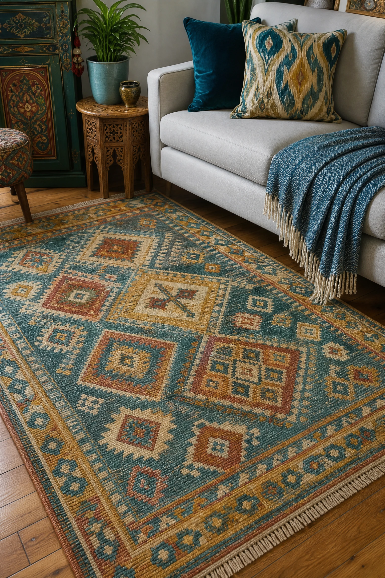
Textiles with a global or artisan pattern in teal and ochre, an ikat print in teal and warm gold, a Moroccan-inspired geometric in blue-green and clay yellow, a kilim rug with teal, ochre, and terracotta in its weave, or a block-printed cushion fabric in both colours, create the most characterful version of the teal and ochre combination because the pattern itself encodes the relationship between the two colours in a form that has cultural depth and design history behind it. These patterns create the most complex and most personally resonant version of the pairing because they bring a specificity, a connection to a craft tradition and a making process, that a plain coloured sofa or wall never achieves. Layering multiple patterned textiles in the same teal and ochre family, a Moroccan-inspired rug, an ikat cushion, and a block-printed throw, is an approach that requires confidence but produces a room that feels genuinely rich and layered.
Quick Tip: Keep the walls and floor neutral when using multiple patterned textiles in teal and ochre. A plain warm white or pale putty wall and a natural timber or warm stone floor give the patterned textiles the visual space they need to read clearly without competition from the surrounding surfaces. Patterned textiles in a patterned room create visual noise. Patterned textiles in a plain room create genuine richness.
18. A Teal Accent Wall in an Ochre Living Room

In a living room where the furniture, floor, and accessories are primarily in warm ochre, honey, and natural material tones, a single teal accent wall on the focal wall of the room introduces the blue-green element as a strong architectural colour that works against a warm background in the same way that a painting of a sea view adds coolness and depth to a warm interior. The teal wall reads as a colour decision with genuine intention and confidence: it does not apologize for being present and it creates a focal point of colour that organizes the whole room around it. The ochre and warm neutral furniture in front of the teal wall creates a composition where the cool depth of the teal provides the visual anchor and the warm materials of the room provide the welcoming, liveable quality.
Heads Up: Teal varies considerably between paint brands and even between swatches and applied results. A teal that reads as a genuine blue-green in a sample card can read as more strongly green or more strongly blue depending on the artificial lighting conditions of the room it is applied in. Test teal samples under both natural daylight and evening artificial light in the specific room before committing.
Blue and Yellow Through Pattern and Texture
In this group, the blue and yellow relationship does not happen through solid coloured walls or single-colour furniture but through pattern, print, and the specific combination of textures that carry both colours within a single surface. These are the most flexible and most complex approaches to the palette and they suit rooms where the homeowner wants the blue and yellow combination without either colour dominating a large surface area.
19. A Statement Blue and Yellow Botanical Wallpaper

A wallpaper with a bold botanical or floral print in shades of blue and yellow on a warm cream or white ground uses pattern to deliver the colour combination in a form that is simultaneously vivid and complex enough to create a room with genuine personality. The pattern distributes both colours across the full wall surface in a proportion that the designer of the wallpaper has already resolved, which removes the difficulty of deciding how much of each colour to use at what scale. In a living room, botanical wallpaper in blue and yellow works best on one feature wall, most naturally the chimney breast or the wall behind the sofa, with the three remaining walls in a tone drawn from the paper, either the cream ground, the blue, or the yellow, at a reduced saturation.
Pro Move: Select the paint colour for the surrounding walls by taking a physical sample of the wallpaper to the paint shop and matching it in person under the same light conditions as the room rather than guessing the colour from a photograph or a screen. The specific undertone of the blue and yellow in the wallpaper determines which wall paint colour creates a cohesive extension of the paper and which one fights it.
20. A Blue and Yellow Geometric Rug as the Palette Foundation
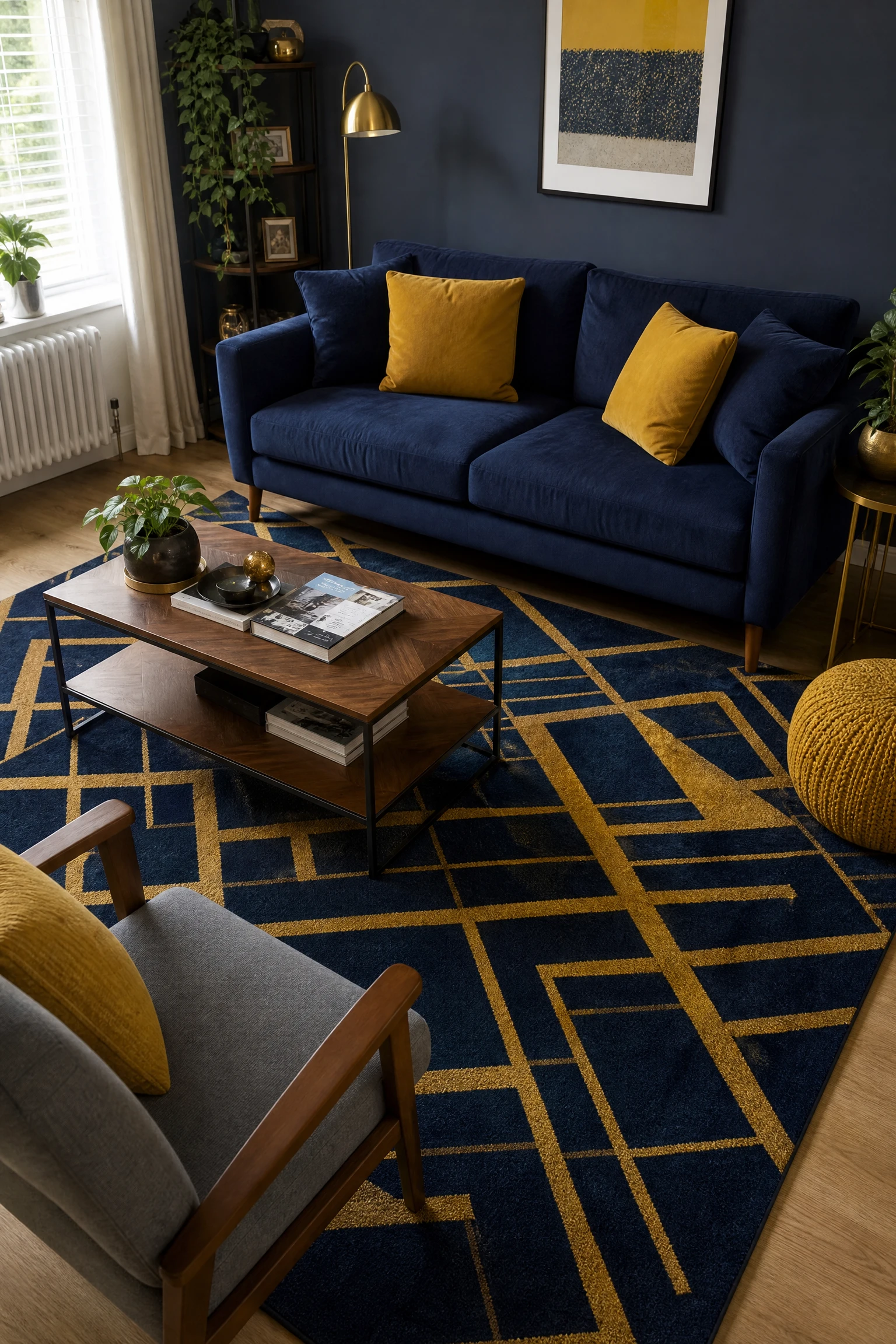
Starting a blue and yellow living room design with the rug rather than with the wall colour or the sofa is the most practical approach because the rug is the largest pattern element in the room and the one that all other colour decisions need to relate to. A geometric rug in a specific combination of blue and yellow tones, perhaps a navy and mustard abstract pattern on a warm cream ground, provides a specific palette reference that eliminates the guesswork from every subsequent choice. Once the rug is selected, the sofa should be in one of the rug colours at a lighter saturation, the walls should be in either the background colour of the rug or a very light version of one of the pattern colours, and the accessories can pick up individual tones from the rug at different scales. The rug literally shows the entire colour plan of the room in miniature form.
Reality Check: A geometric rug with a strong blue and yellow pattern needs genuinely careful sizing for the living room. Too small and it looks like a decorative mat rather than a room-defining element. Too large and the pattern overwhelms the visual space. The standard rule of all front sofa and chair legs sitting on the rug applies particularly strongly to a patterned rug, where having the furniture sit on the pattern grounds it as a deliberate zone rather than a floating object.
21. Mixed Blue and Yellow Cushion Arrangement on a Neutral Sofa

The most affordable, most reversible, and most flexible approach to a blue and yellow living room is a neutral sofa in cream, warm white, or light grey with a layered cushion arrangement that carries the blue and yellow combination across multiple cushion covers in different tones, scales, and textures. A large square cushion in navy linen, a smaller cushion in mustard velvet, a bolster in a navy and white stripe, a round cushion in warm butter yellow cotton, and a final cushion in a geometric print that combines navy and mustard all create the layered version of the blue and yellow combination at cushion scale, and the entire arrangement can be changed with a new set of covers for under fifty dollars when the combination no longer suits. The sofa in neutral means that none of these colour decisions are permanent.
Designer Advice: A mixed cushion arrangement in blue and yellow on a neutral sofa works best when there are between five and seven cushions of genuinely different sizes, rather than three or four identically sized cushions in different colours. The size variation, from large square through medium square to bolster to small round, creates the layered, abundant quality that makes a cushion arrangement look styled. The same colours in all identical sizes looks uniform rather than curated.
22. Blue and Yellow in Artwork as the Room Anchor

A single large piece of artwork that carries the blue and yellow palette, whether an abstract painting with strong cobalt and ochre brushstrokes, a photographic print with dominant blue and golden tones, or a botanical illustration with blue foliage and yellow flowers, acts as the colour anchor for the whole room and gives both colours a cultural and artistic context that a purely decorative application cannot provide. The artwork brings the colours into a relationship that has been composed by a creative mind rather than simply placed in proximity, and this quality elevates the whole room palette from a colour scheme to a genuine design choice. The furniture and accessories in the room should draw their blue and yellow tones from the artwork rather than from their own internal colour logic, creating a room that is unified around a single colour source.
Quick Tip: When selecting artwork to anchor a blue and yellow living room, prioritize pieces where both colours are present in proportions that match how you want them to appear in the room. If you want navy to dominate, choose a painting where the blue area is significantly larger than the yellow. If you want the yellow to be the accent, choose work where the gold or ochre appears as a specific highlight within a cooler or more neutral ground.
23. Woven Blue and Yellow Textiles on a Dark Sofa

A very dark sofa, whether in charcoal, near-black, or deep espresso brown leather, with woven or embroidered cushions and throws in both blue and yellow tones creates a sophisticated version of the palette where the dark background makes both colours read more vividly and more jewel-like than they would against a neutral sofa. The dark sofa plays the same role as a dark wall: it amplifies the colours placed against it rather than competing with them. An Ankara print cushion with cobalt and gold in its pattern, a navy and mustard woven throw, and a small yellow ceramic object on the adjacent side table create a blue and yellow colour story that reads as global and artisan-influenced against the deep, grounding quality of the dark sofa.
Reality Check: Dark leather sofas and patterned woven cushions in bold colours create a visual combination that is bold and confident during the day and can feel quite heavy in the evening under warm artificial light. Ensure the living room has warm, layered lighting, particularly table lamps with warm shades positioned near the sofa, to maintain the richness of the combination in evening conditions rather than letting the dark sofa make the room feel heavy and the colours look flat.
24. Blue Walls With Yellow-Toned Natural Materials

In a living room with blue walls, whether in navy, teal, cobalt, or sky, the yellow element of the combination does not need to arrive through explicitly yellow-coloured furniture or accessories. Natural materials with a warm honey or amber tone, light oak flooring, a honey-toned rattan pendant light, warm oak furniture, amber-toned ceramic vessels, and natural timber accents in warm blonde wood, all carry enough of the yellow spectrum to complete the blue and yellow relationship without any overtly yellow object being present. This is the most subtle version of the blue and yellow combination and the one most likely to look genuinely natural and sophisticated rather than deliberately colour-coordinated. The warm honey tones of natural materials alongside blue walls create the specific quality of warmth within depth that makes the best examples of this colour pairing feel genuinely inviting.
Heads Up: The specific warmth of the timber and natural material tones needs to be genuinely warm rather than pale or bleached. Very pale or whitewashed timber against a blue wall can read as a blue and white combination rather than a blue and yellow one, losing the warmth that the natural material was intended to provide. Medium-warm or honey-toned natural materials are the practical choice for this approach.
25. Blue and Yellow With White as the Third Anchor
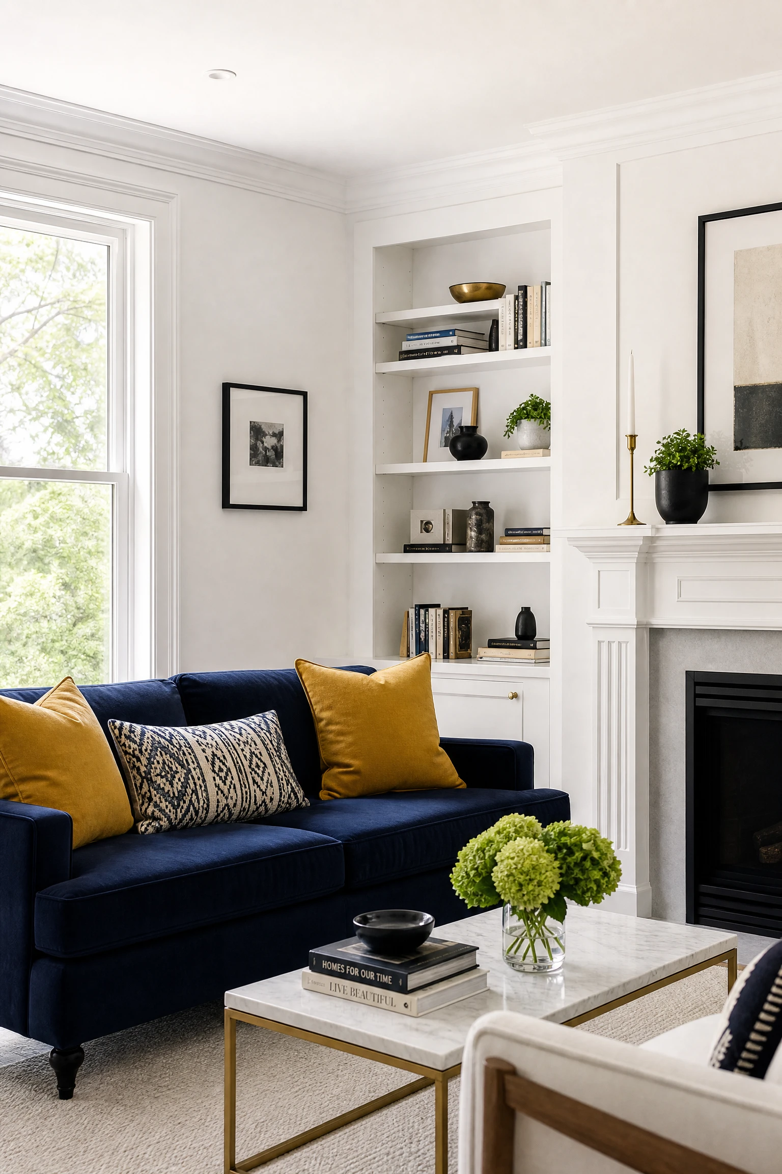
White is the most natural third colour in a blue and yellow living room because it provides the visual relief that both colours need to read clearly without creating a competing third colour presence. White walls with blue furniture and yellow accents, or a white sofa with blue and yellow cushions against a neutral wall, or white architectural elements including skirting, cornicing, and window frames within a room where both colours are used on surfaces and furniture, all use white as the neutral reset that prevents the combination from feeling overloaded. The specific white matters: a warm white with a cream undertone complements the warmth of the yellow element. A cool, slightly grey white complements the blue element. Choosing the white tone that aligns with whichever colour you want to lead the combination is a useful decision-making tool.
Designer Advice: If you are unsure which shade of blue or yellow to choose for a living room, start with the white you already have on the walls and work outward from there. A room with warm white walls will suit warmer versions of both colours: mustard rather than lemon, teal rather than cobalt. A room with cool white walls will suit the crisper versions: navy rather than teal, clear yellow rather than ochre.
26. Blue and Yellow With Natural Green as a Connector

Indoor plants and living greenery are the most effective and most natural connector between blue and yellow in a living room because the green of foliage sits precisely between cool blue and warm yellow on the colour wheel and bridges the gap between them in a way that any designed or manufactured object cannot. A large leafed plant beside a navy sofa with mustard cushions, a trailing pothos on the shelf above a cobalt lamp, a fiddle-leaf fig in a floor corner of a sky blue and butter room: in each case, the living green of the plant provides a middle ground between the two colours that makes the palette feel organic and connected to the natural world rather than precisely calibrated from a colour chart. Natural greenery is also the most flexible element available in any living room: it can be moved, changed, grown, and replaced without any commitment to a fixed design decision.
Quick Tip: Choose plants with distinctly blue-green or yellow-green foliage depending on which side of the palette you want to reinforce. Plants with blue-toned foliage (eucalyptus, some succulents, blue-green hostas) will reinforce the cool element of the room. Plants with yellow-green foliage (golden pothos, many tropical varieties) will reinforce the warm yellow element. Most common indoor plants have a neutral mid-green that bridges both without reinforcing either.
27. The Complete Blue and Yellow Living Room: The Three Rules

A blue and yellow living room that consistently looks sophisticated rather than garish almost always follows three rules that the most problematic examples of the palette ignore. First, the tones of both colours are chosen from the same depth of saturation: a deeply saturated navy works with a deeply saturated mustard but fights a pale butter yellow, and a light sky blue works with a gentle butter yellow but is overwhelmed by a strong cobalt. Second, the proportions give one colour significantly more visual presence than the other: around 70 percent blue and 30 percent yellow, or 70 percent yellow with 30 percent blue, always reads more considered than an equal 50-50 split where neither colour can lead. Third, a neutral, either warm white, warm cream, natural timber, or natural stone, occupies a significant proportion of the room, providing the visual rest that both colours need to register clearly without competing with each other. Apply these three rules to any blue and yellow combination and the specific tones within that framework, and the result will be a room that looks genuinely designed rather than accidentally colourful.
Pro Move: Before purchasing anything for a blue and yellow living room, assemble the key materials together: a paint sample in the wall colour, a fabric sample in the sofa or main upholstery colour, a cushion cover or textile sample in the secondary colour, and a flooring or rug sample. Look at all four together in the actual room in both natural daylight and evening lamplight. The combination that works in all four conditions is the right one for that specific space.
Final Thoughts
Blue and yellow is a colour combination that rewards specificity more than almost any other pairing in interior design. The difference between a blue and yellow living room that looks like a considered, personal design choice and one that looks like a branding accident is almost entirely in the specific shades and tones chosen and the way they are proportioned against each other and against the neutrals that give them space to breathe. Generic blue and generic yellow create the flag problem. Navy and mustard, cobalt and gold, sky and butter, teal and ochre: these are the actual combinations that produce genuinely beautiful living rooms, and each one creates a distinctly different room with a distinctly different atmosphere and a distinctly different lifestyle association.
The simplest and most reliable starting point for any blue and yellow living room is to decide on the tone pairing first, before any furniture is purchased or any wall is painted, and to hold every subsequent decision up against the specific relationship between those two tones. Does this fabric sit within the navy and mustard family? Does this paint confirm the teal direction or does it fight it? Does this accessory add warmth to the sky and butter room or does it introduce a third colour that breaks the palette? These are the questions that lead to a living room that feels completely considered rather than assembled from a general blue and yellow mood board.
“Which of the five tone pairings feels most like your living room? Drop it in the comments below.”
Frequently Asked Questions
Do blue and yellow actually go together in a living room?
Yes, but the specific tones matter enormously. Blue and yellow in their purest primary forms create a contrast that is too graphic and too vivid for a comfortable living room environment. The combinations that work are the more considered versions of each: navy and mustard, cobalt and gold, sky blue and butter yellow, teal and ochre. In each of these pairings, both colours have been moved away from their primary form toward a more complex and more liveable shade, and the result is a combination that reads as genuinely sophisticated rather than cheerfully garish. The 70-20-10 rule, where 70 percent of the room is a neutral, 20 percent is the dominant colour, and 10 percent is the accent colour, is a reliable proportional framework for the blue and yellow combination in any living room.
What is the most sophisticated blue and yellow living room combination?
Navy and mustard is widely considered the most sophisticated pairing because both colours carry enough depth and warmth to read as genuinely rich rather than bright. Navy has the authority of a deep, complex dark tone that suits adult living spaces, and mustard has the warmth of an earthy yellow that has been desaturated enough from pure yellow to read as amber and honey rather than cheerful or graphic. The combination is particularly effective in velvet textures, where the pile adds visual complexity to both colours, and alongside warm brass and natural timber accents that bridge the gap between the cool blue and the warm yellow.
How do I stop a blue and yellow living room from looking too primary?
Choose the shades of blue and yellow that are furthest from their pure primary forms. Deep navy instead of bright blue, warm mustard instead of clear yellow. Add a significant proportion of neutral, warm white, cream, or natural timber, that accounts for at least 50 percent of the room surfaces. Keep the two colours separated by neutral elements rather than placing them in direct contact with each other. Use pattern, where blue and yellow are already in a resolved relationship within a print, rather than solid colour blocks of each. And ensure that at least one of the two colours arrives through a natural material texture, velvet, linen, rattan, or woven wool, rather than a flat synthetic surface, which creates the material complexity that prevents the combination from reading as flat and graphic.
What neutrals work best in a blue and yellow living room?
Warm white and cream are the most reliable neutrals because they sit closer to the warm yellow end of the palette and prevent the combination from tipping too cool. Natural timber in warm oak, honey ash, or walnut provides a material neutral that bridges both colours without introducing a third colour. Warm linen in oatmeal or flax is the most versatile upholstery and curtain neutral in a blue and yellow room. Warm grey with a slight warm undertone works for a more contemporary room. Avoid cool or blue-grey neutrals alongside a blue element, which push the room toward a mono-blue palette and lose the yellow warmth, and avoid very stark bright white, which creates too harsh a contrast with both the deep blue and the warm yellow tones.
Can I use blue and yellow in a small living room?
Yes, with the right tone selection. Pale sky blue and butter yellow in a small living room reflect light and create an airy, expansive quality that darker or more saturated versions of the pairing do not. Keep the walls in the lighter of the two tones, sky blue is lighter than butter yellow in most cases, use the yellow on the sofa or as cushion accents, and keep the floor in a natural light timber or pale neutral that maintains the feeling of openness. Avoid full navy walls or very deep teal in a small room where the space cannot absorb the visual weight of a saturated dark colour on every wall surface.
What style of living room suits blue and yellow best?
Navy and mustard suits mid-century modern, contemporary, and traditionally influenced living rooms best because both colours have roots in mid-twentieth-century interior and graphic design. Cobalt and gold suits Art Deco influenced, maximalist, and glamorous contemporary rooms. Sky blue and butter yellow suits coastal, Scandinavian-influenced, and casually modern living rooms. Teal and ochre suits eclectic, globally-inspired, Moroccan-influenced, and boho living rooms. Pattern and texture-based approaches to the combination suit eclectic and traditional rooms with layered, collected aesthetics. The least flattering setting for blue and yellow in any version is a very neutral, minimal, or contemporary room where the lack of other design elements leaves the two colours to create all the interest by themselves without any material layering or stylistic framework to give them context.