Blue Kitchen Looks That Are Worth Every Bit of the Hype

There is something about a blue kitchen that stops you in your tracks. It does not shout for attention the way red does, and it does not quietly fade into the background the way beige tends to. Blue sits right in that sweet spot where personality meets practicality, and that is exactly why it has become one of the most talked-about colors in kitchen design right now. Whether you are drawn to deep moody navy, soft powder sky tones, or the kind of slate blue that feels both fresh and grounded, there is a version of a blue kitchen that fits your home and your lifestyle.
What makes blue so interesting as a kitchen color is how much range it actually has. A soft duck-egg blue on shaker cabinets feels completely different from bold cobalt on a flat-panel modern kitchen, even though they are technically cousins on the color wheel. That range means you are not locked into one look, one vibe, or one budget bracket. Blue works in a light-filled open-plan space just as naturally as it does in a smaller galley kitchen where you want to add depth and mood.
This article is organized by style category rather than a random numbered list, because the truth is that understanding which shade and approach fits your space matters more than seeing a long list of disconnected ideas. You will find 23 ideas grouped into five clear categories, each with practical guidance on colors, materials, lighting, and accessories. Think of it as your starting point for figuring out exactly what kind of blue kitchen you actually want.
Category One: Navy and Bold Blues
Navy and deep blue tones are some of the most confident choices you can make in a kitchen. They add weight, drama, and a sense of intention that lighter shades simply cannot replicate. The key is balancing them with the right countertops, lighting, and hardware so the space feels rich rather than heavy.
1. Full Navy Cabinet Kitchen with Brass Accents
Going all-in on navy cabinets is a commitment that pays off in a big way when you get the details right. Navy sits beautifully against brass hardware and warm-toned countertops like honed Calacatta marble or a butcher block end section. The combination creates a kitchen that feels expensive without necessarily having an enormous budget behind it. On the walls, stick to a warm white rather than a bright white so you do not end up with a stark, clinical contrast. A shade like Benjamin Moore Chantilly Lace or Simply White works particularly well because it keeps the warmth flowing through the room.
For lighting, oversized brass pendant lights over the island are a natural partner for navy cabinets, and under-cabinet LED strips in a warm white temperature (around 2700K) keep the workspace bright without washing out that gorgeous deep color. Add some open floating shelves in natural walnut or white oak to break up the cabinetry and give you space to display ceramics, cookbooks, and glass jars. The mix of blue, brass, and warm wood is one of the best-looking combinations in modern kitchen design right now.
Designer Note: If your navy cabinets start to feel heavy in a smaller kitchen, use a lighter stone countertop with strong movement rather than a solid dark surface. The veining draws the eye upward and keeps things airy.

2. Two-Tone Kitchen with Navy Lowers and White Uppers
Not everyone wants navy on every cabinet, and honestly, the two-tone approach is one of the smartest ways to bring bold blue into a kitchen without fully committing to it on every surface. Navy lower cabinets grounded against crisp white upper cabinets is a classic pairing that has staying power because it works visually in almost every kitchen layout. The lower cabinets anchor the room with color and depth while the upper ones keep the space feeling open and light, especially important if your kitchen does not have enormous windows.
The countertop becomes even more important in a two-tone setup because it bridges the two colors. A medium-toned quartz in a grey-white with subtle veining does the job beautifully. Avoid going too light or too dark, since you want something that reads as a deliberate connector rather than an afterthought. Matte black handles on the lower cabinets and simple brushed nickel on the uppers is an interesting mix that adds visual texture without being chaotic. A white subway tile backsplash keeps things clean and classic, letting the color story of the cabinets do all the heavy lifting.
Designer Note: Keep the toe kicks on the navy lower cabinets the same navy rather than defaulting to black. It looks intentional and much more polished, especially when you have wood or tile flooring.

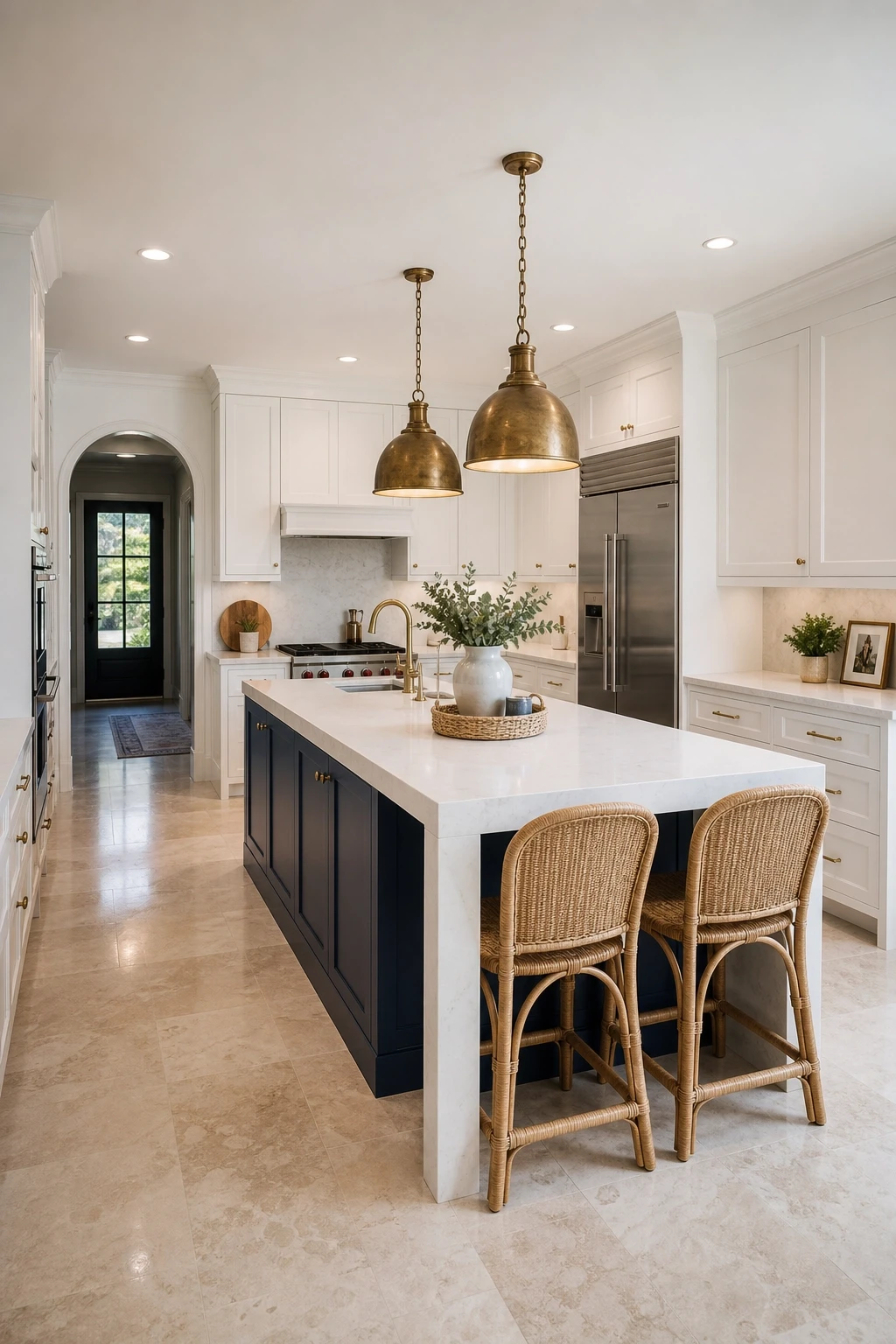
3. Navy Blue Kitchen Island as the Hero Piece
If you love the idea of navy but the thought of it on every cabinet feels like too much, putting it on the island alone is a genuinely great solution. A navy island in a kitchen with white or light grey perimeter cabinets becomes the hero piece of the whole room, and it can carry a huge amount of visual weight without overwhelming the space. It is also a much easier update if you are working with an existing kitchen since you are only painting or replacing one piece of furniture rather than every cabinet in the room.
Style the island with a thick waterfall countertop in bright white quartz or natural stone for maximum contrast. Bar stools in linen, natural rattan, or warm caramel leather add texture against the boldness of the navy. Pendant lighting directly above the island in an aged brass or matte black finish ties the look together. Consider adding some practical drama with a navy paint on the island legs all the way to the floor rather than on a standard cabinet base, which gives the island more of a furniture-like quality that feels intentional and bespoke.
Designer Note: Paint your island in a navy that has a very slight green undertone, like Farrow and Ball Hague Blue, rather than a pure cold navy. It feels less stark and works better with natural wood accents.
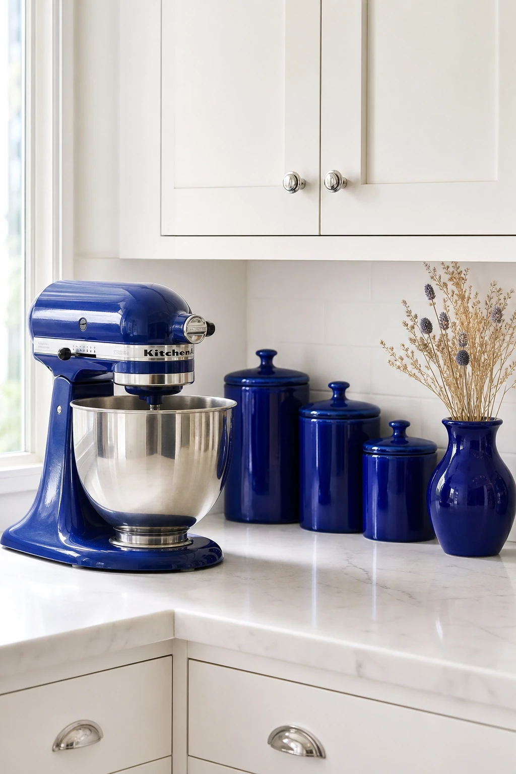
4. Cobalt Blue Accents in a White Kitchen
Not every blue kitchen starts with the cabinets. Sometimes the most interesting approach is keeping your kitchen largely white or neutral and bringing bold cobalt blue in through accessories and accent pieces. A cobalt blue stand mixer on the counter is a genuine conversation starter. Cobalt blue canisters, a set of matching ceramic mugs on open shelving, or a large ceramic vase near the window all punch way above their weight in terms of visual impact. This approach costs very little, requires no renovating, and can be changed out whenever you feel like a refresh.
For a more built-in approach, a cobalt blue tile mosaic behind the stove as a focal backsplash against an otherwise all-white or subway-tiled kitchen adds real character without taking over the whole room. Pair it with simple white shaker cabinets, a white quartz countertop, and unlacquered brass or oil-rubbed bronze hardware for a look that feels layered and collected rather than coordinated. Flooring in a warm wood tone or terracotta brings in earthiness that grounds all that bright blue energy beautifully.
Designer Note: Stick to one or two shades of cobalt across your accessories rather than mixing every blue on the shelf. Consistency is what makes it look styled rather than cluttered.
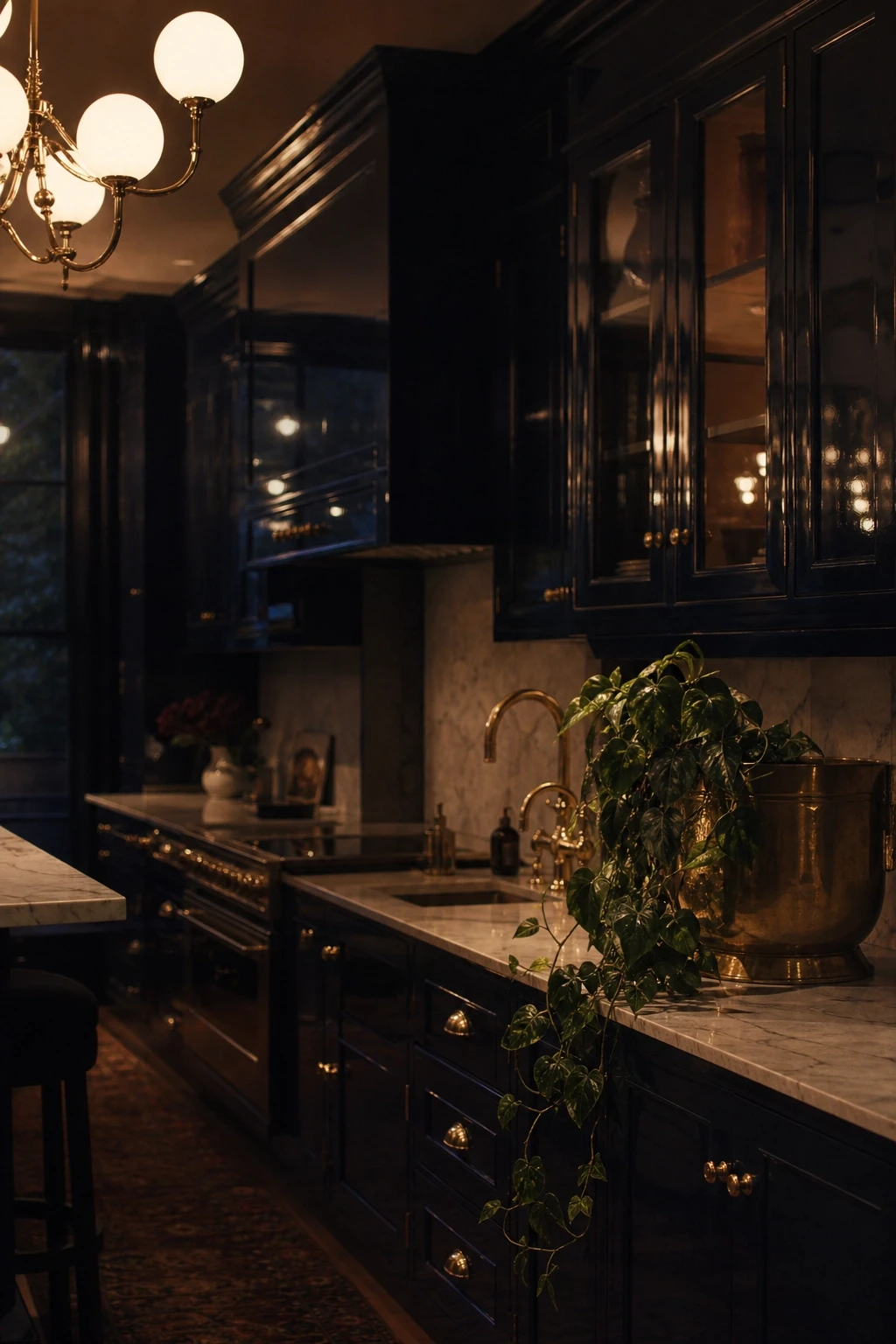
5. Deep Inky Blue Moody Kitchen
Dark, moody kitchens have had a serious moment in interior design, and deep inky blue sits at the centre of that trend. Think of a shade that is so dark it almost reads as black until the light hits it, then you catch that stunning blue depth. Colors like Sherwin-Williams Naval, Little Greene Hicks Blue, or Benjamin Moore Van Deusen Blue are popular choices for achieving this effect. Used on all perimeter cabinets in a high-gloss or satin finish, they create a kitchen that feels like a proper design statement.
In a moody blue kitchen, the hardware and lighting choices matter enormously. Unlacquered brass or aged gold hardware adds warmth that stops the space from feeling cold or oppressive. A statement light fixture, whether a chandelier-style pendant or an oversized cluster of globe lights, becomes the visual anchor. Keep countertops in a lighter tone, either a pale grey quartz or soft white marble, so you have that contrast that helps the dark blue breathe. Introduce some warm texture through a kilim or flat-weave runner rug if you have a kitchen-diner, and add a few trailing plants near the window to bring life and softness to what could otherwise feel quite dramatic.
Designer Note: In a moody kitchen, spend extra on your lighting plan. A dimmer switch on every circuit makes a huge difference in controlling whether the space feels dramatic and evening-ready or bright and functional for morning cooking.
Category Two: Soft and Airy Blues
Soft blue is where you go when you want color without drama. These lighter tones, powder blue, sky blue, duck egg, and pale denim, bring freshness and calm into the kitchen. They work particularly well in smaller spaces or north-facing rooms where you want to maximize the sense of light and airiness.
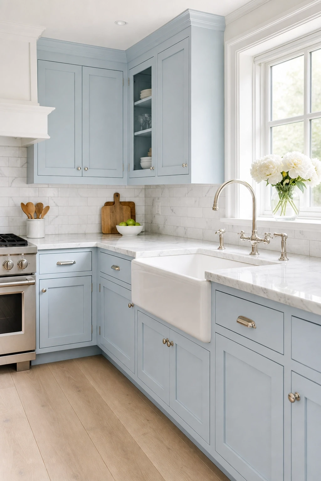
6. Powder Blue Shaker Cabinets with Marble Countertops
Powder blue shaker cabinets are one of the most enduringly popular choices in kitchen design, and it is easy to see why. The color is soft enough that it does not dominate the room, but it is distinct enough that the space never feels generic or forgettable. Paired with white or soft grey marble countertops, the combination has a delicate, almost Parisian quality that feels genuinely elegant. The recessed lines of shaker doors add just enough visual interest to keep the cabinets from looking flat or plain.
Hardware in polished nickel or chrome keeps the look light and clean. A white ceramic farmhouse sink is a natural partner here, and a marble or subway tile backsplash in a soft grey-white tone keeps everything cohesive. For flooring, wide plank white oak or a pale limestone tile adds warmth underfoot without competing with the cabinet color. Lighting should be bright but diffused, so ceiling-mounted semi-flush lights with a warm white bulb temperature along with some under-cabinet strips creates a kitchen that feels cheerful and inviting at any time of day.
Designer Note: Go for a powder blue with a warm, slightly green undertone rather than a cool grey-blue in rooms that get limited natural light. It reads much warmer and more inviting when the daylight is working against you.
7. Sky Blue Open Shelving Kitchen
Open shelving kitchens have become a genuine staple of modern design, and when you combine them with a soft sky blue wall or cabinet color, the result is bright, collected, and full of personality. The idea here is not to use sky blue on heavy closed cabinet doors but rather on the wall behind open shelves, or on a few lower cabinets while leaving the upper section completely open. This lets the color breathe and keeps the kitchen from feeling closed in.
Style those open shelves with purpose. White ceramics, glass jars filled with pantry staples, a few favorite cookbooks stacked horizontally, and some small trailing plants or fresh herbs in terracotta pots all contribute to the collected, lived-in look that makes this style so appealing. The shelves themselves work best in natural wood, either white oak or walnut, which adds warmth against the cool blue wall. Keep the backsplash simple, white zellige tiles or a basic subway tile, so the shelves and their contents remain the focus rather than the background surfaces.
Designer Note: Group items on open shelves in odd numbers and vary the height of objects to avoid everything looking too uniform. A flat row of identically sized items always ends up looking more like storage than decor.

8. Duck Egg Blue Cottage Kitchen
Duck egg blue sits somewhere between blue and green, which gives it a warmth that pure blue does not always have. In a cottage-style kitchen, this color feels completely at home on painted wooden cabinets, particularly when paired with cream or aged white walls. The slightly muted quality of duck egg means it does not look harsh or over-bright, even in a small space with limited natural light. It has the kind of softness that makes a kitchen feel genuinely comfortable, like a place where people naturally want to spend time.
Complement duck egg cabinets with copper or antique brass hardware rather than chrome, since the warm metal tones bring out the green hints in the blue and create a beautifully cohesive color story. A Belfast sink in white ceramic, open plate racks, and a wooden worktop section alongside a stone countertop are all details that reinforce the cottage aesthetic without it tipping over into pastiche. For flooring, encaustic cement tiles in a cream and blue pattern add pattern and personality at the base of the room, tying the whole color scheme together in a way that feels purposeful and charming.
Designer Note: Duck egg is highly light-sensitive. Always test your chosen shade in the actual room at different times of day before committing to the full kitchen, because it can shift significantly between morning and evening light.

9. Pale Denim Blue Kitchen with Natural Oak
Pale denim blue is having a real moment right now, and it makes total sense when you think about how versatile and laid-back the color is. It is the kind of blue that looks equally at home in a modern Scandinavian kitchen as it does in a relaxed California-style space. Paired with natural oak, whether in the form of open shelves, a wood-topped island, or simply a few key furniture pieces, pale denim blue creates a kitchen that feels casual and stylish without trying too hard.
The key to making this pairing work is keeping the palette relatively limited. Pale blue, natural oak, white or off-white walls, and perhaps a very soft stone countertop in a warm grey or cream. Do not introduce a lot of competing colors because the appeal of this look is in its restraint. Hardware in a brushed satin finish, either nickel or a very pale gold, keeps things current without being flashy. Add texture through a cotton or linen window treatment and a woven basket or two on lower shelves, and you have a kitchen that feels genuinely fresh and considered.
Designer Note: If your pale denim cabinets start to look washed out in a very white, bright kitchen, add a contrasting darker grout to your tile backsplash. Even a medium grey grout will give you the definition you need to prevent everything from blending together.

Category Three: Blue Accents and Details
Sometimes the best blue kitchen is not one where the cabinets are blue at all. Using blue as an accent color through tiles, textiles, appliances, and decorative details gives you all the energy of the color with far more flexibility to change things up over time.
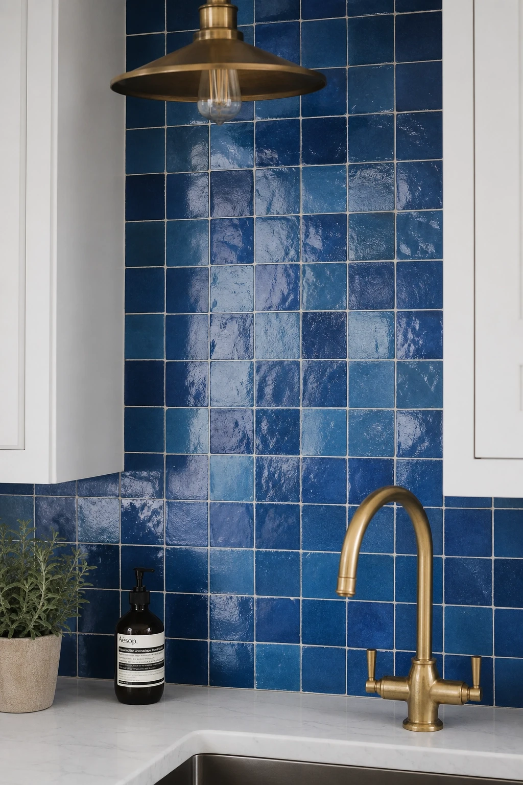
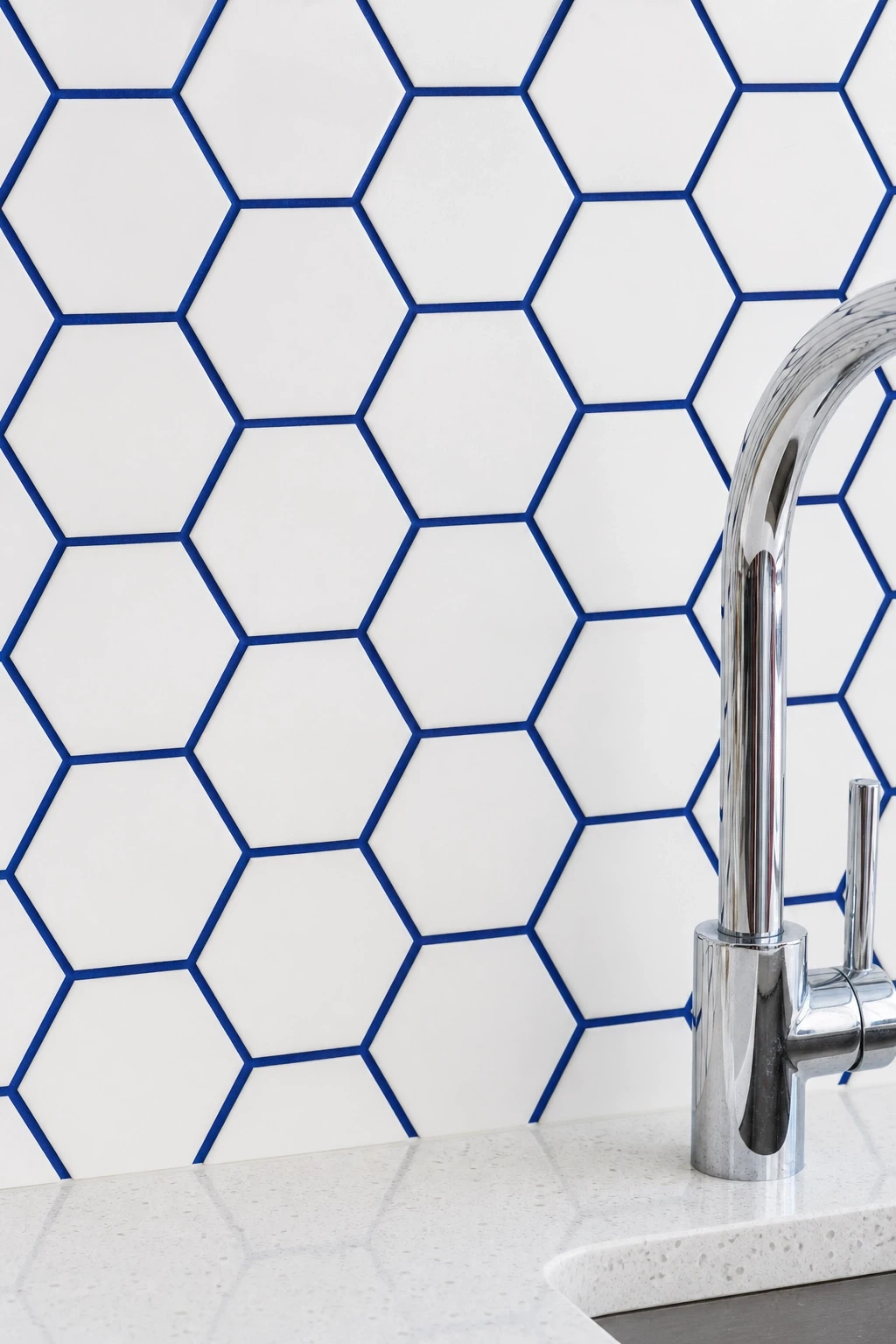
10. Blue Zellige Tile Backsplash in a White Kitchen
Zellige tiles are handmade Moroccan ceramic tiles with a slightly irregular, glossy surface that catches light in the most beautiful way. In a blue shade, they bring enormous character to a kitchen backsplash without requiring a full renovation. Used floor to ceiling behind the stove or just in a standard backsplash band behind the counter, blue zellige tiles add color, texture, and artisan quality all in one go. Their slight imperfections and tonal variation mean no two tiles look exactly the same, which gives the backsplash a depth and richness that standard flat tiles cannot match.
Pair a blue zellige backsplash with white or cream flat-panel cabinets to let the tiles be the star of the show. Countertops in a warm white quartz with minimal veining keep the surface clean and allow the tiles to pop. Hardware should be simple, either raw brass or unlacquered brass, which pairs wonderfully with the earthy, artisanal quality of zellige. For lighting, a wide beam spotlight bar directed at the backsplash will catch every facet of those tiles and make them absolutely glow, especially in the evenings when overhead lighting alone would not do them justice.
Designer Note: When selecting blue zellige tiles, order a slightly larger quantity than you think you need. Their handmade nature means there will be some breakage during installation, and matching tiles from a later batch can be surprisingly difficult.
11. Blue Kitchen Runner Rug and Textile Accents
If you rent, are working with a tight budget, or simply do not want to commit to a full kitchen renovation, textiles are your best friend. A bold blue kitchen runner rug on a wooden or stone floor instantly changes the energy of the room. Look for runners in a deep navy, a graphic blue and white pattern, or even a vintage-style kilim with blue as the dominant color. The rug adds warmth underfoot, introduces color at floor level where you often overlook it, and creates a softer, more layered feel in what can sometimes be a very hard-surfaced room.
Layer your blue textile story with other soft accents. Blue linen dish towels hanging from the oven handle, a set of navy blue or powder blue cushions on a kitchen bench seat, or even a simple blue tablecloth on a kitchen dining table all contribute to the overall color palette without feeling forced. The beauty of going the textile route is that every single piece is completely interchangeable. If you get bored of blue in a couple of years, you simply replace the textiles and the kitchen feels completely different again. It is the most low-commitment and high-return approach to adding color in a kitchen.
Designer Note: For kitchen rugs specifically, always choose a low-pile or flat-weave style. High-pile rugs in kitchens collect crumbs, get damp near the sink, and are very difficult to keep clean. Flat-weave cotton or wool is the practical choice.

12. Statement Blue Pendant Lights Over the Island
Light fixtures are often overlooked as a way to add color in a kitchen, but blue pendant lights can be genuinely transformative. A cluster of blue glass pendants over the kitchen island casts a beautiful colored glow and acts as a piece of art even when the lights are switched off. Blue mouth-blown glass, hand-thrown ceramic in a matte blue finish, or even powder-coated metal in a deep petrol blue are all options that bring color to the ceiling zone of the kitchen, which most people leave completely neutral.
The key consideration when choosing colored pendants is the effect the colored glass or shade will have on the quality of the light itself. Blue glass pendants tend to cast a cooler, slightly moody light, which is beautiful in the evenings but might not be ideal for a task workspace. For that reason, pairing colored decorative pendants with a separate bright recessed lighting circuit gives you the best of both worlds: practical working light when you need it and atmospheric colored light for when you are entertaining or simply sitting with a coffee.
Designer Note: If you find glass pendant lights in the exact blue you love but they are priced above your budget, look at Etsy or independent ceramic artists for handmade versions. You will often find something more interesting and unique for a fraction of the high-street price.

13. Blue Painted Kitchen Ceiling
Painting the kitchen ceiling blue is one of those ideas that sounds surprising until you see it done well, and then it suddenly makes complete sense. A soft sky blue or pale powder blue on a kitchen ceiling creates the impression of an open sky overhead, which makes the room feel airy and cheerful rather than claustrophobic. It works particularly well in kitchens with lower ceilings where you want to draw the eye upward without making the ceiling feel higher in a way that throws the proportions off. The blue ceiling also reflects light around the room in a way that white rarely does.
To make a blue ceiling work in the kitchen, keep everything else in the room fairly light and neutral. White or cream cabinets, light countertops, and simple flooring let the ceiling be the conversation piece without the whole room feeling overwhelmed by color. If you want to go bolder, a navy ceiling in a kitchen with crisp white everything else is genuinely striking and feels very contemporary. For period properties with original ceiling roses or cornicing, a blue ceiling actually highlights those architectural details beautifully, bringing them to life in a way that plain white tends to flatten.
Designer Note: Always carry your blue ceiling paint just a few centimetres down the wall past the ceiling line rather than stopping exactly at the join. This avoids the slightly awkward visual where a painted ceiling looks like a lid sitting on top of the room.

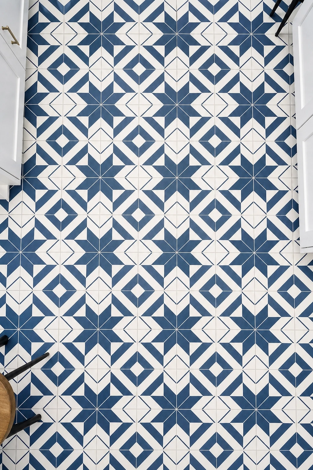
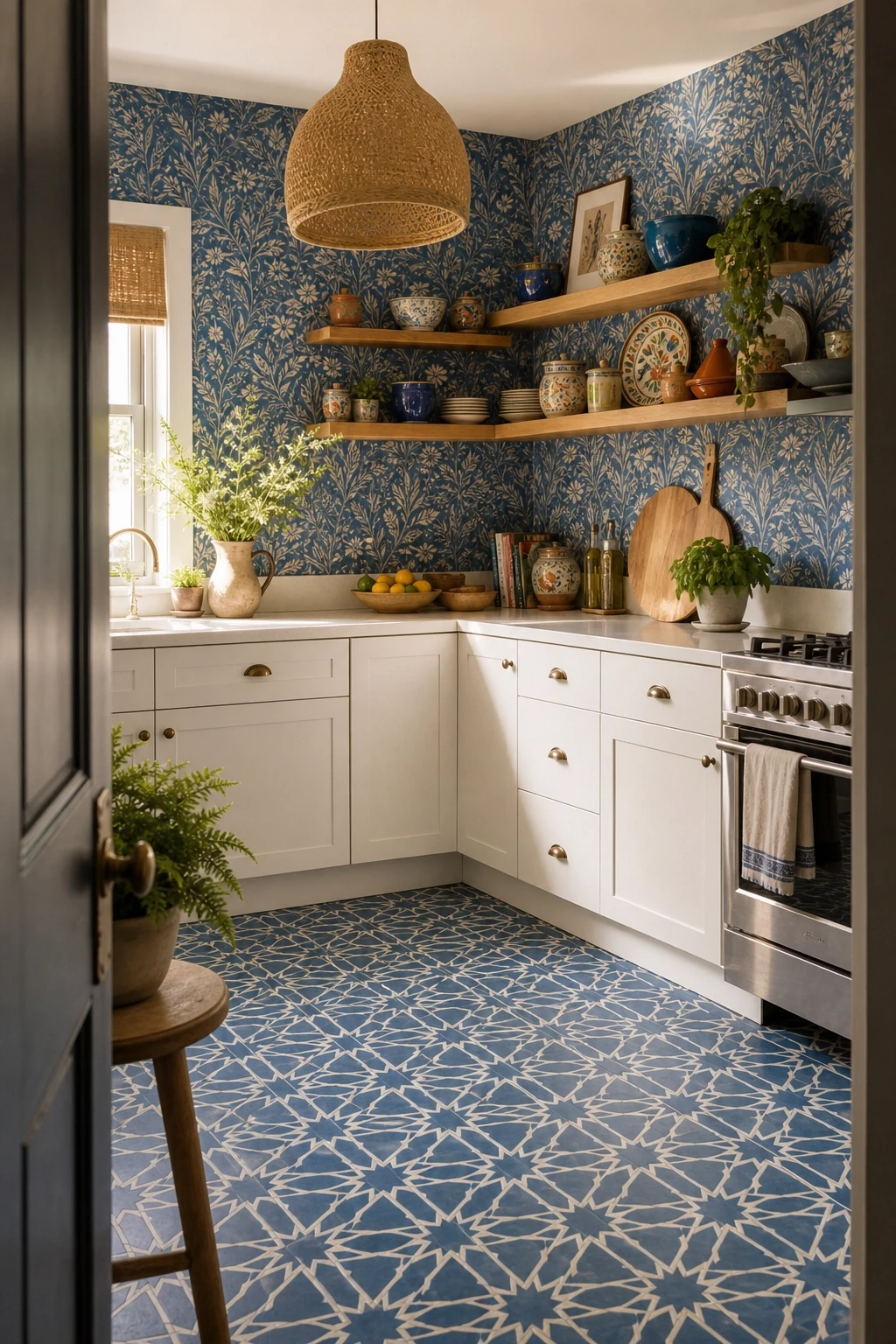
14. Blue and White Patterned Floor Tiles
Blue and white patterned floor tiles are one of the most effective ways to add both color and character to a kitchen from the ground up. Whether you go for traditional encaustic cement tiles in a Moroccan-inspired pattern, hand-painted Portuguese azulejo style tiles, or a more contemporary geometric blue and white grid, the floor becomes the foundation of the whole room’s color story. Everything else you choose for the kitchen, the cabinet color, the countertop, the walls, can be built around and coordinated with the floor.
Practically speaking, a dark blue and white patterned tile on the floor is also extremely forgiving in terms of cleaning and wear. The pattern naturally disguises crumbs, light scuffs, and the kind of general kitchen floor chaos that a solid light tile would show up immediately. Pair patterned blue tiles with plain, unfussy cabinets in white or a very light warm grey so the floor can do its job as the visual centrepiece. Furniture legs in a natural wood or black finish rather than chunky solid bases will let you see more of the beautiful floor pattern rather than covering it up.
Designer Note: Order a sample tile before committing to a full order for blue and white patterned floors. Colors and pattern scales look very different in a real room with real light compared to an online product photo on a white background.
Category Four: Blue by Material and Texture
Beyond paint and tiles, blue appears in kitchen design through materials and textures that add depth and tactility. From stone and glass to concrete and terrazzo, these ideas explore blue as a material expression rather than simply a color choice.
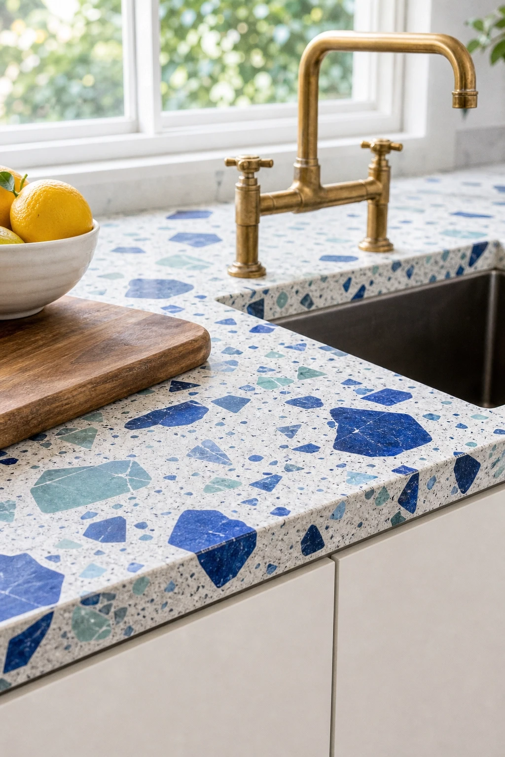
15. Blue Terrazzo Countertops
Terrazzo has made a huge comeback in interior design, and blue terrazzo countertops are one of the most interesting and distinctive ways to use it in a kitchen. Made from chips of marble, granite, glass, or other materials set in a cement or resin base, terrazzo with prominent blue chips or a blue base creates a countertop that is genuinely unlike anything else. It is a talking point, a piece of functional art, and a highly durable surface all at once. Blue terrazzo reads completely differently depending on the size and density of the chips, the background color, and the finish, so there is a lot of creative room within this one material.
Pair blue terrazzo countertops with relatively simple cabinet fronts in white, cream, or light grey so the countertop surface gets the attention it deserves rather than competing with busy cabinet detail. Flooring in a plain polished concrete or large-format pale stone keeps the base of the room simple. Tap and sink choices are important in a terrazzo kitchen, and an oversized bridge-style or gooseneck tap in brushed brass or raw steel adds to the slightly industrial, artisan quality that terrazzo naturally brings. The result is a kitchen that feels genuinely original and considered.
Designer Note: Terrazzo countertops in resin rather than traditional cement are more resistant to staining and require less maintenance, which matters a great deal in a kitchen where liquids are always being spilled. Ask your supplier specifically about resin-based options.
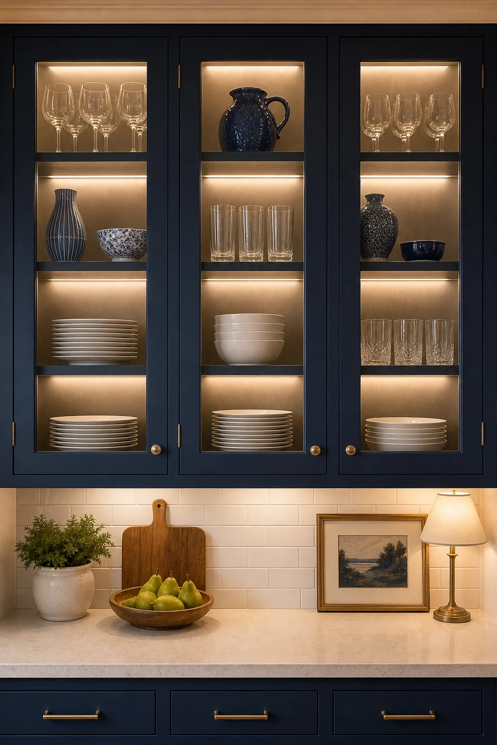
16. Blue Glass Cabinet Fronts
Glass-front cabinet doors are a classic kitchen feature, but using blue-tinted glass or wire-glass panels in a deep blue frame is a genuinely contemporary and interesting spin on the idea. Pale blue glass front cabinets let light through while adding a soft color wash to everything displayed inside, making even a practical collection of plates and glasses look beautiful and intentional. This works particularly well in a kitchen-diner where the cabinetry is visible from a seating area and needs to look good from a distance as well as up close.
Dark navy blue frames around clear glass panels are an equally strong look, creating a grid pattern on the cabinet fronts that feels modern and graphic without being stark. Inside the cabinets, style the contents deliberately since the whole point of glass fronts is that everything inside is part of the display. White stacked plates, glassware that catches the light, and a few ceramics in complementary tones all look wonderful behind glass. Add interior cabinet lighting, a small LED strip along the top or side of each shelf, to turn your glass front cabinets into proper display moments, especially effective in the evenings.
Designer Note: Keep the insides of glass-front cabinets immaculately tidy. A jumbled mix of containers, bags, and random items behind glass looks far worse than closed cabinet doors would, and it undermines the whole effect instantly.
17. Slate Blue Concrete-Look Cabinets
Concrete-look finishes on kitchen cabinets have a particular appeal for anyone who loves the industrial aesthetic but does not want an actual concrete kitchen. Slate blue in a matte, slightly textured concrete-effect finish on flat-panel cabinets is a very specific and very current look that sits confidently in the modern kitchen design space. The color itself, that particular blue-grey that is neither purely blue nor purely grey, is sophisticated and grown-up without being boring. It has an almost architectural quality that makes the kitchen feel considered and deliberate.
Partner concrete-look slate blue cabinets with a light grey quartz countertop with a very subtle concrete texture to your countertop surface so the textures rhyme without being identical. Hardware in a brushed stainless steel or industrial gunmetal finish reinforces the contemporary, material-led aesthetic. For flooring, large-format porcelain tiles in a pale concrete or warm stone finish keep the base clean and simple. The occasional warm touch is essential in a kitchen this cool-toned, so consider a wooden bar stool, a plant on the windowsill, or a woven pendant light that introduces organic texture and stops the room from feeling like an art gallery rather than a kitchen.
Designer Note: Matte concrete-finish cabinet doors show fingerprints and marks less than gloss alternatives, making them genuinely practical for a busy household kitchen. This is one of those rare situations where the most beautiful finish is also the most forgiving.

18. Indigo Blue Grouted Tile Kitchen
Grout is one of the most underrated design decisions in a kitchen, and using indigo or dark blue grout with otherwise plain white or light tiles creates a graphic, high-impact look that costs nothing extra beyond the choice of grout color. White hexagon tiles with indigo grout, plain white subway tiles with a deep blue grout line, or even large-format beige tiles with indigo grout all read as intentional and design-forward rather than like a standard tile choice. The grout lines become the pattern, which is a particularly clever approach in a kitchen where you want texture and interest without introducing a bold tile design that might be harder to live with long-term.
This approach works equally well on the backsplash and the floor, and using it on both creates a cohesive room rather than two disconnected ideas. Keep everything else in the kitchen very simple, white or light cabinets, a clean countertop, minimal accessories, so the tile and grout combination can be appreciated as the design decision it is. Over time, dark grout in a kitchen can pick up oil residue and food marks, so make sure your chosen grout is properly sealed before use and resealed periodically to keep those indigo lines crisp and clean.
Designer Note: Always use a pre-mixed, stain-resistant colored grout for kitchen applications rather than mixing your own dye into standard grout. Pre-mixed versions are formulated to be consistent in color and far more resistant to discoloration over time.
Category Five: Maximalist and Statement Blue
For those who do not do things by halves, this category is all about going bold with blue. These are the kitchens that make a real statement, where blue is not an accent or a detail but the central character of the entire room.
19. All-Blue Kitchen with Tonal Variation
An all-blue kitchen sounds like it could be overwhelming, but when you play with tonal variation, using multiple shades of blue together rather than one flat color on every surface, the result is sophisticated and layered rather than monotonous. Think of the approach as working with a blue palette the way you would with a neutral palette. Use a deep navy on the lower cabinets, a slightly softer blue-grey on the upper cabinets, a pale powder blue on the walls, and then a dark blue lacquered island as the centrepiece. Every surface is some version of blue, but each one is different enough that the eye has somewhere interesting to travel.
In an all-blue kitchen, material texture becomes especially important because it provides the variation that color differences alone cannot fully deliver. Matte cabinet fronts, a slightly glossy backsplash tile, a marble countertop with natural veining, and a polished concrete floor all bring different light responses to the same blue environment, creating a richness and depth that a single-material approach never could. Accessories should stick to white, natural wood, brass, and greenery so that there are some non-blue elements anchoring the room and preventing it from feeling one-note.
Designer Note: When combining multiple shades of blue in one kitchen, photograph the room in progress with your phone and look at the photos rather than looking at the room itself. The camera flattens the image slightly and shows you whether the combination is reading as intentional or chaotic in a way the naked eye sometimes misses.

20. Blue Kitchen with Maximalist Pattern on Pattern
Pattern on pattern sounds like a decorating rule being broken, and in a sense it is, but when done confidently it creates some of the most characterful and memorable kitchens around. Blue patterned floor tiles paired with a blue printed wallpaper or a blue geometric backsplash tile is a bold statement, but it can absolutely work when the patterns share a color family and are different enough in scale that they do not visually compete at the same frequency. A large-scale floral wallpaper and a small-scale geometric tile, for example, sit together without fighting.
This kind of maximalist kitchen works best when the cabinets themselves are relatively simple, either painted in a solid color that is pulled from the dominant blue in your patterns, or in a plain white that lets all the pattern live everywhere else. Open shelves rather than overhead cabinets free up the wall space to allow the pattern to breathe and be seen. For furniture, solid-toned bar stools and chairs in one of the colors from your pattern keep things grounded. Good lighting is essential in a maximalist kitchen because you want to be able to see and appreciate the detail in your patterns rather than having them disappear into a dark corner.
Designer Note: Start with your floor tile or your most expensive pattern first when planning a maximalist kitchen, then build every other element around it. Working from the most fixed element outward is far easier than trying to match a floor tile to a wallpaper you fell in love with first.
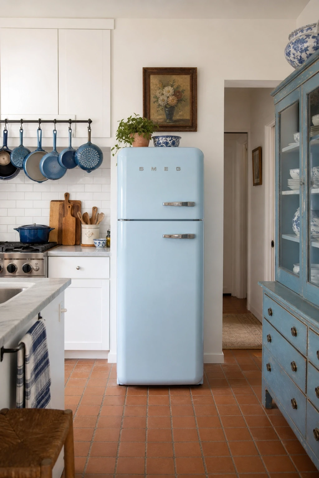
21. Blue Kitchen with Statement Vintage Pieces
One of the most interesting ways to do a blue kitchen is to mix the color with genuine vintage or antique furniture and appliances. A powder blue 1950s-style fridge becomes an instant focal point in a kitchen of white cabinets. A vintage blue enamel pot collection displayed on open shelves adds color and history in equal measure. An antique blue-painted dresser used as a kitchen storage piece brings a completely different scale and materiality to the room that modern flat-pack cabinetry simply cannot replicate. Mixing old and new is where truly individual kitchens happen.
For this kind of kitchen to work well, you need to let go of the idea that everything has to match perfectly. The whole point is that the pieces feel collected over time rather than bought together in one shopping trip. A period kitchen with original features like quarry tile floors, beamed ceilings, or an old stone hearth is an ideal backdrop for this approach since those elements already have age and character baked in. Layer in some simple white cabinets for practical storage, use the vintage pieces as the personality, and keep the overall palette anchored in a consistent blue-and-white story so everything reads as connected even if the individual pieces have very different origins.
Designer Note: If you want the vintage look without genuine antiques, chalk paint in a soft blue applied to a plain IKEA unit and then gently distressed with fine sandpaper at the edges creates a very convincing aged effect for a fraction of the cost.
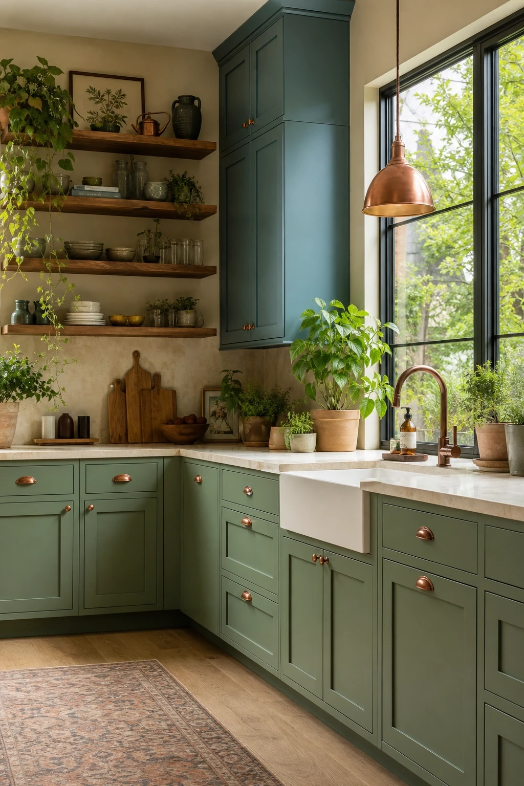
22. Blue and Green Kitchen with Nature-Inspired Tones
Blue and green sit next to each other on the color wheel, and when both shades are slightly muted and nature-inspired, mixing them in a kitchen creates something that feels genuinely organic and grounded. Think sage green lower cabinets paired with a dusty teal or slate blue island, or a soft olive green wall with blue-green shaker cabinet doors. These are not primary colors shouting at each other. They are the kind of tones you find in a coastal rock pool or a shaded garden, which is exactly why they feel so comfortable and liveable together.
In a blue-green kitchen, wood is your most important partner material. Natural oak, teak, or walnut in the form of open shelves, a wooden worktop section, or simply a wooden fruit bowl and cutting boards on the counter provides the warmth that keeps all those cool nature tones from feeling cold or clinical. Stone countertops in a warm cream or soft grey add to the earthy, natural palette. Copper or brushed bronze hardware bridges the blue and green worlds beautifully, and a collection of indoor plants on the windowsill, in various trailing and structural forms, makes the nature connection feel complete and intentional.
Designer Note: In a blue-green kitchen, keep the light fittings in a warm-toned metal rather than chrome or cool silver. Even one warm metallic element in the room shifts the whole palette from cool and slightly distant to warm and genuinely welcoming.
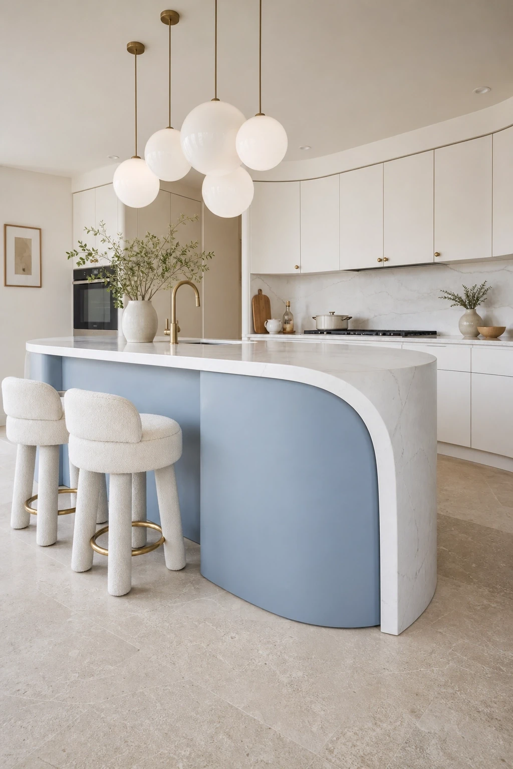
23. Blue Kitchen with Curved Cabinetry and Soft Forms
Curved cabinetry is one of the biggest shifts in kitchen design over the last few years, moving away from strictly rectilinear layouts toward softer, more organic forms. A powder blue or slate blue curved island with a smooth continuous edge rather than sharp corners brings both color and a sculptural quality to the kitchen. Curved corner cabinets, rounded cabinet door profiles, and even an arched opening between the kitchen and dining area all contribute to a kitchen that feels more like a room that has been designed than simply installed.
Blue is a particularly beautiful color for curved cabinetry because the color shifts slightly as it wraps around the curve, catching the light differently on each surface and creating a three-dimensional depth that flat cabinets in the same color would not have. For this style of kitchen, countertops with a waterfall edge that follows the curve of the island feel right, especially in a light-toned Carrara-inspired quartz. Furniture with soft organic shapes, a round dining table, curved bar stools, a rounded pendant light cluster, all reinforce the design language of the kitchen itself and create a space that feels cohesive, modern, and quietly distinctive.
Designer Note: Custom curved cabinetry is a significant investment, but curved corner base cabinets and a curved island skin added to a standard straight run of cabinets can achieve a very similar effect for considerably less money if you are working with a kitchen fitter who is comfortable with bespoke detail.
Final Thoughts
Blue is one of those rare kitchen colors that truly does something for the people who live with it every day. There is real psychology behind why blue promotes a sense of calm and focus, and in a kitchen, where you start and end most of your days, that matters more than you might think. Whether you choose to go all the way with a full navy cabinet kitchen or simply add a blue zellige backsplash and a runner rug, you are bringing something into your home that is both visually interesting and genuinely pleasant to be around.
The most important thing when planning any blue kitchen is to spend time with your chosen shade before committing. Light changes color dramatically throughout the day and from room to room, so what looks perfect in a showroom might read very differently in your north-facing galley kitchen at 7am in December. Get large paint samples, stick them on the actual walls, and live with them for a few days before you open a single tin. That one extra step saves more regret than almost anything else in the kitchen planning process.
However you decide to bring blue into your kitchen, the ideas in this article should give you a solid and genuinely exciting starting point. From soft powder blue shakers to bold moody navy, from zellige tile backsplashes to curved cobalt islands, there is a version of a blue kitchen that is exactly right for your space, your lifestyle, and your taste. Trust the color, get the details right, and you will end up with a kitchen you genuinely love being in.
FAQ
What is the most popular shade of blue for kitchen cabinets right now?
Navy blue remains the top choice for kitchen cabinets, particularly shades like Sherwin-Williams Naval, Benjamin Moore Hale Navy, and Farrow and Ball Hague Blue. However, slate blue and denim-inspired tones have grown significantly in popularity through 2025 and into 2026, particularly for those who want a blue that feels a little softer and more versatile. The most popular shade really depends on your kitchen’s light and the overall style you are going for, so always test your shortlisted colors in the actual room before deciding.
Does blue work in a small kitchen without making it feel smaller?
Yes, absolutely. The key is choosing the right shade and using it thoughtfully. Soft and airy blues like powder blue, pale sky, or duck egg on upper cabinets while keeping lower cabinets and the floor relatively light actually makes a small kitchen feel larger rather than smaller because these tones reflect light well. Even in a fully navy kitchen, using lighter countertops, good lighting, and reflective surfaces like a glossy tile backsplash prevents the space from feeling closed in. Dark paint in a small space with excellent lighting often reads as intentional and dramatic rather than claustrophobic.
What hardware colors work best with blue kitchen cabinets?
Brass and gold hardware, whether in polished, satin, or unlacquered finishes, is the most popular pairing for blue cabinets because the warmth of the metal contrasts beautifully with the coolness of the blue. Matte black hardware is a strong modern choice, particularly for navy or slate blue, where it creates a crisp graphic contrast. Brushed nickel or chrome tends to work best with softer, cooler blues where you want to keep everything light and airy. The one finish to avoid is standard chrome in a warm-toned blue kitchen since it can feel slightly cold and disconnected from the rest of the palette.
Can I mix blue with other colors in a kitchen, or does it need to stand alone?
Blue is one of the most mixable colors in a kitchen. It works brilliantly with white, cream, natural wood tones, and warm metals as discussed throughout this article. It also pairs beautifully with green for a nature-inspired palette, with terracotta or warm clay tones for a more earthy feel, and even with blush or dusty pink for a more eclectic and maximalist approach. The main thing to avoid is mixing too many competing strong colors at the same intensity level. If you want blue alongside another color, let one lead and the other support rather than giving them equal billing.
Is blue a trendy color that will date quickly in a kitchen?
Blue in kitchens is not a passing trend in the way that some very specific finishes or hardware styles can be. Navy, in particular, has been used in kitchen design for decades and continues to feel current because it is fundamentally a classic color with real depth and sophistication. What does date quickly is the very specific way a color is used, the hardware style paired with it, the countertop material, or the tile pattern rather than the blue itself. If you choose a shade of blue you genuinely love and pair it with quality materials in fairly enduring combinations, you are far more likely to still enjoy it in ten years than if you chase a very specific moment-in-time aesthetic.
What is the easiest way to add blue to a kitchen without renovating?
Textiles are by far the easiest entry point. A blue kitchen runner, a set of blue linen dish towels, blue ceramic accessories on the counter, and cushions on a kitchen bench seat can completely change the feeling of a kitchen without touching a single cabinet or tile. Beyond textiles, a statement pendant light in a blue finish or blue glass, a large ceramic vase in a deep blue glaze, or even simply repainting one small alcove wall in a beautiful blue are all relatively low-commitment ways to test the color in your space before going further.


