Interior Design Tips That Actually Work in Real Homes
There is a big difference between a room that looks good in a magazine and a room that feels good to live in. Most of us are somewhere in the middle, with spaces that work fine but never quite feel pulled together. The problem is rarely a lack of budget or a bad eye for style. Usually it comes down to a handful of practical principles that professional designers apply almost without thinking, things that are easy to learn once someone points them out.
This guide covers 25 of those principles. Some are about furniture placement, some are about light and color, and a few are about the small finishing details that separate a put-together room from one that just looks like a collection of nice objects. Every tip here is something you can act on today, whether you are starting from scratch or just trying to make your current home feel a little more like the version you had in your head.
1. Get Your Sofa Off the Wall
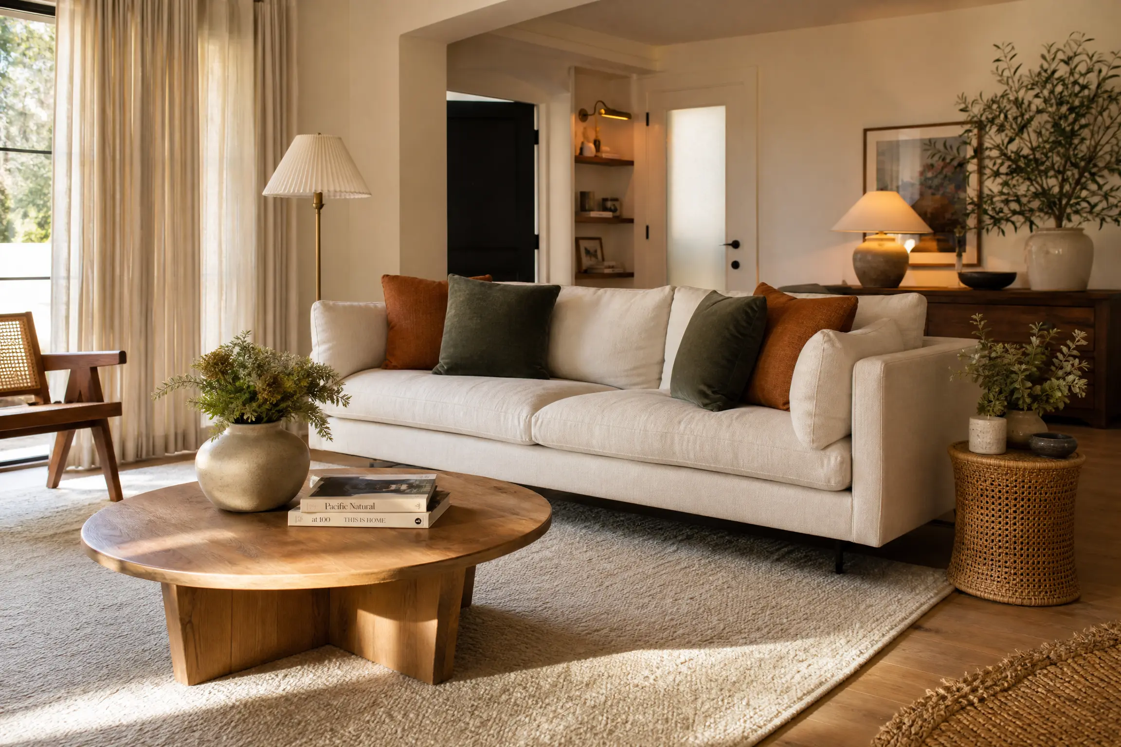
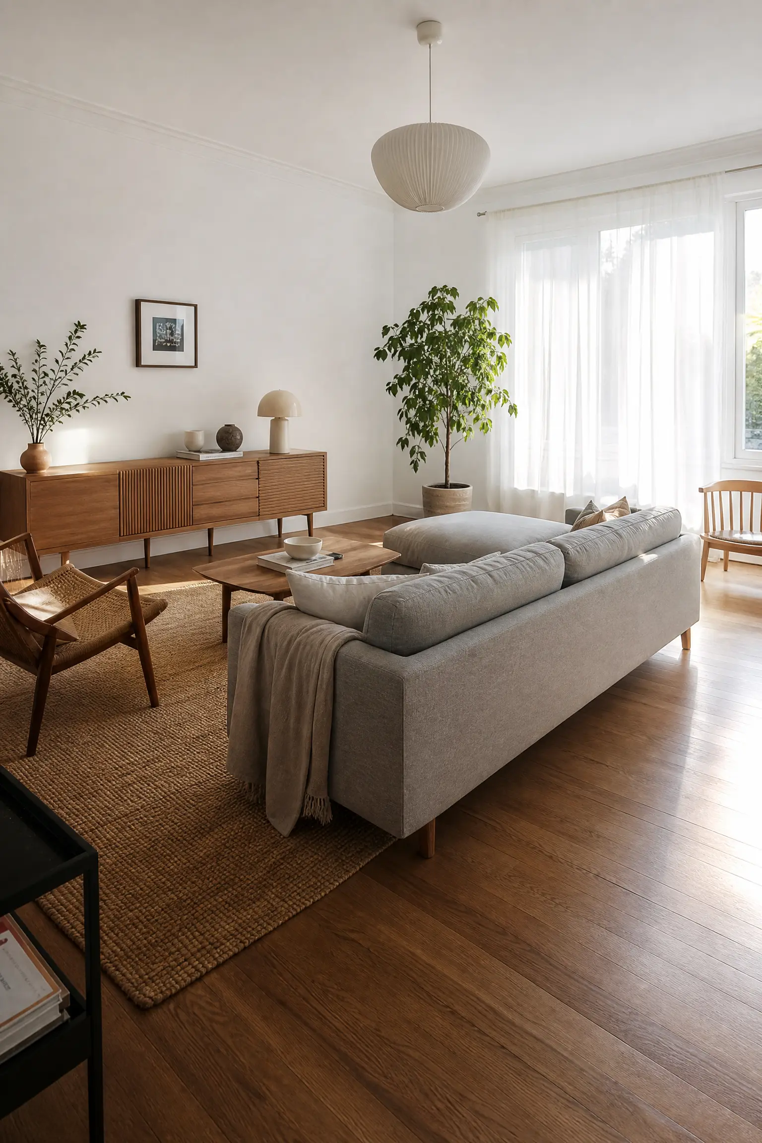
Almost every first apartment has the sofa pushed flat against the wall, and it is one of those habits that is hard to shake even when you move into a bigger place. Pulling the sofa at least 6 to 12 inches away from the wall immediately makes the room feel larger, not smaller, which is counterintuitive but true. Floating furniture creates a sense of intentional layout and allows you to define a proper seating zone. If you have a large open-plan space, try pulling the sofa completely into the center with a console table behind it. This works especially well in Scandinavian-style rooms where negative space is part of the design, not an afterthought. The honest limitation here is that it does require a rug underneath to anchor the furniture grouping, otherwise the sofa just looks lost. A jute or wool area rug in a neutral tone is an affordable way to make the whole arrangement feel grounded.
Designer Advice: Measure your room first. The ideal gap between a sofa and a coffee table is 14 to 18 inches. Any less and you are constantly bumping your shins.
2. Layer Your Lighting Instead of Relying on One Overhead Fixture
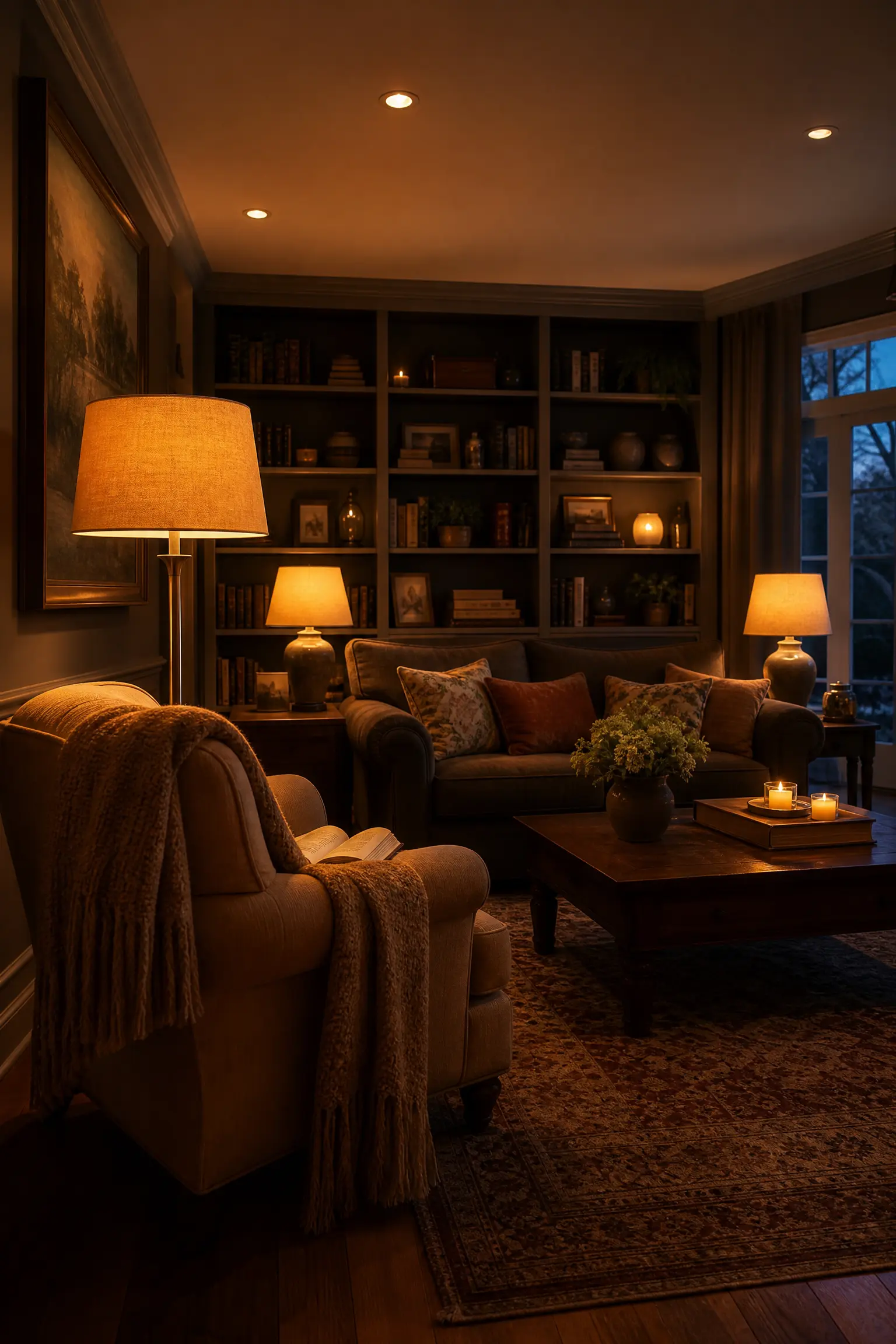
One of the fastest ways to tell a professionally styled room from a DIY one is the lighting. Rooms that rely on a single overhead light feel flat and institutional, regardless of how nice the furniture is. Layered lighting means working with at least three sources: ambient lighting for general illumination, task lighting for functional areas like reading nooks or kitchen counters, and accent lighting to highlight architectural details or art. In a living room, this might look like recessed ceiling lights on a dimmer, a floor lamp beside an armchair, and a pair of table lamps flanking the sofa. Warm bulbs in the 2700K to 3000K color temperature range make every material in the room look better, from linen cushions to wooden shelving. This approach is investment-level when done with quality fixtures, but you can get surprisingly close to the same effect using affordable plug-in sconces and a good dimmable floor lamp.
Designer Advice: Turn off the overhead light and rely only on floor and table lamps one evening. If the room feels warm and cozy, your layering is working.
3. Choose a Rug That Is Actually Big Enough
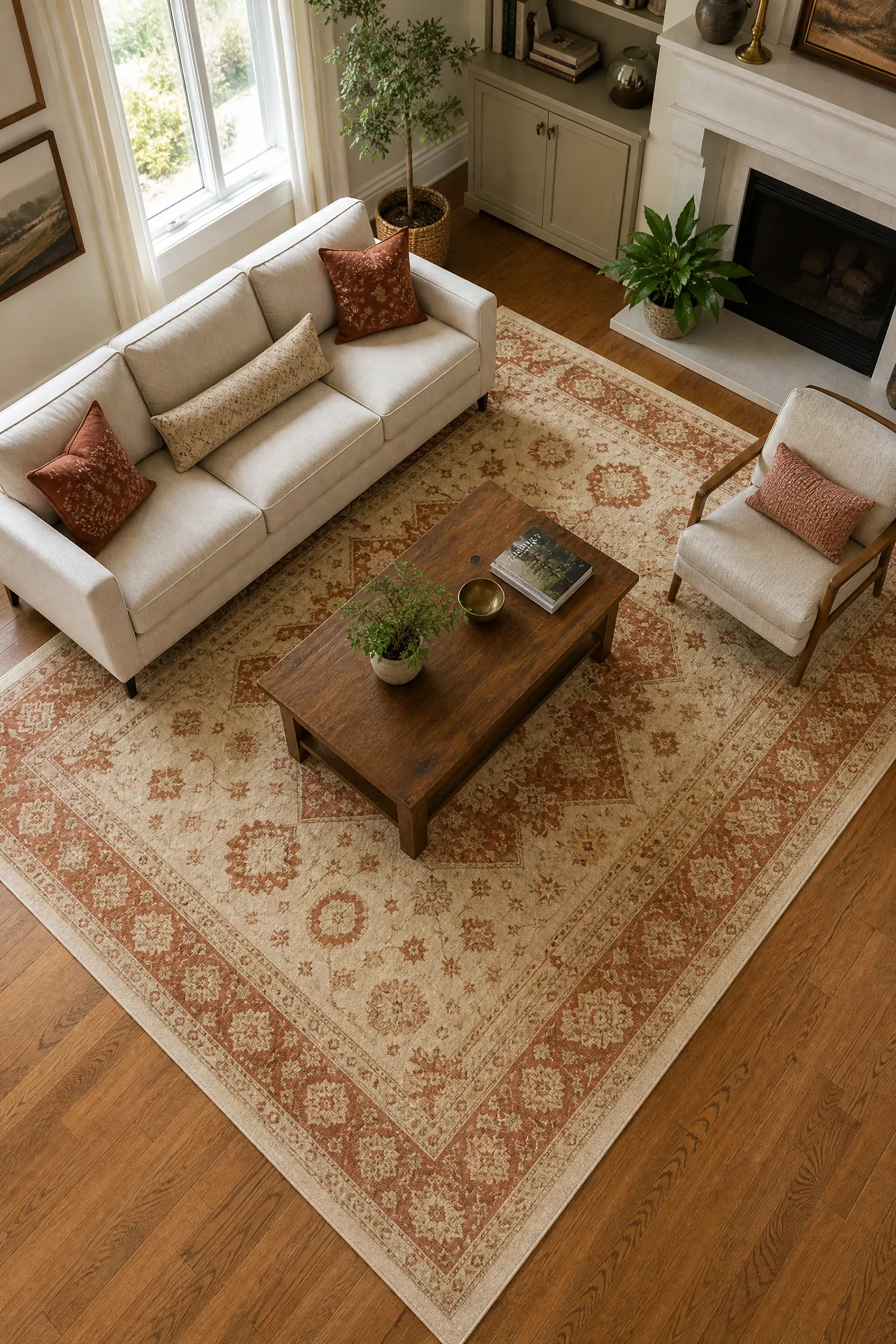
Small rugs are one of the most common and most fixable design mistakes in living rooms. When a rug is too small, it floats in the middle of the room and makes the furniture arrangement look disconnected, like everything is hovering. As a general rule, the front legs of all major seating pieces should sit on the rug, or the entire seating group should sit fully on top of it. In a typical living room, this usually means you need at least a 8×10 foot rug, and often a 9×12. Wool rugs have the best visual weight and texture and last a long time, but they sit at the higher end of the budget. A flat-weave cotton rug or a good quality polypropylene option can work well in high-traffic rooms and come in at a fraction of the price. The honest trade-off with synthetic rugs is that they do not have the same depth underfoot, but for a room where the visual effect matters more than the feel, they do the job well.
Designer Advice: Before you buy, tape out the rug size on the floor with painter’s tape. Living with the outline for a day will tell you immediately whether it is the right scale.
4. Use the 60-30-10 Color Rule
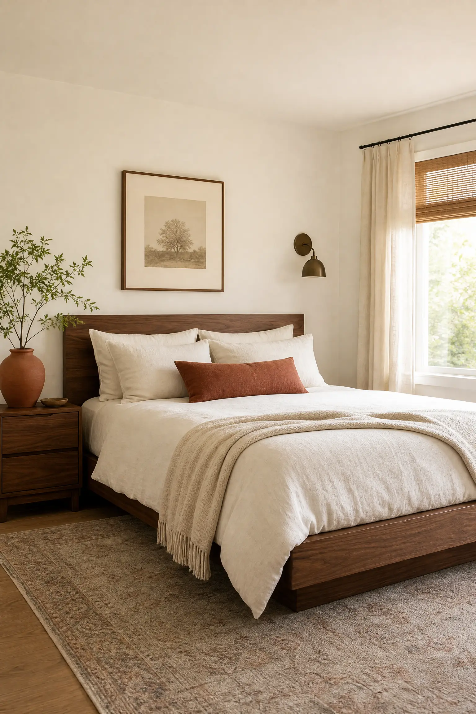
If your room feels like it has too much going on visually but you cannot figure out why, the problem is usually that there is no clear color hierarchy. The 60-30-10 rule is a proportion guideline that designers use to create balance without making a room feel boring. Sixty percent of the room should be a dominant color, typically applied to walls and large upholstery pieces. Thirty percent goes to a secondary color, used on curtains, bedding, or accent chairs. The final ten percent is reserved for an accent color that brings the most visual interest, usually showing up in throw pillows, art, or a few accessories. In practice this might look like a soft warm white on the walls with walnut furniture as the secondary tone and a dusty terracotta showing up in cushions and a ceramic vase. The rule is flexible, but having one at all prevents the most common mistake, which is buying things you love individually without thinking about how they work together in the same room.
Designer Advice: Pull your accent color from something you already own and love, like a piece of art or a patterned cushion, then build the rest of the palette around it.
5. Hang Curtains Higher Than You Think You Should
Curtains hung just above the window frame are one of those things that look fine in isolation but immediately date a room. Hanging curtains as close to the ceiling line as possible and letting them fall all the way to the floor creates the illusion of much taller ceilings and a more luxurious, pulled-together look. This is one of those tricks that costs nothing extra if you are already buying curtains, you just need a longer rod and longer panels. Linen curtains work beautifully for this treatment because they have natural weight and texture that pools slightly at the floor without looking overdone. Blackout curtains can also be mounted this way, though they tend to work better in bedrooms where the priority is light control over aesthetics. The one thing to watch out for is pattern scale. Large-scale patterns on tall curtain panels can be overwhelming in smaller rooms, so stick to solids or subtle textures if your ceilings are under 9 feet.
Designer Advice: Mount the curtain rod 4 to 6 inches above the window frame and extend it 8 to 12 inches past each side of the window. This makes the window look wider and lets in more light when the curtains are open.

6. Mix Metals Instead of Matching Them
The old rule about matching all your metals, where every fixture, handle, and accessory had to be the same finish, has been retired by most professional designers. A room where everything is the same brass or the same chrome reads as rigid and slightly impersonal. Mixing metals, when done with intention, feels much more layered and collected over time. The key is to have one dominant metal that appears most often, with one or two others used sparingly as accents. A kitchen with matte black cabinet hardware might pair beautifully with a brushed brass pendant light and a polished chrome faucet. In a bathroom, unlacquered brass fixtures with a matte black mirror frame and nickel towel bar creates a sophisticated mix. The practical note is that unlacquered brass develops a patina over time and requires some maintenance if you want to keep it bright. If you prefer low-maintenance, opt for satin brass instead.
Designer Advice: Let your dominant metal guide the overall temperature of the room. Warm metals like brass and copper suit warm-toned spaces; cool metals like chrome and nickel suit cooler palettes.

7. Create a Focal Point in Every Room
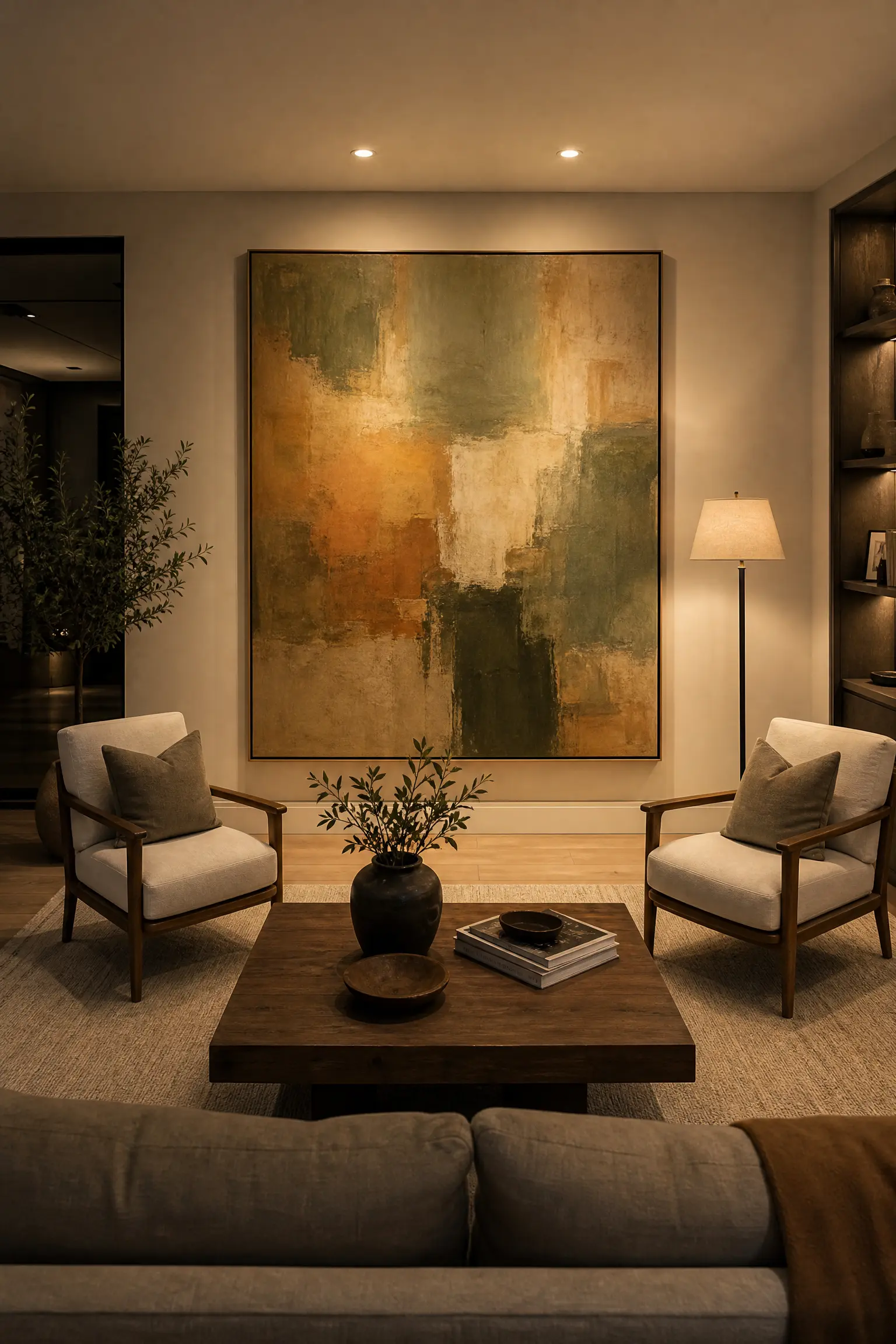
When you walk into a room and your eye does not know where to land first, the space feels unsettled even if it is well-furnished. Every room benefits from one clear focal point, which is the visual anchor that everything else in the room relates to. In living rooms, the focal point is often a fireplace, a large window, or a statement piece of art. In a bedroom, it is usually the bed, and in a dining room, it is the table and the light above it. Once you identify or create your focal point, arrange the furniture to acknowledge it. In rooms without a natural focal point, you can create one with a large-scale piece of art, a bold wallpaper on a single wall, or an architecturally interesting shelving unit. A gallery wall can serve this purpose well, but only if it is cohesive enough in framing and color to read as a single visual element rather than a collection of separate things.
Designer Advice: Stand at the doorway of the room and notice where your eyes go first. That is either your existing focal point or the place you should be creating one.
8. Bring in at Least One Organic Shape
Most contemporary furniture follows clean, rectilinear lines. Sofas, coffee tables, shelving units, and beds are overwhelmingly square and boxy, which creates a very tidy room that can also feel a little cold. Introducing one or two organic, curved shapes breaks the rigidity in a way that immediately makes a room feel more relaxed and interesting. This might be a round coffee table in an otherwise angular living room, a curved boucle armchair in a home office, or an oval dining table instead of a rectangular one. Biophilic design, which refers to the tendency of humans to feel comfortable around natural, irregular forms, explains why this works so consistently. Curved furniture also helps with traffic flow in tighter spaces because there are no sharp corners to navigate around. Budget-friendly versions of this principle include a round rattan side table, an arched floor lamp, or even a round mirror above a console.
Designer Advice: You only need one or two curved pieces to soften a room. Too many organic shapes together can start to feel chaotic rather than calming.

9. Test Paint Colors Before You Commit
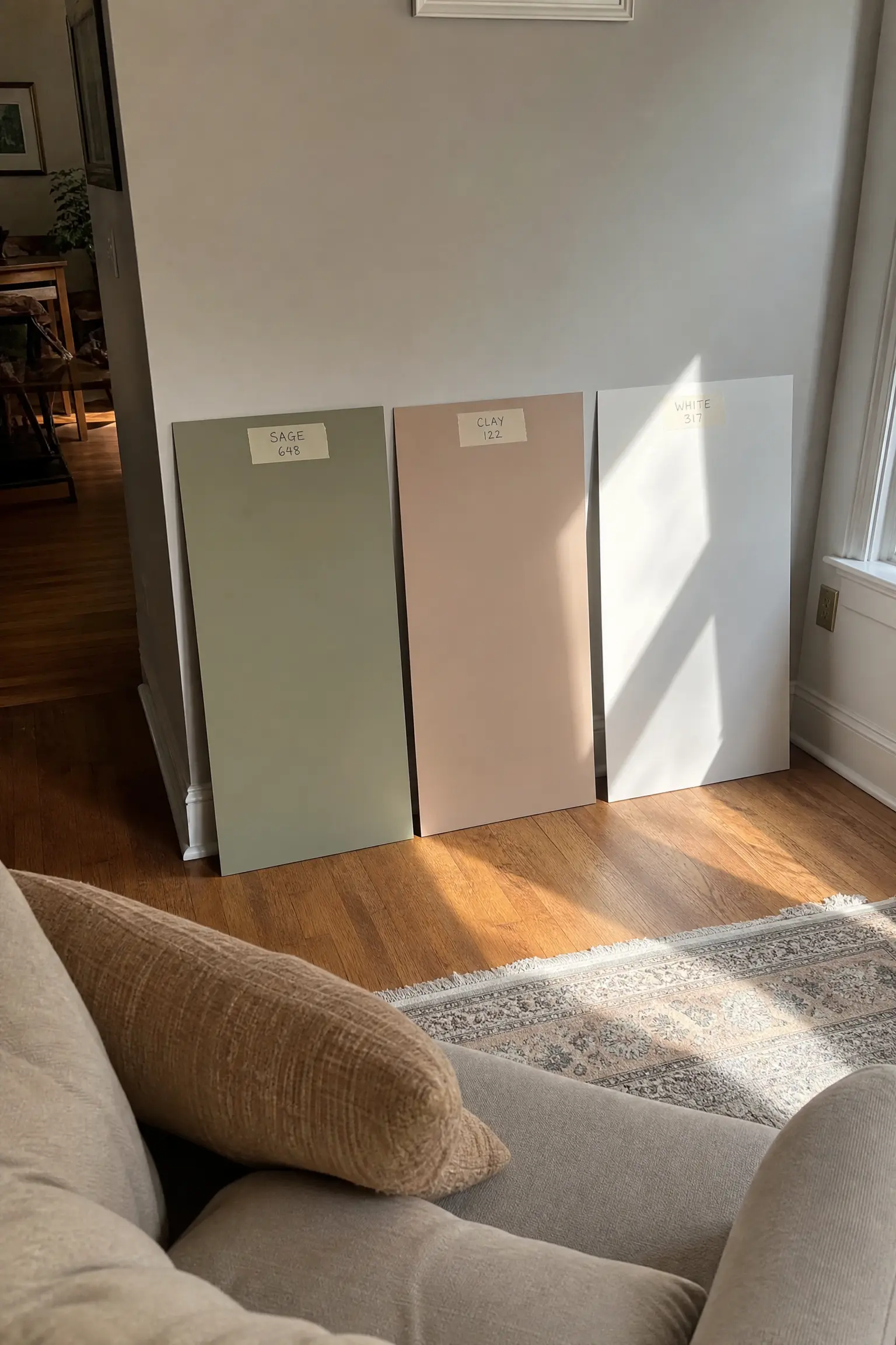
Paint is theoretically the most affordable way to change a room and practically one of the most stressful, largely because most people do not test colors properly before committing to a full room. The mistake is painting a small square directly on the wall and judging it there. Colors look completely different depending on the light source, the surrounding colors, and even the time of day. A better approach is to paint large swatches, at least 12 by 12 inches, on pieces of white foam board and move them around the room at different times of day. This lets you see how the color behaves in morning light versus evening lamplight and against your furniture. Some paint brands now offer peel-and-stick swatches, which are a worthwhile investment before painting a whole room. North-facing rooms tend to make colors look cooler and more muted, while south-facing rooms make the same paint look warmer and brighter.
Designer Advice: Always check your paint swatch next to the largest fixed element in the room, usually the flooring, since that is the relationship that will define the feel of the space.
10. Group Objects in Odd Numbers
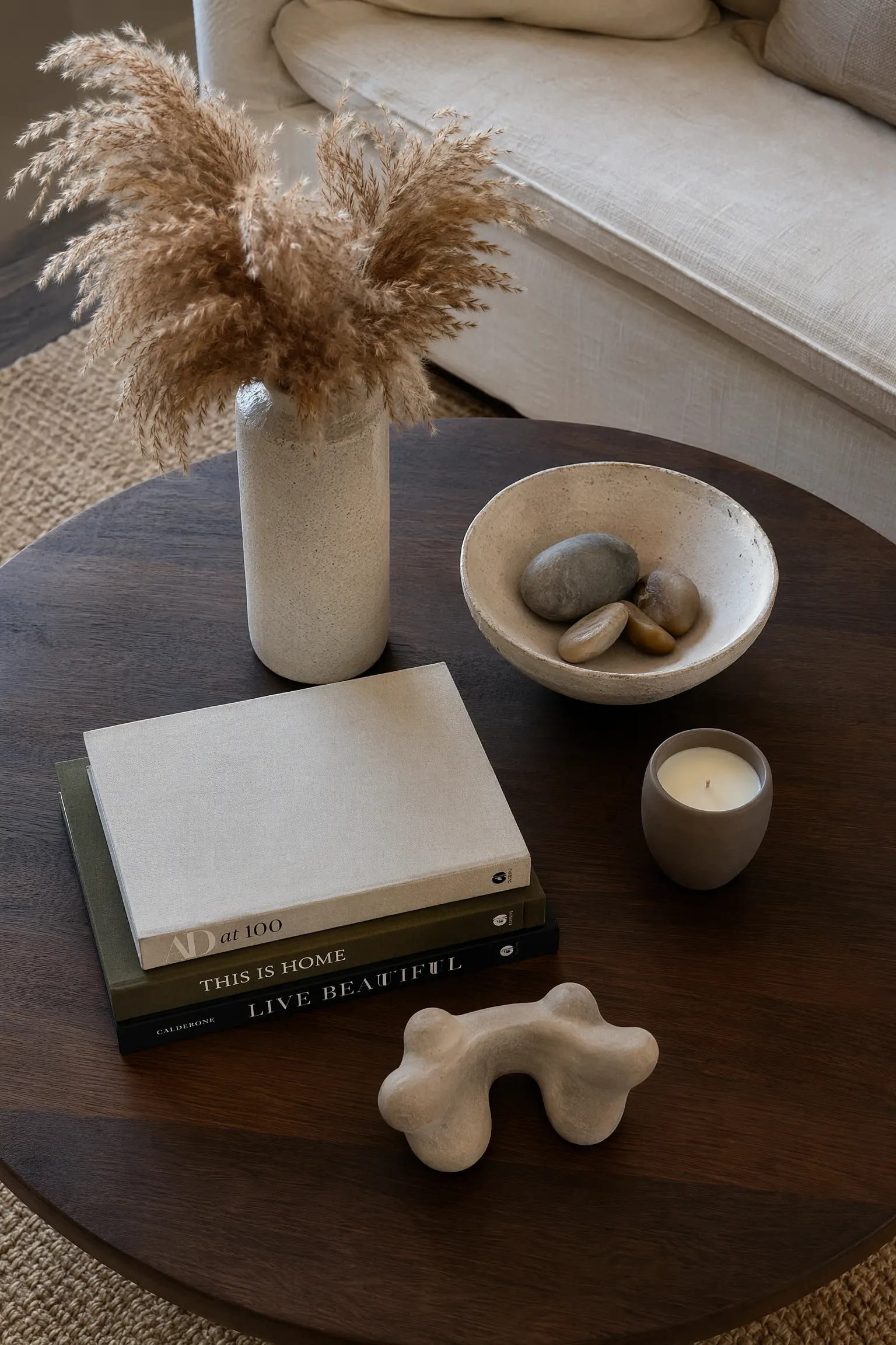
If you have ever arranged objects on a shelf or a console and felt like something was off, even though you had good pieces, the issue is often symmetry. The human eye finds odd-numbered groupings more interesting than even ones because they create natural visual movement from object to object. The rule of three is the most well-known application of this principle. On a coffee table, three objects at varying heights will look more dynamic than two. On a shelf, five books with two bookends and a small plant reads better than a perfectly paired arrangement. This works best when you also vary the heights and textures within the grouping, combining something tall with something mid-height and something low, and mixing materials like ceramic with wood with a small amount of metal. Interior designers call this creating visual rhythm, and it is one of the easier principles to apply immediately in your own home without spending anything.
Designer Advice: When in doubt about a display, remove one piece. More often than not, less is what the grouping needed.
11. Invest in One Statement Piece Per Room
A room full of similarly priced, similarly quality furniture tends to read as flat. What makes a room feel collected and interesting is usually one piece that stands out, either because of its quality, its age, its scale, or its character. This might be a vintage mid-century modern sideboard in an otherwise contemporary dining room, or a hand-thrown ceramic lamp in a bedroom of flat-pack furniture. The statement piece does not need to be the most expensive thing in the room, it just needs to have more personality than everything else around it. Antique markets, estate sales, and online vintage marketplaces are great sources for character pieces that cost less than their new equivalents. The practical consideration is that a real statement piece should be something you genuinely love, not just something that looks impressive, because it will be the thing your eye keeps returning to every day.
Designer Advice: Spend more of your budget on the pieces you touch every day, like a sofa or a bed, and use budget options for purely decorative items where quality is less noticeable.

12. Use Mirrors to Borrow Light, Not Just Add Space
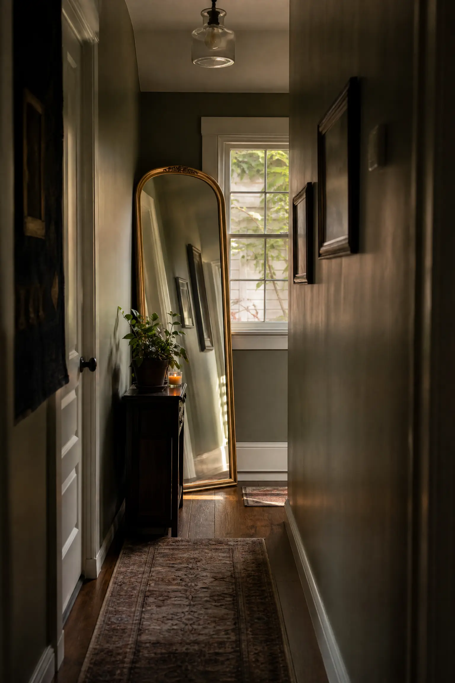
Most people know that mirrors make rooms feel larger, but the more useful trick is knowing how to use mirrors to redistribute natural light in rooms that do not get much of it. Placing a large mirror on a wall perpendicular to a window, rather than directly opposite it, catches and scatters the light around the room more effectively than a mirror that simply reflects the window back at you. In hallways and dark corners, an oversized mirror with a warm-toned or antique frame adds both light and interest without taking up any floor space. Leaning a large floor mirror against a wall is one of the most popular styling moves in contemporary interiors right now and for good reason. It feels casual and collected rather than formal, and it makes even narrow bedrooms feel much more generous. The limitation is that mirrors opposite cluttered or uninspiring views just amplify those views, so be thoughtful about what yours is reflecting.
Designer Advice: Before hanging a mirror, hold it up and look at what it reflects. Make sure that reflection is something you actually want to see repeated in the room.
13. Add Texture When You Cannot Add Color
Neutral rooms are popular for good reason. They are calm, versatile, and easy to live with. But an all-neutral room without texture can feel sterile and lifeless, like a hotel lobby between renovations. The solution is to layer materials with different surface qualities so that even within a limited palette, there is visual depth and tactile interest. In a room decorated in shades of oatmeal, cream, and warm grey, you might have a chunky knit throw on the sofa, a linen cushion beside a velvet one, a jute rug underfoot, a rattan side table, and a matte plaster-finish vase on the coffee table. None of these add color, but together they create a room that feels rich and considered. This approach is also forgiving of rental restrictions or simply changing tastes, since texture layers can be swapped in and out without repainting or replacing furniture.
Designer Advice: Run your hand across the surfaces in your room. If everything feels smooth, that is your sign to introduce something woven, something rough, or something soft.

14. Hang Art at Eye Level, Not Too High
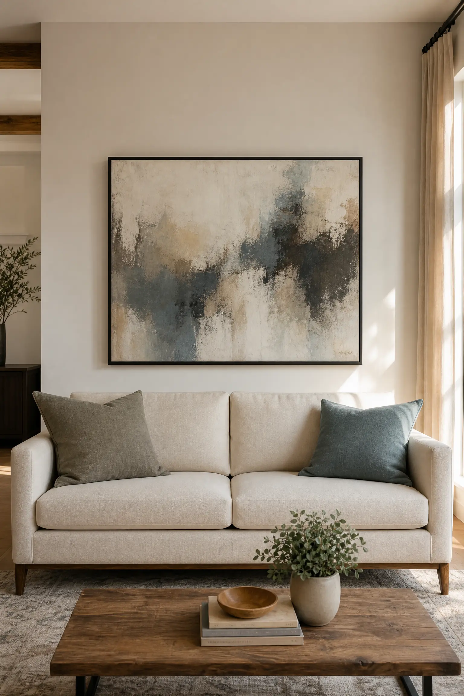
Art hung too high is one of those things that looks slightly wrong in a room but takes a moment to identify as the problem. The standard professional guideline is to hang the center of the artwork at approximately 57 to 60 inches from the floor, which corresponds to average eye level when standing. The common mistake is hanging art at the same height as the top of a door frame, which places the visual center of the piece well above where your eye naturally rests. When art is hung above a sofa, the bottom of the frame should sit 6 to 8 inches above the top of the sofa back. This maintains the visual connection between the furniture and the art, making them feel like they belong to the same arrangement. Very large pieces of art, over 40 inches tall, can be hung slightly lower to keep the visual weight from feeling top-heavy, particularly in rooms with lower ceilings.
Designer Advice: For gallery walls, treat the entire arrangement as a single artwork. The center of the whole grouping should sit at that 57 to 60 inch mark, not each individual piece.
15. Edit Ruthlessly Before Adding More
When a room feels cluttered or overwhelming, the instinct is often to rearrange things or add something new to try to fix it. In most cases, the better move is to remove things until the room starts to breathe. Negative space, the areas in a room where there is nothing, is a design element in its own right and one that is frequently undervalued outside of professional design circles. A shelving unit with 60 percent of its space filled and 40 percent open actually looks more considered than one packed from end to end. The hardest part of editing is being honest about what you actually love versus what you have simply kept out of habit or guilt. A useful exercise is to clear every surface in a room completely, then put back only the things you actively want there. Most people find they put back about half of what they removed, and the room immediately feels more spacious and intentional.
Designer Advice: Anything you keep putting back in a drawer or cabinet rather than on display is probably something you do not actually love enough to style with. Trust that instinct.

16. Use Plants to Add Scale and Life
A well-placed plant does something in a room that no piece of furniture or accessory can replicate. It adds a sense of scale, movement, and life that makes a space feel genuinely inhabited rather than simply arranged. The key word here is well-placed, because a small succulent on a bookshelf is not doing the same work as a large Ficus lyrata, commonly known as a fiddle-leaf fig, in the corner of a living room. Large-scale plants, those over four feet tall, have real architectural presence and work particularly well in corners that would otherwise feel dead. Medium plants like a Monstera deliciosa or an Alocasia work on plant stands or side tables and add height variation at a middle level. If you genuinely struggle to keep plants alive, high-quality faux stems in real planters filled with real soil and moss read far better in person and in photographs than obviously artificial arrangements. The practical note is that fiddle-leaf figs, despite their popularity, are genuinely finicky and not the best choice for low-light apartments.
Designer Advice: Match your planter to the room’s material palette. A terracotta pot suits warm, earthy rooms; a matte white ceramic suits modern or Japandi-style spaces; a woven basket suits coastal or bohemian interiors.

17. Think About Scale Before You Buy Furniture
The most common furniture mistake is buying pieces that look right in a showroom and then feel completely wrong in your home. Scale is the relationship between furniture and the room it lives in, and getting it wrong is one of the hardest problems to fix without simply replacing pieces. Before buying anything significant, measure your room and tape out the footprint of the furniture on the floor. Then live with those tape outlines for a few days before ordering. A coffee table that is too small for the sofa group floats in a way that feels purposeless. A dining table that is too large for the room makes every meal feel like you are eating in a corridor. In rooms with low ceilings, low-profile furniture with clean lines maintains the sense of proportion. In rooms with high ceilings, taller furniture, statement lighting, and vertical art help fill the visual space without making the room feel empty above the furniture line.
Designer Advice: The coffee table should be about two-thirds the length of your sofa. This is a proportion rule that holds up consistently across different room sizes and sofa styles.
18. Let the Architecture of Your Home Guide the Style
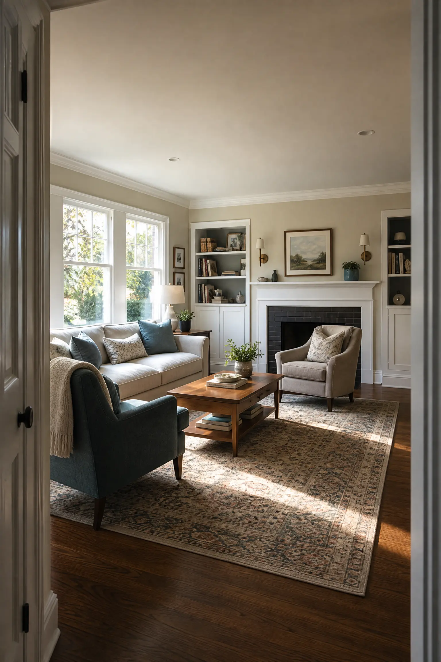
One of the most common sources of design friction is choosing a style that fights the bones of your home. A Victorian terrace with ornate cornicing and original tiled floors does not want to be a stark minimalist space, and a flat-roofed 1960s modernist house does not naturally suit heavy, traditional furniture. Working with your home’s architecture rather than against it is one of the most reliable routes to a space that feels genuinely cohesive. This does not mean you have to be literal about it. A mid-century modern house can absolutely have some traditional touches, and a Victorian home can carry contemporary furniture beautifully. The key is to acknowledge the bones and use them as a starting point. Original fireplaces, exposed beams, ceiling roses, and window proportions all give you information about what the house wants to be, and rooms that listen to those cues tend to feel more settled and considered.
Designer Advice: Before you do anything else in a new home, identify the three best architectural features in each room. Your job is to style around those, not compete with them.

19. Use Dark Colors in Small Rooms
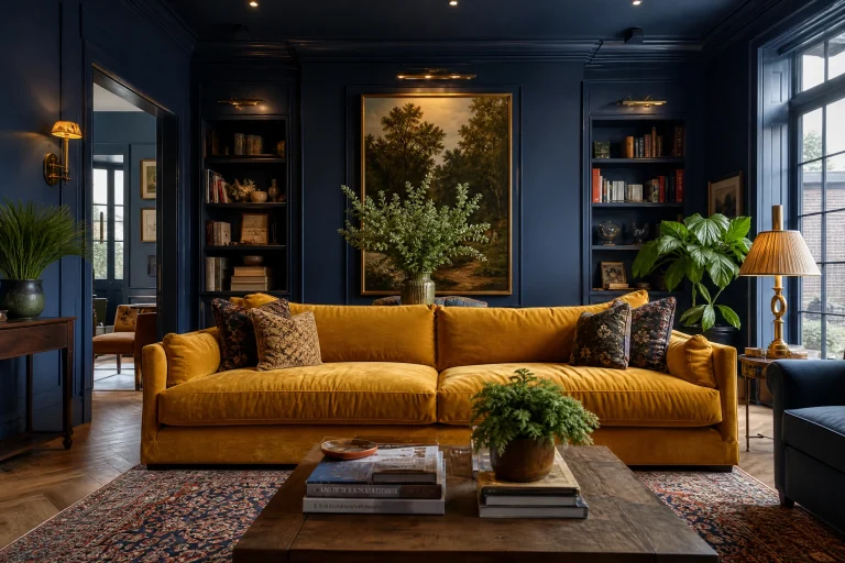
The received wisdom that small rooms need light colors to look bigger is one of the most persistent myths in home decor, and it is worth questioning. A small room painted in a rich, deep color like forest green, navy, or charcoal does not feel smaller. It feels enveloping, intentional, and genuinely atmospheric in a way that a cautiously pale space rarely achieves. The darkness makes the edges of the room recede, which removes the feeling of four walls closing in and replaces it with a sense of depth. Powder rooms, small studies, and narrow hallways are particularly good candidates for this treatment because they are spaces you pass through rather than spend hours in, which makes the drama feel exciting rather than oppressive. The practical consideration is that dark paint requires better light to read well, so pairing a deep wall color with good lighting is not optional, it is essential.
Designer Advice: Paint the ceiling the same color as the walls in a small, dark room. This removes the contrast at the top of the room and makes the ceiling feel higher rather than lower.

20. Treat Books as Decor, Not Just Storage
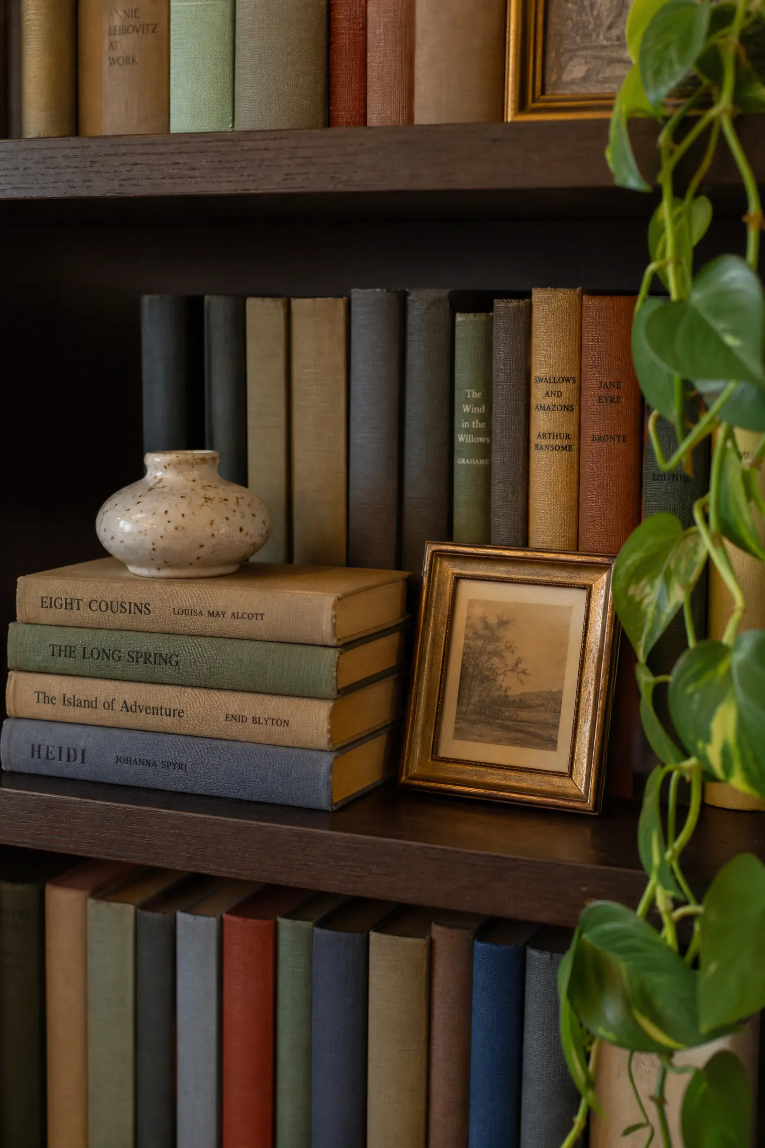
A shelf full of books arranged purely by size and color with no other objects is not a bookshelf, it is a storage wall with good intentions. And a shelf with books crammed in every direction with no breathing room is just clutter with an intellectual alibi. The most visually successful bookshelves use books as one ingredient in a styled display, not the only one. Stack some horizontally to create platforms for small objects. Leave some sections with open space. Mix in a small framed print, a ceramic pot, or a trailing plant. Grouping books loosely by color, rather than strictly, creates a softer, more organic look than the color-blocked shelf that went very viral a few years ago and has since started to feel slightly staged. The limitation of color-organizing your books is that it makes finding anything impossible, which is a genuine practical trade-off worth knowing about before you commit an afternoon to the reorganization.
Designer Advice: Remove the dust jackets from hardcovers. The cloth bindings underneath are usually more interesting colors and give the shelf a more cohesive, literary look.
21. Define Zones in Open-Plan Spaces
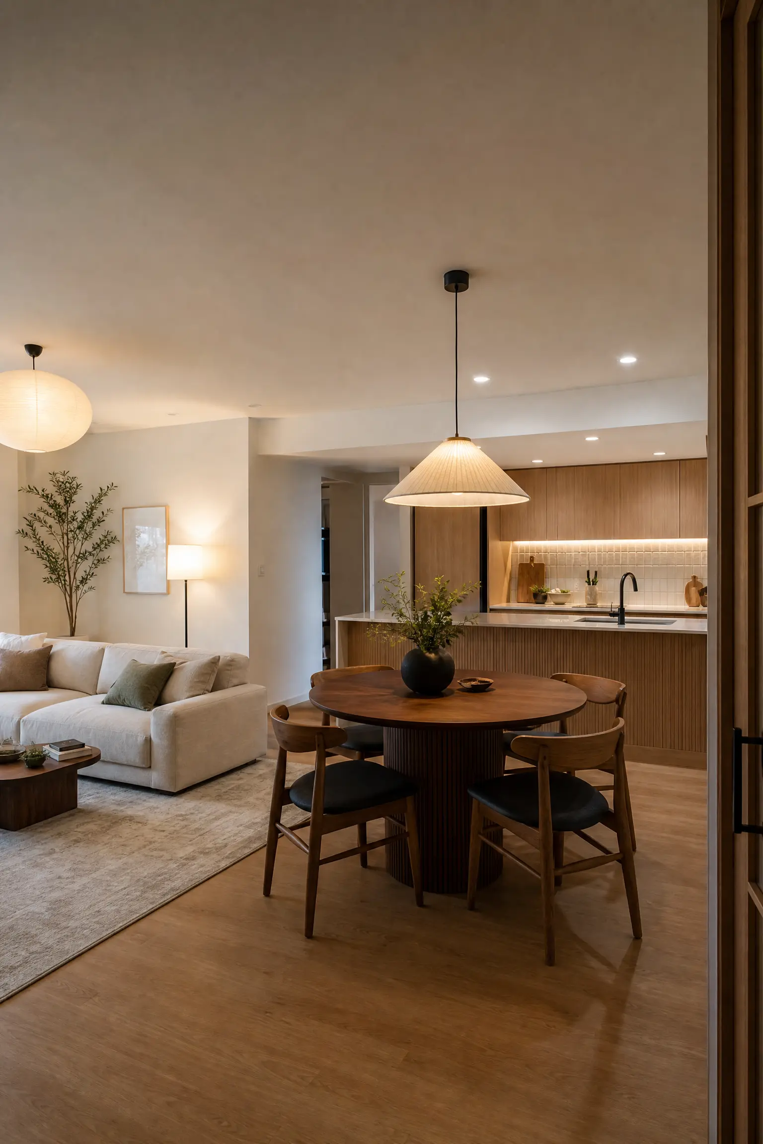
Open-plan living is popular because it feels spacious, but without some intentional zoning, a large open room can feel like a waiting room where no area has a clear purpose. The most effective zoning tools are rugs, lighting, and furniture arrangement used together. A rug anchors the living area, a pendant light designates the dining zone, and the orientation of the sofa communicates where the conversation zone ends and the kitchen begins. In Japandi and Scandinavian-style interiors, this is often done with light, the warm glow of a pendant light over a dining table becomes a zone in itself. Room dividers, low bookshelves, and even plants arranged in a row can provide soft visual separation without interrupting the flow of the space. The key is that each zone needs to feel purposeful and complete on its own while still making sense as part of the whole.
Designer Advice: In open-plan spaces, each zone needs its own light source. If they all share one overhead light, the zones you have created with furniture will dissolve the moment the main light goes on.
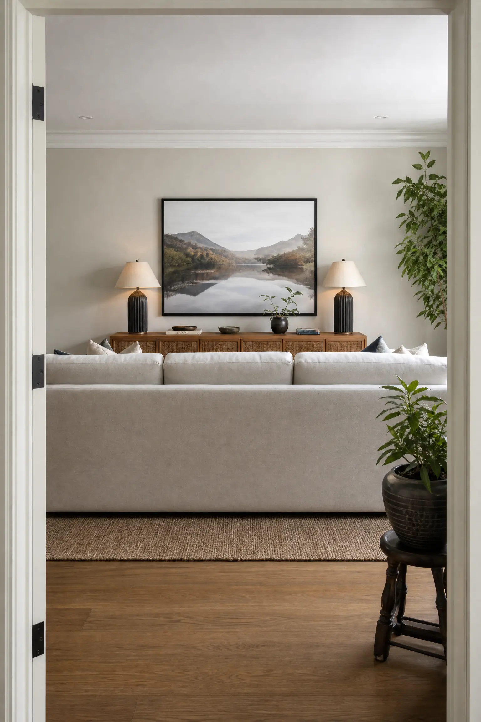
22. Pay Attention to What You See When You Walk In
The first view of any room, the moment you enter, sets the emotional tone for everything that follows. Most people style rooms from the inside looking out, sitting on the sofa and thinking about the view they have from there. But the more powerful design move is to think about what the room looks like from the doorway. If the first thing you see is the back of a sofa or a cluster of mismatched furniture, the room will feel closed and unwelcoming even before you step in. A considered entryway view might frame the focal point of the room, whether that is a fireplace, a piece of art, or a well-styled console. Even in rooms where you cannot change the furniture layout, a large piece of art on the far wall or a carefully placed mirror will give the eye somewhere interesting to land the moment you walk in.
Designer Advice: Take a photo from the doorway of every room in your home. Photos reveal awkward compositions and visual clutter that you stop noticing when you are living in the space every day.
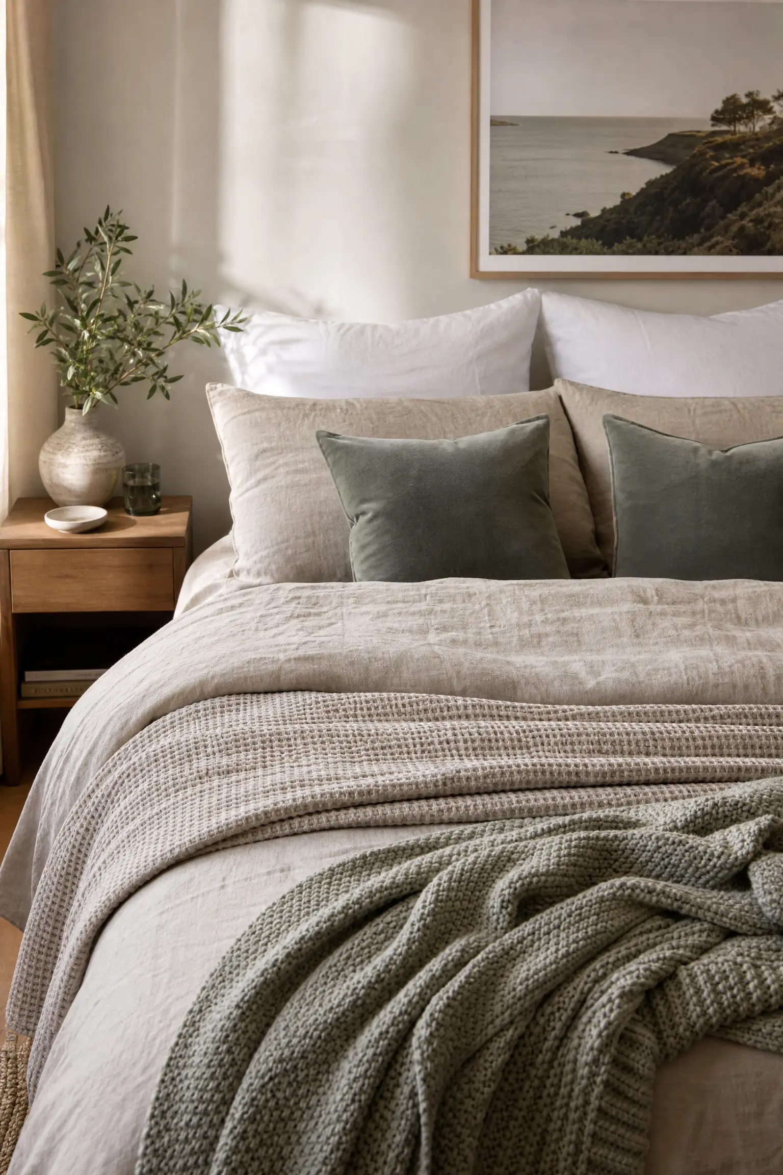
23. Layer Your Bedding Like a Hotel That Actually Feels Human
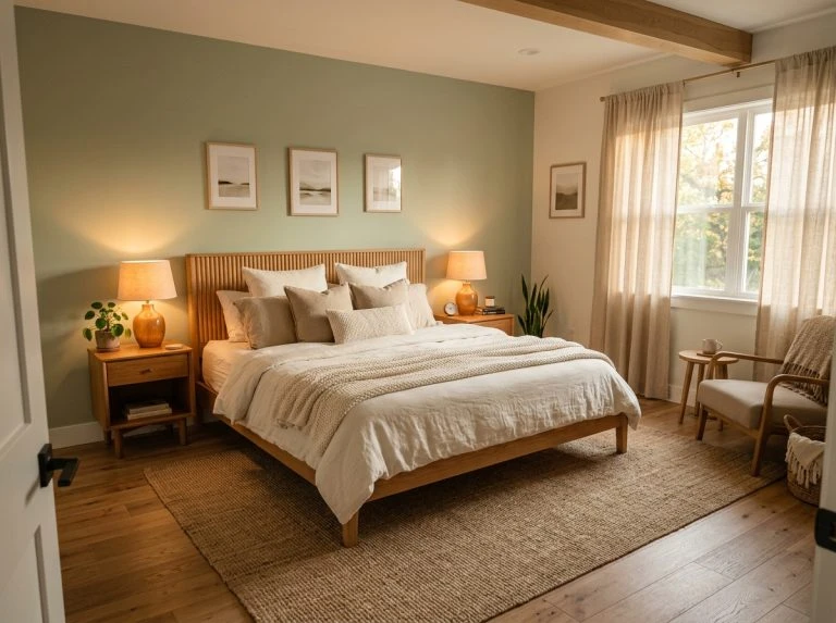
The hotel bed look that everybody tries to recreate at home often ends up feeling either too stiff or too chaotic, because the key is not just in how many layers you use but in the texture mixing. Start with good quality cotton or linen sheets in a neutral tone, the foundation layer that dictates the overall warmth or coolness of the palette. Add a lightweight waffle-weave blanket or a linen coverlet over that as a middle layer, which gives the bed a relaxed, lived-in quality that a perfectly pressed duvet alone cannot achieve. Then bring in two or three Euro pillows at the back for height, your sleeping pillows in front, and a couple of smaller decorative cushions in a complementary color or texture. A throw folded loosely at the foot of the bed finishes the look. Linen bedding has the advantage of looking better slightly rumpled, which makes it easier to maintain the look without making the bed with hotel-level precision every morning.
Designer Advice: Stick to two to three colors across all your bedding layers and let texture provide the variation. More than three colors makes a bed look busy rather than layered.
24. Use Scent as a Design Element
Interior design is usually discussed in purely visual terms, but the scent of a space has a significant effect on how it feels to be in. High-end hotels and retail spaces have known this for years, using consistent signature scents to make their environments feel more complete and memorable. At home, scent layering works through a combination of candles, reed diffusers, and natural materials rather than a single overpowering fragrance. A reed diffuser provides a consistent background note, while a lit candle adds warmth and a ritual quality to the space. Cedar and sandalwood work well in living rooms and studies for their warm, grounded quality. Citrus and eucalyptus suit bathrooms and kitchens where freshness is the priority. The practical note is that synthetic fragrances in very small rooms can quickly become overwhelming, so start with the lightest version of any diffuser and build up from there.
Designer Advice: Choose one consistent scent per room and use it reliably. Over time, that scent becomes associated with that specific space, which deepens the sense of home every time you enter the room.

25. Design for How You Actually Live, Not How You Wish You Did
The most beautifully styled rooms in the world are ones that also function for the people inside them. A living room designed around a formal sofa that nobody sits on because it is uncomfortable is not a well-designed room. A dining room staged for dinner parties that you host once a year while you eat every meal on the sofa is not working for you. The most effective design decisions start with an honest look at how a space is actually used, what routines happen there, what storage is genuinely needed, and where the natural light falls. If you work from home, a bedroom that accommodates a proper desk matters more than one that looks symmetrical. If you have young children, hard-wearing performance fabrics on the sofa matter more than a showroom-perfect finish. Professional designers call this design around lifestyle, and it is the principle that makes the difference between a room that photographs well and a room that genuinely improves your daily life.
Designer Advice: Write down the three things that frustrate you most about a room before you start redesigning it. Those frustrations are the brief. Everything else is optional.

Final Thoughts
Good interior design is not about spending more or following trends more closely. It is about understanding a handful of principles that have held up across decades of practice and applying them with an honest eye toward how your home actually works for you. Most of the tips in this guide cost nothing to implement. Floating your sofa, editing your shelves, hanging your curtains higher, and checking your art height are all changes you can make this weekend without buying a single new thing. The ones that do involve spending, like a properly sized rug or a quality floor lamp, are investments that pay off in daily quality of life rather than just in how the room looks in a photograph. The best version of your home is not the one that looks exactly like something you saw online. It is the one that feels specific to you, that has been edited and refined over time, and that makes you genuinely happy every time you walk through the door. Start with one tip. Live with the change for a week. Then do another. That is how rooms that feel truly complete come together.
Frequently Asked Questions
What is the most important interior design principle for beginners?
If you are just starting out, focus on scale and proportion first. Getting the furniture sizes right, the rug big enough, the coffee table proportional to the sofa, and the curtains long enough will have a bigger impact than any decorative choices you make after that.
How do I make a rental feel more like home without breaking the rules?
Focus on the things you can take with you: rugs, curtains, lighting, plants, art, and soft furnishings. These elements do most of the design work in a room and none of them require drilling holes in walls or changing permanent fixtures. Removable peel-and-stick wallpaper is also a useful option for rental spaces.
How many throw pillows is too many?
The honest answer is that you have too many when they are taking up seating space on the sofa or need to be removed and stacked on the floor every time someone sits down. For a standard three-seater sofa, four to six cushions is usually the practical maximum. Quality and texture matter more than quantity.
Is it worth hiring an interior designer?
For major renovations or rooms where you feel genuinely stuck, yes. A good interior designer will save you money in the long run by preventing costly mistakes and will access trade pricing on furniture and materials that can offset their fee. For smaller updates, online consultations or e-design services offer professional advice at a fraction of the cost of full-service design.
How do I choose between different interior design styles?
Start by collecting images of rooms you genuinely love, not just rooms you admire in theory, and look for patterns in what they have in common. Most people’s taste clusters around two or three styles that share underlying characteristics. You do not have to commit to a single named style. Most successful interiors are a personal blend, and that specificity is usually what makes them feel real rather than staged.
What should I change first if I want to improve my home quickly?
Lighting and soft furnishings give you the most visible return for the least disruption. Swapping out a bare bulb for a warm-toned lamp, adding a decent rug, and refreshing your cushion covers can change the feel of a room within a day and does not require any tradespeople or major decisions.